
Updated! Timber Wolf Screen Shots Revealed
#761
Posted 14 April 2014 - 08:58 AM
#762
Posted 14 April 2014 - 09:33 AM
 Cimarb, on 14 April 2014 - 07:34 AM, said:
Expectations for the TimberWolf were just too high. There was no way PGI was going to make everyone happy with it, and even if they "fix" the legs, 95% of the complainers are still going to complain about something else.
As I said a great deal of pages before: Nostalgia is as much of a curse as it is a gift. It's fine and dandy to relish the best things the past had and get annoyed when a rebuild mutates so badly that it becomes a shell (looking at you Micheal Bay), but when a rebuild that is actually good comes along and people fight...well...to each their own...i guess.
But I'm just a doof rambling on again when I should plan on royally blowing up some clan mechs when they come...
Edited by Magic Murder Bag, 14 April 2014 - 09:35 AM.
#763
Posted 14 April 2014 - 10:01 AM
Then came the clans and the Timber Wolf, and oh my how I swooned at the wonderfulness that was the Mad Cat. I am thoroughly pleased with the design, I agree the legs might be a bit chunky but when considering the game mechanics and hit boxes... it really is necessary to make them chunky to be fair to everyone shooting at this beast.
As for those of you who are claiming 55 dollars or 210 dollars is to much for this mech, I want you to consider something.
The $55 package is THREE mechs and THREE mech bays. The prime variant might as well be classified a hero mech as its increase of Cbills. so lets do some quick math here with a comparison mech. The Orion Protector hero mech is 5,625 MC adding on the cheapest 2 Orions there after 2500, and 2605 respectively in MC plus 3 mech bays 420 mc for a grand total of 11,150 mc which might as well be 50 bucks. So for 3 Timber wolves + 3 mech bays I will happily pay 55.00 dollars.. as the Timber Wolf is far superior in every right to the Orion.
You freebirths, need to learn to do arithmetic ;P
Oh, and the 210 dollar package? 21 mechs? 7 primes (hero mechs) 21 bays and 90 days of premium time? If you've got it you really are crazy not to drop it... its a great deal over all when you consider the amount of things you get. The 90 days of premium alone would cost you around 7500 mc or about 40 bucks.
Edited by WulfMackenzie, 14 April 2014 - 10:06 AM.
#764
Posted 14 April 2014 - 10:23 AM
 WulfMackenzie, on 14 April 2014 - 10:01 AM, said:
Then came the clans and the Timber Wolf, and oh my how I swooned at the wonderfulness that was the Mad Cat. I am thoroughly pleased with the design, I agree the legs might be a bit chunky but when considering the game mechanics and hit boxes... it really is necessary to make them chunky to be fair to everyone shooting at this beast.
As for those of you who are claiming 55 dollars or 210 dollars is to much for this mech, I want you to consider something.
The $55 package is THREE mechs and THREE mech bays. The prime variant might as well be classified a hero mech as its increase of Cbills. so lets do some quick math here with a comparison mech. The Orion Protector hero mech is 5,625 MC adding on the cheapest 2 Orions there after 2500, and 2605 respectively in MC plus 3 mech bays 420 mc for a grand total of 11,150 mc which might as well be 50 bucks. So for 3 Timber wolves + 3 mech bays I will happily pay 55.00 dollars.. as the Timber Wolf is far superior in every right to the Orion.
You freebirths, need to learn to do arithmetic ;P
Oh, and the 210 dollar package? 21 mechs? 7 primes (hero mechs) 21 bays and 90 days of premium time? If you've got it you really are crazy not to drop it... its a great deal over all when you consider the amount of things you get. The 90 days of premium alone would cost you around 7500 mc or about 40 bucks.
Oh No, Not Math! I Figures ThIs Out Long Ago. Thething Was I Waited To Get An End Round Discount. Ultimate Gamer Cards Whent On Sale 20% And I Bought All The Cards From 2 Gamestops To By Masakari Pack. Thats The Way To Do It, The Math On That Pack Looks Even Better!
#765
Posted 14 April 2014 - 10:24 AM
 Cimarb, on 14 April 2014 - 07:34 AM, said:
Remember Ekman's "what are people's expectations?" question to the community about the Marauder? The truth is that people are all over the place with their expectations. The people ranting about the MadCat's legs are not all people. Not only that, but if you "fix" the legs to satisfy the people complaining now, you'll likely get a whole new set of people complaining about the new legs that weren't complaining before.
Remember the complaints about the Centurion? You don't hear much about them now, and it's still a pretty popular 'mech in the games I'm seeing. It just takes getting used to.
When they unleashed the ReSeen Marauder in the table top's Project Phoenix over a decade ago, there was a huge backlash. But you know what? Even though that design was (IMO) fugly as hell, at least it's their own design now, and they can do what they want to with it, including altering it over the years (or get better artists to translate their designs). Now they've pretty much adopted some of the Shimmering Sword Marauder design elements into their own as the "official" Marauder, even going so far as to halt Sentinel373's 3D-printed production of Shimmering Sword's Marauder because it's too similar to the "official" BattleTech miniatures IronWind Metals is making (who Sentinel also works with now).
It is also important to note that PGI does not have the license to use any pre-existing art from Topps, the official license holder for all Battletech/MechWarrior images in print media (although I guess the same doesn't hold true for Topps getting their hands on designs initially made for PGI). All art in MWO has to be new art made for MWO. None of the stuff here can look exactly like the art that originally appeared in the old books. And none of it does.
#766
Posted 14 April 2014 - 10:34 AM
 DirePhoenix, on 14 April 2014 - 10:24 AM, said:
It is also important to note that PGI does not have the license to use any pre-existing art from Topps, the official license holder for all Battletech/MechWarrior images in print media (although I guess the same doesn't hold true for Topps getting their hands on designs initially made for PGI). All art in MWO has to be new art made for MWO. None of the stuff here can look exactly like the art that originally appeared in the old books. And none of it does.
This is great, but it doesn't address the disparity between Alex's concept art and the in-game model. The proportions shown in the concept art are solid. Piss-poor translation is the real issue. The same thing can be said of the Banshee. Fantastic art. Sad, sad WTF model.
#767
Posted 14 April 2014 - 12:20 PM
 Magic Murder Bag, on 14 April 2014 - 09:33 AM, said:
But I'm just a doof rambling on again when I should plan on royally blowing up some clan mechs when they come...
I can't stand to watch X-Men 3, so I totally understand the "artistic butchering" that can happen. The Timber Wolf mech is beautiful, even if it is a tad on the chunky side (which a 75-ton mech should be, btw).
 Zack Esseth, on 14 April 2014 - 10:23 AM, said:
Oh No, Not Math! I Figures ThIs Out Long Ago. Thething Was I Waited To Get An End Round Discount. Ultimate Gamer Cards Whent On Sale 20% And I Bought All The Cards From 2 Gamestops To By Masakari Pack. Thats The Way To Do It, The Math On That Pack Looks Even Better!
First, are you using some weird creepy stalker addon that capitalizes every word and removes all punctuation and random spaces between words? If so, please stop.
Second, my eyes are now bleeding, so I can't tell exactly what you were trying to say...
 Jacon Ceronia, on 14 April 2014 - 10:34 AM, said:
This is great, but it doesn't address the disparity between Alex's concept art and the in-game model. The proportions shown in the concept art are solid. Piss-poor translation is the real issue. The same thing can be said of the Banshee. Fantastic art. Sad, sad WTF model.
The in-game model is pretty close to the standard concept art (the green one), but every mech they convert into the game has to be adjusted to balance it against existing mechs.
It's like automobiles: the concepts are just what they would LIKE it to look like, while the production model has to take into account cost of materials and assembly, legal constraints, and many other factors that cause the model to generally be much more bland than the concept it was based upon.
#768
Posted 14 April 2014 - 12:39 PM
 DirePhoenix, on 13 April 2014 - 08:24 PM, said:
Then you have the standard variants. This is what the in-game screenshots are showing. Note it is still a "Prime" variant, but it's the same difference as the SHD-2H(P) and the SHD-2H, or the CPLT-C1(F) and the CPLT-C1. Same 'mech, same stats, different geometry pieces.
Consider this the Timberwolf Prime(Special Edition):

This would be the Timberwolf Prime (standard) - the one you'd be getting for Cbills, also the only (non-hero) version you'll be able to get after the Clan package promotion ends:

Same mech - these are both still Timberwolf Primes - but you can see the differences in geometry. Both of these pictures have been on the Clan package page since the beginning, and for all the other available Clan OmniMechs as well. just click the pictures of the mechs and click through the carousel to see them all.
Dire, I am really surprised that I did not notice that. Thank you for the heads-up about the "special" geometry, or would not have seen it.
#769
Posted 14 April 2014 - 01:12 PM
 Cimarb, on 14 April 2014 - 12:20 PM, said:
I completely agree that [all] designs need some adjustment to be in-game compatible. I disagree though, that the in-game Timberwolf looks "pretty close" to the concept art. Sure, most of the lines, and shapes are present-- in some form. However, the overall silhouette is vastly different, from all angles. If I was at home, I would post a quick photoshop image illustrating what I mean.
#770
Posted 14 April 2014 - 02:07 PM
 Jacon Ceronia, on 14 April 2014 - 01:12 PM, said:
If it was really so "vastly different" it would have the arms of a Black Jack, the cockpit of an Orion, and the legs of an Atlas.
Edited by Nathan K, 14 April 2014 - 04:53 PM.
#771
Posted 14 April 2014 - 02:07 PM

#772
Posted 14 April 2014 - 02:19 PM
It looks like they took a great looking Timber Wolf and shrank the CT/Cockpit area by about 15%. Maybe this was because it was getting cored WAY too easily in-game, or the headshots were too frequent. I don't know. All I know now is that it looks like they smashed the mech's face in, making this the pug breed of Timber Wolfs.
Until I see a profile shot from the side showing me otherwise, I still think the nose of the mech is too squashed (especially compared to the concept art).
Edited by ShadowVFX, 14 April 2014 - 02:33 PM.
#773
Posted 14 April 2014 - 09:10 PM
 Cimarb, on 14 April 2014 - 12:20 PM, said:
First, are you using some weird creepy stalker addon that capitalizes every word and removes all punctuation and random spaces between words? If so, please stop.
Second, my eyes are now bleeding, so I can't tell exactly what you were trying to say...
You have witnessed a post from my dumb phone. Its level of fail is through the roof.
#774
Posted 14 April 2014 - 09:31 PM

This is an excellent example of the disparity between the concept art and the in-game model. The concept art retains the angles, proportions, and curves of the classic Timberwolf design, while giving it a fresh look that is consistent with the game. The absence of offset knee joints isn't even a problem with the concept art.
But then the in-game model looks flat, fat, and disproportionate. What happened???
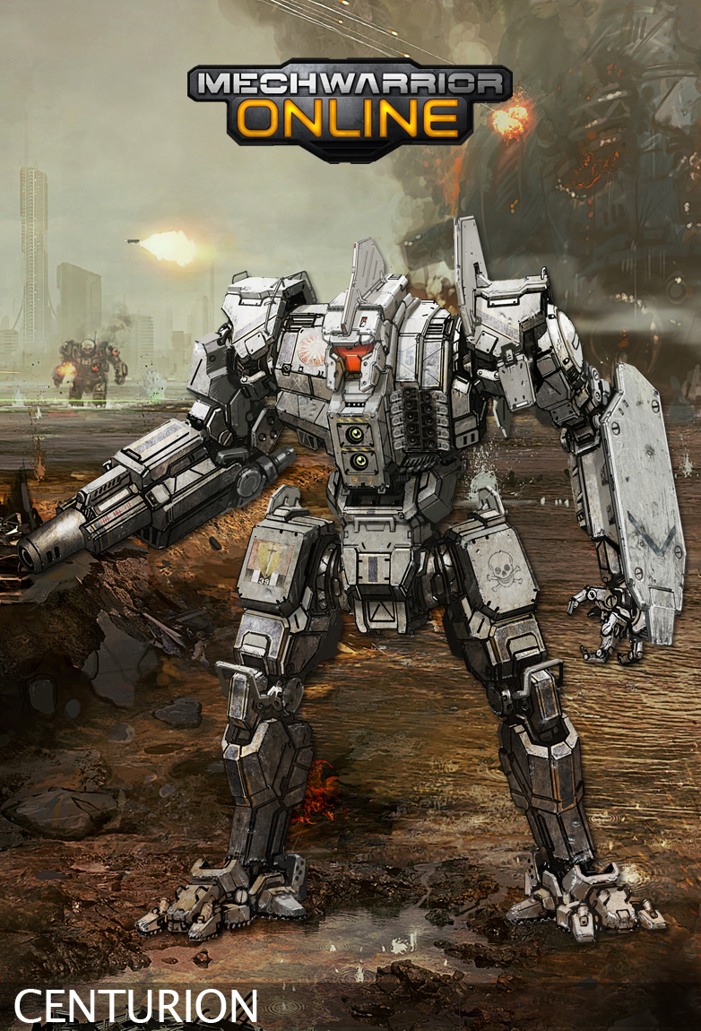
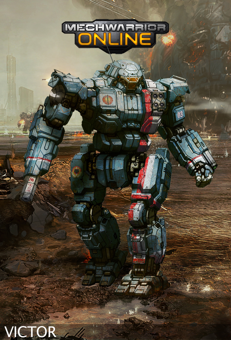
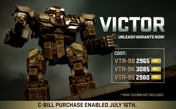
And then take a look at the Centurion and the Victor concept art, they look incredible. But the models look blocky, the legs and pelvis are huge, and the proportions are off. The Centurion ends up looking squat compared to the more athletic looking concept art. The Victor concept art looks like a boss, but in game it looks like a giant Commando.

#775
Posted 14 April 2014 - 10:24 PM
 Haitchpeasauce, on 14 April 2014 - 09:31 PM, said:
This is an excellent example of the disparity between the concept art and the in-game model. The concept art retains the angles, proportions, and curves of the classic Timberwolf design, while giving it a fresh look that is consistent with the game. The absence of offset knee joints isn't even a problem with the concept art.
But then the in-game model looks flat, fat, and disproportionate. What happened???
And then take a look at the Centurion and the Victor concept art, they look incredible. But the models look blocky, the legs and pelvis are huge, and the proportions are off. The Centurion ends up looking squat compared to the more athletic looking concept art. The Victor concept art looks like a boss, but in game it looks like a giant Commando.
if you are using the victor as a justification for "3d models can differ from the concept" then you picked the worst case. I dont know if it looks like an oversized commando or not, but the model and the concept could not be more similar.
3d models always differ from the concept of course but certain key points define the characteristic of a concept (like the skull on the atlas's head)
Agile look is one key point for the timber... a key point which is missing in the 3d model but is present in the concept.
loosing a key point is not about drastic deviation form the concept. Even a wrongly scaled object can spoil it all.
This mech is not released yet. Clan mechs are still being worked on... so there is point in giving feedback and opinions. I think I'll be fine with it if the timber is released like that (with fat legs). It's not really a big deal... but it's not released yet.... so we'll cry louder.
#776
Posted 15 April 2014 - 12:08 AM
 Navid A1, on 14 April 2014 - 10:24 PM, said:
3d models always differ from the concept of course but certain key points define the characteristic of a concept (like the skull on the atlas's head)
Agile look is one key point for the timber... a key point which is missing in the 3d model but is present in the concept.
loosing a key point is not about drastic deviation form the concept. Even a wrongly scaled object can spoil it all.
This mech is not released yet. Clan mechs are still being worked on... so there is point in giving feedback and opinions. I think I'll be fine with it if the timber is released like that (with fat legs). It's not really a big deal... but it's not released yet.... so we'll cry louder.
All I see on the Victor model is "huge crotch".
Putting that aside, the main point I am driving at is the "spirit" of the concept art being lost. Which is why, when I see the examples of legs being made slightly thinner, I think the look of the Timberwolf is already quite improved.
I've grown rather cynical about the response to feedback, but hey at least this time around feedback has been requested, so that's a good thing.
PGI, restore my faith in you!
#778
Posted 15 April 2014 - 01:30 AM
 Haitchpeasauce, on 14 April 2014 - 09:31 PM, said:

This is an excellent example of the disparity between the concept art and the in-game model. The concept art retains the angles, proportions, and curves of the classic Timberwolf design, while giving it a fresh look that is consistent with the game. The absence of offset knee joints isn't even a problem with the concept art.
But then the in-game model looks flat, fat, and disproportionate. What happened???
And then take a look at the Centurion and the Victor concept art, they look incredible. But the models look blocky, the legs and pelvis are huge, and the proportions are off. The Centurion ends up looking squat compared to the more athletic looking concept art. The Victor concept art looks like a boss, but in game it looks like a giant Commando.


I agree !
PGI's 3D-modelers seem to "cook their own soup" when translating the concept-arts into 3D-models
while concept-arts are looking very smooth and athletic (Centurion, Victor, Battlemaster ...)
the 3D-models are overmuscled body-builders, out of proportion, oversized shoulders, too wide torsos, blocky
in case of Mad-Cat, the 3D-modelers outproportioned the legs
question: is there an "order" for the 3D-modelers to change models this way, are do they really have a very bad taste and sense for translating sexy concept-arts ?
#779
Posted 15 April 2014 - 06:54 AM
 Zack Esseth, on 14 April 2014 - 09:10 PM, said:
You have witnessed a post from my dumb phone. Its level of fail is through the roof.
LOL. You are a brave man to even try posting from your phone. Posting from a tablet is bad enough!
 Masterrix, on 15 April 2014 - 01:30 AM, said:
PGI's 3D-modelers seem to "cook their own soup" when translating the concept-arts into 3D-models
while concept-arts are looking very smooth and athletic (Centurion, Victor, Battlemaster ...)
the 3D-models are overmuscled body-builders, out of proportion, oversized shoulders, too wide torsos, blocky
in case of Mad-Cat, the 3D-modelers outproportioned the legs
question: is there an "order" for the 3D-modelers to change models this way, are do they really have a very bad taste and sense for translating sexy concept-arts ?
Concept artists have absolutely no requirements upon them, while 3d modeler shave to worry about hitboxes, game resources, animation clipping, and numerous other factors. If you would like to try to do better, Heffay made a great thread about creating your own mechs through Blender and other 3d tools.
(Edit to remove snarkyness...)
Edited by Cimarb, 15 April 2014 - 07:04 AM.
#780
Posted 15 April 2014 - 08:06 AM
1 user(s) are reading this topic
0 members, 1 guests, 0 anonymous users
 This topic is locked


