#1
Posted 06 May 2014 - 11:38 AM
#2
Posted 06 May 2014 - 01:43 PM
Other than that there has been suspiciously few information on any upcoming changes to the UI or plans thereof.
#3
Posted 06 May 2014 - 04:07 PM
#4
Posted 06 May 2014 - 04:59 PM
Edited by Harbinger Prime, 07 May 2014 - 04:21 AM.
#5
Posted 06 May 2014 - 10:46 PM
 Harbinger Prime, on 06 May 2014 - 04:59 PM, said:
Disgusting really
#6
Posted 07 May 2014 - 12:01 AM
#7
Posted 07 May 2014 - 12:19 AM
That was at least half the game for me, trying to make that useless stock mech (most of them are really not designed for the game, and that is nothing to do with PGI, but the way they would work in the books) into something viable for me.
I've seen countless mech's with highly effective loadouts get huge damage, and then after spending half hour in mechlab I've taken it out to find it horrible! I've then gone back to what I liked, 2 hours wasted, but I loved it.
Now I play with the mechs I had already set up before the change over, and maybe write down a good looking config for later use. But after a few hours of team deathmatch in the same 5 mechs it does get a bit boring, especially as I have a lot lore than that available in the hanger.
I've taught myself to use it enough so that I can change things if I have to, but I don't do it for fun any more and that's my major problem.
Also, all the other forum pages on the new UI performance seem to be locked for some reason.
#8
Posted 07 May 2014 - 12:23 AM
Wasn't something "Smurfy"-like promised?
#9
Posted 07 May 2014 - 12:25 AM
#11
Posted 07 May 2014 - 12:32 AM
 Draal Kaan, on 07 May 2014 - 12:31 AM, said:
Ah, that superb "Mech Details"?
Hm, sry, me wants more....
No they added a whole private match UI and changed the social tab. So I'm pretty sure they are still messing with the UI it's always going to be changing.
#12
Posted 07 May 2014 - 01:00 AM
 StaggerCheck, on 06 May 2014 - 11:38 AM, said:
I cannot help but notice that there is no pinned UI feedback thread for this latest patch. I think this is the third patch without any changes to the new UI. Do you consider the UI complete and functioning as intended at this point, or are you going to revisit the Mech Lab and other omissions in the future?
I hope not. The current UI is ******* pathetic. If you disagree, you are either a PGI fanboy or, more innocently, simply naive regarding efficient user interface design. And that is simply all there is to it.
Seriously, choose an action (find an engine, move a module, open and close friends list/message etc.) and take note of how many times you must needlessly move your mouse from one end of the screen to the other, how many times you must x out or click yes on stupid, redundant prompts etc. Its a god damn shameful mess. But hey, at least the color scheme is pretty.
#13
Posted 07 May 2014 - 01:58 AM
 Harbinger Prime, on 06 May 2014 - 04:59 PM, said:
Don't listen to rubbish like this, though if you know how to read the page you can tell "the plan" doesn't say anywhere that the UI is finished.
That specific link says that the UI modifications needed to implement Community Warfare are done.
Meanwhile another page says that UI changes to implement the Clans are only 30% done, and UI changes to help integrate new players is at 0% while they working on training missions.
It's pretty obvious that the UI will have many changes made, only "when" is what we don't know.
#14
Posted 07 May 2014 - 05:15 AM
 Shimmering Sword, on 07 May 2014 - 01:58 AM, said:
Don't listen to rubbish like this, though if you know how to read the page you can tell "the plan" doesn't say anywhere that the UI is finished.
That specific link says that the UI modifications needed to implement Community Warfare are done.
Meanwhile another page says that UI changes to implement the Clans are only 30% done, and UI changes to help integrate new players is at 0% while they working on training missions.
It's pretty obvious that the UI will have many changes made, only "when" is what we don't know.
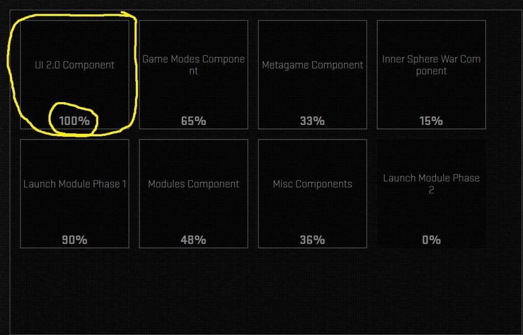
UI is short for User Interface which if you see is noted as 100% completed

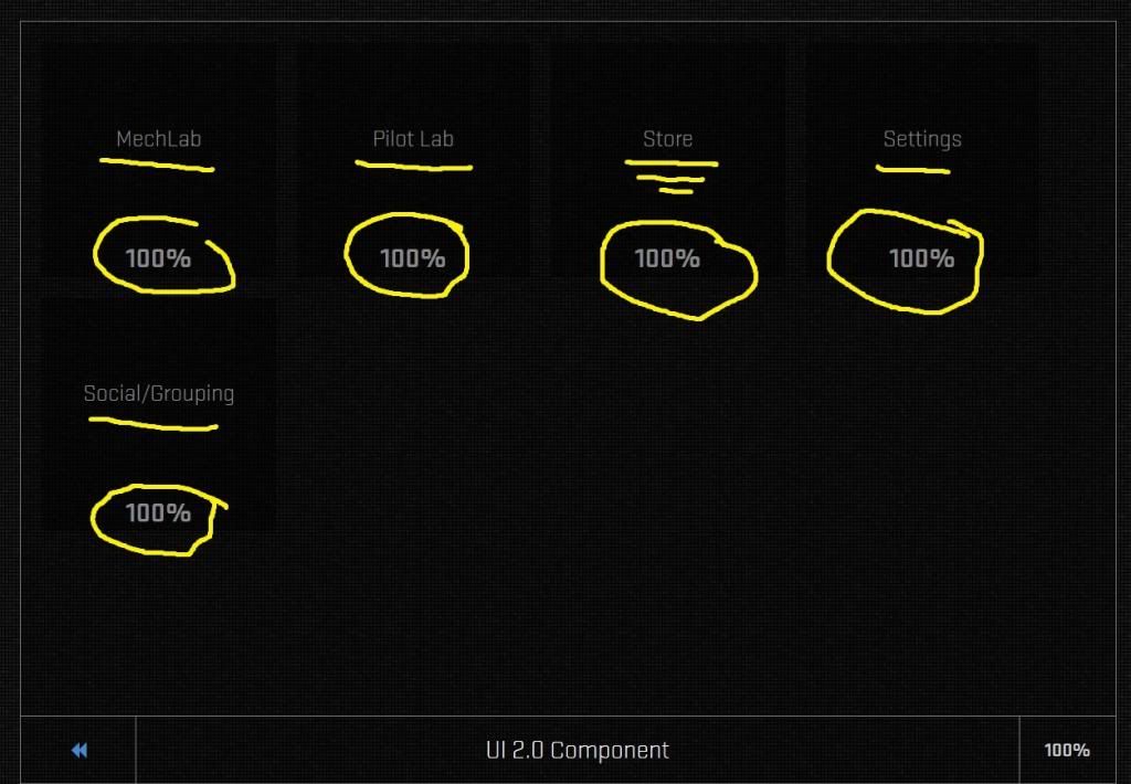
if you click on it, it will take you to this page, as can see everything concerning the U.I. is 100% completed even the store which has been broken and reported broken since the test and has yet to be fixed.
But if you think it is done then I can see that your/developers definition of 100% and the rest of the worlds are two different things.

Edited by Harbinger Prime, 07 May 2014 - 05:31 AM.
#15
Posted 07 May 2014 - 06:11 AM
#16
Posted 07 May 2014 - 06:39 AM
#17
Posted 07 May 2014 - 09:26 AM
#18
Posted 07 May 2014 - 09:44 AM
#20
Posted 07 May 2014 - 10:12 AM
1 user(s) are reading this topic
0 members, 1 guests, 0 anonymous users


