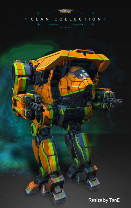
Exhibit A: Dire Wolf is shrunk vertically. This brings the legs and center torso more inline with the concept art, but still doesn't look good. I would say more acceptable, but still not quite what we want.

Exhibit B: The Dire Wolf is shrunk horizontally. This gives it the height typically seen in canon, but doesn't help with the nose or double chin. It also decreases the horizontal profile, but makes it very vulnerable in low cover, as it can be shot, but cannot shoot back.

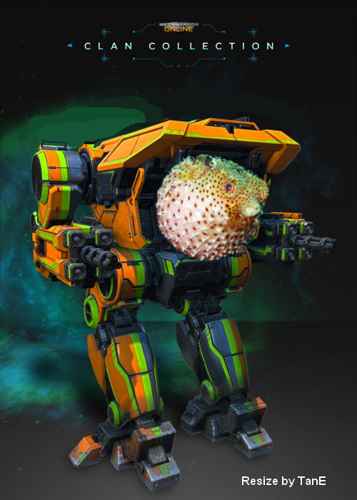
Exhibit C: The suggestion that they used a fish eye effect on it that slightly distorted it's features is examined. After much deliberation, I'm confident that this is not the issue at hand.

Edited by S3dition, 27 May 2014 - 06:46 PM.


