#13961
Posted 10 July 2016 - 10:08 AM
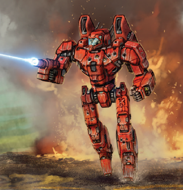
The new Combat Manual introduced a new Panther variant, the PNT-9ALAG used by the Amphigean Light Assault Group. It trades its JJ for a larger engine.
(And the MWO PXH definitely looks better than CGL's...)
#13962
Posted 10 July 2016 - 08:48 PM
#13963
Posted 10 July 2016 - 09:13 PM
#13968
Posted 12 July 2016 - 07:03 AM
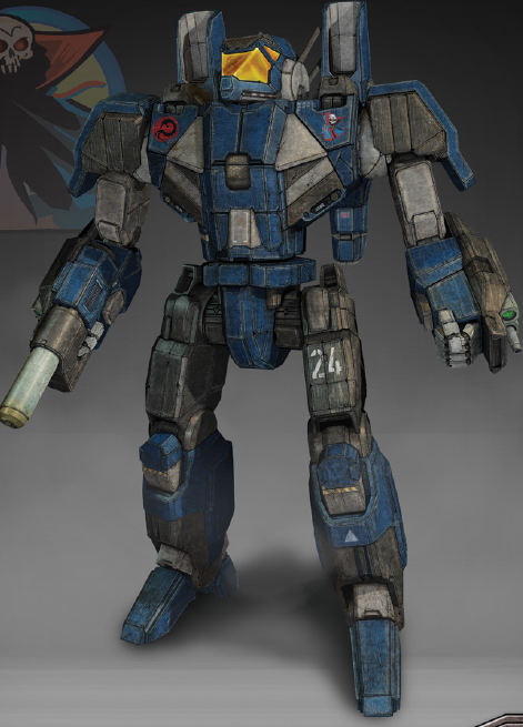
Also just realized, Linebackers legs look like supper fat Cicada legs almost xD
#13972
Posted 12 July 2016 - 10:48 PM
 Karl Streiger, on 12 July 2016 - 10:41 PM, said:
here a comparison between wasp as 3d model and "drawing" (no so sure if it is a drawing at all)
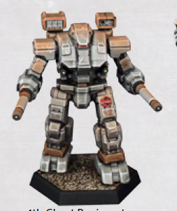
oh the new Unseen as Miniatures
Oh goodness.
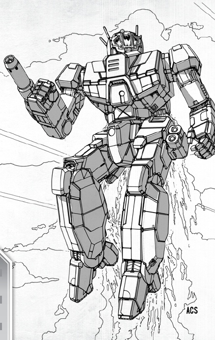
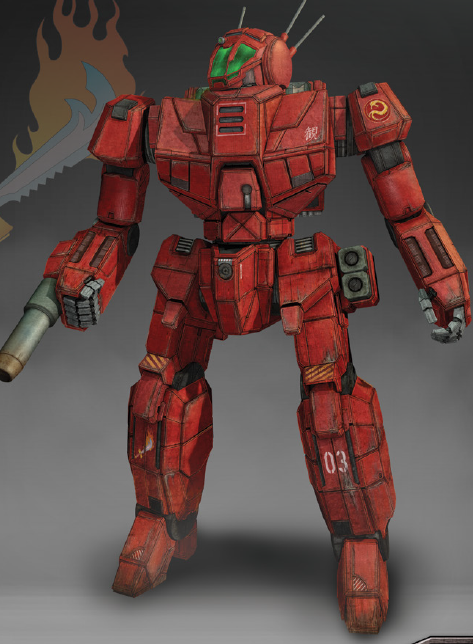
That Marauder looks so good.
I very much prefer THIS design over the Overly-sleek design of MW:O.
Also, it retains the iconic cockpit design from the old TROs, instead of having the large, open cockpit of the MW:O design.
#13974
Posted 13 July 2016 - 03:05 AM
 Karl Streiger, on 12 July 2016 - 10:41 PM, said:
oh the new Unseen as Miniatures
Not a fan of the Hawk at all.
As for the Minis, I do think that the CGL Marauder is much nice than ours (sorry Alex), though I wish the forearm weapon pods were about 10% bigger and the Autocannon around 15% smaller.
And I still can't get in love with the warhammer. Especially with how thick and bulky the arms are compared to the barrels. Looks like the 1980s Shockwave toy to me.
while there are a thing or two I'd tweak on the MWO version, given a chance, Alex's is (IMO) the far better Warhammer, despite the sleekness.

 Juodas Varnas, on 12 July 2016 - 10:48 PM, said:
That Marauder looks so good.
I very much prefer THIS design over the Overly-sleek design of MW:O.
Also, it retains the iconic cockpit design from the old TROs, instead of having the large, open cockpit of the MW:O design.
 Karl Streiger, on 12 July 2016 - 11:00 PM, said:
The Irony is.... Alex's MWO MAD is so very similar to Shimmering Swords traditional redsesign, which I always disliked because it simply felt too massive and bloated, like a MAD II, instead of the lean and mean look the MAD is supposed to entail.
Then Shimmering Sword goes and does a complete 180º from his usual MAD design for the official TT version and makes one that is pretty fantastic (even if I'd still tweak a few proportions)
Edited by Bishop Steiner, 13 July 2016 - 03:11 AM.
#13975
Posted 13 July 2016 - 05:04 AM
 Karl Streiger, on 12 July 2016 - 10:41 PM, said:
here a comparison between wasp as 3d model and "drawing" (no so sure if it is a drawing at all)
oh the new Unseen as Miniatures
I loved them all!
And I'm impressed with how close to the originals they are.
PS: I have to disagree with Bishop: the Shimmering Sword's redesigned Marauder is the best of all (better than this one).
#13976
Posted 13 July 2016 - 05:08 AM
#13977
Posted 13 July 2016 - 05:34 AM
 MeiSooHaityu, on 13 July 2016 - 05:08 AM, said:
That's the reason why probably prefer Alex's take on it over Shimm's CGL piece.
Shimmering Sword kept much closer to the original look of it than Alex. (I wouldn't mind Alex's Marauder that much if it had stuck with the original square cockpit window in the front, instead of the large open cockpit he made)
Edited by Juodas Varnas, 13 July 2016 - 05:35 AM.
#13978
Posted 13 July 2016 - 05:41 AM
 Juodas Varnas, on 13 July 2016 - 05:34 AM, said:
I think the decision to change the cockpit might have been 2 fold.
1. It distanced itself further from the Robotech look.
And most likely...
2. It made the mech more MWO friendly. If the design had stayed square, cockpit visibility would have been a cross between the Shadow Hawk and maybe an Atlas.
I kind if like the Shadow Hawk's "view from inside a mailbox" type feel because it is different, but I don't know if it would have worked as well for the slower turning Marauder and it might not have been as well received either.
#13979
Posted 13 July 2016 - 05:49 AM
 MeiSooHaityu, on 13 July 2016 - 05:41 AM, said:
1. It distanced itself further from the Robotech look.
And most likely...
2. It made the mech more MWO friendly. If the design had stayed square, cockpit visibility would have been a cross between the Shadow Hawk and maybe an Atlas.
I kind if like the Shadow Hawk's "view from inside a mailbox" type feel because it is different, but I don't know if it would have worked as well for the slower turning Marauder and it might not have been as well received either.
I won't argue, since i do agree with your points.
Especially since, as far as i recall, PGI's design was revealed before the CGL's "closer to original" design and it makes sense if they deliberately tried to stay away from the whole Unseen debacle.
And it being more FPS-friendly, well, that is also true, however, i've always been more towards the whole "aesthetics before function" crowd.
Even though i do not like the decision, i do understand it.
Edited by Juodas Varnas, 13 July 2016 - 05:49 AM.
#13980
Posted 13 July 2016 - 09:16 AM
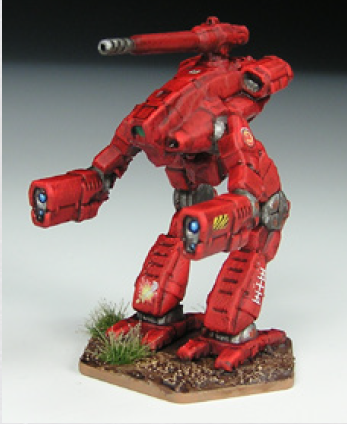
I like this design too.
But if Alex made this marauder, the metawarriors would complain and cry about a small, mid level cockpit, with very low arms (lower third = dragon syndrome).

I like both of them
Edited by TrapJaw80, 13 July 2016 - 09:19 AM.
6 user(s) are reading this topic
0 members, 6 guests, 0 anonymous users


