Jump to content

Shadow Cat Concept Art


138 replies to this topic

#101 Kiiyor

    Member

  • PipPipPipPipPipPipPipPipPipPip
  • Big Daddy
  • Big Daddy
  • 5,565 posts
  • LocationSCIENCE.

Posted 04 March 2015 - 04:27 PM

View PostOvion, on 04 March 2015 - 10:41 AM, said:

Just spotted this on Wave III page.
Not up-up, yet, but there's a magnifying glass over the silouette now.
Posted Image


Posted Image

#102 Jack Shayu Walker

    Member

  • PipPipPipPipPipPipPipPip
  • The God
  • The God
  • 1,451 posts

Posted 04 March 2015 - 06:59 PM

View PostKain Thul, on 04 March 2015 - 12:05 PM, said:


From the wave 3 FAQ:

Gladiator and Ebon Jaguar June 16

Shadow Cat and Arctic Cheetah July 21


Bollics, the one time they decide to drop the heavier chassis first, and it has to be now ;.;

#103 Bloodweaver

    Member

  • PipPipPipPipPipPipPip
  • Shredder
  • Shredder
  • 890 posts

Posted 04 March 2015 - 07:39 PM

Ehhhhh
Fat, ugly thighs
Weird cockpit, like a turtle poking it's head out
Not too impressed with this one, sadly. Alex has done better :/
It'll still be a joy to play in, of course...

#104 Tennex

    Member

  • PipPipPipPipPipPipPipPipPipPip
  • The 1 Percent
  • The 1 Percent
  • 6,619 posts

Posted 04 March 2015 - 07:49 PM

View PostBloodweaver, on 04 March 2015 - 07:39 PM, said:

Ehhhhh
Fat, ugly thighs
Weird cockpit, like a turtle poking it's head out
Not too impressed with this one, sadly. Alex has done better :/
It'll still be a joy to play in, of course...


i think the thighs look much bigger than they actually are because the fist is exactly where the thigh cuts off.

Plus the larger legs are PGI's style. If they were too small the mech would look inconsistent with the art style

#105 Bloodweaver

    Member

  • PipPipPipPipPipPipPip
  • Shredder
  • Shredder
  • 890 posts

Posted 04 March 2015 - 08:05 PM

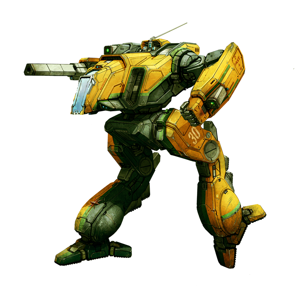
Look at the front of the SCat's right leg. That is one fat thigh. Not talking about the front-to-back dimension, but the side-to-side. Hell, if you cut out the orange part of the the upper leg entirely, but left it on the lower leg, that alone would improve them drastically.

And it's not as if there aren't 'mechs with (relatively) gangly legs. Multiple lights, Vindicator, Blackjack, Ice Ferret... Consistency is cool and all, but if it leads to ugliness, drop it.

But the cockpit is the real sore point to me. Without the window going all the to the bottom it loses a lot of SCat character, and with the full "head" section being so distinctly separate from the torso it looks like someone in a guillotine...

Edited by Bloodweaver, 04 March 2015 - 08:07 PM.


#106 Kassatsu

    Member

  • PipPipPipPipPipPipPipPip
  • The Devoted
  • The Devoted
  • 1,078 posts
  • LocationColorado

Posted 04 March 2015 - 08:34 PM

Seems to be growing on me the more I look at it, but I still don't know.

#107 PraetorGix

    Member

  • PipPipPipPipPipPipPip
  • The Warden
  • The Warden
  • 763 posts
  • LocationHere at home

Posted 04 March 2015 - 08:40 PM

View PostMeiSooHaityu, on 04 March 2015 - 11:44 AM, said:

I guess I'm the only one who is kind of...eh when it comes to the Shadow Cat.

Nothing on it looks wrong or offensive, I'm just s bit underwhelmed. I think it just looks plain.

Besides, the more I look at it, something just doesn't look right with the cockpit area (head and surrounding CT). It looks "droopy" to me.

There is things I like about it. The arms and legs look good. Even the side torso vents are OK.

Still, that CT around the cockpit just looks wrong to me.


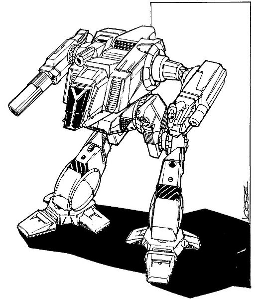
Nah you're not the only one. I honestly cannot believe, given how many people in this forum take these robots more seriously than RL, that so few have even mentioned the wrong cockpit. It's not just off, it is plain WRONG. The rest of the concept is a mirror of the original but Iglesias screwed up in a crucial spot I think. That thing is not a Shadow Cat to me, it's just a different mech with the same silhouette.

Edited by Cmdr Hurrell, 04 March 2015 - 08:42 PM.


#108 Kassatsu

    Member

  • PipPipPipPipPipPipPipPip
  • The Devoted
  • The Devoted
  • 1,078 posts
  • LocationColorado

Posted 04 March 2015 - 08:47 PM

View PostCmdr Hurrell, on 04 March 2015 - 08:40 PM, said:


Nah you're not the only one. I honestly cannot believe, given how many people in this forum take these robots more seriously than RL, that so few have even mentioned the wrong cockpit. It's not just off, it is plain WRONG. The rest of the concept is a mirror of the original but Iglesias screwed up in a crucial spot I think. That thing is not a Shadow Cat to me, it's just a different mech with the same silhouette.


So you want to be completely unable to see directly in front of you?

#109 Bloodweaver

    Member

  • PipPipPipPipPipPipPip
  • Shredder
  • Shredder
  • 890 posts

Posted 04 March 2015 - 08:57 PM

View PostKassatsu, on 04 March 2015 - 08:47 PM, said:

So you want to be completely unable to see directly in front of you?

So you think the only thing missing from the cockpit is the center bar?

As I said above, simply STRETCH the front cockpit window down the cockpit of the head section, and you instantly change the 'mech into a true SCat:
Posted Image
This was done in MS Paint, by the way. Took about one full minute to download the image, select the cockpit window, stetch it down, and upload the new image to photobucket. And you can already see a drastic improvement.

Of course, the "turtle-head" effect is still present... that vent sitting on/around the top of the "neck" needs to go, so that the head is just a direct extension of the torso instead of coming out from inside of it.

Edited by Bloodweaver, 04 March 2015 - 08:59 PM.


#110 PraetorGix

    Member

  • PipPipPipPipPipPipPip
  • The Warden
  • The Warden
  • 763 posts
  • LocationHere at home

Posted 04 March 2015 - 08:58 PM

View PostKassatsu, on 04 March 2015 - 08:47 PM, said:


So you want to be completely unable to see directly in front of you?


Because they couldn't put the inside of the cockpit offset for example. Or make a slight variation in the "Y" of the cockpit to leave room for viewing. Or even using the Dark Age cockpit version. Also, are you supposed to be able to see through the blinds in the Hunch? Don't think so, but they're there anyway. It's ok, I understand this is the internet and you have to try to look smarter than everyone else; just don't do it on my post please.

View PostBloodweaver, on 04 March 2015 - 08:57 PM, said:

So you think the only thing missing from the cockpit is the center bar?

As I said above, simply STRETCH the front cockpit window down the cockpit of the head section, and you instantly change the 'mech into a true SCat:
Posted Image
This was done in MS Paint, by the way. Took about one full minute to download the image, select the cockpit window, stetch it down, and upload the new image to photobucket. And you can already see a drastic improvement.

Of course, the "turtle-head" effect is still present... that vent on the top of the torso needs to go, so that the head is just a direct extension of the torso instead of coming out from inside of it.


Yup, even that single change is enough.

#111 Brody319

    Member

  • PipPipPipPipPipPipPipPipPipPip
  • The Ominous
  • The Ominous
  • 6,273 posts

Posted 04 March 2015 - 08:59 PM

View PostBloodweaver, on 04 March 2015 - 08:57 PM, said:

So you think the only thing missing from the cockpit is the center bar?

As I said above, simply STRETCH the front cockpit window down the cockpit of the head section, and you instantly change the 'mech into a true SCat:
Posted Image
This was done in MS Paint, by the way. Took about one full minute to download the image, select the cockpit window, stetch it down, and upload the new image to photobucket. And you can already see a drastic improvement.

Of course, the "turtle-head" effect is still present... that vent on the top of the torso needs to go, so that the head is just a direct extension of the torso instead of coming out from inside of it.


I think its a downgrade personally.

I love the current artwork.

#112 MauttyKoray

    Member

  • PipPipPipPipPipPipPipPipPip
  • 2,831 posts

Posted 04 March 2015 - 08:59 PM

View PostGhost Badger, on 04 March 2015 - 10:48 AM, said:
This may be one of the best translations of the old art I've seen yet. Very obvious what it is, where it comes from, but updated to look awesome. Alex continues to make fantastic art.

I hope the modelers can match it!
Posted Image

Well, between the Panther and Enforcer I'd say its a 50/50 chance on the pack. The 2nd resistance half hasn't come in yet so I can't really determine if the Enforcer/Panther is a continuing issue, or if it was a fluke and the Enforcer was just the rushed model of the 2 (it seriously needs a touch up, its pathetic) as the Panther looked amazing and true to its concept while the Enforcer just...eugh everything was different, and off, and just sloppy looking in comparison.

Really hoping they go back and make some serious touch ups on the Enforcer, especially the cockpit area. The view could be AMAZING and unique, but the current one is just so horribly generic and the outer visual is terrible in the head area. It has none of the character it had from the concept. The way the cockpit view looked originally, was a wide vertical view in the center, flanked by two shorter vertical views in mid-side, and then it would open up vertically again on the far sides.

#113 Navid A1

    Member

  • PipPipPipPipPipPipPipPipPip
  • CS 2022 Gold Champ
  • CS 2022 Gold Champ
  • 4,954 posts

Posted 04 March 2015 - 09:01 PM

The shadowcat concept looks nice.

Only question is whether it becomes a headshot magnet or not.

#114 MauttyKoray

    Member

  • PipPipPipPipPipPipPipPipPip
  • 2,831 posts

Posted 04 March 2015 - 09:03 PM

View PostTrashhead, on 04 March 2015 - 02:38 PM, said:

I like it... in general.

However, the Center torso-Area looks a bit... hmm.. it looks not very aggressive.
The Cockpit gives me the impression it belongs to a machine, like an excavator or a forklift, rather then a BattleMech.

The Cockpit of the original table top game looked far more aggressive to me.

Took the liberty to slightly rework the Cockpit-Window.
I am not quite satisfied with it.

Plus i am not certain if I or anyone else would be happy to have two struts in their field of view.

Posted Image

What i totally like though is the additional window on top of the cockpit - nice for looking up in case you suspect an enemy UAV somewhere above you. ;)

The knees look different too - the ones at Alex' Shadow Cat look more.. robust.
I'm fine with this change. ;)

But the cockpit could use a bit more love.. just a ~tiny~ bit.
Apart from that it's just perfect - thumps up! :D

I like that little cockpit design change, its pretty sweet. Its not something major, and it may not be considered, but its a great aesthetic to bring from the original IMO and really fits.

#115 Brody319

    Member

  • PipPipPipPipPipPipPipPipPipPip
  • The Ominous
  • The Ominous
  • 6,273 posts

Posted 04 March 2015 - 09:18 PM

View PostMauttyKoray, on 04 March 2015 - 09:03 PM, said:

I like that little cockpit design change, its pretty sweet. Its not something major, and it may not be considered, but its a great aesthetic to bring from the original IMO and really fits.


I think its such a tiny detail no one will ever really notice.

#116 Lexx

    Member

  • PipPipPipPipPipPipPip
  • The Clamps
  • The Clamps
  • 740 posts
  • LocationSlung below a mech's arm shooting nothing but dirt

Posted 04 March 2015 - 09:21 PM

Arms and legs are too large and the cockpit area is too small.

It just looks,... wrong.

#117 Elkfire

    Member

  • PipPipPipPipPipPip
  • Survivor
  • Survivor
  • 483 posts

Posted 04 March 2015 - 11:46 PM

View PostLexx, on 04 March 2015 - 09:21 PM, said:

Arms and legs are too large and the cockpit area is too small.

It just looks,... wrong.

Posted Image

#118 AlmightyAeng

    Member

  • PipPipPipPipPipPipPipPipPip
  • Bad Company
  • Bad Company
  • 3,905 posts

Posted 05 March 2015 - 07:17 AM

View Postmike29tw, on 04 March 2015 - 12:04 PM, said:

It looks......a lot more organic than I predicted.

Maybe it's the horrible invasion paintjob, but this one looks like a domestic cat, while the original Shadow Cat is a menacing predator......

I guess I'm in the minority here. <_<


LOL. I just realized this...but does the re-vamped Shadowcat remind anyone else of the mechsuit from District 13?

Posted Image

#119 Kiyoshi Amaya

    Member

  • PipPipPipPipPipPip
  • The Covert
  • The Covert
  • 366 posts
  • LocationWaiting for PVE Co-op

Posted 05 March 2015 - 08:18 AM

View PostGhost Badger, on 05 March 2015 - 07:17 AM, said:


LOL. I just realized this...but does the re-vamped Shadowcat remind anyone else of the mechsuit from District 13?


No, no it doesn't. :P

#120 Greenjulius

    Member

  • PipPipPipPipPipPipPipPipPip
  • Bridesmaid
  • Bridesmaid
  • 2,319 posts
  • LocationIllinois

Posted 05 March 2015 - 08:29 AM

Some of the complaints will be alleviated by looking at the concept from another angle. Many pictures of the scat show it with a top-down perspective.

I like the concept art. It's fast becoming the mech I'm most looking forward to in the pack. Things are gonna change when these mechs get released... the Holy Trinity will finally have some competition, but not likely be beaten outright. The Ebon Jag should be able to safely mount slightly more ballistic weapons than the Timber, turning it into a useful and versatile gunboat for clans. The Arctic Cheetah will become the premier clan light and should give the Firestarter a run for it's money. The Scat should fill the stealthy sniper / harasser role that the Raven 3L, Cicada and Blackjack all do for IS. Or it could take similar roles to the Shadowhawk, Griffin and Centy. Hitboxes will determine much of this.

The wildcard for me is the Executioner. It will likely be a big, crazy Nova for many players. The side torso weapons and 95 tonner armor will immediately elevate it above the Gladiator.


3 user(s) are reading this topic

0 members, 3 guests, 0 anonymous users