Color Blind Mode?
#81
Posted 19 July 2015 - 10:19 AM
#82
Posted 20 July 2015 - 10:11 PM
 Fat Jack Murphy, on 24 June 2015 - 10:08 AM, said:
he says if you got a greyscale mode that works, he`ll come back playing
...
How about a special tilte "colour blind", like "hearing impaired", which is only available when you play the game in such a GREYSCALE mode ?
 MercJ, on 17 April 2015 - 10:42 AM, said:

Especially where you see the lower part of a "2", instead of the "7" I see, I see more darker greyish red dots !
And the part of the "4", which you dont see as you only see a "1", has a different hue of green for me ...
Hope this helps you to understand your degree of colour blindness better.
MfG, MEX
PS: I can see the 4, but the first impresson after a quick glance was "71" ... are there others in the 71-club too ?
Edited by M E X, 21 July 2015 - 10:04 AM.
#83
Posted 22 July 2015 - 11:29 PM
It's one of the issues I have with the mechlab when it uses red to indicate that you cannot use something or there isn't enough room for something. Everything else is nice and vibrant, why not do it with all text?
#84
Posted 25 July 2015 - 03:46 AM
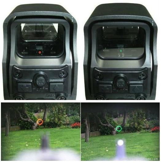
Just as an example:

The red and green dots do look a lot better in real life, the photo doesn't do them justice.
I realise it means changing the way the cross hairs react when you damage the enemy. You could have the colour change to white for example, instead of red?
#85
Posted 05 August 2015 - 11:26 PM
#86
Posted 10 August 2015 - 06:12 PM
other visual issues. I play the game ok.. but often my targets are off due to not being able to see X cross hairs
but instead seeing the hash marks on either side.. That is due to size and of them. I see the clan targeting much
better.. the inner sphere targeting is the biggest issue. To me a simple solution is letting us adjust to hud
colors to allow customers with disabilities to also fully experience battle..
#87
Posted 21 August 2015 - 04:30 PM
#88
Posted 08 September 2015 - 07:21 PM
#89
Posted 29 December 2015 - 10:59 PM
I don't see any change at all in the reticle and that isn't the problem for me. anyway...I need to be able to fiddle with the IFF markers and boxes. On most of the maps I can't see one or the other
Just putting a white outline around the red and a black outlin on the blue would be enough.
what "G Light" says above is true for me as well.
Edited by MasterErrant, 29 December 2015 - 11:01 PM.
#90
Posted 30 December 2015 - 11:47 AM
#91
Posted 31 December 2015 - 05:47 AM
 Mister Blastman, on 19 July 2015 - 10:19 AM, said:
I have a lot of problems on hpg and in the terra thetma volcano. Tweaking gamma and contrast helps.
#92
Posted 01 January 2016 - 11:18 AM
 M E X, on 20 July 2015 - 10:11 PM, said:
How about a special tilte "colour blind", like "hearing impaired", which is only available when you play the game in such a GREYSCALE mode ?I usually have some problems to see the difference between the red/green dots in THESE tests too, but in your example I see the digits "7" and "4" in 2 shades of green, surrounded by ORANGE dots in 3 shades.
Especially where you see the lower part of a "2", instead of the "7" I see, I see more darker greyish red dots !
And the part of the "4", which you dont see as you only see a "1", has a different hue of green for me ...
Hope this helps you to understand your degree of colour blindness better.
MfG, MEX
PS: I can see the 4, but the first impresson after a quick glance was "71" ... are there others in the 71-club too ?
#93
Posted 03 January 2016 - 10:03 PM
A lot of maps, spotting mechs at long range without a dorito is plain impossible.
Is there any word on a timeline for a fix?
Otherwise am stuck with with being sniped to death by "terrain", where my only hope of finding the sniper is by spraying the offending area with fire till the reticule indicates a hit.
(|Edit: using thermal can help, even on the really hot maps there is enough difference in contrast to pick out a mech, but the range is so limited)
Edited by RangerDave, 05 January 2016 - 05:01 PM.
#94
Posted 04 January 2016 - 11:56 AM
 MercJ, on 17 April 2015 - 10:53 AM, said:
EDIT: Looking at it further, I'd assume that you're supposed to pick the column that most closely matches the original, and that would be your "type"? In that case, the Deutan column is probably the closest match, followed by the Protan (pretty close too). The Tritan is way off for me, looks mostly pink.
If it hasn't been mentioned, I believe that chart is used t gauge color blindness.
From what I believe I'm grasping of it, the first color is the color "being tested". Each block is actually a different color from the main block. If some/all the blocks look exactly the same, than you are color blind to that color spectrum.
For example, #8. I see a megenta/dusty rose main color (reddish Purple). The next block in is more of a blue grey. If I was a Protan color blind (type?), it probably would match the main color. The Deutan column for me is more of a slate grey, or a grey blue. The Tritan box is closest, but is more of a browner pink/purple (a duster dusty rose?) than the first box.
Reading over the chart again though, I'm suspecting it's to give people without a color blindness a taste of what color blindness would look like. If you where Protan color blind, your pinks and greens would appear as browns and blue grays? If that is the case, then I can understand people's issue with certain colors. (I could anyway, but still, brings the point even closer.)

I'm not color blind in the slightest that I know of (and have received many comments on how accurately I can see color), so for me every block on that chart is a different color. Even row #1 are all different shades of black.
A little known fact: Most men are slightly color blind to some extent. Women are less likely to have a color blindness.
Another side note... your monitor can also disturb this test, if it isn't calibrated correctly... These types of tests (if done for real) are best done with a controlled printout of the color test. Even then, the lighting it is viewed under can also change how the colors are perceived. (I do a lot of art, physical and digital. My paintings can appear completely different when viewed under different light sources/types.)
#95
Posted 12 January 2016 - 12:19 PM
#96
Posted 12 January 2016 - 10:54 PM
 EIcarim, on 22 July 2015 - 11:29 PM, said:
It's one of the issues I have with the mechlab when it uses red to indicate that you cannot use something or there isn't enough room for something. Everything else is nice and vibrant, why not do it with all text?
I dont think you quite grasp how colour blindness works, the vibrancy of the colours isn't an issue.
#97
Posted 13 January 2016 - 06:35 AM
Lets start this off by declaring red/green colourblindness here...
I am experiencing it bad today, some days I can cope, but today I cant see the red for the trees, or the rocks, or the lava or the buildings... literally. If someone hadn't called out where the mech was in one match today, I wouldn't have seen it. I could not see the indicator. The mech was stood almost next to me. If i'm not playing on a snow map, I'm at a disadvantage. Imagine trying to find a red box in a Jackson Pollock painting... thats what it feels like to me.
I tried the colourblind mode... is there any difference in it? I didn't notice.
Armoured Warfare, WoT change the targeting colours and I can see them. Is it that hard?
Heat/IR vision can help on some maps, on others I lose depth perception and walk into walls or out into the open...
#98
Posted 10 June 2016 - 12:22 PM
#99
Posted 13 June 2016 - 08:55 PM
You should be able to see the difference when going to the "Testing Ground" and daamge some of the static Mech-Targets there.
The HUD is hard to see anyway when amassed effects explode on your Screen.
I would like to increase "line thickness" of HUD Elements, Reticle size/shape, Fontsize/art change colours etc.
Edited by Thorqemada, 13 June 2016 - 08:57 PM.
#100
Posted 24 June 2016 - 04:09 PM
 Mister Blastman, on 19 July 2015 - 10:19 AM, said:
Funny enough i have this issue as well, but on maps with HEAT MODE on i have much less of an issue. Even is HEAT MODE isnt the best for everyone else on my team i find myself having a much better time with it on on most maps.
Maybe im freakin color blind...?
4 user(s) are reading this topic
0 members, 4 guests, 0 anonymous users


