Where do i see my mech's quirks at? Before, you only had to hold the courser over the mech and you could see the mech's quirks. Am i just not seeing the tab somewhere or is it no longer showing in the mechlab. And please dont tell me its in the expanded view which I can not do on my screen because that view centers off of my screen and I can not see half the screen in that view.

New Mechlab Is Better Except...
Started by Joe Mallad, Jun 03 2015 07:24 AM
17 replies to this topic
#2
-
-

- Rage

- 3,740 posts
Member
- LocationMichigan
Posted 03 June 2015 - 07:28 AM
And while im att it, off topic but is anyone else having issues editing their signatures in their profiles? I tried to change my banner i have now and Support told me i was probably putting in a banner or new pic that was too big and thats why i was getting an error message.
Support dont know what the hell they are talking about because even when i try to totally delete my current signature and banner, i get the same error message and it will not let me remove it at all. this is what im getting and Supprt just isnt understanding me and or dont care enough to really look into it.
HTTP Error 500
#3
-
-
- The Messenger
- 4,560 posts
Member
- LocationCanada ᕙ(⇀‸↼‶)ᕗ

Posted 03 June 2015 - 07:32 AM

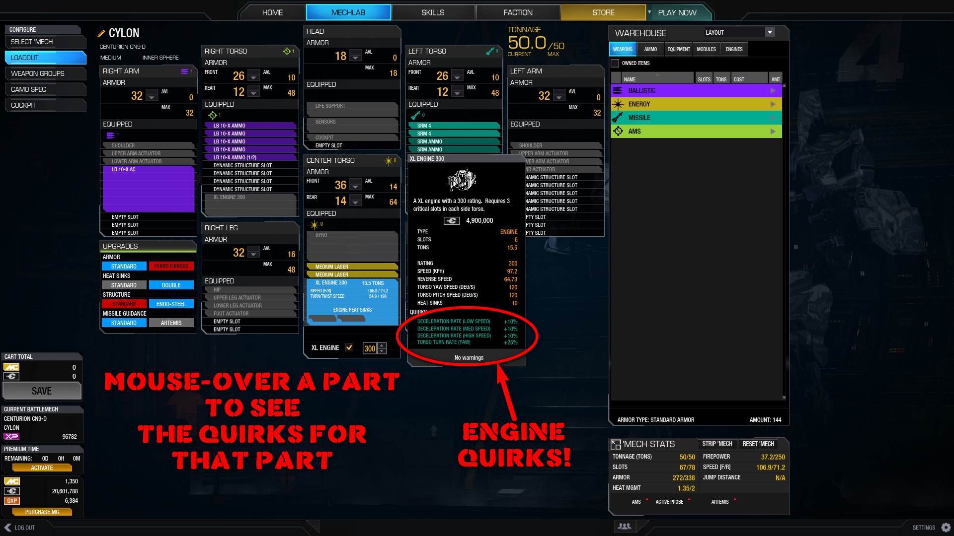
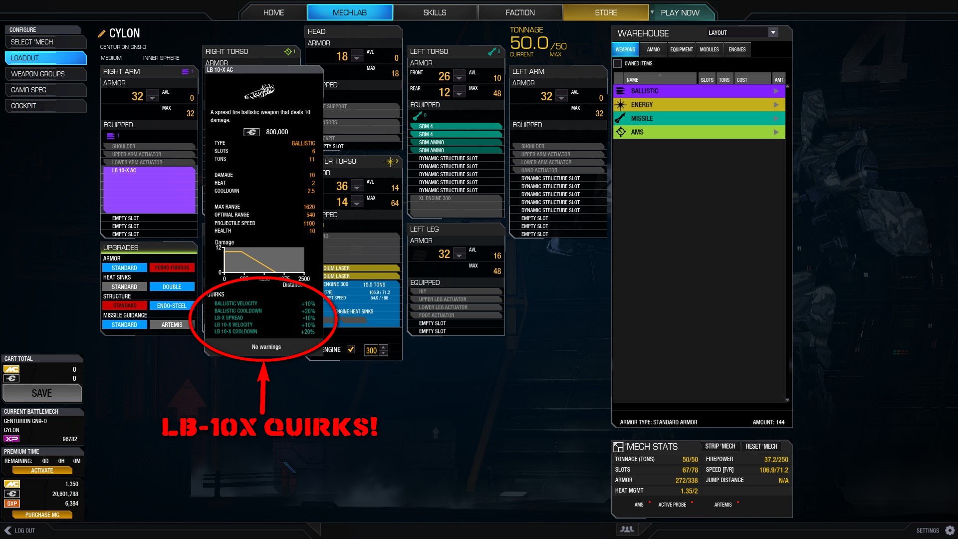
Click for mech quirks.
#4
-
-
- Rage
- 3,740 posts
Member
- LocationMichigan
Posted 03 June 2015 - 07:35 AM
 MoonUnitBeta, on 03 June 2015 - 07:32 AM, said:
Click for mech quirks.
#5
-
-
- The Messenger
- 4,560 posts
Member
- LocationCanada ᕙ(⇀‸↼‶)ᕗ
Posted 03 June 2015 - 07:36 AM
Also, their signature link saving thing is broken. Just going into my signature and clicking save with no changes gives me 550 error as well.
It's nothing that you're doing wrong, they just need to fix it.
It's nothing that you're doing wrong, they just need to fix it.
Edited by MoonUnitBeta, 03 June 2015 - 07:36 AM.
#6
-

-
- Elite Founder

- 1,553 posts
Member
- LocationAttleboro, MA

Posted 03 June 2015 - 07:36 AM
I had the same problem when I was first dealing with the Mechlab, Yoseful.
I am mostly indifferent to the new Mechlab.
I am mostly indifferent to the new Mechlab.
#7
-

-

- 4,000 posts
Member
- LocationUSA

Posted 03 June 2015 - 07:40 AM
What bothers me, is that quirks and some of that information is not visible until you actually have a mech selected and are in the Mechlab building it.
When selecting a mech, its just not there, no quick reference.
Only place you can easily see quirks, is in the store page when purchasing a mech.
When selecting a mech, its just not there, no quick reference.
Only place you can easily see quirks, is in the store page when purchasing a mech.
#8
-
-
- The Messenger
- 4,560 posts
Member
- LocationCanada ᕙ(⇀‸↼‶)ᕗ
Posted 03 June 2015 - 07:41 AM
Yoseful Mallad, on 03 June 2015 - 07:35 AM, said:
thank you! Why could they not label that or actually put it in a different color to draw your eye to it so people think "hmmm maybe i can click into that." lol!!! Thanks bud.
Yeah. It hardly looks like an icon. I even mistakingly took it as a sort of flare icon for the mech stats themselves at first.
Not sure why they opted to make it a white icon with lots of lines, which is surrounded by a lot of white liney text... Nothing about it stands out in anyway.
#9
-
-
- Rage
- 3,740 posts
Member
- LocationMichigan
Posted 03 June 2015 - 07:44 AM
MoonUnitBeta, on 03 June 2015 - 07:36 AM, said:
Also, their signature link saving thing is broken. Just going into my signature and clicking save with no changes gives me 550 error as well.
It's nothing that you're doing wrong, they just need to fix it.
It's nothing that you're doing wrong, they just need to fix it.
Mister D, on 03 June 2015 - 07:40 AM, said:
What bothers me, is that quirks and some of that information is not visible until you actually have a mech selected and are in the Mechlab building it.
When selecting a mech, its just not there, no quick reference.
Only place you can easily see quirks, is in the store page when purchasing a mech.
When selecting a mech, its just not there, no quick reference.
Only place you can easily see quirks, is in the store page when purchasing a mech.
MoonUnitBeta, on 03 June 2015 - 07:41 AM, said:
Yeah. It hardly looks like an icon. I even mistakingly took it as a sort of flare icon for the mech stats themselves at first.
Not sure why they opted to make it a white icon with lots of lines, which is surrounded by a lot of white liney text... Nothing about it stands out in anyway.
Not sure why they opted to make it a white icon with lots of lines, which is surrounded by a lot of white liney text... Nothing about it stands out in anyway.
#10
-
-
- 4,000 posts
Member
- LocationUSA
Posted 03 June 2015 - 07:49 AM
I think quite a few people, including myself are impressed with every other feature and upgrade made to the Mechlab itself, we just want the nice tiled Mech selection window back how it was.
Why? because it worked, and it worked well.
Why? because it worked, and it worked well.
#11
-
-
- Rage
- 3,740 posts
Member
- LocationMichigan
Posted 03 June 2015 - 07:50 AM
Mister D, on 03 June 2015 - 07:49 AM, said:
I think quite a few people, including myself are impressed with every other feature and upgrade made to the Mechlab itself, we just want the nice tiled Mech selection window back how it was.
Why? because it worked, and it worked well.
Why? because it worked, and it worked well.
#12
-

-
- Big Daddy

- 14,274 posts
Member
- LocationCalifornia Central Coast

Posted 03 June 2015 - 07:52 AM
Mister D, on 03 June 2015 - 07:49 AM, said:
I think quite a few people, including myself are impressed with every other feature and upgrade made to the Mechlab itself, we just want the nice tiled Mech selection window back how it was.
Why? because it worked, and it worked well.
Why? because it worked, and it worked well.
Agreed, but to be honest, I am much happier with that mech select screen along with the expanded layout than I was with the previous setup. Hopefully they can make some tweaks and improvements to that screen, in the mean time, I am pretty pleased with the expanded layout. Looking forward to outfitting 8 new clan mechs in two weeks!
#13
-

-
- Legendary Founder
- 9,498 posts
Member
- LocationOn your six, chipping away at your rear armour.
Posted 03 June 2015 - 07:53 AM
MoonUnitBeta, on 03 June 2015 - 07:32 AM, said:
Click for mech quirks.
Also:
#14
-
-
- Rage

- 3,781 posts
Member
- LocationGermany
Posted 03 June 2015 - 07:53 AM
if you didnt notice, weapons that fit to the quirks of the mech are marked now ^..^
actually i find it better to find mechs now but thats because i dont change the names of the mech so i pretty much know anyway how they are loaded
actually i find it better to find mechs now but thats because i dont change the names of the mech so i pretty much know anyway how they are loaded
#15
-
-

- 1,803 posts
Member
- LocationA desolate moon circling a desolate planet
Posted 03 June 2015 - 08:20 AM
Also notice the up/down arrow under the engine section.
Can down size and see the weight and speed differences.
It will also show the purchase amount if you don't already own one.
So don't save if you don't own one if you don't want to buy it.
Can down size and see the weight and speed differences.
It will also show the purchase amount if you don't already own one.
So don't save if you don't own one if you don't want to buy it.
#16
-

-
- The Patron Saint
- 744 posts
Member
- LocationHuntress
Posted 03 June 2015 - 08:58 AM
I actually prefer the new mech select screen, because seeing 120+ mechs every time just made my eyes cross. The new smurfy type lab is a huge improvement as well. It seems I'm in the minority opinion on the mech select screen. Would it be so hard to code the option in for people to be able to sort their mechs the old way if they wanted to do so?
#17
-
-
- 4,000 posts
Member
- LocationUSA
Posted 03 June 2015 - 09:06 AM
Well the old mech selection tileset you could see what mechs you have, ready to play, at a glance.
You didn't have to dig through drop menus in the click-pocalypse just to see what you owned and had ready to play.
That was the big thing that frustrated people with UI2.0, all the clicking through menus to do simple things.
Why it got changed, it is confusing when it worked so well for the selection menu as it was.
Edited by Mister D, 03 June 2015 - 09:42 AM.
#18
-

-
- Knight Errant

- 2,812 posts
Member
- LocationDefending the Cordon, Arc-Royal
Posted 03 June 2015 - 10:40 AM
I'd like to see more intuitiveness built into how something of the information is presented. There's a lot of info that is obscurely found or is displayed without context. This is something the old version did better. I do like how there is a lot more categorized info provided, if you can figure out what you're looking at.
I would like to see a few things fixed or added... better colors (back to less pastel and more subdued), an option to strip engine (for those of us who dont have a stable of the same size xls sitting around), and a method to quickly equip items in module or layout views without drag and drop (maybe double-click to add to selected component or appropriate module slot). Things like that.
I would like to see a few things fixed or added... better colors (back to less pastel and more subdued), an option to strip engine (for those of us who dont have a stable of the same size xls sitting around), and a method to quickly equip items in module or layout views without drag and drop (maybe double-click to add to selected component or appropriate module slot). Things like that.


1 user(s) are reading this topic
0 members, 1 guests, 0 anonymous users


