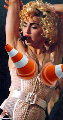
And ye, time and again, PGI gives us Nipple PPCs, Red Ryder BB Gun Autocannons, and little flat Doorbell Lasers. (Missiles..... can't even think of some not so witty thing to label them with atm, sorry).
This is a Giant, Stompy Space Robot Game. Mind you, there is zero logical combat application to said giant stompy robots. We almost certainly all, got into them because they LOOKED FREAKING COOL. Big Robots, BIG GUNS.
Now we aren't having to talk Crazy Gundam Swords and Final Fantasy oversize weapons. But ones that looks proportionate and pleasing, should not be that hard.
These Hardpoints look like an Accountant designed them, not anyone with one ounce of artistic sensibilities.
Example, AWS-8Q as we are getting it:

AWS-8Q that we COULD have gotten

or for comparison sake, how the M1A1 Abrams would look, as designed by PGI

Yes, I know some of the Denizens of Mount TryHard, will dismiss it, as it has no real in game impact on Uberplay. And perhaps that is what this is PGI trying to get the last of us holdouts to cave in and imply embrace Sword and Board Meta LegoMechs. Because only a blind person would drive any of these for their Aesthetics.
It's so dang disappointing to see a patch that is so chock full of apparently great in game fixes and a such, get saddled with such a horrible job of visual customization. Doubly so when it's nothing new, people have been blowing up PGI about this since the VERY FIRST visual customization pass!!!!
Dang it PGI!!!! Hire someone to do some visual QA over this stuff!!! Heck, I'll do it for freaking FREE. But stop shooting yourself in the foot with these ludicrously bad, undersized and generic looking weapon passes. Please? (see, I asked nicely?)
*Edit (just for you Escef)

Happy now?
Edited by Bishop Steiner, 07 July 2015 - 07:59 AM.


