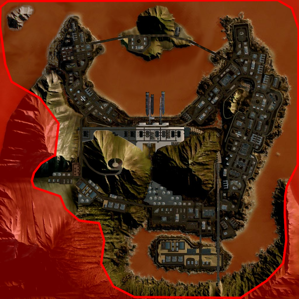
There will come a time when PGI decides to look at Crimson Strait. They'll add day/night cycle, they'll add destructible lamps, destructible trees, they might densify the infrastructure... but I'd like to see an improvement to layout as well.

Here is Crimson Strait as it is right now, for reference: http://mwo.smurfy-ne...etropolis&m=tdm
Changes:
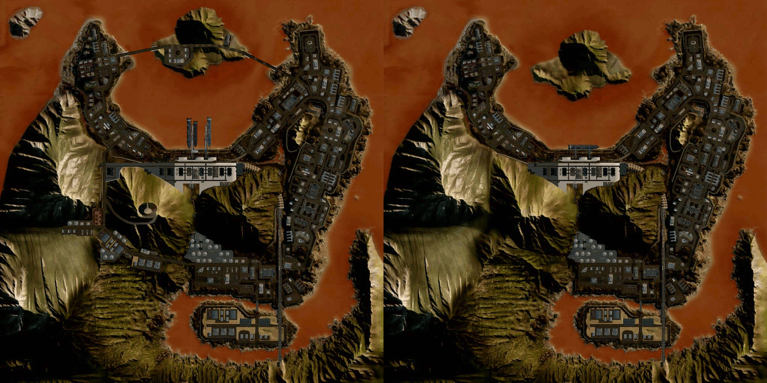
- A passage through E5 has been added - allows the use of a flank that was previously out of bounds and should diversify the gameplay experience. This new area features storage and light industrial structures.
- A satellite tower has been added to the newly-inbounds hill, as well as a steep rickety path up to it.
- The "upper platform" and "basement" have both been expanded further into E4 and are longer.
- Docks have been added to accommodate additional ships at the harbour. This adds more cover to the water area and helps make it more interesting.
- Island has been moved northward and waterways into and out of the bay have been widened to accommodate the passage of ships
- Bridges have been added to and from the island - these should be elevated enough to allow the passage of ships
- Light infrastructure has been added to the island
Here is a two-step animation that shows the changes against the original map:

Comments and criticism are welcome! While most people are generally very happy with this map, I think the opening up of a new area (the bottom left corner) will really freshen up the map. It's getting monotonous, as almost all the fights happen in the same three grid squares every match.


