CapperDeluxe, on 21 February 2012 - 11:48 AM, said:
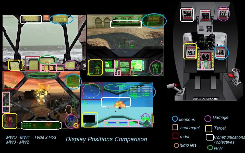
The current MWLL HUD is temporary, the real deal is yet to come

Didn't know about that - great news, then!
Quote
- Combined reticule/radar: I think this is trying to pack in too much info into one tiny little space. It just won't work unless your reticule is massive.
Yes, it may be a problem for some people - but from my own experience in flight sims and looking at the real combat aircraft's HUD's, i hope this may work in MWO as well.
As example - Super Hornet's HUD indication.

Quote
- In-reticule zoom: Same problem of being too small, for instance the novelty of having this in Mechwarrior 3 was interesting at first, but now I realize as I get older I just can't see worth a damn on that tiny zoomer. And I'm only 28!
Yes, local zoom, due to its small angular size, may be not comfortable in some situations/low resolution displays. But full zoom has its own drawbacks too - the 1st of them is a FOV degradation, which leads to the overall combat awareness degradation. Local zoom doesn't have such a drawback.
Edited by Scar, 21 February 2012 - 12:27 PM.