Jump to content

Unit Insignia


847 replies to this topic

#281 Darknstormy

    Member

  • PipPipPipPipPip
  • 181 posts
  • LocationBrisbane Australia

Posted 07 April 2012 - 01:26 AM

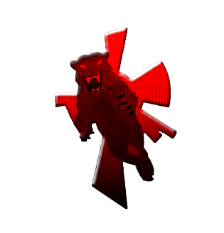
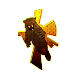
http://i1157.photobu...rmy1/smoke1.pngPosted ImagePosted Image


http://i1157.photobu...ormy1/smoke.png

Edited by Darknstormy, 07 April 2012 - 02:03 AM.


#282 Hayden

    Member

  • PipPipPipPipPipPipPipPip
  • Little Helper
  • Little Helper
  • 1,997 posts

Posted 07 April 2012 - 01:38 AM

View PostDarknstormy, on 06 April 2012 - 11:01 PM, said:


Top right is my favorite of the bunch.

#283 Hartsblade

    Member

  • PipPipPipPipPipPipPip
  • Big Brother
  • 772 posts

Posted 07 April 2012 - 06:19 AM

View PostHayden, on 07 April 2012 - 01:38 AM, said:


Top right is my favorite of the bunch.

I agree

#284 Hayden

    Member

  • PipPipPipPipPipPipPipPip
  • Little Helper
  • Little Helper
  • 1,997 posts

Posted 07 April 2012 - 12:55 PM

View PostOhGilPin, on 07 April 2012 - 12:53 PM, said:

Im trying to put a insignia together for a unit Im in the process of forming Capellan Commandos and would love to have some feedback and advice on my first insignia attempt, Im finding it reasonable hard to think of something which ties into the Capellan Confederation style and so forth.

Posted Image

And thanks in advance. ;)


I actually think that's a pretty good rendition. If you just clean it up a bit I dare say you'll have a winner.

#285 Threat Doc

    Member

  • PipPipPipPipPipPipPipPipPip
  • The Bowman
  • The Bowman
  • 3,715 posts
  • LocationO'Shaughnnessy MMW Base, Devon Continent, Rochester, FedCom

Posted 07 April 2012 - 01:17 PM

I agree with Hayden. Make a VERY LARGE version of this, don't just scale it up, rebuild it, and then you can scale it down, later, with anti-aliasing turned on, and you'll get a smoother version. Otherwise, I agree with Hayden, it's extremely well-done. Kudos, bud.

Edited by Kay Wolf, 07 April 2012 - 01:17 PM.


#286 Ironhawk

    Member

  • PipPipPipPipPipPipPipPip
  • Ace Of Spades
  • Ace Of Spades
  • 1,333 posts
  • LocationMontreal

Posted 08 April 2012 - 04:16 AM

View PostDarknstormy, on 06 April 2012 - 11:01 PM, said:


These look perfect for vid display, while I think Hartsblade fits the more classic print look, which you woud see on a 'Mech. Just a personal thought. Personally, I like 'em all.

#287 Hayden

    Member

  • PipPipPipPipPipPipPipPip
  • Little Helper
  • Little Helper
  • 1,997 posts

Posted 08 April 2012 - 09:36 AM

View PostHartsblade, on 06 April 2012 - 06:05 PM, said:

Had a request from AlfphalfaCat to make the lines on the Tornado darker, so here it is...

Posted Image

Posted Image

Posted Image

Editt: added 2 more versions, let me know what you think.


The only thing I would strongly suggest changing is the eye and mouth. They look good, but the transparency throws me a bit. I think it would look better if they were completely opaque. Otherwise, this is totally great!

#288 Hartsblade

    Member

  • PipPipPipPipPipPipPip
  • Big Brother
  • 772 posts

Posted 08 April 2012 - 01:40 PM

View PostHayden, on 08 April 2012 - 09:36 AM, said:


The only thing I would strongly suggest changing is the eye and mouth. They look good, but the transparency throws me a bit. I think it would look better if they were completely opaque. Otherwise, this is totally great!


Thank you sir!!

I was tryin got go for the eye and mouth being part of the tornado, but I think you might be right. I went both opaque and more transparent for comparison

edit: hit post before I was ready...

Posted Image

Posted Image

Edited by Hartsblade, 08 April 2012 - 01:41 PM.


#289 Evedro Solais

    Member

  • PipPipPipPipPip
  • Survivor
  • Survivor
  • 179 posts
  • LocationLas Vegas, NV

Posted 08 April 2012 - 02:30 PM

Could someone adapt this:
Posted Image

Into a larger and more traditional heraldry style insignia? Its basically a dented shield hung on an upright spear with a rose vine growing on it. I originally made this a few years ago and decided to quit while I was ahead. Its not BT but I'd like it for my own insignia for when we can hopefully display our own in game since I plan on going Lone Wolf for a while till I get a feel for the faction I want to join. In fact, if anyone does decide to pick this up, go ahead and drop the roses, the main theme is the unstoppable force(spear) and the immovable object(shield). After all, when an unstoppable force meets an immovable object, the whole universe moves.

Edited by Evedro Solais, 09 April 2012 - 12:05 AM.


#290 Threat Doc

    Member

  • PipPipPipPipPipPipPipPipPip
  • The Bowman
  • The Bowman
  • 3,715 posts
  • LocationO'Shaughnnessy MMW Base, Devon Continent, Rochester, FedCom

Posted 08 April 2012 - 07:12 PM

Are we able to put personal unit insignia's in this thread, as well? If so, I have a few to show off, myself.

#291 Hartsblade

    Member

  • PipPipPipPipPipPipPip
  • Big Brother
  • 772 posts

Posted 08 April 2012 - 07:17 PM

View PostKay Wolf, on 08 April 2012 - 07:12 PM, said:

Are we able to put personal unit insignia's in this thread, as well? If so, I have a few to show off, myself.

Show them off ;)

#292 Threat Doc

    Member

  • PipPipPipPipPipPipPipPipPip
  • The Bowman
  • The Bowman
  • 3,715 posts
  • LocationO'Shaughnnessy MMW Base, Devon Continent, Rochester, FedCom

Posted 08 April 2012 - 07:59 PM

These are for my unit, Armageddon Unlimited... few... I hope these are the clean versions, or I'm going to have to do a bit more work... we'll see in a minute.

Okay, well, the unit logo...
Posted Image

1st Battalion HeadQuarters Lance
Posted Image

And then for my own personal crest...
Posted Image
This last one is ate up like a soup sandwich, but was done before I knew what I was doing with PNG files. I may try to clean it up at a later time.

#293 Max OConnor

    Member

  • PipPipPipPipPipPipPip
  • The Phoenix
  • The Phoenix
  • 731 posts
  • Google+: Link
  • Facebook: Link
  • LocationLebanon, TN

Posted 09 April 2012 - 10:43 AM

View PostOhGilPin, on 08 April 2012 - 04:56 PM, said:

Insignias

I was just about to start work on updating the Capellan Commandos insignia, then I just remembered that the Scotts are part of the Confederation, and I personally admire the Scotts don't know why I just do, so I thought hey Im going to turn Capellan Commandos into a Scotts unit which means Im going to have to change the name so far Im going with 'Blue Fury' anyway here are the insignia designs...

Posted Image


So which do you prefer and anything you think to be improved, if you refer to one of them count them going left to right, top row then second.

The design of the insignia

It is the Scottish lion surrounded by Capellan swords, which represents them being guarded and keep safe by the Capellans and also represents the lion trying to escape a wreak havoc upon her enemies...

or something like that.


2nd row, 2nd pic is the one I like the best.

#294 Hartsblade

    Member

  • PipPipPipPipPipPipPip
  • Big Brother
  • 772 posts

Posted 09 April 2012 - 11:54 AM

View PostKay Wolf, on 08 April 2012 - 07:59 PM, said:

These are for my unit, Armageddon Unlimited... few... I hope these are the clean versions, or I'm going to have to do a bit more work... we'll see in a minute.

Okay, well, the unit logo...
Posted Image

1st Battalion HeadQuarters Lance
Posted Image

And then for my own personal crest...
Posted Image
This last one is ate up like a soup sandwich, but was done before I knew what I was doing with PNG files. I may try to clean it up at a later time.

Very nice! Have you thought about turning the graphics into line drawings?

View PostOhGilPin, on 08 April 2012 - 04:56 PM, said:

Insignias

I was just about to start work on updating the Capellan Commandos insignia, then I just remembered that the Scotts are part of the Confederation, and I personally admire the Scotts don't know why I just do, so I thought hey Im going to turn Capellan Commandos into a Scotts unit which means Im going to have to change the name so far Im going with 'Blue Fury' anyway here are the insignia designs...

Posted Image


So which do you prefer and anything you think to be improved, if you refer to one of them count them going left to right, top row then second.

The design of the insignia

It is the Scottish lion surrounded by Capellan swords, which represents them being guarded and keep safe by the Capellans and also represents the lion trying to escape a wreak havoc upon her enemies...

or something like that.


View Postmaxoconnor, on 09 April 2012 - 10:43 AM, said:

2nd row, 2nd pic is the one I like the best.


I like the last ones on both rows, the ones without the yellow border best.

#295 Hayden

    Member

  • PipPipPipPipPipPipPipPip
  • Little Helper
  • Little Helper
  • 1,997 posts

Posted 09 April 2012 - 12:09 PM

View PostHartsblade, on 09 April 2012 - 11:54 AM, said:

I like the last ones on both rows, the ones without the yellow border best.

Agreed.

#296 CoffiNail

    Oathmaster

  • PipPipPipPipPipPipPipPipPip
  • The Cub
  • The Cub
  • 4,285 posts
  • Facebook: Link
  • Twitter: Link
  • LocationSome place with other Ghost Bears. A dropship or planet, who knows. ((Winnipeg,MB))

Posted 09 April 2012 - 12:12 PM

View PostHartsblade, on 09 April 2012 - 11:54 AM, said:

I like the last ones on both rows, the ones without the yellow border best.


Yep, it looks good with no yellow border.

#297 Thomas de Ville

    Member

  • PipPipPip
  • The Mercenary
  • The Mercenary
  • 90 posts
  • LocationGermany / Terra

Posted 09 April 2012 - 12:29 PM

Thanks, great job :huh:

#298 Threat Doc

    Member

  • PipPipPipPipPipPipPipPipPip
  • The Bowman
  • The Bowman
  • 3,715 posts
  • LocationO'Shaughnnessy MMW Base, Devon Continent, Rochester, FedCom

Posted 09 April 2012 - 12:30 PM

OGP, what about changing the yellow to a black border? I agree the yellow border doesn't quite do it for me.

View PostHartsblade, on 09 April 2012 - 11:54 AM, said:

Very nice! Have you thought about turning the graphics into line drawings?
Truth be told, no, I hadn't. I've never been one for drawing by hand, especially anything with curves, hehe (so much for my drafting career, huh?). Now, I WAS thinking about perhaps creating a thick white-line insignia, with the shape of the left-hand side of my unit standard as a thick white line, perhaps broken like the No Fear German helmet images you see on truck windows sometimes -I am ignorant as to what those are called-, and then a sort of broken outline of the left-hand side of a Wolf's head. Do you understand what I mean? I'm not certain I'm describing it very well, but I think what I have in mind -I know that doesn't help you see it, hehe- would look very cool if I can ever get it done correctly.

#299 Vincent Vascaul

    Member

  • PipPipPipPipPipPipPip
  • 858 posts
  • LocationEverett, Wa

Posted 09 April 2012 - 04:56 PM

Thought I had already posted this here but I guess not

Posted Image

Work done by Psychopuppet

#300 Threat Doc

    Member

  • PipPipPipPipPipPipPipPipPip
  • The Bowman
  • The Bowman
  • 3,715 posts
  • LocationO'Shaughnnessy MMW Base, Devon Continent, Rochester, FedCom

Posted 09 April 2012 - 05:15 PM

That is fantastic. Nicely done.


10 user(s) are reading this topic

0 members, 10 guests, 0 anonymous users