Edited by Kay Wolf, 01 April 2013 - 07:28 AM.

Unit Insignia
#621
Posted 31 March 2013 - 08:12 PM
#622
Posted 31 March 2013 - 08:14 PM
#623
Posted 01 April 2013 - 02:23 AM
Lets just hope we can make cool insignias when that option becomes available in game. (fingers crossed) seeing as there is a lot of cool work in here.
#624
Posted 01 April 2013 - 02:43 AM
 Hayden, on 08 December 2011 - 07:23 PM, said:
Donegal Guards

2nd Donegal Guards

3rd Donegal Guards

4th Donegal Guards

5th Donegal Guards

7th Donegal Guards

10th Donegal Guards, Conjectural
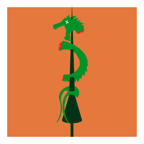
12th Donegal Guards, Conjectural
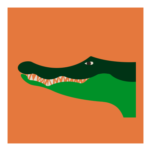
13th Donegal Guards
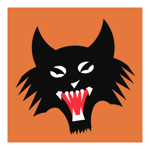
17th Donegal Guards

I left out the 6th, 8th, 11th, and 14th. I will probably do those soon. Hope you guys like these!
The 10th Donegal Guards, Conjectural have a nice Unit Emblem: Dragon Killers!
Can identify myself with this ^^
#625
Posted 01 April 2013 - 04:36 PM
 LiGhtning90, on 01 April 2013 - 02:43 AM, said:
The 10th Donegal Guards, Conjectural have a nice Unit Emblem: Dragon Killers!
Can identify myself with this ^^
Well, you're already using my Tamar Jägers insignia in your sig, so sure!
In all seriousness, all art that I post on the forums is open for community use. By all means, go for it.
#626
Posted 07 April 2013 - 01:06 AM


#627
Posted 07 April 2013 - 02:51 AM
Thank you BlackJack!
#628
Posted 12 April 2013 - 09:22 PM

Harloc Raiders
Edited by Tie Ma, 13 April 2013 - 11:00 AM.
#629
Posted 13 April 2013 - 07:26 AM

I must correct this..... Unless someone else wants to.
Incidentally, no Nova Cat love in this thread? It is because we bid edge on a coin toss, quiaff?
Edit:
Cannot seem to strike a good color balance, either. Raw paterns:
http://i.imgur.com/y0hfx0o.png
Perhaps too busy textured:
http://i.imgur.com/9Dd59a6.png
http://i.imgur.com/lWFdy4M.png
Possible Refinement:
http://i.imgur.com/PmvjGHd.png
Not sure where to take this, if any of you have idea. :\
Edited by Pariah Devalis, 13 April 2013 - 09:36 AM.
#630
Posted 13 April 2013 - 08:39 AM
Otherwise, the insignia is absolutely beautiful.
#631
Posted 13 April 2013 - 11:14 AM
 Pariah Devalis, on 13 April 2013 - 07:26 AM, said:

I must correct this..... Unless someone else wants to.
Incidentally, no Nova Cat love in this thread? It is because we bid edge on a coin toss, quiaff?
Edit:
Cannot seem to strike a good color balance, either. Raw paterns:
http://i.imgur.com/y0hfx0o.png
Perhaps too busy textured:
http://i.imgur.com/9Dd59a6.png
http://i.imgur.com/lWFdy4M.png
Possible Refinement:
http://i.imgur.com/PmvjGHd.png
Not sure where to take this, if any of you have idea. :\
I see that you're a fan of Washington State University (Go Cougs! Eh, who am I kidding, I went to Western...)
Well, I looked through the various postings, my feedback is this: when coming up with a "base" insignia, one should dispense with all the extra little pieces of "bling"/"flair": These can be nice, and at times VERY desirable, but should be avoided when coming up with a base design: it's always easier to add that sort of stuff in later, than it is to try to take it out.
Anyway, from the various insignia variations you posted, I would say that this is my personal favorite:
http://i.imgur.com/y0hfx0o.png
It's biggest strength is that the form is easy to make out; it's a bit busy, but what saves it is that the "busy" portions are all unified in color and when put against a proper background, they'll "pop" into place. I'm a little less crazy about the red in the background as that clashes somewhat with the blue: better colors might be yellow, orange, or black, but really: you're the artist and the best part about being an artist working for fun* is that you can say "THIS IS HOW IT MUST BE!" The last thing I would recommend is that you put all of the "cat" portions on the same background, instead of having it spill over, but that's kind of a personal thing, I recommend it here, because you risk losing the unity of color that allows the "busy" cat to work.
Some rules of thumb (but by no means mandatory:
-Limit yourself to about 3-4 colors. This is the most flexible rule, but trust me, fewer is better. This is especially true if you ever decide to get patches made.
-Contrast is important. This is a sense that must be developed over time, but from the BattleTech Universe there are quite a few examples of "good" insignia/color combinations (Eridani Light Horse: two colors, black horse clearly stands out from the bold yellow), and some less desirable insignia (I.d describe Brion's Legion: the brown-bear's-paw-on-black-field just looks like a giant black blob, especially from a distance).
-Avoid the use of gradients: it may be tempting, but often it's just adding more for the sake of adding more, or if they are necessary, then something is going wrong (I.E. you probably need to change the arrangement of your colors). Solid colors are more "reliable".
Anyway, there's other suggestions/advice I can give, but these are the really important ones. On the whole, good job and kudos for experimenting with art. Last thing: you're trying to please yourself here, so have fun. Do what you ultimately feel is "right" for you and what you need in an insignia.
*The equation changes when you're working for someone.
#632
Posted 13 April 2013 - 12:30 PM
Edited by Pariah Devalis, 13 April 2013 - 12:40 PM.
#633
Posted 13 April 2013 - 01:20 PM
The following is sort of smallish, but this was the unit logo I was going to go with if I ever started AU back up, back before October 2011, and I actually had this one made into a real patch...

Though I feel this patch came out very well, you can see that this is really busy, with gradients, about six colors, unless you include the gradients as separate colors, and the noses of the wolves on the sides stick out from the patch itself. I asked the business-owner who made this patch if it was difficult to do, and he sent me to a page on his web site with a bunch of patches he considered to be more difficult.
I like what you're getting to, and I think it will look wonderful with some more refinements.
#634
Posted 14 April 2013 - 03:47 PM

guy says he got these here. What art style is that I really like it.
#635
Posted 28 April 2013 - 04:18 PM

Can I get this cleaned up good sir.
#636
Posted 28 April 2013 - 04:52 PM
The only thing I can think of is to size up Company on the right-hand side. I know Armalite Rifle can be difficult to work with, but if you can find a way to size it up to fit between that inner-thick circle and the sun beam, so it's closer in size to Bravo on the left, you'll do well.
#637
Posted 28 April 2013 - 05:26 PM
#638
Posted 20 May 2013 - 04:51 PM

#640
Posted 01 June 2013 - 06:22 AM

1 user(s) are reading this topic
0 members, 1 guests, 0 anonymous users


