Jump to content

Unit Insignia


847 replies to this topic

#381 Threat Doc

    Member

  • PipPipPipPipPipPipPipPipPip
  • The Bowman
  • The Bowman
  • 3,715 posts
  • LocationO'Shaughnnessy MMW Base, Devon Continent, Rochester, FedCom

Posted 24 May 2012 - 11:37 AM

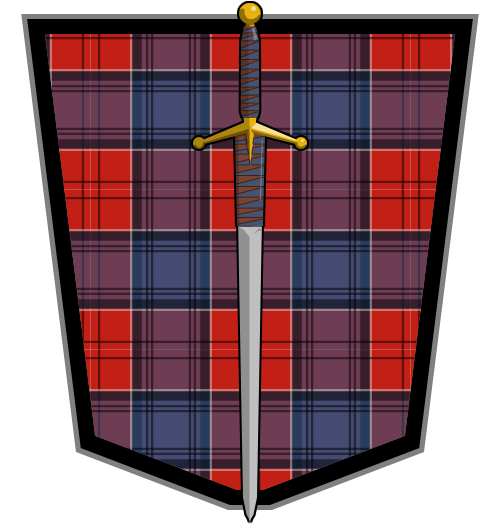
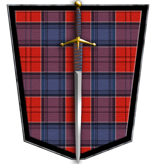
12th Dark Horse Irregulars... LOVE the name. The shield is also excellent, and basically the opposite of the Eridani Light Horse and St. Ives Compact, so you're most likely safe.

#382 Hartsblade

    Member

  • PipPipPipPipPipPipPip
  • Big Brother
  • 772 posts

Posted 24 May 2012 - 12:51 PM

View PostKay Wolf, on 24 May 2012 - 11:37 AM, said:

12th Dark Horse Irregulars... LOVE the name. The shield is also excellent, and basically the opposite of the Eridani Light Horse and St. Ives Compact, so you're most likely safe.

Thank you, sir.

#383 Threat Doc

    Member

  • PipPipPipPipPipPipPipPipPip
  • The Bowman
  • The Bowman
  • 3,715 posts
  • LocationO'Shaughnnessy MMW Base, Devon Continent, Rochester, FedCom

Posted 25 May 2012 - 01:22 PM

Maybe you guys can help me figure out if the following is good or not:

A little background, first. Back in the 1997 - 1999 time-frame, Armageddon Unlimited's first iteration, and then the second, 2002 - 04, my friend Joe (aka Panzer-Schrek) was the commander of our recon battalion, the Outriders. He asked a friend of his, last-name Newman, to come up with a patch in 1999 to represent Joe's battalion, and he came up with the patch below and to the left. Since I don't wish to step on either Newman's or Joe's toes, and because the original patch/logo was for the 3058 time-frame in which we were playing, I wanted to design a new patch that I felt was more fitting the time-frame, the job of the Outriders -reconnaissance-, and as something of an homage to MWO.

By the way, before anyone asks, Joe had permission from Newman to use this without restriction, and Joe forwarded that email to me at the time. Considering how long ago that was, I couldn't tell you where that email could be right now, especially with the number of reloads I've had to do since that time.

The one on the far-left, as explained, is the 1999 original Newman patch, the one in the middle is the 'plain' flat patch, and the one on the right is the completed new patch. I, of course, have the much larger images (1401 x 2001 for the new patches) and the 765 tall one for the old patch.

Posted Image Posted Image Posted Image

So, what do you guys think, is the new patch better, if somewhat pixelated at it's smaller size, or is there something more that needs to be done?

Edited by Kay Wolf, 25 May 2012 - 01:28 PM.


#384 Ironhawk

    Member

  • PipPipPipPipPipPipPipPip
  • Ace Of Spades
  • Ace Of Spades
  • 1,333 posts
  • LocationMontreal

Posted 27 May 2012 - 08:46 AM

Commission for Windbourne Highlanders player unit.

Posted Image

#385 Adridos

    Member

  • PipPipPipPipPipPipPipPipPipPipPip
  • Bridesmaid
  • 10,635 posts
  • LocationHiding in a cake, left in green city called New A... something.

Posted 27 May 2012 - 09:05 AM

Yay! Really nice insignia, Ironhawk. Pretty original, too. :)

#386 Hayden

    Member

  • PipPipPipPipPipPipPipPip
  • Little Helper
  • Little Helper
  • 1,997 posts

Posted 27 May 2012 - 09:21 AM

View PostIronhawk, on 27 May 2012 - 08:46 AM, said:

Commission for Windbourne Highlanders player unit.

Posted Image

OGP! IRONHAWK! NICE! :)

Edited by Hayden, 27 May 2012 - 09:31 AM.


#387 Hayden

    Member

  • PipPipPipPipPipPipPipPip
  • Little Helper
  • Little Helper
  • 1,997 posts

Posted 27 May 2012 - 09:32 AM

View PostOhGilPin, on 27 May 2012 - 09:27 AM, said:

I think you be giving credit to the wrong man there Hayden :)


mmmmmmmmmmmmmmmmmmaybe. :rolleyes:

ED: Actually, this makes a lot of sense, since while looking at it I was thinking "Man, he's giving Ironhawk a run for his money!"

Edited by Hayden, 27 May 2012 - 09:34 AM.


#388 Hayden

    Member

  • PipPipPipPipPipPipPipPip
  • Little Helper
  • Little Helper
  • 1,997 posts

Posted 27 May 2012 - 09:57 AM

View PostOhGilPin, on 27 May 2012 - 09:46 AM, said:

You're making me want to step up my game Hayden, alas I don't have the time right now.


It's ok. Few of us do. And honestly, I suspect our artistic contributions to the hobby will drop precipitously once the game launches. :)

#389 Ironhawk

    Member

  • PipPipPipPipPipPipPipPip
  • Ace Of Spades
  • Ace Of Spades
  • 1,333 posts
  • LocationMontreal

Posted 27 May 2012 - 10:01 AM

Thx for the compliments re: Windbourne. The original idea (which is awesome) comes from them though.

Official Atlas Hunter Insignia:

Posted Image

#390 Hayden

    Member

  • PipPipPipPipPipPipPipPip
  • Little Helper
  • Little Helper
  • 1,997 posts

Posted 27 May 2012 - 10:02 AM

View PostIronhawk, on 27 May 2012 - 10:01 AM, said:

Thx for the compliments re: Windbourne. The original idea (which is awesome) comes from them though.

Official Atlas Hunter Insignia:

Posted Image

WIN!

ED: Also, still holding out for that uniform description.

Edited by Hayden, 27 May 2012 - 10:02 AM.


#391 -Kite-Man-

    Member

  • PipPipPipPipPip
  • Ace Of Spades
  • Ace Of Spades
  • 117 posts

Posted 27 May 2012 - 10:10 AM

Hey Hartsblade,

Not to burst your bubble or anything man, but are you aware that the Dark Horse Regiment(151st) is an actual regiment in the Eridani Light Horse, and their symbol looks very much like the one you just posted? If you do try to use that as your unit symbol most people are going to assume you're trying to be ELH...

http://www.sarna.net...1st_Light_Horse

#392 Hartsblade

    Member

  • PipPipPipPipPipPipPip
  • Big Brother
  • 772 posts

Posted 27 May 2012 - 10:27 AM

View PostBucklar, on 27 May 2012 - 10:10 AM, said:

Hey Hartsblade,

Not to burst your bubble or anything man, but are you aware that the Dark Horse Regiment(151st) is an actual regiment in the Eridani Light Horse, and their symbol looks very much like the one you just posted? If you do try to use that as your unit symbol most people are going to assume you're trying to be ELH...

http://www.sarna.net...1st_Light_Horse


I did not know that, but at least "Dark Horse Regiment" is only the nickname of the 151 Light Horse Regiment. I don't think the insignias look that much alike, do they? Thanks for the info.

Posted Image Posted Image

@Iron Hawk: Those last two are rocking! Nice work!

#393 Ironhawk

    Member

  • PipPipPipPipPipPipPipPip
  • Ace Of Spades
  • Ace Of Spades
  • 1,333 posts
  • LocationMontreal

Posted 27 May 2012 - 06:02 PM

I know this thread is for unit insignia, but nonetheless I am throwing in a personal insignia in the mix. I picture a pin, with a round copper border for the Atlas Hunters. I then used the same, bent I-beam shape to do the 'I' and the 'H' by just laying it horizontally. Screws and texture within the 'I' represent the 'iron' reminder while the wings in the 'H' are for... well you guessed it. Together, the two stylized I-beams are reminders of a reticule/crosshair.

Latin phrase means 'conquer or die'.

Posted Image

Edited by Ironhawk, 27 May 2012 - 06:05 PM.


#394 Hartsblade

    Member

  • PipPipPipPipPipPipPip
  • Big Brother
  • 772 posts

Posted 27 May 2012 - 06:06 PM

View PostIronhawk, on 27 May 2012 - 06:02 PM, said:

I know this thread is for unit insignia, but nonetheless I am throwing in a personal insignia in the mix. I picture a pin, with a round copper border for the Atlas Hunters. I then used the same, bent I-beam shape to do the 'I' and the 'H' by just laying it horizontally. Screws and texture within the 'I' represent the 'iron' reminder while the wings in the 'H' are for... well you guessed it. Together, the two stylized I-beams are reminders of a reticule/crosshair.

Latin phrase means 'conquer or die'.

Posted Image

Looks good! Well done as usual B)

#395 Bullet Magnet

    Member

  • PipPipPipPipPipPip
  • Elite Founder
  • Elite Founder
  • 212 posts

Posted 29 May 2012 - 01:11 AM

View PostIronhawk, on 20 May 2012 - 09:27 AM, said:


Haven't seen it elsewhere so I gave it a shot:


Posted Image

EDIT: Adding Ceremonial Version

Posted Image


That looks awesome! It's a shame we can't use it anymore.

#396 Hartsblade

    Member

  • PipPipPipPipPipPipPip
  • Big Brother
  • 772 posts

Posted 29 May 2012 - 08:29 AM

View PostKay Wolf, on 25 May 2012 - 01:22 PM, said:

Maybe you guys can help me figure out if the following is good or not:

A little background, first. Back in the 1997 - 1999 time-frame, Armageddon Unlimited's first iteration, and then the second, 2002 - 04, my friend Joe (aka Panzer-Schrek) was the commander of our recon battalion, the Outriders. He asked a friend of his, last-name Newman, to come up with a patch in 1999 to represent Joe's battalion, and he came up with the patch below and to the left. Since I don't wish to step on either Newman's or Joe's toes, and because the original patch/logo was for the 3058 time-frame in which we were playing, I wanted to design a new patch that I felt was more fitting the time-frame, the job of the Outriders -reconnaissance-, and as something of an homage to MWO.

By the way, before anyone asks, Joe had permission from Newman to use this without restriction, and Joe forwarded that email to me at the time. Considering how long ago that was, I couldn't tell you where that email could be right now, especially with the number of reloads I've had to do since that time.

The one on the far-left, as explained, is the 1999 original Newman patch, the one in the middle is the 'plain' flat patch, and the one on the right is the completed new patch. I, of course, have the much larger images (1401 x 2001 for the new patches) and the 765 tall one for the old patch.

Posted Image Posted Image Posted Image

So, what do you guys think, is the new patch better, if somewhat pixelated at it's smaller size, or is there something more that needs to be done?

Hey Kay, I like the patches but there is something about the oval shape that doesn't sit right. I think it maybe that there is too much negative space (the olive) and your images kinda get lost in the center.

#397 Threat Doc

    Member

  • PipPipPipPipPipPipPipPipPip
  • The Bowman
  • The Bowman
  • 3,715 posts
  • LocationO'Shaughnnessy MMW Base, Devon Continent, Rochester, FedCom

Posted 29 May 2012 - 09:05 AM

Honestly, Hartsblade, I was thinking that as well, which is why I was seeking an opinion. Thank you for letting me know. The original patch shows up with a significantly larger center, so I'm thinking I might redo this, by setting the planet and the Ravens separately, and then centering them and working to move them around until I fill a roughly proportionate space to that of the original patch.

Does anyone else have anything to say about this before I start that work, please?

#398 Ironhawk

    Member

  • PipPipPipPipPipPipPipPip
  • Ace Of Spades
  • Ace Of Spades
  • 1,333 posts
  • LocationMontreal

Posted 29 May 2012 - 07:24 PM

View PostKay Wolf, on 29 May 2012 - 09:05 AM, said:

Honestly, Hartsblade, I was thinking that as well, which is why I was seeking an opinion. Thank you for letting me know. The original patch shows up with a significantly larger center, so I'm thinking I might redo this, by setting the planet and the Ravens separately, and then centering them and working to move them around until I fill a roughly proportionate space to that of the original patch.

Does anyone else have anything to say about this before I start that work, please?


I wasn't sure about it but Hartsblade, in his usual wisdom, shed the light on the biggest issue with it I think. Small stuff to consider for cosmetic improvement maybe:
- leave a bit of room between rim text and the border
- harmonize the blue highlights with one of the blue tints used in the image if you can
- the planet, the sword, the raven and the 'Mech makes it somewhat crowded. Without changing the concept, which has a cool composition, perhaps if you elect to make an outline for the element you'd wish to highlight (such as the 'Mech for instance)...

Looking forward to seeing the revised version.

Take care. :P

#399 Threat Doc

    Member

  • PipPipPipPipPipPipPipPipPip
  • The Bowman
  • The Bowman
  • 3,715 posts
  • LocationO'Shaughnnessy MMW Base, Devon Continent, Rochester, FedCom

Posted 30 May 2012 - 05:19 AM

Thank you, IH... I'll certainly take these under advisement. I'm working with a now 18-year-old program, and have no desire to learn any of the new ones at this time, they're simply too complex, too many buttons, overwhelming for me. All of you artsy-types have already taught me so many new things I can do in that program, though, that the things I'm doing now are looking very good. There will come a time, however, when I'll put some real thrust into purchasing and learning a new program, or I'll learn GIMP (shudder), but that time is not now, unfortunately.

#400 Hartsblade

    Member

  • PipPipPipPipPipPipPip
  • Big Brother
  • 772 posts

Posted 30 May 2012 - 07:52 AM

View PostKay Wolf, on 30 May 2012 - 05:19 AM, said:

Thank you, IH... I'll certainly take these under advisement. I'm working with a now 18-year-old program, and have no desire to learn any of the new ones at this time, they're simply too complex, too many buttons, overwhelming for me. All of you artsy-types have already taught me so many new things I can do in that program, though, that the things I'm doing now are looking very good. There will come a time, however, when I'll put some real thrust into purchasing and learning a new program, or I'll learn GIMP (shudder), but that time is not now, unfortunately.


Take a photoshop class at your local Community College and then pick up Adobe Design Suite at the student cost ;)


24 user(s) are reading this topic

0 members, 24 guests, 0 anonymous users