Jump to content

Kodiak Design Disappointment


97 replies to this topic

#1 El Bandito

    Member

  • PipPipPipPipPipPipPipPipPipPipPipPipPipPip
  • Big Daddy
  • Big Daddy
  • 26,736 posts
  • LocationStill doing ungodly amount of damage, but with more accuracy.

Posted 05 April 2016 - 11:25 PM

1. The first picture was taken from an upper angle, so the legs will seem smaller than they really are.

2. If you look at the concept art carefully, you will see that it has slim waist too. It's just covered by the right arm.

Wait until they give it weapon mounts.

Edited by El Bandito, 05 April 2016 - 11:26 PM.


#2 Karl Marlow

    Member

  • PipPipPipPipPipPipPipPipPip
  • Elite Founder
  • Elite Founder
  • 2,277 posts

Posted 05 April 2016 - 11:26 PM

Can we go off on him like a rabid pack of dogs yet?

#3 El Bandito

    Member

  • PipPipPipPipPipPipPipPipPipPipPipPipPipPip
  • Big Daddy
  • Big Daddy
  • 26,736 posts
  • LocationStill doing ungodly amount of damage, but with more accuracy.

Posted 05 April 2016 - 11:30 PM

View PostMarack Drock the Unicorn Wizard, on 05 April 2016 - 11:28 PM, said:

Posted Image

Lower angle and it still suffers the same problems.

Also the waist isn't nearly as slim as it is on the model.


Nope. If you look at the Atlas and the Awesome, their legs also appear small. So this angle is also incorrect. Most likely the huge forearms are throwing you off.

Edited by El Bandito, 05 April 2016 - 11:32 PM.


#4 Hit the Deck

    Member

  • PipPipPipPipPipPipPipPipPip
  • 4,677 posts
  • LocationIndonesia

Posted 05 April 2016 - 11:32 PM

Wait until they release the orthigraphics, which are drawn by Alex for the modelers.

#5 Widowmaker1981

    Member

  • PipPipPipPipPipPipPipPipPipPip
  • The Widow Maker
  • The Widow Maker
  • 5,031 posts
  • LocationAt the other end of the pretty lights.

Posted 05 April 2016 - 11:38 PM

View PostHit the Deck, on 05 April 2016 - 11:32 PM, said:

Wait until they release the orthigraphics, which are drawn by Alex for the modelers.


Released some time ago.

Posted Image

Promisingly, the flat lack of texture areas on the shoulders seem to show where the weapon hardpoints will be, and it means the 2nd B slot on the KDK-3 will be above the first.

Edited by Widowmaker1981, 05 April 2016 - 11:41 PM.


#6 El Bandito

    Member

  • PipPipPipPipPipPipPipPipPipPipPipPipPipPip
  • Big Daddy
  • Big Daddy
  • 26,736 posts
  • LocationStill doing ungodly amount of damage, but with more accuracy.

Posted 05 April 2016 - 11:52 PM

View PostMarack Drock the Unicorn Wizard, on 05 April 2016 - 11:43 PM, said:
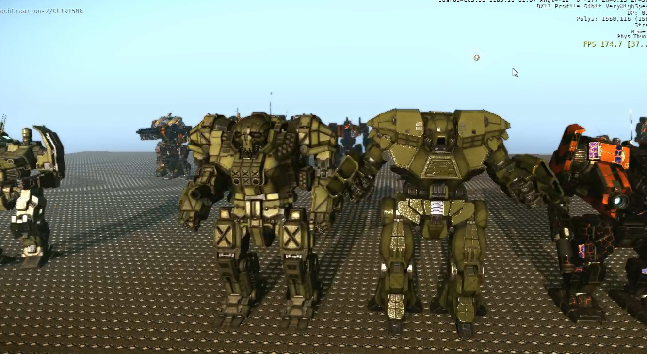

Atlas looks like that in game too. I have ALWAYS hated the new Atlas design. And also the Awesome suffers the same problem in game too as well.

Posted Image

This one is barely up at all okay and gives a good approximation of everything.

Basically the designs they have put forth to compare it to are possibly in my opinion their worst designs. Its legs are terrible and so is its waist. In my opinion anyways.

I am a super jaded and picky individual though.


From this latest angle I can see the legs are fine. Sure, they could be slightly thicker but it is nothing I would fuss about. Besides, the leg to body proportions are identical to Kodiaks I have faced in the past, such as this guy in MW4.

Posted Image


Or here in MW2.

Posted Image

Edited by El Bandito, 06 April 2016 - 12:00 AM.


#7 Revis Volek

    Member

  • PipPipPipPipPipPipPipPipPipPip
  • The 1 Percent
  • The 1 Percent
  • 7,247 posts
  • Google+: Link
  • Facebook: Link
  • LocationBack in the Pilots chair

Posted 05 April 2016 - 11:53 PM

View PostEl Bandito, on 05 April 2016 - 11:25 PM, said:

1. The first picture was taken from an upper angle, so the legs will seem smaller than they really are.

2. If you look at the concept art carefully, you will see that it has slim waist too. It's just covered by the right arm.

Wait until they give it weapon mounts.


and the view from that camera is kinda FISH EYE'd a bit, it definitely isnt doing it justice.

View PostMarack Drock the Unicorn Wizard, on 05 April 2016 - 11:43 PM, said:

Atlas looks like that in game too. I have ALWAYS hated the new Atlas design. And also the Awesome suffers the same problem in game too as well.

Posted Image

This one is barely up at all okay and gives a good approximation of everything.

Basically the designs they have put forth to compare it to are possibly in my opinion their worst designs. Its legs are terrible and so is its waist. In my opinion anyways.

I am a super jaded and picky individual though.


From that angle it looks just fine IMO, the space around the waist looks better straight on as well. But as far as not liking the redesigns you are prolly the only person i know who isnt all about them (lol) i think alex does a great job honestly. Anything is better then the old junky 80's looking mechs IMO.

But you wont enjoy CGL new game either then, its using PGI art assets because they are something that draws people to this game...well people other then you. :P

Edited by Revis Volek, 05 April 2016 - 11:56 PM.


#8 ManDaisy

    Member

  • PipPipPipPipPipPipPipPipPip
  • Elite Founder
  • Elite Founder
  • 3,272 posts
  • LocationKing Of Flower Beds

Posted 05 April 2016 - 11:53 PM

the problem is with the arms. Upper arms need to be thicker and shorter. bringing lower arms closer to the body.

#9 Khobai

    Member

  • PipPipPipPipPipPipPipPipPipPipPipPipPip
  • Elite Founder
  • Elite Founder
  • 23,969 posts

Posted 06 April 2016 - 12:10 AM

who cares its not like I have to look at it when im piloting it

im way more bothered by the fact its BIGGER than an atlas

#10 Juodas Varnas

    Member

  • PipPipPipPipPipPipPipPipPipPip
  • Ace Of Spades
  • Ace Of Spades
  • 7,534 posts
  • LocationGrand Duchy of Lithuania

Posted 06 April 2016 - 12:15 AM

View PostMarack Drock the Unicorn Wizard, on 06 April 2016 - 12:11 AM, said:

Atlas looks like a cartoon now,

What the hell is wrong with you?!

Atlas is one of the best looking mechs in the game and it has never looked better!

#11 Tristan Winter

    Member

  • PipPipPipPipPipPipPipPipPip
  • Ace Of Spades
  • Ace Of Spades
  • 2,530 posts
  • LocationNorway

Posted 06 April 2016 - 12:17 AM

Those are some epic sized gloves. I guess they needed to make four ppc slots, and they ended up with those huuuge blocks. This thing is going to shield its torso like a boss.

Everything except the hands looks good, I think. They should have used different slots for lasers and ppcs, like how the SHC arm uses three small slots for MGs, but expands its size if you equip multiple large ballistics.


View PostJuodas Varnas, on 06 April 2016 - 12:15 AM, said:

Atlas is one of the best looking mechs in the game and it has never looked better

QFT

#12 C E Dwyer

    Member

  • PipPipPipPipPipPipPipPipPipPip
  • Legendary Founder
  • Legendary Founder
  • 9,274 posts
  • LocationHiding in the periphery, from Bounty Hunters

Posted 06 April 2016 - 12:19 AM

View PostKhobai, on 06 April 2016 - 12:10 AM, said:

who cares its not like I have to look at it when im piloting it

im way more bothered by the fact its BIGGER than an atlas


Has higher weapon mounts than the Atlas so *shrug*

#13 Damien Tokala

    Member

  • PipPipPipPipPipPipPip
  • Ace Of Spades
  • Ace Of Spades
  • 788 posts

Posted 06 April 2016 - 12:23 AM

other way around, the side torsos need to be scaled DOWN. they are too damn massive.

#14 Tarogato

    Member

  • PipPipPipPipPipPipPipPipPipPip
  • Civil Servant
  • Civil Servant
  • 6,558 posts
  • LocationUSA

Posted 06 April 2016 - 12:33 AM

View PostMarack Drock the Unicorn Wizard, on 05 April 2016 - 11:21 PM, said:

legs


Meh, they look fine to me. Here's a better perspective:

Posted Image

Posted Image

Edited by Tarogato, 06 April 2016 - 12:43 AM.


#15 Damien Tokala

    Member

  • PipPipPipPipPipPipPip
  • Ace Of Spades
  • Ace Of Spades
  • 788 posts

Posted 06 April 2016 - 12:37 AM

View PostTarogato, on 06 April 2016 - 12:33 AM, said:

Meh, they look fine to me. Here's a better perspective:

Posted Image


side torsos... too... fat... if one blows, all the weight shifts to the other side, and h goes BOOM to the ground.

#16 NoiseCrypt

    Member

  • PipPipPipPipPipPipPip
  • Philanthropist
  • Philanthropist
  • 596 posts
  • Twitter: Link
  • Twitch: Link
  • LocationDenmark

Posted 06 April 2016 - 12:45 AM

Posted Image
Legs are fine

And remember that it isn't in the "in game pose", but the "design pose". Legs will slumb down a bit.

And the Wolverine pose should be a thing :D
Posted Image

#17 Lily from animove

    Member

  • PipPipPipPipPipPipPipPipPipPipPip
  • The Devoted
  • The Devoted
  • 13,891 posts
  • LocationOn a dropship to Terra

Posted 06 April 2016 - 12:53 AM

hard to tell with this crappy paintjob eating some details. But then be happy that the Torsi have some large plain areas, atm when decals arrive you gonna love those plain areas.

Edited by Lily from animove, 06 April 2016 - 12:55 AM.


#18 NephyrisX

    Member

  • PipPipPipPipPipPip
  • 394 posts
  • LocationSingapore

Posted 06 April 2016 - 01:14 AM

JFC, people:
  • Model is not finalised as the details are not finished.
  • Perspective can screw up the appearance of things.
  • FOV can also alter how items appear.
  • Kodiak posture is not finalised. It's in the equivalent of a T-pose.

View PostMarack Drock the Unicorn Wizard, on 05 April 2016 - 11:43 PM, said:

Atlas looks like that in game too. I have ALWAYS hated the new Atlas design. And also the Awesome suffers the same problem in game too as well. This one is barely up at all okay and gives a good approximation of everything. Basically the designs they have put forth to compare it to are possibly in my opinion their worst designs. Its legs are terrible and so is its waist. In my opinion anyways. I am a super jaded and picky individual though.

Posted Image

Edited by NephyrisX, 06 April 2016 - 01:15 AM.


#19 Juodas Varnas

    Member

  • PipPipPipPipPipPipPipPipPipPip
  • Ace Of Spades
  • Ace Of Spades
  • 7,534 posts
  • LocationGrand Duchy of Lithuania

Posted 06 April 2016 - 07:45 AM

View PostMarack Drock the Unicorn Wizard, on 06 April 2016 - 07:35 AM, said:

Some people like death metal, I find it repulsive.

Thanks for proving us right, about you not having taste and all that. Posted Image

#20 Pariah Devalis

    Member

  • PipPipPipPipPipPipPipPipPipPip
  • The Clan Cat
  • The Clan Cat
  • 7,655 posts
  • Google+: Link
  • Twitter: Link
  • LocationAboard the NCS True Path

Posted 06 April 2016 - 07:55 AM

I really just have one area of concern with the design, aesthetically.

Posted Image

If the red areas were shrunk, vertically, by about 50% and the laser area in the periwinkle was inset a bit with the chest plate, I think the mech would look a lot better. That entire love handles area on the mech seems to take up too much vertical space in the mech, overall. Plus, in the side by side, right now the mech is slightly taller than the Atlas, and reduction of height in that area specifically would bring the two more into line.

Edit: wasn't so much blue as it was periwinkle

Edit 2.0 for clarity:

Posted Image

Edited by Pariah Devalis, 06 April 2016 - 08:08 AM.


7 user(s) are reading this topic

0 members, 7 guests, 0 anonymous users