

I much prefer this latest mini over the previous ones.

Minimap Analysis - Has It Actually Improved The Game?
Started by Yosharian, Jun 24 2016 10:51 AM
57 replies to this topic
#42
-

-

- Ace Of Spades
- 541 posts
Member
- LocationWarren

Posted 27 June 2016 - 09:19 AM
I miss directional arrows for my teammates. I am making a lot of rookie mistakes without them,
Why were they taken out again? I forget.
Why were they taken out again? I forget.
#43
-
-
- The Privateer

- 2,688 posts
Member
Posted 27 June 2016 - 10:19 AM
Initially I found the map confusing but that was almost entirely because it no longer rotated. I got use to that and then they did the Hotfix and it rotated again (sigh). OK, so after having played about 25 or so games on the new and improved mini-map, I find that I like it better than the old one. For one thing, I find it a lot easier to read the coordiantes on the map now than before because there is normally more contrast between the background and the white lettering. I also like that it is not zoomed in as close because it makes it easier for me to keep track of the location of my complete team. The old map often was zoomed in so much that you would not have a scout or a straggler on the map so if trouble arose you need someone to call it out on VOIP or you had to push B to see where the help was needed.
I have really not found myself missing the Doritos much. I have also not made much use of the Mech class indicators a whole lot but I can see how that information can be useful.
I would call this map an evolution of the old map and if the infowarfare add ins come as promised I think it will be totally better for the game. Call me cautiously optimistic.
#44
-
-
- Elite Founder

- 158 posts
Member
Posted 27 June 2016 - 10:48 PM
love the new minimap. dont know why, i just love satelite image maps.
i can never make sense of "waze" map but have better understanding using goggle maps (satelite)
and those icons let me pick targets faster and position myself better.
i can never make sense of "waze" map but have better understanding using goggle maps (satelite)
and those icons let me pick targets faster and position myself better.
#45
-
-
- The Ardent

- 273 posts
Member

Posted 27 June 2016 - 10:53 PM
It's crap, I missed a few times already the "NASCAR" in a assault...
#46
-

-
- Survivor
- 1,185 posts
Member
Posted 28 June 2016 - 12:01 AM
You don't need directional arrows.
It's much more valuable to know the type of mech on a minimap, rather than which way said mech is facing.
It's much more valuable to know the type of mech on a minimap, rather than which way said mech is facing.
#47
-

-
- Ace Of Spades

- 17,923 posts
Member
Posted 28 June 2016 - 04:31 AM
i kind of like the new map better, the old map showed a bunch of doritos which indicated direction, new map instead indicates mech class. which is a damn good indicator of whether or not i want to engage that target or not (like if its an assault and you are in a locust, or perhaps its a light and you happen to be in your streak crow) and frankly the angle indicator was for the legs not the torso, it really didnt show you where it was looking at, it could be pointing to the side and you pop and get greeted with dual gauss, so it wasnt very good at indicating anything useful anyway. the mech class indication is far more useful.
i would have actually prefered a map+radar implementation like MWLL had. the new map pre hotfix was still pretty useful as a map, its easier to figure out where you need to point to get to a particular grid square, or determining what grid your target is in, especially when its beyond the range of your radar. what it was not good for is determining the local battle situation in reference to your mech's orientation, and only concerns itself with what the mech's sensors can see. having both on the hud would be totally awesome, and there is plenty of space.
i would have actually prefered a map+radar implementation like MWLL had. the new map pre hotfix was still pretty useful as a map, its easier to figure out where you need to point to get to a particular grid square, or determining what grid your target is in, especially when its beyond the range of your radar. what it was not good for is determining the local battle situation in reference to your mech's orientation, and only concerns itself with what the mech's sensors can see. having both on the hud would be totally awesome, and there is plenty of space.
Edited by LordNothing, 28 June 2016 - 04:38 AM.
#48
-
-
- Legendary Founder

- 5,725 posts
Member
- LocationSt.Petersburg / Outreach
Posted 28 June 2016 - 04:53 AM
I think its obvious. New new minimap looks cooler, but information wise (i.e. the sole point of minimap) it is garbage compared to what we had before.
I honestly don't understand how this game could be 4+ years in development and still lack a fully customizable UI, including a variable zoom option for minimap.
I honestly don't understand how this game could be 4+ years in development and still lack a fully customizable UI, including a variable zoom option for minimap.
#49
-
-
- Liquid Metal

- 5,230 posts
Member
Posted 28 June 2016 - 05:02 AM
I don't think it should be reverted.. I think it is more just getting used to the new one..
But i will agree with you that the terrain aspect as a whole could get another pass to make them easier to read.. But that is something that can be added on/too, to improve it as a whole. IMO no need to through the baby out with the bathwater so to speak. But nothing wrong with giving it some more polish like cleaning behind the ears
But i will agree with you that the terrain aspect as a whole could get another pass to make them easier to read.. But that is something that can be added on/too, to improve it as a whole. IMO no need to through the baby out with the bathwater so to speak. But nothing wrong with giving it some more polish like cleaning behind the ears
#50
-

-
- Bad Company

- 210 posts
Member

Posted 28 June 2016 - 05:27 AM
Its not as good as the old one but is just about ok now they fixed things like auto rotate.
#51
-
-
- The Nocturnal

- 5,443 posts
Member
- Locationmy cockpit
Posted 28 June 2016 - 05:37 AM
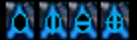
I like team icon can show the mech class.
I like the minimap can slightly show more grind.
I hate:
1) Minimap pic is made so naive.... it seems that author finds more useful to show you the trees in Veridian than hills! LOL
2 ) doritos. Naive pgi strikes again..... of course, in the mw/bt virtual reality, a computer can calculate and show DIRECTION!
#52
-
-
- Legendary Founder
- 2,097 posts
Member
- LocationWV
Posted 28 June 2016 - 06:13 AM
 Mystere, on 24 June 2016 - 11:15 AM, said:
PGi should seriously consider displaying the mini-map and possibly other HUD elements on those currently useless cockpit monitors and on a player's secondary display.
in quite a few mechs, there are no visible screens unless you free-look to look around the cockpit. This is especially true if you are zoomed.
I'd rather keep with the concept that the HUD is on the inside of your helmet.
I wouldn't mind the secondary display, but honestly.... This is PGI, don't get your hopes up.
#53
-
-
- The Wolf

- 2,937 posts
Member
- LocationNordic Union
Posted 16 July 2016 - 05:18 AM
No need for arrows. You easly see if those diamonds are moving. The only thing you dont see are if they are reversing or moving forward.
What they should do is place LETTERS inside the diamonds. Much easier to read, L for light, M for medium, H for heavy and A for assault. Those lines inside them are pointless.
Or you know what, maybe make arrows with letters inside! Bam!
What they should do is place LETTERS inside the diamonds. Much easier to read, L for light, M for medium, H for heavy and A for assault. Those lines inside them are pointless.
Or you know what, maybe make arrows with letters inside! Bam!
Edited by Tordin, 16 July 2016 - 05:18 AM.
#54
-

-
- Ace Of Spades

- 1,956 posts
Member
- LocationSweden
Posted 16 July 2016 - 05:32 AM
This is much better than what we had before. Weight class is useful but not overly easy mode info such as directional arrows.
#55
-
-
- Bad Company

- 4,316 posts
Member
- LocationLinoleum.
Posted 16 July 2016 - 09:14 AM
I much prefer seeing weight class so fast without having to use the overlay. It's not like you could trust people to shoot in the direction their arrow was pointing.
There is a problem with the map though, it's intended purpose has not been implemented yet and we dont even know what it will be.
There is a problem with the map though, it's intended purpose has not been implemented yet and we dont even know what it will be.
Edited by DAYLEET, 16 July 2016 - 09:15 AM.
#56
-
-
- Ace Of Spades
- 2,617 posts
Member
- LocationNorway
Posted 16 July 2016 - 09:20 AM
I cannot see which way the enemy is facing with the new map? That was a major setback for me.
I'll adapt like i always do but that will take some time.
I'll adapt like i always do but that will take some time.
#57
-

-
- Ace Of Spades

- 7,102 posts
Member
- LocationCO
Posted 16 July 2016 - 09:47 AM
Quote
MINIMAP ANALYSIS - HAS IT ACTUALLY IMPROVED THE GAME?
nope its just different
reminds me of a RHAW scope display (radar homing and warning)
if your a drop caller it does not help you since you can't tell what your team is doing
it makes the game less tactical
more of a just run to the center and try and out alpha the other guy/gal
sort of like domination (so we should of seen this coming)
bottom line not a big big deal they just sucked a little more fun out of the game
Edited by Davegt27, 16 July 2016 - 09:54 AM.
#58

Posted 16 July 2016 - 11:31 AM
Davegt27, on 16 July 2016 - 09:47 AM, said:
if your a drop caller it does not help you since you can't tell what your team is doing
it makes the game less tactical
it makes the game less tactical
..and if the employees played FP, that would have been readily apparent in the first match.
Goodluck trying to organize pugs with the new minimap.
Friendly doritos need to return for the sake of teamwork and getting all the blue guys onto the same page.


1 user(s) are reading this topic
0 members, 1 guests, 0 anonymous users


