Jump to content

Mad Cat Mk Ii Model Adjustments.

BattleMechs

242 replies to this topic

#41 Bishop Steiner

    ForumWarrior

  • PipPipPipPipPipPipPipPipPipPipPipPipPipPipPip
  • The Hammer
  • The Hammer
  • 47,187 posts
  • Locationclimbing Mt Tryhard, one smoldering Meta-Mech corpse at a time

Posted 01 May 2017 - 09:57 AM

View PostLuscious Dan, on 01 May 2017 - 09:55 AM, said:

+1 for the expansion of the arm shrouding to conceal more of the gauss barrel, and shrinking the CT/cockpit glass a little bit as well. With a bit of tweaking the Mad Cat Mk2 can be one of the best looking robuts in the game.

While you're at it, the Cougar's torso appears to sit a little too far back on the pelvis. And the lower legs on the Uziel are a bit skinny IMO. Otherwise, absolutely gorgeous mechs that I can't wait to get my hands on. Well worth the wait.

The Uziel also sits too far forward on it's pelvis, TBH. And Skinny legs is kid of a hallmark for the design.

#42 Cat-in-Exile

    Member

  • PipPipPipPipPip
  • Ace Of Spades
  • Ace Of Spades
  • 108 posts

Posted 01 May 2017 - 12:59 PM

You guys are nuts, it's looks pretty great as it is. Don't ruin the aesthetics of this mech for me like you did the Ebon Jag by crying about how it wasn't crouched enough.

#43 CK16

    Member

  • PipPipPipPipPipPipPipPipPip
  • The Cub
  • The Cub
  • 3,031 posts
  • LocationAlshain V

Posted 01 May 2017 - 01:14 PM

View PostCat-in-Exile, on 01 May 2017 - 12:59 PM, said:

You guys are nuts, it's looks pretty great as it is. Don't ruin the aesthetics of this mech for me like you did the Ebon Jag by crying about how it wasn't crouched enough.


Have you read the discussion? Nothing much on its stance (most like it's height and stance actually). We are about the arms and not wanting our Gauss Rifles strapped to the front of the arms instead of housed inside as they should be both by lore and by the art work.

#44 Imperius

    Member

  • PipPipPipPipPipPipPipPipPipPip
  • The God
  • The God
  • 5,747 posts
  • LocationOn Reddit and Twitter

Posted 01 May 2017 - 01:37 PM

View PostCat-in-Exile, on 01 May 2017 - 12:59 PM, said:

You guys are nuts, it's looks pretty great as it is. Don't ruin the aesthetics of this mech for me like you did the Ebon Jag by crying about how it wasn't crouched enough.

Sorry, I missed seeing you ask for this mech for 4 years... I will "cry" to have this mech match the concept art as close as possible. So kindly keep your insults to yourself before you make me mad. You already irritated me after reading your slanderous post.

Us early adopters pay to have the models match the concept art. Check the warhammer thankfully that was able to get fixed. It literally was a small banshee head. Looked nothing like the concept.


#45 Cat-in-Exile

    Member

  • PipPipPipPipPip
  • Ace Of Spades
  • Ace Of Spades
  • 108 posts

Posted 01 May 2017 - 01:56 PM

View PostCK16, on 01 May 2017 - 01:14 PM, said:


Have you read the discussion? Nothing much on its stance (most like it's height and stance actually). We are about the arms and not wanting our Gauss Rifles strapped to the front of the arms instead of housed inside as they should be both by lore and by the art work.


I know you aren't talking about the Madcat's stance. My point is that when the community demands some change to the mech models, the end result is, IMO, usually worse that the original. Like the Ebon Jag.

View PostImperius, on 01 May 2017 - 01:37 PM, said:

Sorry, I missed seeing you ask for this mech for 4 years... I will "cry" to have this mech match the concept art as close as possible. So kindly keep your insults to yourself before you make me mad. You already irritated me after reading your slanderous post.

Us early adopters pay to have the models match the concept art. Check the warhammer thankfully that was able to get fixed. It literally was a small banshee head. Looked nothing like the concept.


Insults? Oookaaay buddy.

And FWIW, I'm an early adopter too.

#46 Jackal Noble

    Member

  • PipPipPipPipPipPipPipPipPip
  • 4,863 posts
  • LocationTerra

Posted 01 May 2017 - 02:04 PM

Finally, someone else agrees that the gauss hardpoint should not be upside down as that would be ludicrous in it's own right but whatevs.

#47 Jackal Noble

    Member

  • PipPipPipPipPipPipPipPipPip
  • 4,863 posts
  • LocationTerra

Posted 01 May 2017 - 02:08 PM

View PostImperius, on 01 May 2017 - 01:37 PM, said:


Us early adopters pay to have the models match the concept art. Check the warhammer thankfully that was able to get fixed. It literally was a small banshee head. Looked nothing like the concept.


Hate to be trouble, but anyone have a snap of that ol' girl with a mini banshee head? Gots to see that.

#48 Metus regem

    Member

  • PipPipPipPipPipPipPipPipPipPipPip
  • The Sureshot
  • The Sureshot
  • 10,282 posts
  • LocationNAIS College of Military Science OCS courses

Posted 01 May 2017 - 02:15 PM

View PostCat-in-Exile, on 01 May 2017 - 12:59 PM, said:

You guys are nuts, it's looks pretty great as it is. Don't ruin the aesthetics of this mech for me like you did the Ebon Jag by crying about how it wasn't crouched enough.


To be fair, the complant about the Warhammer's head gave us a better looking Warhammer... Sometimes you win some, sometimes not....

That being said, what CK is asking for, is to have the lower arm weapon mount more closely match the art work, both concept and TRO, and I support that aspect. What I don't support is trying to get the weapons placed higher than they are, as the Gauss Rifles on the Mk. II has always been slightly below the cockpit, like they are in the TRO, MW4 and the concept art used here.

On another side note, it's not worth the energy to get stuck into a fight with Imperius, he takes things a little too personal in regards to the Mk. II... as several threads have shown, and my own personal experience in dealing with him have shown.

#49 Andi Nagasia

    Volunteer Moderator

  • PipPipPipPipPipPipPipPipPipPip
  • Ace Of Spades
  • Ace Of Spades
  • 5,982 posts

Posted 01 May 2017 - 02:33 PM

id agree, maybe pull the weapons into the Arms, or extend the Arms over the Weapons more,

#50 Cat-in-Exile

    Member

  • PipPipPipPipPip
  • Ace Of Spades
  • Ace Of Spades
  • 108 posts

Posted 01 May 2017 - 02:40 PM

I should also specify when I said "you", CK16, meant it as the community collectively, not you specifically.

I don't remember the Warhammer head crisis. Must have been during one of my breaks from the game.

#51 Metus regem

    Member

  • PipPipPipPipPipPipPipPipPipPipPip
  • The Sureshot
  • The Sureshot
  • 10,282 posts
  • LocationNAIS College of Military Science OCS courses

Posted 01 May 2017 - 02:48 PM

View PostCat-in-Exile, on 01 May 2017 - 02:40 PM, said:

I should also specify when I said "you", CK16, meant it as the community collectively, not you specifically.

I don't remember the Warhammer head crisis. Must have been during one of my breaks from the game.


Long story short, the first game model for it had a very pronounced head, it looked strange. Enough noise was made, it got adjusted to what we have now.

#52 Imperius

    Member

  • PipPipPipPipPipPipPipPipPipPip
  • The God
  • The God
  • 5,747 posts
  • LocationOn Reddit and Twitter

Posted 01 May 2017 - 02:57 PM

View PostMetus regem, on 01 May 2017 - 02:15 PM, said:


To be fair, the complant about the Warhammer's head gave us a better looking Warhammer... Sometimes you win some, sometimes not....

That being said, what CK is asking for, is to have the lower arm weapon mount more closely match the art work, both concept and TRO, and I support that aspect. What I don't support is trying to get the weapons placed higher than they are, as the Gauss Rifles on the Mk. II has always been slightly below the cockpit, like they are in the TRO, MW4 and the concept art used here.

On another side note, it's not worth the energy to get stuck into a fight with Imperius, he takes things a little too personal in regards to the Mk. II... as several threads have shown, and my own personal experience in dealing with him have shown.

I know they are supposed to be slightly below like the concept art. They are however too low lined up with the belly laser points were they are supposed to be above those. The gauss rifles should line up with the box indent on the nose.

Calling us nuts for wanting the model to match the art is an insult. Saying that it's crying is also an insult. Feedback is not crying. Crying would be if I just insulted the art team and stomped my feet without saying why I'm stomping my feet!

Edited by Imperius, 01 May 2017 - 03:03 PM.


#53 HardLuck

    Member

  • PipPip
  • FP Veteran - Beta 1
  • FP Veteran - Beta 1
  • 28 posts
  • LocationOhio

Posted 01 May 2017 - 03:52 PM

I'm more upset with the body size to leg size ratio. It looks like a Stormcrow's torso on a set of Direwolf's legs...

#54 Imperius

    Member

  • PipPipPipPipPipPipPipPipPipPip
  • The God
  • The God
  • 5,747 posts
  • LocationOn Reddit and Twitter

Posted 01 May 2017 - 04:26 PM

View PostJackalBeast, on 01 May 2017 - 02:08 PM, said:


Hate to be trouble, but anyone have a snap of that ol' girl with a mini banshee head? Gots to see that.

https://mwomercs.com...ost__p__4891963

This was already textured at the time so I'm glad we got a preview before things got too far.

#55 RestosIII

    Member

  • PipPipPipPipPipPipPipPipPipPip
  • The 1 Percent
  • The 1 Percent
  • 7,322 posts
  • LocationDelios

Posted 01 May 2017 - 05:00 PM

'pops into the forums during a break to see if anything has happened since I was last here'

....

Oi, PGI, please don't release it with those arms. They're stubs. One of the main things I like about the Mad Cat MK II is the longer arms that go out to at least the end of its nose. And definitely don't have the Gauss sticking that far out of the arm itself. Jeeze. I don't know how you can have a model that drastically different from Alex's concept art.

#56 Bishop Steiner

    ForumWarrior

  • PipPipPipPipPipPipPipPipPipPipPipPipPipPipPip
  • The Hammer
  • The Hammer
  • 47,187 posts
  • Locationclimbing Mt Tryhard, one smoldering Meta-Mech corpse at a time

Posted 01 May 2017 - 05:48 PM

View PostMetus regem, on 01 May 2017 - 02:48 PM, said:

Long story short, the first game model for it had a very pronounced head, it looked strange. Enough noise was made, it got adjusted to what we have now.

helped that Russ had a live dev stream going, and I decided to get a little loud...which encouraged the other stream followers to speak up.... sadly ...it was also the last time Russ did a preview that early on.... kind of silly when he even admitted later that the changes MASSIVELY improved the model.

View PostHardLuck, on 01 May 2017 - 03:52 PM, said:

I'm more upset with the body size to leg size ratio. It looks like a Stormcrow's torso on a set of Direwolf's legs...

it's in the basic modeling pose, not the "live pose". Leg ratio looks just fine for the model to concept art.

#57 Bishop Steiner

    ForumWarrior

  • PipPipPipPipPipPipPipPipPipPipPipPipPipPipPip
  • The Hammer
  • The Hammer
  • 47,187 posts
  • Locationclimbing Mt Tryhard, one smoldering Meta-Mech corpse at a time

Posted 01 May 2017 - 05:55 PM

View PostJackalBeast, on 01 May 2017 - 02:08 PM, said:


Hate to be trouble, but anyone have a snap of that ol' girl with a mini banshee head? Gots to see that.

View PostCat-in-Exile, on 01 May 2017 - 02:40 PM, said:

I should also specify when I said "you", CK16, meant it as the community collectively, not you specifically.

I don't remember the Warhammer head crisis. Must have been during one of my breaks from the game.

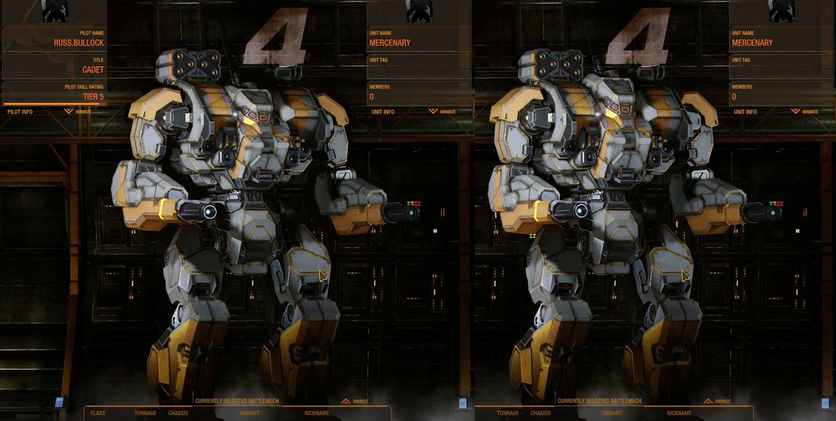
Posted Image

left side is closer to what we got, right side is what they originally planned to give us.

Edited by Bishop Steiner, 01 May 2017 - 05:58 PM.


#58 Imperius

    Member

  • PipPipPipPipPipPipPipPipPipPip
  • The God
  • The God
  • 5,747 posts
  • LocationOn Reddit and Twitter

Posted 01 May 2017 - 06:15 PM

Wish we didn't have to get a little loud. The one main income of MWO shouldn't be held as a secret until 7 days of release to catch potential discrepancies. I get it that at the same time you don't want everyone screaming at every model made. At the same time it's a product and the only advertisement we are given is the concept art. So most buy decisions are based off that. Sure I could cancel my pre-orders or wait until it's released to make my decision. The benifts of being able to critique models before release is it stops forum fires and backlash. It's easier to fix a model at this stage before everything is done on it.

Also I'm biased to this chassis so it's the only one I'm critiquing. I've bought every top tier mech pack except the hero packs (just expensive skins to me). I've only given feedback about a few 3D models the Warhammer and this one. I had a friend who really like the Warhammer so I backed up the art change push. So to put it into understanding I support the games and only play 2-3 mechs Jericho will be replaced but this gem when it's released.

Edited by Imperius, 01 May 2017 - 06:25 PM.


#59 Snowbluff

    Member

  • PipPipPipPipPipPipPipPipPip
  • Bad Company
  • 2,368 posts

Posted 01 May 2017 - 06:20 PM

View PostRestosIII, on 01 May 2017 - 05:00 PM, said:

'pops into the forums during a break to see if anything has happened since I was last here'

....

Oi, PGI, please don't release it with those arms. They're stubs. One of the main things I like about the Mad Cat MK II is the longer arms that go out to at least the end of its nose. And definitely don't have the Gauss sticking that far out of the arm itself. Jeeze. I don't know how you can have a model that drastically different from Alex's concept art.

See, Ck? I did it.
#diamondsharks4life
Posted Image

I wish my original Madcat MkII thread got this much of a response (instead of an off topic bait about CASE). It's good to know that other people think the Madcat MkII's arms aren't long enough.

Edited by Snowbluff, 01 May 2017 - 06:24 PM.


#60 Chiasson Brinker

    Member

  • PipPipPipPipPipPip
  • The Ace
  • The Ace
  • 260 posts
  • LocationWayside V

Posted 01 May 2017 - 06:24 PM

View PostBishop Steiner, on 30 April 2017 - 09:38 PM, said:

hhmmmmm... i think Iconic get's bandied about too easily. Atlas and Timby are for sure Iconic... probably the main Unseens, but not really sure I would can stretch it to cover the mkII... even the KDK just barely fits, and not that comfortably, IMO.


also surprised not really seeing (or have missed) any negative feedback on the missile boxes being notably taller and squarer than the concept art.


As a whole it almost feels like somebody put it in a vise and squeezed, it's lost length and added height in almost every aspect. I don't wanna bash, because I know it's not easy to model, but the longer I look, the farther off it is.


The Mad Cat Mk II is considered iconic because it was a literal icon for MW Dark Age as well as several rulebooks.


1 user(s) are reading this topic

0 members, 1 guests, 0 anonymous users