Jump to content

Repainted Concept Art

Art

7732 replies to this topic

#1521 GD26

    Member

  • PipPipPip
  • 74 posts
  • LocationGlengarry

Posted 30 March 2012 - 09:56 AM

Quote

I usually save things as a png, but then it looked all wrong when I uploaded it. - Stormblast


Don’t get humble on me brother. :D
Maybe they oughta get a grip of this work of yours and let them eat their hearts out at the greatness of our legion.
Enemies, behold! ^_^

Posted Image

#1522 Hayden

    Member

  • PipPipPipPipPipPipPipPip
  • Little Helper
  • Little Helper
  • 1,997 posts

Posted 30 March 2012 - 10:01 AM

View PostGD26, on 30 March 2012 - 09:56 AM, said:


Don’t get humble on me brother. :D
Maybe they oughta get a grip of this work of yours and let them eat their hearts out at the greatness of our legion.
Enemies, behold! ^_^

Posted Image


You know, there's a Commando GDL floating around here, too.

#1523 GD26

    Member

  • PipPipPip
  • 74 posts
  • LocationGlengarry

Posted 30 March 2012 - 10:09 AM

That's right Hayden.

The Commando wasn't supposed to be there. That one is already behind enemy lines! :D

#1524 Hayden

    Member

  • PipPipPipPipPipPipPipPip
  • Little Helper
  • Little Helper
  • 1,997 posts

Posted 30 March 2012 - 10:13 AM

View PostGD26, on 30 March 2012 - 10:09 AM, said:

That's right Hayden.

The Commando wasn't supposed to be there. That one is already behind enemy lines! ^_^


I'll take it :D

#1525 Larry Headrick

    Member

  • PipPipPipPipPipPip
  • 303 posts
  • Locationoklahoma

Posted 30 March 2012 - 10:13 AM

View Postguardian wolf, on 30 March 2012 - 09:54 AM, said:

Does that work with Gimp?

Yes this is what got me started.
One key point to remember when painting over something with a layer is to make sure you remove the color of what ever is below it. you get bouth colors bleeding together if you dont. to do this i choose { Colors/ Hue-Saturation/ } Set Saturation to -100. also make sure the paint layer is on Soft light. This alows the background texture to remain.
Hope that helps.

#1526 Dihm

    Member

  • PipPipPipPipPipPipPipPipPip
  • 3,312 posts
  • Google+: Link
  • LocationPlanet Trondheim

Posted 30 March 2012 - 10:15 AM

Don't forget that the clone tool is your friend too. Some concept art paint jobs don't all "disappear" when primed, and you need to touch it up. Like the Awesome's chest racing stripes.

#1527 rolling thunder

    Member

  • PipPipPipPipPip
  • The 1 Percent
  • The 1 Percent
  • 120 posts
  • LocationSOUTHPORT,UK

Posted 30 March 2012 - 10:31 AM

View PostGD26, on 30 March 2012 - 09:56 AM, said:


Posted Image

Now they look like machines of War & not the Glory boys on a poster.I still think the Awesome should drop the power fist & carry another PPC there instead of on the torso.

Edited by rolling thunder, 30 March 2012 - 10:32 AM.


#1528 Ironhawk

    Member

  • PipPipPipPipPipPipPipPip
  • Ace Of Spades
  • Ace Of Spades
  • 1,333 posts
  • LocationMontreal

Posted 30 March 2012 - 10:48 AM

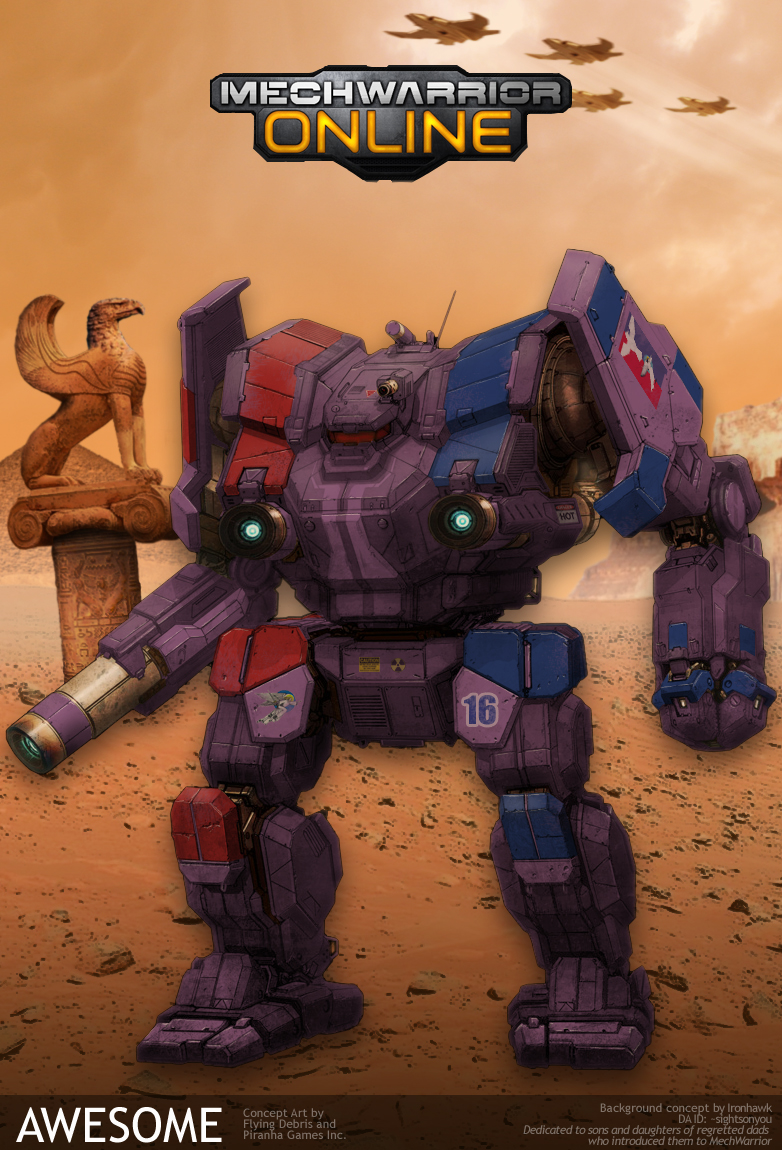
Attempt at 1st Marik Militia. EDIT: Credit goes to Hayden for insignia work :D

Posted Image

Edited by Ironhawk, 30 March 2012 - 12:55 PM.


#1529 Max OConnor

    Member

  • PipPipPipPipPipPipPip
  • The Phoenix
  • The Phoenix
  • 731 posts
  • Google+: Link
  • Facebook: Link
  • LocationLebanon, TN

Posted 30 March 2012 - 11:59 AM

Here you go Chuckie, don't say I never did anything nice for you. :P

Sorry for the grungy look but its how the filter went on. I think it looks pretty cool myself. I put your Knights of NI badge on the left shoulder, your personal logo on the right torso, the NWH Regimental logo on the left per cannon specs. I also put your personal tartan on the right leg per cannon specs. I hope you like it. Let me know if you need anything changed.
Posted Image

View PostGD26, on 30 March 2012 - 09:56 AM, said:


Don’t get humble on me brother. :D
Maybe they oughta get a grip of this work of yours and let them eat their hearts out at the greatness of our legion.
Enemies, behold! :P

Posted Image

DUDE THAT ROCKS!!!!!!!!!!!!!!!!!!
Post that bad boy over in the recruitment posters forum!!!

View PostGD26, on 30 March 2012 - 09:56 AM, said:


Don’t get humble on me brother. ^_^
Maybe they oughta get a grip of this work of yours and let them eat their hearts out at the greatness of our legion.
Enemies, behold! :blink:

Posted Image

One suggestion, your 3 mechs have differing shades of grey. They might look better if you could make them all uniform.
I think the Awesome looks the best IMO.

#1530 AdamBaines

    Member

  • PipPipPipPipPipPipPipPip
  • Elite Founder
  • Elite Founder
  • 1,384 posts

Posted 30 March 2012 - 12:12 PM

Alright, I'm jumping back into the painting gig it just for this one. I did a variant Commando I posted earlier, removing the Monocle. So I decided why not paint it up in my fave Colors, the Periphery Star Guards (PSG). Its a simple one, yet also not so simple as trying to get the colors to flow properly is key. I still think my first Hunchie I did this way was better.

EDIT: GIMP is difficult sometimes. Not everything translates directly from Photoshop well :D

Posted Image

Edited by AdamBaines, 30 March 2012 - 12:14 PM.


#1531 Blackfang

    Member

  • PipPipPipPipPipPipPip
  • The Blood Bound
  • The Blood Bound
  • 766 posts
  • LocationComing to a planet near you!

Posted 30 March 2012 - 02:30 PM

I'm not terribly good at repainting these things, but I thought I'd give the commando, centurion and jenner a go in our Wolf Spider Battalion colour scheme. The hunchback I did a little while ago not sure if I posted it here though. Last one before I hit the sack is the atlas, not sure if I'm keen on this one, but maybe it's just because I don't like the atlas much...

Posted Image

Posted Image

Posted Image

Posted Image

Posted Image

Edited by Blackfang, 30 March 2012 - 03:32 PM.


#1532 Stormblast

    Member

  • PipPipPip
  • Survivor
  • Survivor
  • 68 posts
  • LocationVirginia

Posted 30 March 2012 - 03:13 PM

View Postmaxoconnor, on 30 March 2012 - 11:59 AM, said:

Post that bad boy over in the recruitment posters forum!!!

One suggestion, your 3 mechs have differing shades of grey. They might look better if you could make them all uniform.
I think the Awesome looks the best IMO.


Yea, I threw it up there last night when I finished to see what people thought. And depending on my laziness factor I might try to bring the other two in line with the one I did in the middle; The other two are awesome repaints by others on the forum (I think Ironhawk painted the Cat, but I'm not sure about the amazing atlas, my CO just posted it for me to work with on our website). They look excellent in their own right but making them uniform would definitely look nice.

#1533 Ironhawk

    Member

  • PipPipPipPipPipPipPipPip
  • Ace Of Spades
  • Ace Of Spades
  • 1,333 posts
  • LocationMontreal

Posted 30 March 2012 - 03:31 PM

View PostStormblast, on 30 March 2012 - 03:13 PM, said:


Yea, I threw it up there last night when I finished to see what people thought. And depending on my laziness factor I might try to bring the other two in line with the one I did in the middle; The other two are awesome repaints by others on the forum (I think Ironhawk painted the Cat, but I'm not sure about the amazing atlas, my CO just posted it for me to work with on our website). They look excellent in their own right but making them uniform would definitely look nice.


The Atlas was Hayden's.

#1534 Glory in the Highest

    Member

  • PipPipPipPipPipPipPipPip
  • The Clan Cat
  • The Clan Cat
  • 1,482 posts

Posted 30 March 2012 - 07:13 PM

Posted Image

7th Jaguar Dragoons isorla Hunchback


#1535 Tanki

    Member

  • PipPipPipPipPipPip
  • 276 posts

Posted 30 March 2012 - 09:13 PM

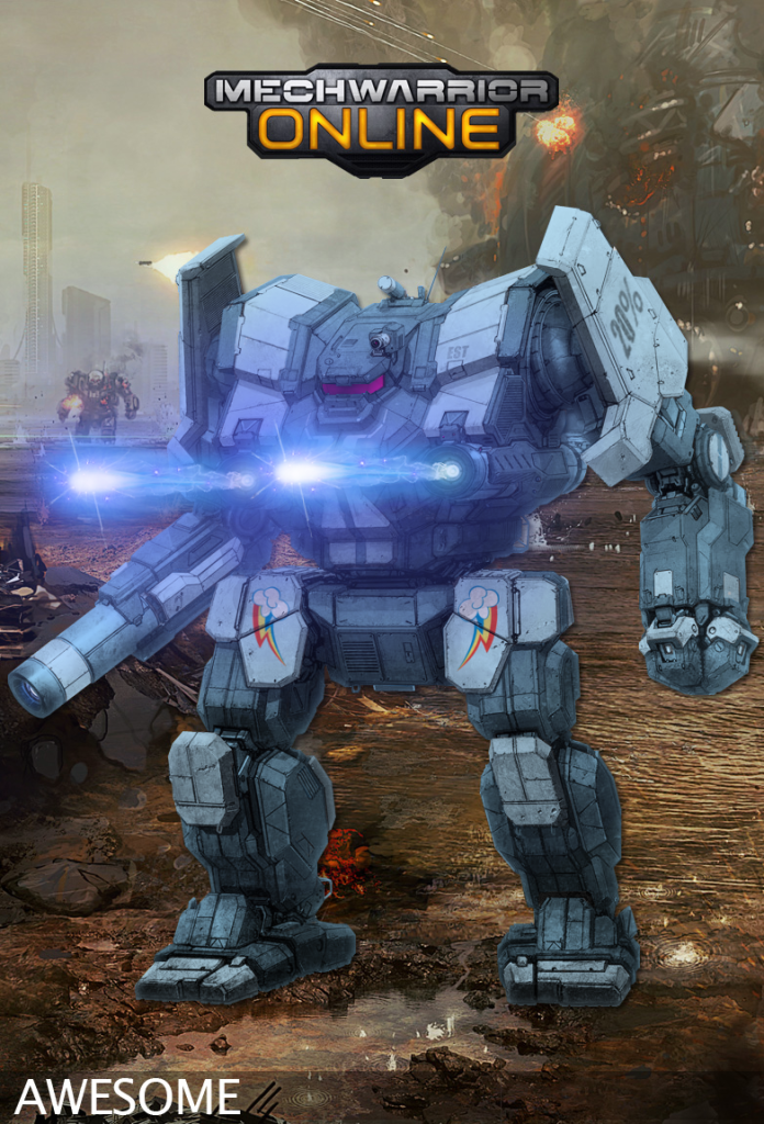
20% more Awesome! You can thank Grimm for this one, it was he who sparked the interest. ;)
Posted Image

#1536 Chuckie

    Member

  • PipPipPipPipPipPipPipPip
  • FP Veteran - Beta 1
  • FP Veteran - Beta 1
  • 1,739 posts
  • LocationHell if I don't change my ways

Posted 31 March 2012 - 07:28 AM

View Postmaxoconnor, on 30 March 2012 - 11:59 AM, said:

Here you go Chuckie, don't say I never did anything nice for you. ;)

Sorry for the grungy look but its how the filter went on. I think it looks pretty cool myself. I put your Knights of NI badge on the left shoulder, your personal logo on the right torso, the NWH Regimental logo on the left per cannon specs. I also put your personal tartan on the right leg per cannon specs. I hope you like it. Let me know if you need anything changed.
Posted Image


Looks great.. !

Only one thing with the camo pattern being expanded so large, the green / blue seems a bit overpowering.. Was thinking a more Black/Grey Camo like the GDL but with a tighter Camo pattern.. I think the only real change would be to grayscale the camo pattern.

Also could you swap the head (and make it larger) on the shoudler and the insignia on the chest..

BTW love the 9Q arm on it..

Edited by Chuckie, 31 March 2012 - 07:31 AM.


#1537 Tanki

    Member

  • PipPipPipPipPipPip
  • 276 posts

Posted 31 March 2012 - 07:41 AM

View PostOhGilPin, on 31 March 2012 - 07:18 AM, said:

Ok this ended up taking a while; probably took the long route by doing a shed load of masks and all that, did not know what to use as background so just chucked in a Piranha Games logo sadly I could not find a hi-rez one, I may put together some more images with this re-paint, I just need a little break.

Posted Image


I'm very intreseted in what method you used to deform the stripes to match the contour of the mech.

#1538 Tanki

    Member

  • PipPipPipPipPipPip
  • 276 posts

Posted 31 March 2012 - 08:31 AM

View PostOhGilPin, on 31 March 2012 - 07:47 AM, said:


I did it by hand using masks and making sure they bent at the angle of the Mech, so it took me a long time I started this on wednesday and slowly chipped away at it since then.

Ah, the long and hard way that *cringes* takes for ever but produces the best results. Good work there man you deserve some props.

#1539 Jack Gallows

    Member

  • PipPipPipPipPipPipPipPip
  • Legendary Founder
  • Legendary Founder
  • 1,824 posts

Posted 31 March 2012 - 08:45 AM

View PostOhGilPin, on 31 March 2012 - 07:18 AM, said:

Ok this ended up taking a while; probably took the long route by doing a shed load of masks and all that, did not know what to use as background so just chucked in a Piranha Games logo sadly I could not find a hi-rez one, I may put together some more images with this re-paint, I just need a little break.

Posted Image


Kosh, the Vorlon from Babylon 5 is an Awesome now?

Great repaint!

#1540 Leitwolf

    Member

  • PipPipPip
  • 86 posts
  • LocationGemmrigheim / Germany

Posted 31 March 2012 - 09:35 AM

Posted Image

This is my first Igels-try ;)


7 user(s) are reading this topic

0 members, 7 guests, 0 anonymous users