

 maxoconnor, on 11 April 2012 - 07:52 AM, said:
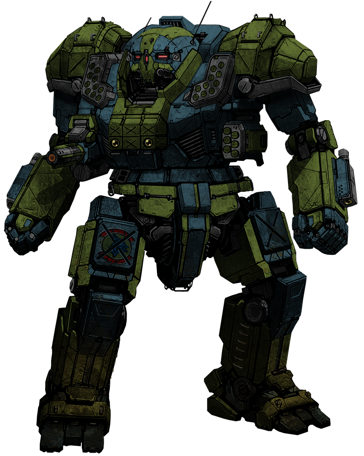
I made a new wallpaper based on Ironhawk's atlas.
http://mwomercs.com/...post__p__172269
I've made a few changes and added my own markings and placed it on a suitable background.
I'd like to add some caption to it but I'm not sure what to put.
Thoughts?

http://mwomercs.com/...post__p__172269
I've made a few changes and added my own markings and placed it on a suitable background.
I'd like to add some caption to it but I'm not sure what to put.
Thoughts?
Couple things I noticed with this, the lighting should be coming from behind the 'Mech given that's where the sun is, but its up off the left shoulder and the 'Mech is much "crisper" than the background. Also the whole floating feet people mentioned earlier.
I've only used GIMP a little bit and no photo shop, but I know that in GIMP you can add lighting lighting sources and adjust where they're coming from. I don't remember if you can do it for just a single layer or not, but you might try that to make the light come from more behind the Atlas. Second I'd suggest running a blur or gaussian blur over the 'Mech to slightly break up the well defined edges and make it a little softer/fuzzier to match the background.
As for the floating effect I think you mentioned something about adding more fog around the feet. Don't remember seeing it so not sure how that turned out. My suggestion for those is to make the fog right at the edges of the feet so thick you can't see them. That way there's no way to see where the feet actually "touch" the ground.
Anyway hope that helps and kudos to all the talented artists who make and repaint these great machines.


