Jump to content

Repainted Concept Art

Art

7732 replies to this topic

#901 Ironhawk

    Member

  • PipPipPipPipPipPipPipPip
  • Ace Of Spades
  • Ace Of Spades
  • 1,333 posts
  • LocationMontreal

Posted 06 February 2012 - 03:34 PM

View PostGarth Erlam, on 06 February 2012 - 03:12 PM, said:

Ironhawk, you are the man. That is the most awesome UrbanMech redesign. Well everyones were great, but I just wanted to '80's movie style' jump up with my fist in the air shouting 'Yeah!' when I saw the Any Given Gameday.

The man.


Urbie really showed that Atlas who's boss, now didn't he! Glad you liked it.

#902 Ironhawk

    Member

  • PipPipPipPipPipPipPipPip
  • Ace Of Spades
  • Ace Of Spades
  • 1,333 posts
  • LocationMontreal

Posted 06 February 2012 - 03:58 PM

View PostBullet Magnet, on 06 February 2012 - 03:20 PM, said:


I just noticed the Urbie has R2FU written on it.


Also note the Ultramarine shoulderpads and the fact that the Atlas has a Superman logo on his chest in reference to Brad Bird's Iron Giant...

#903 GrimJim

    Member

  • PipPipPipPipPipPip
  • 293 posts
  • LocationPottery Barn, $120 richer than my fellow Founders

Posted 06 February 2012 - 04:25 PM

View PostJack Gallows, on 04 February 2012 - 11:21 AM, said:
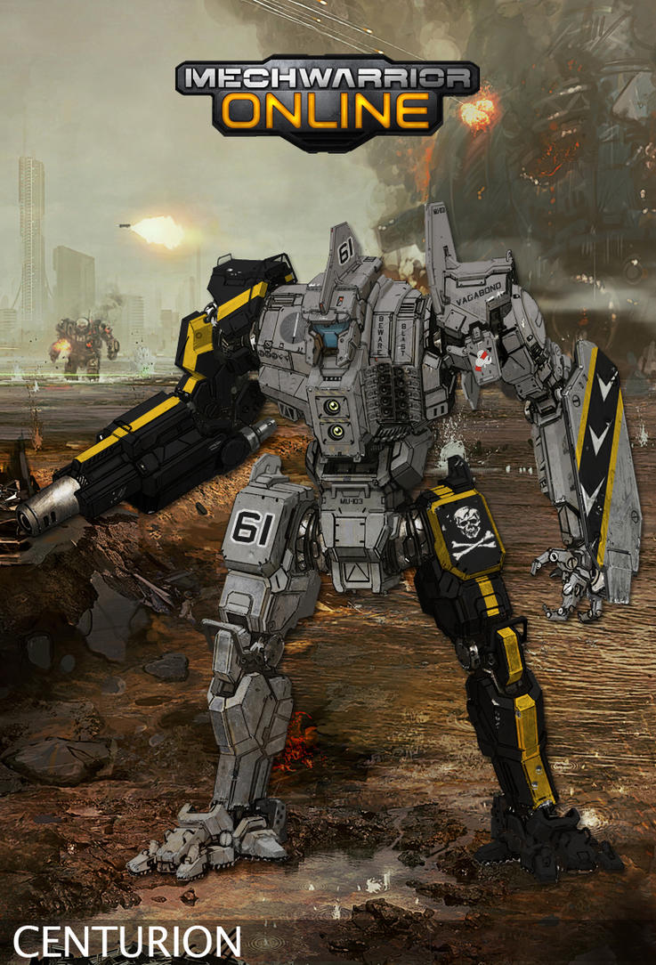
I'd like to thank Hayden for the amazing paint schemes (page 37, halfway down!) that he's done for my new personal unit. I only asked for an Atlas or a Centurion, and I got damn near an entire Regiments worth of art!

Each one is truely amazing, and it was a real joy working with someone that has an appreciation of both Battletech and the source material I gave him.

Fear the bones!!!!

Posted Image


Don't know why, but this is one of my favs. Maybe b/c it's not a full body treatment or it gives some love to the VF-103, even down to the old school Sluggers sig on the RT. I half expect it to transform into a Super Hornet!

#904 Bullet Magnet

    Member

  • PipPipPipPipPipPip
  • Elite Founder
  • Elite Founder
  • 212 posts

Posted 06 February 2012 - 05:05 PM

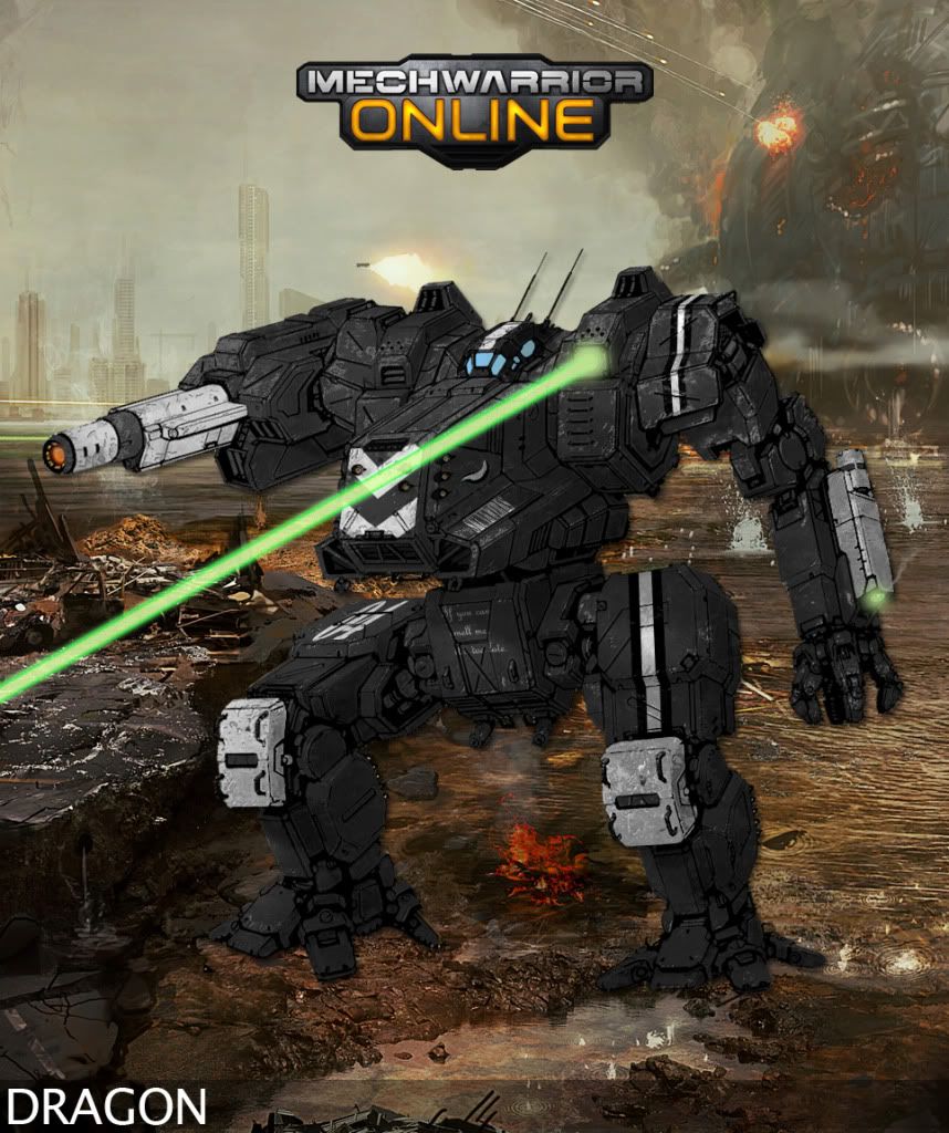
Here's my second, The name on the left torso reads "Skunkwerks," and below that it says "If you can smell me, it's too late."

Posted Image

#905 Larry Headrick

    Member

  • PipPipPipPipPipPip
  • 303 posts
  • Locationoklahoma

Posted 06 February 2012 - 05:42 PM

Link is now fixed.
This is the same link.
http://i1176.photobu...on20Concept.jpg

#906 Adridos

    Member

  • PipPipPipPipPipPipPipPipPipPipPip
  • Bridesmaid
  • 10,635 posts
  • LocationHiding in a cake, left in green city called New A... something.

Posted 06 February 2012 - 11:54 PM

You know there is a multi qoute option on the forums Garth, right? :D


Really nice repaints everyone, my internet doesn't work right now (postiong from school), so I can't comment on everything, but it's mostly awesome (not as awesome as The Awesome :D ). Ironhawk's Urbie is almost perfect, but I agree that his AC should be fixed and not on an arm. ;)

Repaints are good, I just still miss one of them on the new artwork of Dragon. Probably because everyone is too lazy to make a new template for it. :P

#907 Jack Gallows

    Member

  • PipPipPipPipPipPipPipPip
  • Legendary Founder
  • Legendary Founder
  • 1,824 posts

Posted 07 February 2012 - 05:43 AM

View PostAdridos, on 06 February 2012 - 11:54 PM, said:

Repaints are good, I just still miss one of them on the new artwork of Dragon. Probably because everyone is too lazy to make a new template for it. ;)


I think that one's quite a bit harder because of the colorization already on the machine, might take longer and be more difficult to alter without loosing some of the lines/seams on the actual 'mech.

Besides, I personally like the older Dragon concept art with the straight arm (though both are awesome.)

Edited by Jack Gallows, 07 February 2012 - 05:55 AM.


#908 Adridos

    Member

  • PipPipPipPipPipPipPipPipPipPipPip
  • Bridesmaid
  • 10,635 posts
  • LocationHiding in a cake, left in green city called New A... something.

Posted 07 February 2012 - 07:49 AM

View PostJack Gallows, on 07 February 2012 - 05:43 AM, said:

Besides, I personally like the older Dragon concept art with the straight arm (though both are awesome.)


Diversity is the spice of life. ;)


P.S. Yeah, internet back online. :D

#909 Darrin Thomason

    Member

  • PipPipPip
  • 98 posts
  • LocationBuckingham, UK

Posted 07 February 2012 - 11:14 AM

Sorry having massive problems with GIMP, I open up the templatesand the Colour here layer is on top, however, I can't see anything bar the beige colour of the entire layer (I can't see where to stay within the lines or even where the lines are). I have found where to send the layer to the back, however, it does not show up any of the alterations. If someone can help could you please pm me (rather than take up space on the thread) and I will replace this post with some new repaints.

#910 Threat Doc

    Member

  • PipPipPipPipPipPipPipPipPip
  • The Bowman
  • The Bowman
  • 3,715 posts
  • LocationO'Shaughnnessy MMW Base, Devon Continent, Rochester, FedCom

Posted 07 February 2012 - 12:32 PM

No no no... please post that here... take up valuable space, because I know for a fact I'm having the very same problem and have yet to figure it out.

#911 Darrin Thomason

    Member

  • PipPipPip
  • 98 posts
  • LocationBuckingham, UK

Posted 07 February 2012 - 12:44 PM

Well I think (Hope and pray) I have found the solution. I don't think the Colour here layer works in GIMP (lol) - I have only tried this in the Jenner template.

Step one - go to the toolbox, there is a drop down menu where it says paintbrush click then click add tab, click layers.
This should give you a layers tab within the tool box - Click on it.

Step two - Then click "Color Here" layer in the layer toolbox - this makes the picture totally beige. In the work window (don't know what the real name is) there is a menu bar at the top, click Layer, go to stack, click Layer to bottom

Step three - Click the layer "white mutli" in the layer toolbox and then you should be able to colour in this layer (careful of the edges though, it doesn't stop you from going over the edge as it does in photoshop)

I hope this helps (and works) I am just about to try and go in detail. Will post the result.

EDIT: If you want to add an insignia you need to do so in the White multi layer otherwise it won't blend in.

Edited by Darrin Thomason, 08 February 2012 - 01:34 AM.


#912 Darrin Thomason

    Member

  • PipPipPip
  • 98 posts
  • LocationBuckingham, UK

Posted 07 February 2012 - 01:25 PM

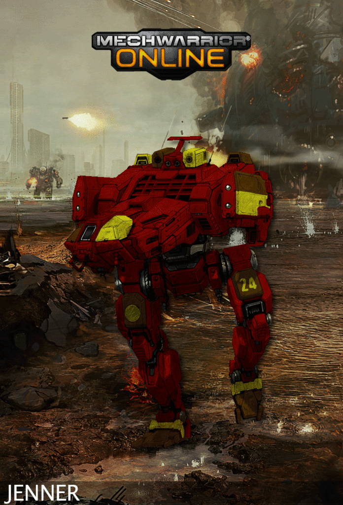
This is a repaint of the first mech repaint that I undertook, this repaint in GIMP Posted Image

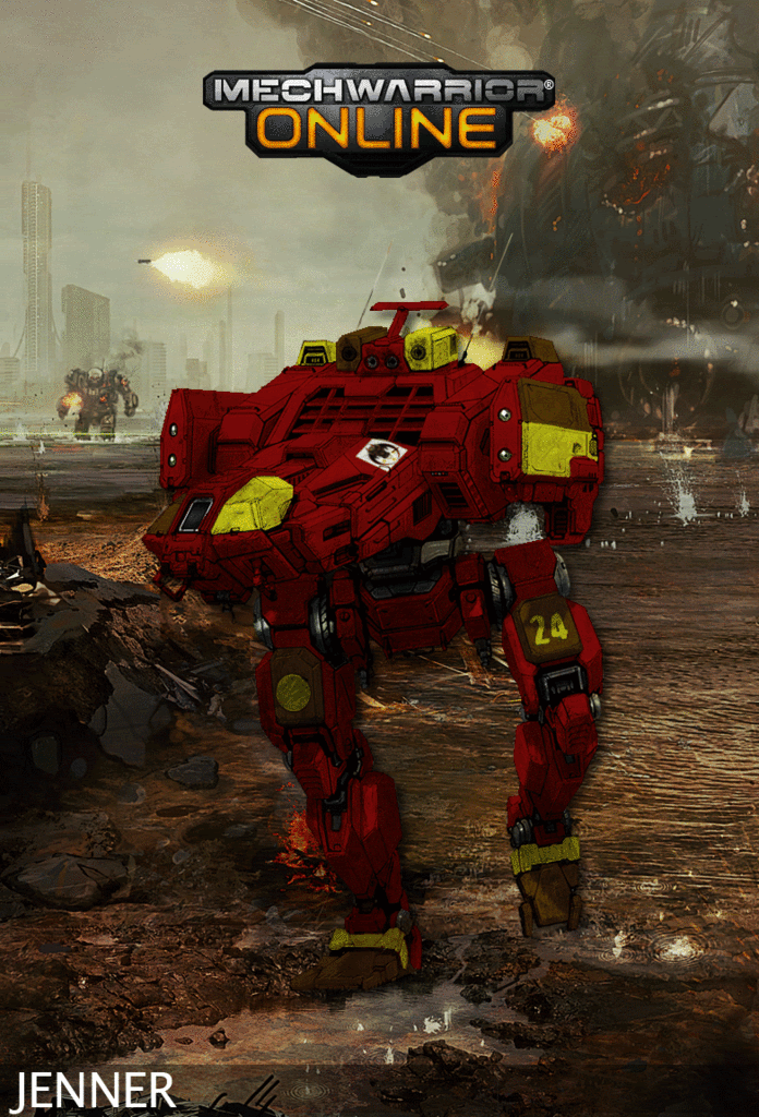
Woke up this morning and found a couple of things wrong with the repaint above so corrected them, also added the TC logo.
Posted Image

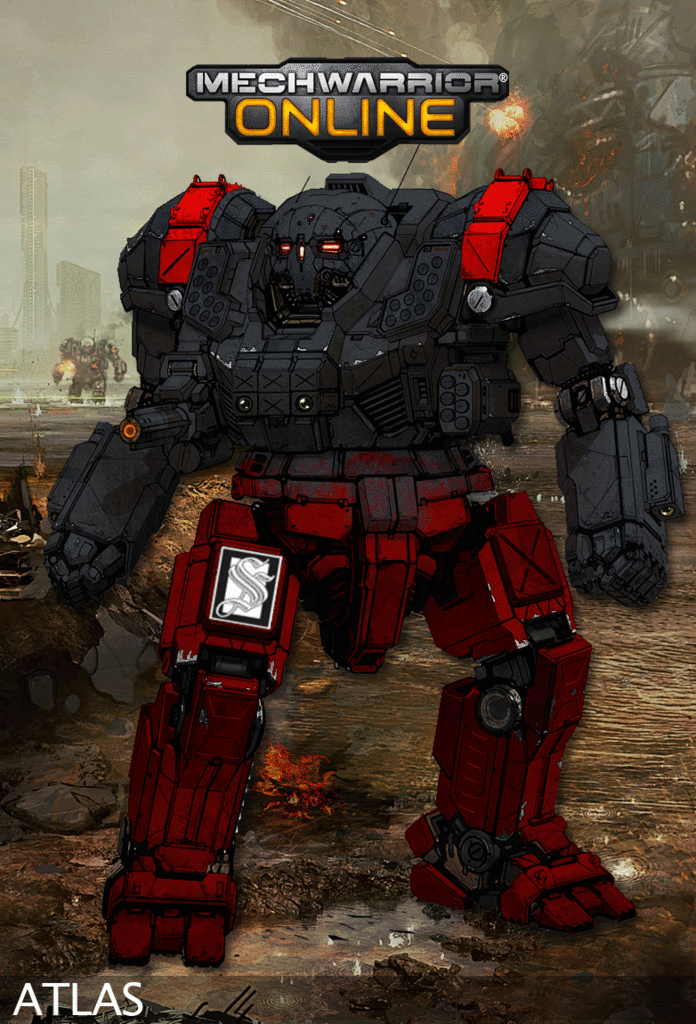
2nd Stewart Dragoons Atlas - the fade in from grey to red did not go as well as I hoped. Not sure how I can solve it as I am having teh same problems in GIMP with the gradient :)
Posted Image

Edited by Darrin Thomason, 08 February 2012 - 12:01 PM.


#913 Mautty the Bobcat

    Member

  • PipPipPipPipPipPip
  • 230 posts

Posted 09 February 2012 - 01:45 AM

I will love you forever and praise you as a god if you wanted to take this emblem and work it into a scheme inclusion, that would be awesome.

Posted Image

Choose your colors, design, etc. Preferably on the Catapult would be awesome, if not then choose a different one. The name currently is The Hunting Pack (best I could come up with relating to a wolf emblem ;>.> If you can think of a better one, let me know...)

Bonus : If you were able to make a 1st and 2nd company scheme that would be even more epic, but obviously you don't have to if you don't want. =D

Edited by Mautty the Bobcat, 09 February 2012 - 01:53 AM.


#914 Stone Profit

    Member

  • PipPipPipPipPipPipPipPip
  • Leftenant Colonel
  • Leftenant Colonel
  • 1,376 posts
  • LocationHouston, TX

Posted 09 February 2012 - 08:26 AM

View PostBrakkyn, on 29 January 2012 - 08:28 AM, said:

I hope he redesigned that because he wanted to, and not because of some public outcry. The previous one was fine.


I think the two versions represent a dragon for the first one, and a grand dragon (with a ppc instead of the AC/5) for the second one. the original dragon artwork from tro 3025 had no elbow joint on the right arm, and that was recorded as having an AC/5. So we may have different limbs for different variants, which would make me a very happy panda. of course, if FD would like to comment... XD
But just let me say, while not what I would have done with some of the mechs, and not being "perfect" to me, I am absolutely thrilled with ALL of the new designs by Alex (FD). So, to Alex and all the devs, community mods and everyone else involved, THANK YOU FROM THE BOTTOM OF MY HEART!

#915 Dihm

    Member

  • PipPipPipPipPipPipPipPipPip
  • 3,312 posts
  • Google+: Link
  • LocationPlanet Trondheim

Posted 09 February 2012 - 08:38 AM

View PostStone Profit, on 09 February 2012 - 08:26 AM, said:


I think the two versions represent a dragon for the first one, and a grand dragon (with a ppc instead of the AC/5) for the second one. the original dragon artwork from tro 3025 had no elbow joint on the right arm, and that was recorded as having an AC/5. So we may have different limbs for different variants, which would make me a very happy panda. of course, if FD would like to comment... XD

There aren't two versions any more, they replaced the old art with the new in the Media page instead of adding it in as a seperate concept piece. :o

#916 Darrin Thomason

    Member

  • PipPipPip
  • 98 posts
  • LocationBuckingham, UK

Posted 09 February 2012 - 12:17 PM

View PostMautty the Bobcat, on 09 February 2012 - 01:45 AM, said:
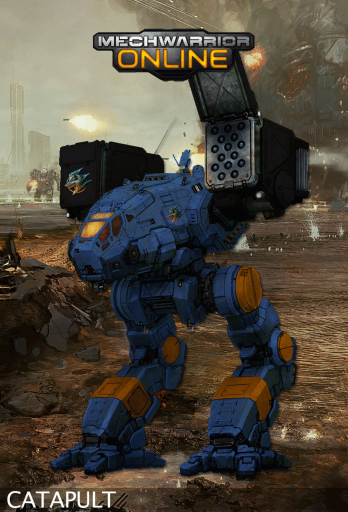
I will love you forever and praise you as a god if you wanted to take this emblem and work it into a scheme inclusion, that would be awesome.


Choose your colors, design, etc. Preferably on the Catapult would be awesome, if not then choose a different one. The name currently is The Hunting Pack (best I could come up with relating to a wolf emblem ;>.> If you can think of a better one, let me know...)

Bonus : If you were able to make a 1st and 2nd company scheme that would be even more epic, but obviously you don't have to if you don't want. =D


Hey I had a crack, see if you like it.

I saw you were in a Clan Cayote group so I pulled the blue and black/grey scheme from the Delta galaxy as inspiration. I added the orange from the bottom of the emblem.
Posted Image

I will have a go at another scheme tomorrow if you would like.

#917 Mautty the Bobcat

    Member

  • PipPipPipPipPipPip
  • 230 posts

Posted 09 February 2012 - 02:51 PM

That is beautiful T_T If I ever start playing TT, that will be my custom scheme...

Anyways, CC on it...I really can only find one single thing to poke at, the emblem on the close missile pod seems to 'stand out'. My only suggestions would be to make it ever so slightly transparent and see if it blends better, attempt to skew it to the left, or even both. I would recommend testing a skew to angle it with the missile pod first, that seems to be the most prevalent thing to me as I just looked at it again and it looks sort of flat compared to the missile pod's angle.

Also, if you wanted to spice up the Catapult any way, stripes, designs, etc. I would say go for it. I'm interested in what sort of things you could come up with to really turn it into a custom paint scheme. Just if you want to of course, I love it as is already. xD

Edited by Mautty the Bobcat, 09 February 2012 - 02:58 PM.


#918 Felix Dante

    Member

  • PipPipPipPipPipPip
  • Knight Errant
  • Knight Errant
  • 400 posts
  • LocationDallas, TX

Posted 09 February 2012 - 03:14 PM

View PostDarrin Thomason, on 09 February 2012 - 12:17 PM, said:

I will have a go at another scheme tomorrow if you would like.


I was hoping someone would do a Gray Death Legion varient Catapult... :rolleyes:
I saw the Atlas done up and started hoping! :o

#919 Ironhawk

    Member

  • PipPipPipPipPipPipPipPip
  • Ace Of Spades
  • Ace Of Spades
  • 1,333 posts
  • LocationMontreal

Posted 09 February 2012 - 03:18 PM

View PostFelix Dante, on 09 February 2012 - 03:14 PM, said:


I was hoping someone would do a Gray Death Legion varient Catapult... :D
I saw the Atlas done up and started hoping! :rolleyes:


Well... that can be arranged. :o

#920 Conjure

    Member

  • PipPipPipPipPip
  • Star Colonel
  • Star Colonel
  • 149 posts

Posted 09 February 2012 - 03:28 PM

If you are looking for another scheme I would love to see Grim Determinations!

VVVVVV

http://www.camospecs...ure.asp?ID=1913


3 user(s) are reading this topic

0 members, 3 guests, 0 anonymous users