Jump to content

Repainted Concept Art

Art

7732 replies to this topic

#821 Darrin Thomason

    Member

  • PipPipPip
  • 98 posts
  • LocationBuckingham, UK

Posted 03 February 2012 - 01:50 PM

I finished my first batch of 10 (on page 41) so here are my next contributions
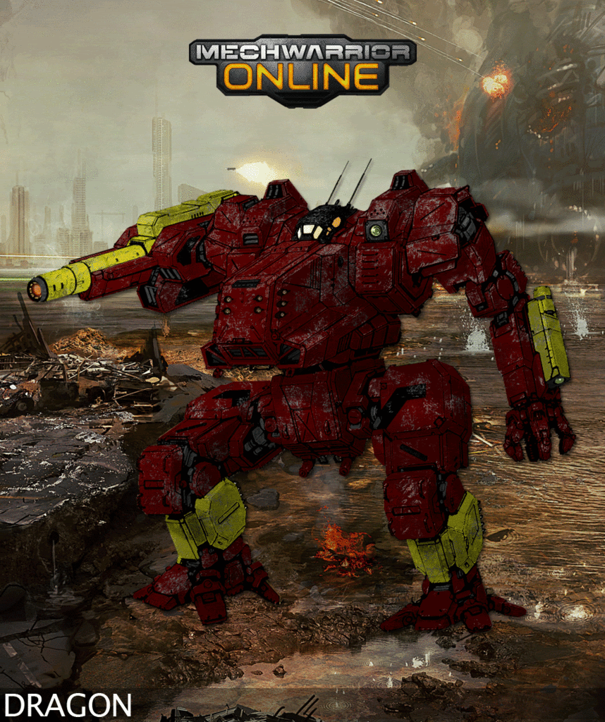
First up is a Red Lancers Dragon, it has taken a few extra LBX hits
Posted Image

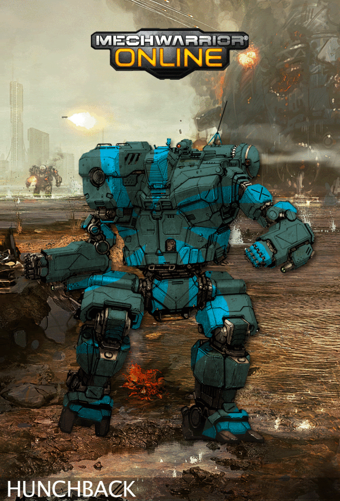
Then I had a go at doing some mouse painting to ry and get a sprial shape on the 3rd Alliance Airwing mech
Posted Image

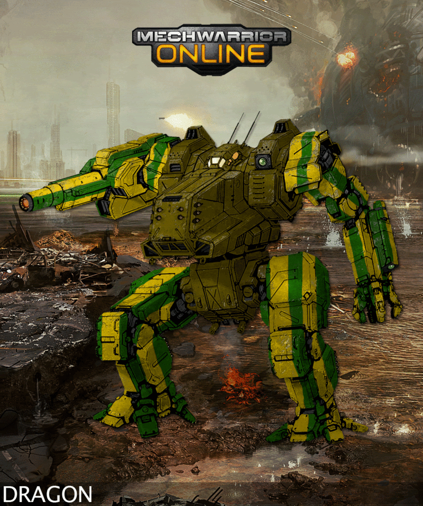
Castilian Brigade Dragon next with its rather garish paint scheme
Posted Image
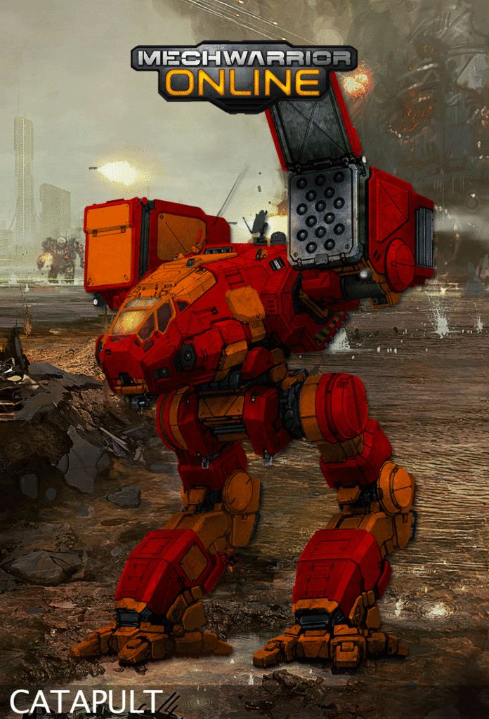
1st Canopian Fusiliers next this is based on deathstriker's Wolf Dragoon's Catapult and is not done in much detial, however, I think I may come back to this. I think I have also learnt a lot more looking in depth at Hayden's, deathstriker's & Ironhawk's catapult designs and am looking to produce better than this tomorrow.
Posted Image

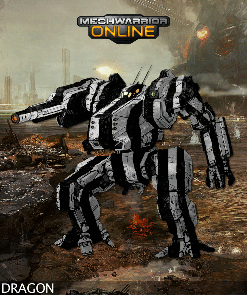
One Zebra/American Football Ref mech

Posted Image

Next one is quite basic, it is and Avanti's Angels Jenner, however, I was playing about with other layers and what else I could look to do, so it has a proper logo (Yeah! :D ) it also has a gold simily face on its left leg.
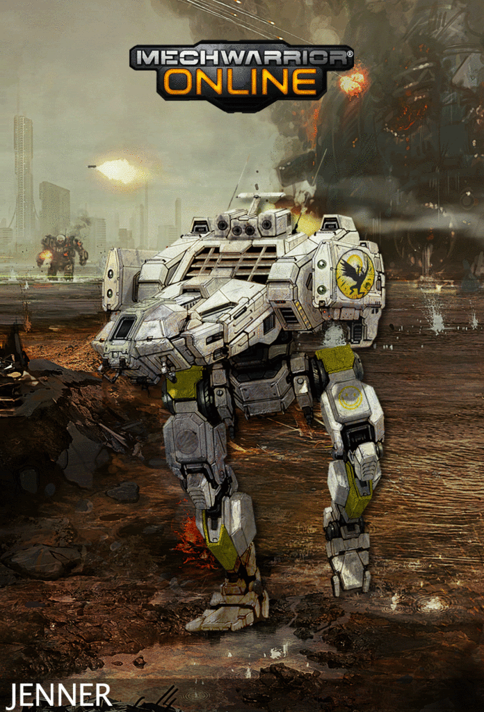
Posted Image

I love the Atlas redesign, it is so versertile I feel.
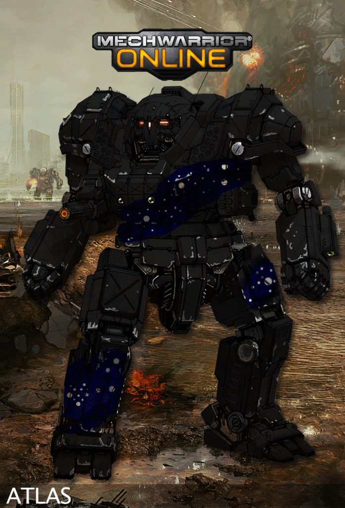
Anyhoo I feel that the following Atlas from the Otomo it the best I have done so far, it is no where as cool as this however, I like that the colours match MWO. Also the left arm on this Atlas had a problem which ment that the pilot could not use the hand effectivly, so the Dracs techs replaced the forearm, but kept the laser.
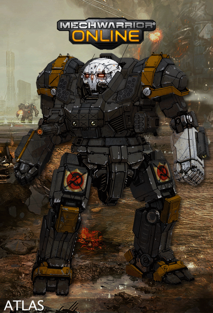
Posted Image

Lexington Combat Group were a band of Mercs dating from the SLDF, this pilot is a Steiner in the 32nd Recon
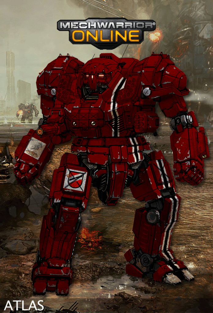
Posted Image

Periphery Star Guard Atlas
Posted Image

Edited by Darrin Thomason, 04 February 2012 - 05:01 AM.


#822 Ironhawk

    Member

  • PipPipPipPipPipPipPipPip
  • Ace Of Spades
  • Ace Of Spades
  • 1,333 posts
  • LocationMontreal

Posted 03 February 2012 - 04:18 PM

Nice job, Darrin. Love the Cat!

#823 Hayden

    Member

  • PipPipPipPipPipPipPipPip
  • Little Helper
  • Little Helper
  • 1,997 posts

Posted 03 February 2012 - 04:20 PM

I think the castilian brigade is my favorite of this recent bunch.

#824 Threat Doc

    Member

  • PipPipPipPipPipPipPipPipPip
  • The Bowman
  • The Bowman
  • 3,715 posts
  • LocationO'Shaughnnessy MMW Base, Devon Continent, Rochester, FedCom

Posted 03 February 2012 - 05:17 PM

Holy Mary!!!! I don't know how you guys do this. I've been trying to use GIMP, and it's impossible for me. There are so damn many tools and I just can NOT find what I'm looking for in any of that garbage. If that was my realm and I knew what half the terms meant, perhaps I could do it. All I want to do is import my frickin' graphic as a pattern so that I can apply it, because the fill tool only works with patterns... I'm not going to explain this, I don't want any further help, I'll just sit back helplessly and hope to God PGI develops a tool where I can use a bitmap, JPEG, GIF, or PNG! Just give me a maximum size and I'll build it... this layers stuff is for you guys that are a whole lot more genius than me.

#825 Waylandx

    Member

  • PipPipPipPipPipPip
  • Survivor
  • 273 posts
  • LocationAt the computer!

Posted 03 February 2012 - 06:02 PM

Zebra style next!

#826 Ironhawk

    Member

  • PipPipPipPipPipPipPipPip
  • Ace Of Spades
  • Ace Of Spades
  • 1,333 posts
  • LocationMontreal

Posted 04 February 2012 - 06:54 AM

View PostDarrin Thomason, on 03 February 2012 - 01:50 PM, said:

I finished my first batch of 10 (on page 41) so here are my next contributions

I love the Atlas redesign, it is so versertile I feel.
Anyhoo I feel that the following Atlas from the Otomo it the best I have done so far, it is no where as cool as this however, I like that the colours match MWO. Also the left arm on this Atlas had a problem which ment that the pilot could not use the hand effectivly, so the Dracs techs replaced the forearm, but kept the laser.
Posted Image


It's cool to see your craft improve before our eyes. I like the thought process you provide for each one you submit as it really allows us to understand your evolution, almost step by step. Nice touch on the Jenner.

One quick piece of advice on the 'blacks' that I found when making Death Commandos'. If you want to go for miniature like realism and preserve the richness of FD's designs, you'll notice that lack is never fully black on a 3D volume as light reflects on its surfaces. Playing with variants of dark gray while preserving the same tint will allow you to represent that black feel while really giving the model thatrealistic feel.

At the point you're at I think you ought to start playing with metal finish! The trick is to use gradients with multiple grade points to give it realistic reflection and depth. Start with a semi dark tint for the color you want to emulate (warm brown for copper, somewhat dark tan for gold, etc.) then insert a darker tint at about 40% to middle point in the gradient to represent the horizon. At about 60%, so not so far to that middle point, you'd want to add a lighter, brighter tint that will really provide this gleaming metal feel. Then it's back on to the semi-dark one so that you give it depth again... That's pretty much the base for the sauce so to speak. So have fun tweaking those metal gradients and I can't wait to see that Atlas again with those copper accents!

#827 Darrin Thomason

    Member

  • PipPipPip
  • 98 posts
  • LocationBuckingham, UK

Posted 04 February 2012 - 07:09 AM

Thank you for the advice Ironhawk, I love the AH Catapult.
I am working on a Atlas on the same style as the catapult that you liked.
I have been messing about with gradients (but with not having a clue what to do. After this atlas I will attempt a mech using the advice you have given. I hope to have the two up in the next 6 hours.

#828 Darrin Thomason

    Member

  • PipPipPip
  • 98 posts
  • LocationBuckingham, UK

Posted 04 February 2012 - 10:11 AM

Next batch

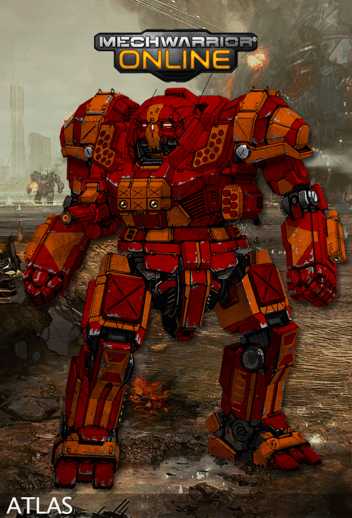
First up is the 1st Canopian Fusiliers Atlas, I really liked the catapult so fanicied doing it on another mech (and I have been having a bit of an Atlas day) so the Atlas was chosen. Also I looked back through the work in the thread and there did not appear to be a proper 2 colour Atlas about (please post if I am wrong as I would like to take a look). I ummmed and ahhhed a lot over which panelling to do each colour and eventually settled on what is before you. Oh I did not put the logos on as I could only pull them off of Sarna and they weren't transparent.

Posted Image

Now to mess about with metals :o

EDIT: Graident has been a massive.....fail :unsure: I can't get it to grade the specific sections it does the entire design.
I am going to have my tea and then go through the video tutorials for Photoshop elements :blink:
:blush: after having read the tutorials (videos were useless) it appears that I have to do the gradients on a differnt layer and then brush out all the areas where I don't want the gradient to take effect. Phew this might be hard work.

Had massive problems last night with gradients so have given up (for the time being)

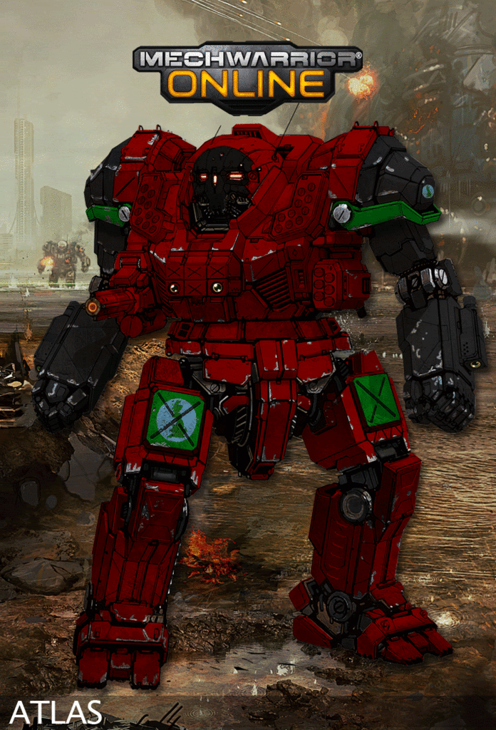
Being a Brit when I saw this logo I thought I should probably make a 4th Skye Rangers mech re-paint
I tried to model it on this, however, I fear that 1) I am focusing too much on the Atlas 2) I seem to fixate on changing the colour of the shoulders, anyway, next mech won't be an Atlas :unsure:

Posted Image

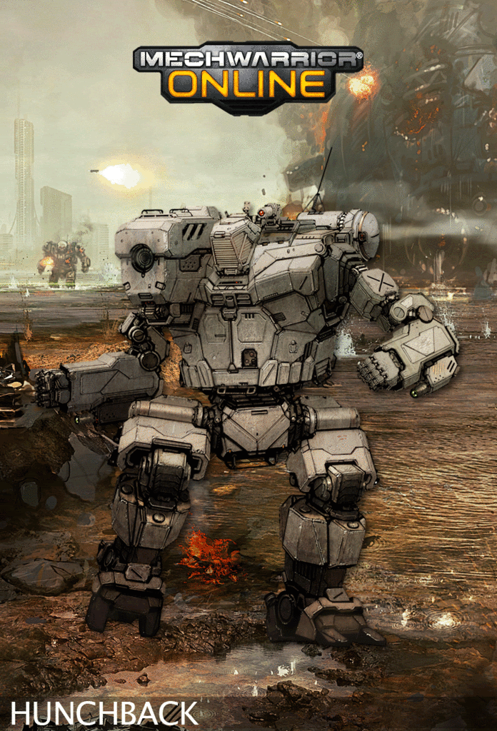
EDIT: I am writing this before I actually do my next mech. I really liked the Wolf Dragoons mechs, there was a lot of work went into varis bits by deathstalker to do all the metal bits that at first glance you don't see or realise that they have been added by the repaint artist. Therefore I wanted to do a mech that was pretty much metallic. Due to my problems with the gradients (see above) I have decided not to wait. As a result what I am doing next is a Hunchback hot off the production line of the Kali Yama Industries Factory on Kalidasa. It was committed into the fight by the 2nd Silver Hawk Irregulars (Gryphons), before they could paint the mech in their own scheme, to repulse back the Lyran raid. After all that writing I hope it lives up to its hype.

EDIT: I like it, two slight problems with it that I could not solve, there is strips (in its orginal tan) on its left shuolder and left forearm and you can just about see the orginal Davion sunburst on its right leg. But all in all I think it looks cool. I tried to do the legs darkest and try to aim to get lighter at its head but also in the centre of its chest. Like I say I think on the whole it has come out ok.
Posted Image

Edited by Darrin Thomason, 05 February 2012 - 05:05 AM.


#829 Jack Gallows

    Member

  • PipPipPipPipPipPipPipPip
  • Legendary Founder
  • Legendary Founder
  • 1,824 posts

Posted 04 February 2012 - 11:21 AM

I'd like to thank Hayden for the amazing paint schemes (page 37, halfway down!) that he's done for my new personal unit. I only asked for an Atlas or a Centurion, and I got damn near an entire Regiments worth of art!

Each one is truely amazing, and it was a real joy working with someone that has an appreciation of both Battletech and the source material I gave him.

Fear the bones!!!!

Posted Image

#830 Sesambrot

    Member

  • PipPipPipPipPipPipPip
  • Bridesmaid
  • 862 posts
  • LocationGermany

Posted 04 February 2012 - 03:59 PM

Words fail to describe how awesome this topic is! :)

However, I have a challange for anyone willing to take it.
Someone in here capable of turning one of these mechs into a "Bloody GIR"?
Posted Image
or at least use it as a baseline for a paintjob...
If I'm lucky there are some Invader Zim fans among you :(

#831 Ironhawk

    Member

  • PipPipPipPipPipPipPipPip
  • Ace Of Spades
  • Ace Of Spades
  • 1,333 posts
  • LocationMontreal

Posted 04 February 2012 - 04:12 PM

View PostGarth Erlam, on 02 February 2012 - 09:43 AM, said:

If you guys want a REAL challenge, come up with an FD-style UrbanMech... taking out an Atlas with a critical hit (IE. similar to the Critical Hit card in the CCG. And yes I know it wasn't an Atlas there :))


Capital REAL challenge is correct. It is not easy. Based on one of your earlier posts, I figure the expectation is to have the UrbanMech 'wicked'... two words tough to put together (Urbie and wicked). Until the Urbie concept is finalized and pasted onto the CCG card style you are referring to, here is a work in progress view of some FD-style concept Urbie work... Hope the critiques and purists are not going to be too tough!

Posted Image

EDIT: Colored model with changed legs as per Sesambrot's constructive comments.
Posted Image

EDIT: Posting a ROUGH version of yet another alternative legs. This time closer to the original design while I hope it retains some of the Flyingdebris style. Obviously because this is rough, some of the shapes need to be defined further and the second leg is to be more detailed during finalization. Anyway, I'll be interested in the reader's (you) opinion before I push much further.
Posted Image

Edited by Ironhawk, 05 February 2012 - 06:22 PM.


#832 Sesambrot

    Member

  • PipPipPipPipPipPipPip
  • Bridesmaid
  • 862 posts
  • LocationGermany

Posted 04 February 2012 - 04:29 PM

quick response/feedback:
it looks awesome, but I think there are two things that could still be improved.
Torso and arms are about perfect, wouldn't know what to change about them, but the legs should be more beefy.
At the moment they don't have the same bulk as the torso which makes them look rather flimsy espeically compared to the torso. I see you took inspiration from Hunchback and Centurion for the legs, while the lower leg and feet fit the Urbie quite well, the upper leg doesn't seem to fit the design just as well, and is actually what makes them look comaratively fragile.
maybe even making them a tad longer would help, about as long as the torso is high (they seem slightly shorter atm)

The other thing I have a minor problem with, is the stance. It looks like it was running, but considering that this mechs topspeed is at 32kph it doesn't really make sense...

I know this sounds like a lot of critique, but I don't think it's all that much considering that the torso is pretty much perfect! :)

Edited by Sesambrot, 04 February 2012 - 04:31 PM.


#833 Ironhawk

    Member

  • PipPipPipPipPipPipPipPip
  • Ace Of Spades
  • Ace Of Spades
  • 1,333 posts
  • LocationMontreal

Posted 04 February 2012 - 04:40 PM

Actually this is great. Thanks Sesambrot. Your comment is very constructive and your rationale is good. I'll get working at those legs. As for the stance, I think I'm gonna have to position the legs differently to have it walk fast rather than run.

I know this small Mech is just supposed to go at 32kph as per BT specs, but it still makes no sense to me unless he's in a school zone. Can he get from 0 to 32 in like 2 seconds at least? :)

#834 Threat Doc

    Member

  • PipPipPipPipPipPipPipPipPip
  • The Bowman
  • The Bowman
  • 3,715 posts
  • LocationO'Shaughnnessy MMW Base, Devon Continent, Rochester, FedCom

Posted 04 February 2012 - 06:58 PM

I agree with Sesamebrot, Ironhawk... everything he said, I agree with, and that it's extremely cool. If I were to see this version of an Urbie in MWO, I don't think I would find it so easy to laugh.

#835 Hayden

    Member

  • PipPipPipPipPipPipPipPip
  • Little Helper
  • Little Helper
  • 1,997 posts

Posted 04 February 2012 - 07:22 PM

St. Ives Protest Artwork. The next 10 images are going to be about St. Ives units. Many of these will be conjectural paint schemes. This will also be my first attempt at depicting similar 'mechs in the same unit (normally I try not to do more than one 'mech type per unit).

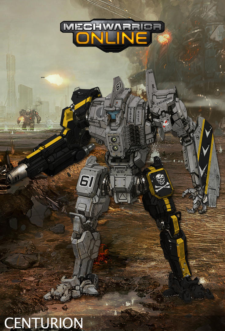
St. Ives Cheveau Legers Centurion. Totally guessing on the scheme, since this is a rather neglected unit. Though, it was deployed to the clan front and was later destroyed in the Capellan-St. Ives war. Paint Scheme is utterly conjectural. I will do a couple other conjectural schemes for this unit.
Posted Image

Aliesha's Mounted Fusiliers Catapult. This is meant to be a generic woodland-like scheme. Conjectural. Another obscure unit with a dearth of information.
Posted Image

Cheveau Legers conjectural parade scheme.
Posted Image

More to come! Thanks for watching.

ED: PS, my tablet suddenly works. So... maybe I can do some more exciting stuff?

Edited by Hayden, 11 February 2012 - 01:15 PM.


#836 Ironhawk

    Member

  • PipPipPipPipPipPipPipPip
  • Ace Of Spades
  • Ace Of Spades
  • 1,333 posts
  • LocationMontreal

Posted 04 February 2012 - 09:09 PM

View PostGarth Erlam, on 02 February 2012 - 09:43 AM, said:

If you guys want a REAL challenge, come up with an FD-style UrbanMech... taking out an Atlas with a critical hit (IE. similar to the Critical Hit card in the CCG. And yes I know it wasn't an Atlas there :))


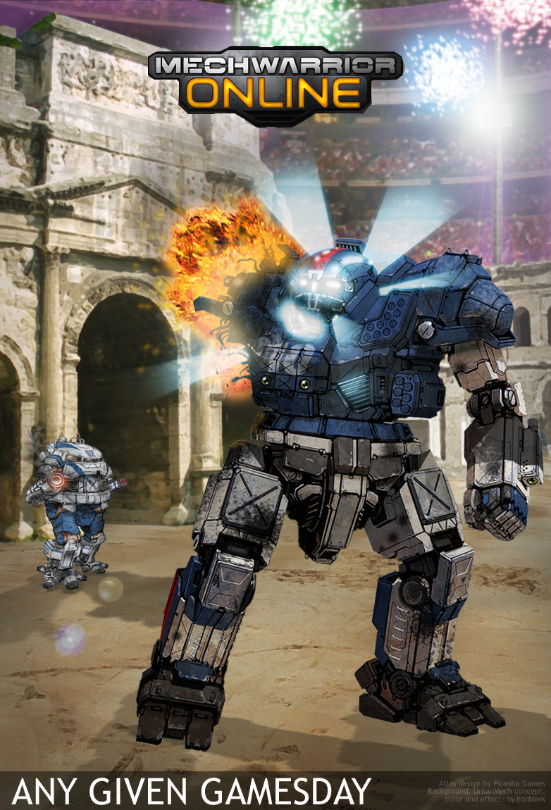
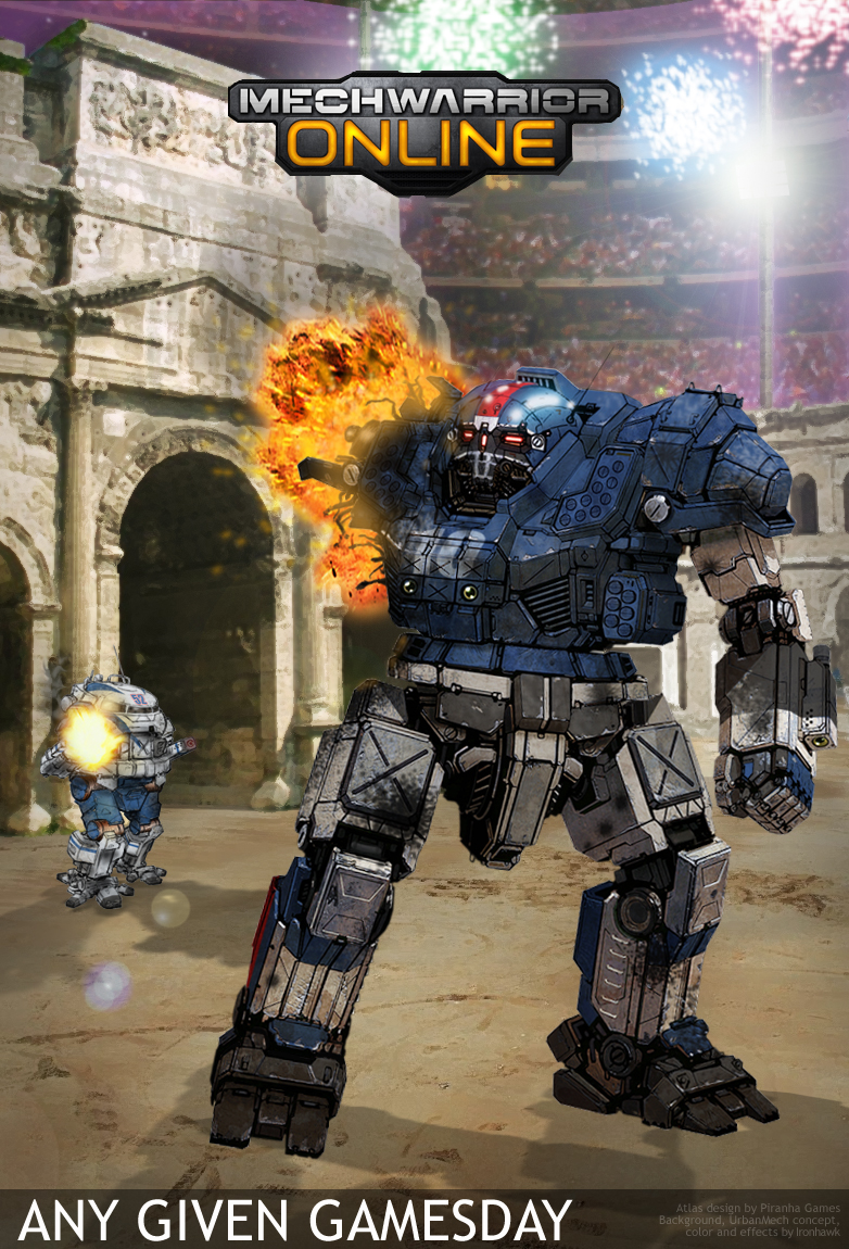
OK Garth, here goes. Response with a Superbowl special in Solaris VII. I tried to capture FD's style not only in the Urbie but also in the fact that poor Atlas has got his arm ripped off... Versus your CCG card reference, the action here would take place a second or two later I guess... But I wanted to see the initiation of the core's chain reaction.

To all football fans, enjoy the game!

Posted Image

EDIT: Adding what would be the view of the hit just a second earlier (AC detonates, no core reaction).

Posted Image

Edited by Ironhawk, 04 February 2012 - 09:28 PM.


#837 Demi-Precentor Konev

    Member

  • PipPipPipPipPipPip
  • Knight Errant
  • Knight Errant
  • 386 posts
  • LocationDnepropetrovsk, Galedon Military District

Posted 04 February 2012 - 09:18 PM

Superb.

#838 Kaemon

    Member

  • PipPipPipPipPipPipPipPip
  • 1,924 posts
  • LocationMN

Posted 04 February 2012 - 09:34 PM

I have a challenge for the maestros in the thread (cause it's driving me crazy).

How about a HyperPulse News Squad? So the weapons change into cameras/microphones/etc?

After all, how can they interview us in the field where the action is, if they don't have the proper rides to do so?

#839 Hayden

    Member

  • PipPipPipPipPipPipPipPip
  • Little Helper
  • Little Helper
  • 1,997 posts

Posted 04 February 2012 - 10:29 PM

Ok, here's my Phase 1 of the "Flying Debrisian Style Urbanmech and Atlas Critical Destruction match up." Since this is in the style of flying debris, I wanted to start at what seemed to be the very beginning. A selection of concept pieces. So, I want the readers here to help me to decide which of these to "flesh out" into the next step (which is gonna be line art, followed by a final colored rendition of it giving the final blow to an Atlas). Anyway, let me know what's good :)

Posted Image

Thanks for looking!

#840 Darrin Thomason

    Member

  • PipPipPip
  • 98 posts
  • LocationBuckingham, UK

Posted 04 February 2012 - 10:58 PM

View PostIronhawk, on 04 February 2012 - 04:12 PM, said:


Capital REAL challenge is correct. It is not easy. Based on one of your earlier posts, I figure the expectation is to have the UrbanMech 'wicked'... two words tough to put together (Urbie and wicked). Until the Urbie concept is finalized and pasted onto the CCG card style you are referring to, here is a work in progress view of some FD-style concept Urbie work... Hope the critiques and purists are not going to be too tough!


Really great work there Ironhawk. I know that you have already done it and I think that the end product looks great.
This is not really a critique (firstly because I can't draw for toffee I don't feel that I should critique a far superior artist) but more of an observation and wondering what everyone else's feelings are on the subject.
The feet, every picture I could see of the urbie has a type of boot or sneeker not the 'toes' that FDhas so far done on all the mechs.
Like I say, just wondered what people's feelings were on it.


9 user(s) are reading this topic

0 members, 9 guests, 0 anonymous users