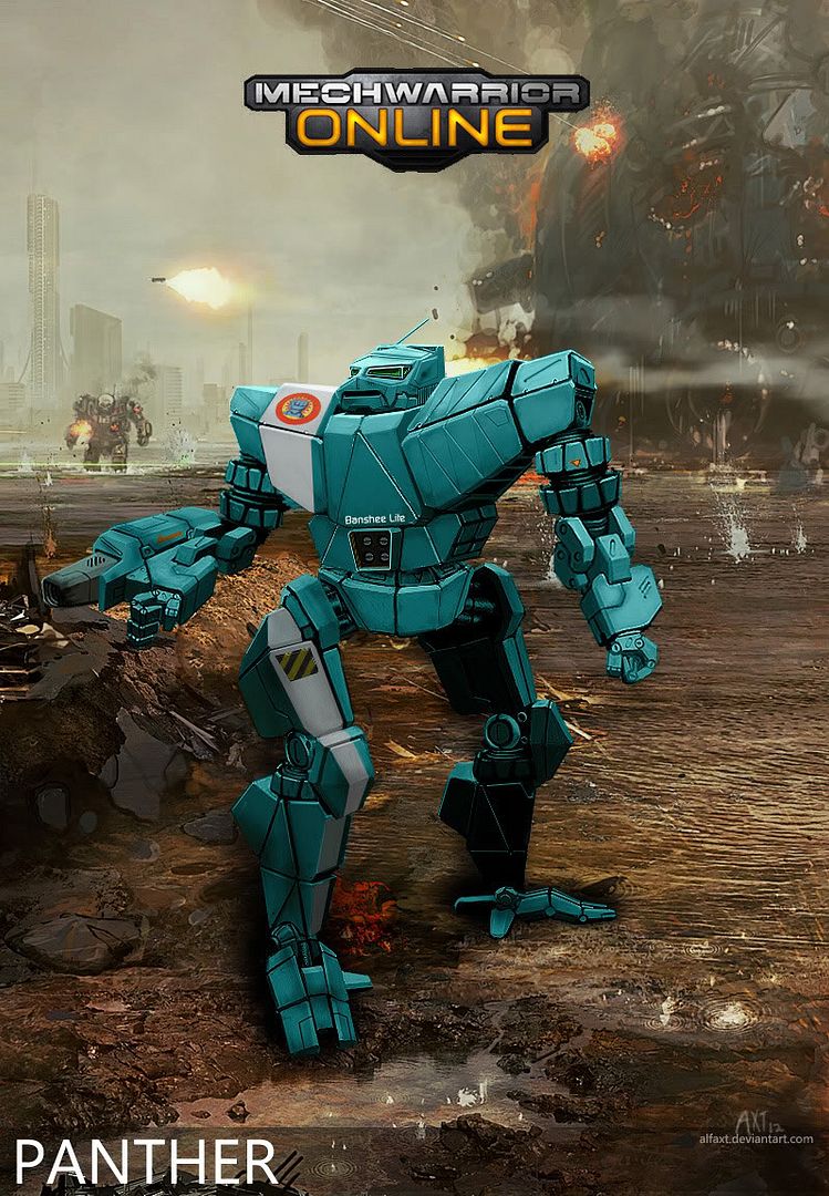
PNT-9K Panther fan concept
#81
Posted 12 February 2012 - 08:19 AM
#82
Posted 12 February 2012 - 08:23 AM
 Mautty the Bobcat, on 12 February 2012 - 02:54 AM, said:
He is not fan of it, either, but you have seen the response "It must have head! Missiles to the middle!". Not that I have anything against them. They are just Panther fans...
#83
Posted 13 February 2012 - 10:47 AM
 Adridos, on 11 February 2012 - 04:13 AM, said:
I don't know where you got that idea from, I already did the Dragon even. FRR has a ton of Kurita mechs, given where we came from. The Panther is one of our most prevalent light mechs.
As for the SRMs in the center torso... that's where they're located, so having them elsewhere is just weird.
#84
Posted 13 February 2012 - 11:57 AM
#85
Posted 13 February 2012 - 03:50 PM
 Dihm, on 13 February 2012 - 10:47 AM, said:
As for the SRMs in the center torso... that's where they're located, so having them elsewhere is just weird.
Its a redesign of the mech, having them somewhere else would be entirely legitimate. I don't think having the launcher in the center torso like that looks right to be honest in this redesign. It looked fine in the original art, but either the left or right torso would be a better place to put it in this one. I'd personally recommend the left (our right).
#86
Posted 14 February 2012 - 05:38 AM
#87
Posted 14 February 2012 - 09:56 AM

#88
Posted 14 February 2012 - 10:16 AM
I really like the PNT-9 Panther redesign made by "ethnic minority". It has much potential.
#89
Posted 14 February 2012 - 10:20 AM
RESPECT.
#90
Posted 13 March 2012 - 04:30 AM
#91
Posted 13 March 2012 - 10:56 AM

#92
Posted 13 March 2012 - 11:05 AM
#93
Posted 13 March 2012 - 02:30 PM
#94
Posted 13 March 2012 - 02:40 PM
 ethnic minority, on 08 February 2012 - 01:50 AM, said:
Enjoy!
VERSION 2:

Original Panthurrrdurr
My favorite design for a MWO-Panther!
#95
Posted 31 March 2012 - 12:26 AM
The windows are done in red, like the MWO concepts, but I haven't bothered to try to make them look like real glass yet. The "fangs" on the bottom-front of the cockpit are windows that will allow the Panther pilot to see his landing zone after a jump. Panthers were supposed to have highly advanced computers and communications, so I gave him a couple of big base-loaded antennas as well. The main window is protected by armored slats to keep anything but a direct frontal shot from hitting the windshield, like you see on some armored vehicles.
Let me know what you think I could do to improve it! I'm gonna start on the chest next but I'm still not satisfied with the head.
(Click through for 4-view)

#96
Posted 31 March 2012 - 01:10 AM
I mean if we only get the window view of the outside, without holographic imaging...
a Panther player wouldn't see much then huh?
I mean I even think the Atlas window of cockpit view is too big, compared to the measurement of the outside, compared to the hunchbakc size (in the gameplay vids)
Edited by Andar89, 31 March 2012 - 01:11 AM.
#97
Posted 31 March 2012 - 01:26 AM
#98
Posted 31 March 2012 - 12:04 PM
 Ivan Whackinov, on 31 March 2012 - 12:26 AM, said:
The windows are done in red, like the MWO concepts, but I haven't bothered to try to make them look like real glass yet. The "fangs" on the bottom-front of the cockpit are windows that will allow the Panther pilot to see his landing zone after a jump. Panthers were supposed to have highly advanced computers and communications, so I gave him a couple of big base-loaded antennas as well. The main window is protected by armored slats to keep anything but a direct frontal shot from hitting the windshield, like you see on some armored vehicles.
Let me know what you think I could do to improve it! I'm gonna start on the chest next but I'm still not satisfied with the head.
(Click through for 4-view)


 Andar89, on 31 March 2012 - 01:10 AM, said:
I mean if we only get the window view of the outside, without holographic imaging...
a Panther player wouldn't see much then huh?
I mean I even think the Atlas window of cockpit view is too big, compared to the measurement of the outside, compared to the hunchbakc size (in the gameplay vids)
Yeah, for the final revision I really didn't give much thought to scale :\
I was thinking more along the lines of tank viewing prisms or up-armoured hummer windows
OOPS
Edited by ethnic minority, 31 March 2012 - 12:19 PM.
#99
Posted 31 March 2012 - 04:11 PM
 Andar89, on 31 March 2012 - 01:10 AM, said:
I mean if we only get the window view of the outside, without holographic imaging...
a Panther player wouldn't see much then huh?
I mean I even think the Atlas window of cockpit view is too big, compared to the measurement of the outside, compared to the hunchbakc size (in the gameplay vids)
I would agree with you on the Atlas videos, the eye seems like a picture window in the videos but it would actually be a tiny little porthole if it were scaled properly. However, my understanding is that the glass in 'mech cockpits is basically an afterthought, the sensors give the pilot everything he needs to actually do his job. According to the rules if a 'mech loses all its sensors it is completely blind... so the glass really serves no purpose at all, except perhaps as a way to armor the sensors themselves (cameras behind ballistic glass).
 ethnic minority, on 31 March 2012 - 12:04 PM, said:

Thanks. Does it look cat-like enough for a PNT? I used a photo of an actual panther's head (the animal) as a reference when sketching it up, combined with the classic Panther head from the TROs.
-E
#100
Posted 01 April 2012 - 11:30 AM
 Ivan Whackinov, on 31 March 2012 - 04:11 PM, said:
Thanks. Does it look cat-like enough for a PNT? I used a photo of an actual panther's head (the animal) as a reference when sketching it up, combined with the classic Panther head from the TROs.
-E
For sure, definitely retains the panther motif while incorporating practical window placement (I like the slat armored center window panel and the downward facing window 'fangs'). Your design is actually shares a similar profile with mektek's own panther head redesign for MW4, with a protruding snout, canine teeth and eyes.
1 user(s) are reading this topic
0 members, 1 guests, 0 anonymous users


