You've got some great talent this an awesome project, i'll admit i've fallen in love with the original design that any revisions look a little alien but you've done a great job. although one thing has irked me, the perspective in which you've drawn it looks wrong the lines don't seem to converge to one point this is very noticeable with missile pods. Another thing would be occlusion some parts shouldnt be visible, this is noticable on the left side window (viewers left looking at the mech straight on.) the top part of it you have drawn in so it makes the window look bigger as its curled around the top part of the cockpit which isnt how the right window is.
Anyway just some slight nitpicking nice work overall.

Timberwolf/Madcat redesign wip
Started by Apocalips07, Sep 29 2012 12:21 PM
114 replies to this topic
#42
-

-

- 64 posts
Member

- LocationPoland
Posted 12 October 2012 - 12:59 AM
Well, for me, I'd stick with the original design:

Cheers!
Cheers!
#43
-

-
- 208 posts
Member
- LocationGermany

Posted 12 October 2012 - 03:33 AM
the old design looks good and we all fell in love with it, but it doesnt fit anymore in the new MWO "enviroment" many old mech designs looks strange or stupid if you consider that mechs are more like tanks. the arms of the old madcat/timberwolf for example just looked "wrong" if you consider that they carry the primary weapon pods they should be a bit beefer and more armored like on the new design.
also the new cockpit looks better in my opinion and the whole mech looked more like tank with armor plating but not so "fat" like the new catapult. i just like the redesign very much. would be cool to see it ingame. my hopes are that the dev´s consider this artwork to be implemented as timberwolf/madcat into MWO
also the new cockpit looks better in my opinion and the whole mech looked more like tank with armor plating but not so "fat" like the new catapult. i just like the redesign very much. would be cool to see it ingame. my hopes are that the dev´s consider this artwork to be implemented as timberwolf/madcat into MWO
#44
-
-
- Knight Errant

- 65 posts
Member
Posted 12 October 2012 - 11:44 AM
 NairdaAU, on 11 October 2012 - 10:11 PM, said:
You've got some great talent this an awesome project, i'll admit i've fallen in love with the original design that any revisions look a little alien but you've done a great job. although one thing has irked me, the perspective in which you've drawn it looks wrong the lines don't seem to converge to one point this is very noticeable with missile pods. Another thing would be occlusion some parts shouldnt be visible, this is noticable on the left side window (viewers left looking at the mech straight on.) the top part of it you have drawn in so it makes the window look bigger as its curled around the top part of the cockpit which isnt how the right window is.
Anyway just some slight nitpicking nice work overall.
Anyway just some slight nitpicking nice work overall.
Thank you for your constructive criticism. I see what you mean about the window and I am aware that not all the angles match up and I hope to correct them. I'm always trying to improve myself as an artist so your nitpicking is greatly appreciated.
#45
-
-
- The Howl

- 740 posts
Member
- LocationMinnesota, USA
Posted 12 October 2012 - 12:08 PM
It's coming along very nicely, and I really enjoy the the curvy-ness that you've got going for it. When FD finally does the clan mechs I hope he takes a similar approach.
My only gripe would have to be its posture. If you look at the MadCat a few posts above me, it has that "tall and proud" stance, while your current design is hunched over. I'm not an artist, but I think that could be fixed simply by pushing the torso back a bit, so the middle of the "fuselage" sits above the legs.
But like I said, it looks great.
#46
-
- 7 posts
Rookie
Posted 12 October 2012 - 12:12 PM
The Madcat looks neither strange or stupid. I like your drawings but replacing the original Madcat design would be silly.
#47
-
-
- Knight Errant
- 65 posts
Member
Posted 12 October 2012 - 01:00 PM
Disclaimer:
It is clear to me that many people love the original design of the Timberwolf, and I respect that. I am fond of the original myself otherwise I probably would have redesigned another mech. My original intent was to put my own spin on a classic mech design and give it a more modernized design that MW:O has taken with their own mech designs. Never fear, this is simply for fun and a chance to improve my skills as an artist not to rewrite the official cannon images. Wether MW:O's artists choose to take a similar approach to mine, use the original designs or go off in a completely different direction is entirely up to them. I appreciate all the feedback I'm getting on this project you guys have been great I just felt that I needed this disclaimer that I'm not trying to step on anybody's toes this project is just for funzies.
Thank and enjoy your week ends, and I will try to have another update later tonight.
#48
-
-
- Knight Errant
- 588 posts
Member
- LocationPNW
Posted 12 October 2012 - 01:13 PM
I've enjoyed the evolution of your design from your initial Rakshasa looking vision to the current form. I also like how you've added in angled armor profiles rather than the original boxy designs we see so often in BattleTech. I think it's an apt directional change in design over the past two decades. Just look at how differently cars look between 1990 and today!
#49
-

-
- 545 posts
Member

- LocationMoving at long last....
Posted 12 October 2012 - 01:14 PM

Edited by 1ceTr0n, 12 October 2012 - 01:14 PM.

#51
-
-
- Knight Errant
- 65 posts
Member
Posted 12 October 2012 - 06:56 PM
Mostly shading and minor alterations to fix things that weren't in perspective.
Edited by Apocalips07, 24 October 2012 - 07:53 PM.
#52
-
-
- 208 posts
Member
- LocationGermany
Posted 13 October 2012 - 02:41 AM
looks realy good
@hana: maybe you can do the 3d model of the design? you are really talented in 3d moddeling mechs :-)
@hana: maybe you can do the 3d model of the design? you are really talented in 3d moddeling mechs :-)
#53
-
-
- Knight Errant
- 588 posts
Member
- LocationPNW
Posted 13 October 2012 - 11:53 AM
1stBEAST, on 13 October 2012 - 02:41 AM, said:
looks realy good
@hana: maybe you can do the 3d model of the design? you are really talented in 3d moddeling mechs :-)
@hana: maybe you can do the 3d model of the design? you are really talented in 3d moddeling mechs :-)
That's very kind of you! Though I'm not the only one doing 3D models. The idea is intriguing but I'm afraid I have too much on my plate to attempt it.
#54
-

-
- 2,547 posts
Member

- LocationLloydminster
Posted 13 October 2012 - 12:07 PM
zer0imh, on 12 October 2012 - 01:23 PM, said:
perfection 

Thats my Wallpaper!

#55
-

-
- 12 posts
Member

Posted 13 October 2012 - 12:10 PM
Johannes Falkner, on 29 September 2012 - 12:38 PM, said:
Sticking more to the original designs also shows some of the advancements the clans have made in that they can make curved armor plate easier and have a distinctly different design aesthetic.
spot on... I think making the Is mechs look more curved means theres not that instant look diff between IS + clan
#56
-
-
- Legendary Founder

- 459 posts
Member
- LocationColorado
Posted 13 October 2012 - 12:29 PM
Take your original Artwork, rip off the LRM pods and slap an Autocannon over the top so I can have my Marauder back please. This would be great alternate artwork that would not infringe on the copywright of the unseen. You have some real talent.
As far as it replacing the original Artwork for the Timberwolf, I like it better myself. It gives the mech that real MWO feel. Though I do argree with peoples comments about making some facets of it smoother and giving the weapons a more pod feel in design.
As far as it replacing the original Artwork for the Timberwolf, I like it better myself. It gives the mech that real MWO feel. Though I do argree with peoples comments about making some facets of it smoother and giving the weapons a more pod feel in design.
Edited by Sennin, 13 October 2012 - 12:37 PM.
#57
-

-
- The Warden

- 745 posts
Member
- LocationHere at home
Posted 13 October 2012 - 12:40 PM
I love the redesign after you added more curves to it. I agree that Clans should have a more disctinct look than IS mechs, What I don't get is why so many people is saying "leave the original design untouched". You do know this is a reboot and the mechs will officially be all re-envisioned right guys? You better start getting used to that fact.
Edited by Cmdr Hurrell, 13 October 2012 - 12:41 PM.
#58
-
-
- Knight Errant
- 65 posts
Member
Posted 15 October 2012 - 11:21 AM
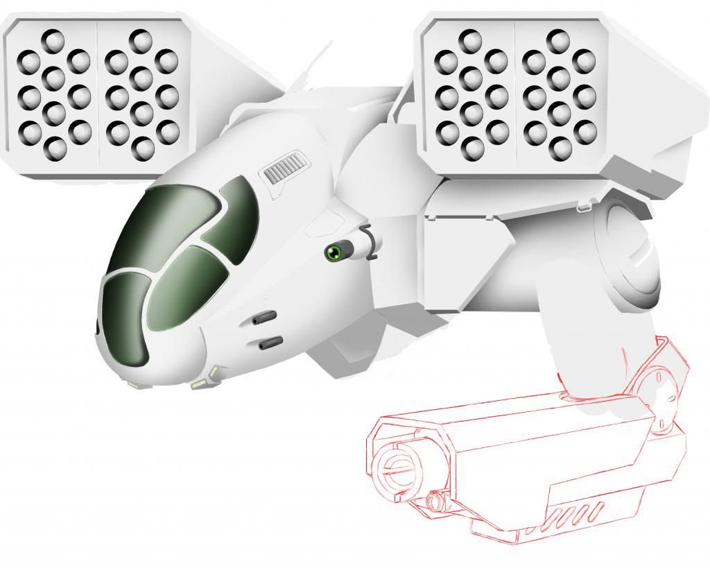 Trying a more pod like look for the arm guns. Thoughts?
Edited by Apocalips07, 24 October 2012 - 07:54 PM.
#59
-
-
- Knight Errant
- 588 posts
Member
- LocationPNW
Posted 15 October 2012 - 01:49 PM
The perspective lines on your LRM launchers is WAY off. You have good lines everywhere else, but what you've done with the LRMs just ruins the image. Look at how well the arm and the weapon cowling fit into the angle of the 'mech and the scene itself.
I'm guessing you tried to do a copy/past and it didn't work.
-edit-
Sorry if this seems a bit harsh.
I'm guessing you tried to do a copy/past and it didn't work.
-edit-
Sorry if this seems a bit harsh.
Edited by HanaYuriko, 15 October 2012 - 01:56 PM.
#60
-
-
- Ace Of Spades
- 60 posts
Member
- LocationTexas
Posted 15 October 2012 - 01:59 PM
I think the latest iterations with the curved lines look fantastic, though i can't say i like the 'pod' look on the guns. Personal preference though.


6 user(s) are reading this topic
0 members, 6 guests, 0 anonymous users


