Edited by Lordred, 03 May 2013 - 01:39 PM.

#81
Posted 03 May 2013 - 01:25 PM
#82
Posted 03 May 2013 - 08:42 PM
I wish I could use my drivers to alter AA settings(as MWO's AA is *terrible*), but alas; any attempt to do so leaves me in you-exploiting-******* land, with things looking terrible and basically cheating.
#83
Posted 04 May 2013 - 12:20 AM
#84
Posted 04 May 2013 - 12:50 AM
 Lordred, on 04 May 2013 - 12:20 AM, said:
I've got a 7850, heavily OC'd (pretty far beyond a 7870). I spend a lot of time in the custom settings, but there's a bug with MWO and (at least ATI) AA settings that really, really messes with the display. Turning on AA at the driver level (at least, with the higher end settings) causes all the mechs, terrain, and objects to become transparent. It's extremely hard to play like that, but also for obvious reasons potentially exploity.
Frustrating, really, as I'm solidly capped at 60fps all the time - lots of room for improvement, but MWO won't go for higher settings, and driver level improvements really mangle the game.
#85
#86
Posted 04 May 2013 - 08:05 AM
#87
Posted 04 May 2013 - 08:15 AM
#88
Posted 04 May 2013 - 10:00 AM
#89
Posted 04 May 2013 - 12:15 PM
Am I on crack? Have you noticed that? Or anyone else?
I swear, every time I play on Tourmaline, it just looks... wrong. It's a cool effect and often works out pretty well, but... it's strange.
As if the mechs are lit from light reflecting off the ground primarily, and only receiving ambient light on their sun-facing surfaces.
#90
Posted 04 May 2013 - 04:58 PM
 Wintersdark, on 04 May 2013 - 12:15 PM, said:
For the most part the problem i feel is the restriction to DX9, wait till they give us DX11 again, I'll be putting the game though its paces then and these current screenshots will be nothing more then childsplay.
But as for the lighting on tourmaline, I think thats just the way they have the light setup, the map is very bright on its own, and everything is really bleached out.
#91
Posted 04 May 2013 - 05:04 PM
 Lordred, on 04 May 2013 - 04:58 PM, said:
For the most part the problem i feel is the restriction to DX9, wait till they give us DX11 again, I'll be putting the game though its paces then and these current screenshots will be nothing more then childsplay.
But as for the lighting on tourmaline, I think thats just the way they have the light setup, the map is very bright on its own, and everything is really bleached out.
It's not the amount of light, but rather the lighting and shading angles, they seem... backwards, on Tourmaline and Forest Colony. As if the ground was a brighter light source than the sky.
God, I can't wait for DX11 though =)
#92
Posted 04 May 2013 - 05:14 PM
It's probably kind of hard to read the text on the above image (quick markup in mspaint) but in short, look at the direction of the land shadows, then the lighting on the Cataphract and Hunchback. The highlights on the hunchback appear to be coming from the direction that should be the most shadowed, and the Cataphract's is very much strange and backwards - like it was lit from a spotlight on the ground practically directly underneath it.
Anyways, sorry for messing up your beautiful screenshot thread, it's just something I've found baffling.
Edited by Wintersdark, 04 May 2013 - 05:15 PM.
#93
Posted 04 May 2013 - 05:29 PM
If you ever want to try to drop with me for some screen caps of you in action, let me know Via PM or in here, well see if we can line something up.
 Wintersdark, on 04 May 2013 - 05:14 PM, said:
It's probably kind of hard to read the text on the above image (quick markup in mspaint) but in short, look at the direction of the land shadows, then the lighting on the Cataphract and Hunchback. The highlights on the hunchback appear to be coming from the direction that should be the most shadowed, and the Cataphract's is very much strange and backwards - like it was lit from a spotlight on the ground practically directly underneath it.
Anyways, sorry for messing up your beautiful screenshot thread, it's just something I've found baffling.
No, I see it, I'm just hoping it has to do with DX9, if I were allowed to I might try messing with the engine itself, but that is not only frowned upon, but disallowed. So I work with what I'm given, when DX11 rolls out, I'm ready to put it though the paces.
Edited by Lordred, 04 May 2013 - 05:32 PM.
#94
Posted 04 May 2013 - 06:26 PM
 Wintersdark, on 04 May 2013 - 05:14 PM, said:
It's probably kind of hard to read the text on the above image (quick markup in mspaint) but in short, look at the direction of the land shadows, then the lighting on the Cataphract and Hunchback. The highlights on the hunchback appear to be coming from the direction that should be the most shadowed, and the Cataphract's is very much strange and backwards - like it was lit from a spotlight on the ground practically directly underneath it.
Anyways, sorry for messing up your beautiful screenshot thread, it's just something I've found baffling.
"Baked shadows" on maps. Evidently they don't match the real lighting.
-------
On a separate note, I noticed Garth said this:
TheGarth @pgi_thegarth 3 May
@argentbear Very, very cool. The same people made my paint scheme!
So... Lordred, we made his paint scheme? I'm confuzzled.
Edited by Koniving, 04 May 2013 - 06:29 PM.
#95
Posted 04 May 2013 - 06:56 PM
 Lordred, on 04 May 2013 - 05:29 PM, said:
If you ever want to try to drop with me for some screen caps of you in action, let me know Via PM or in here, well see if we can line something up.
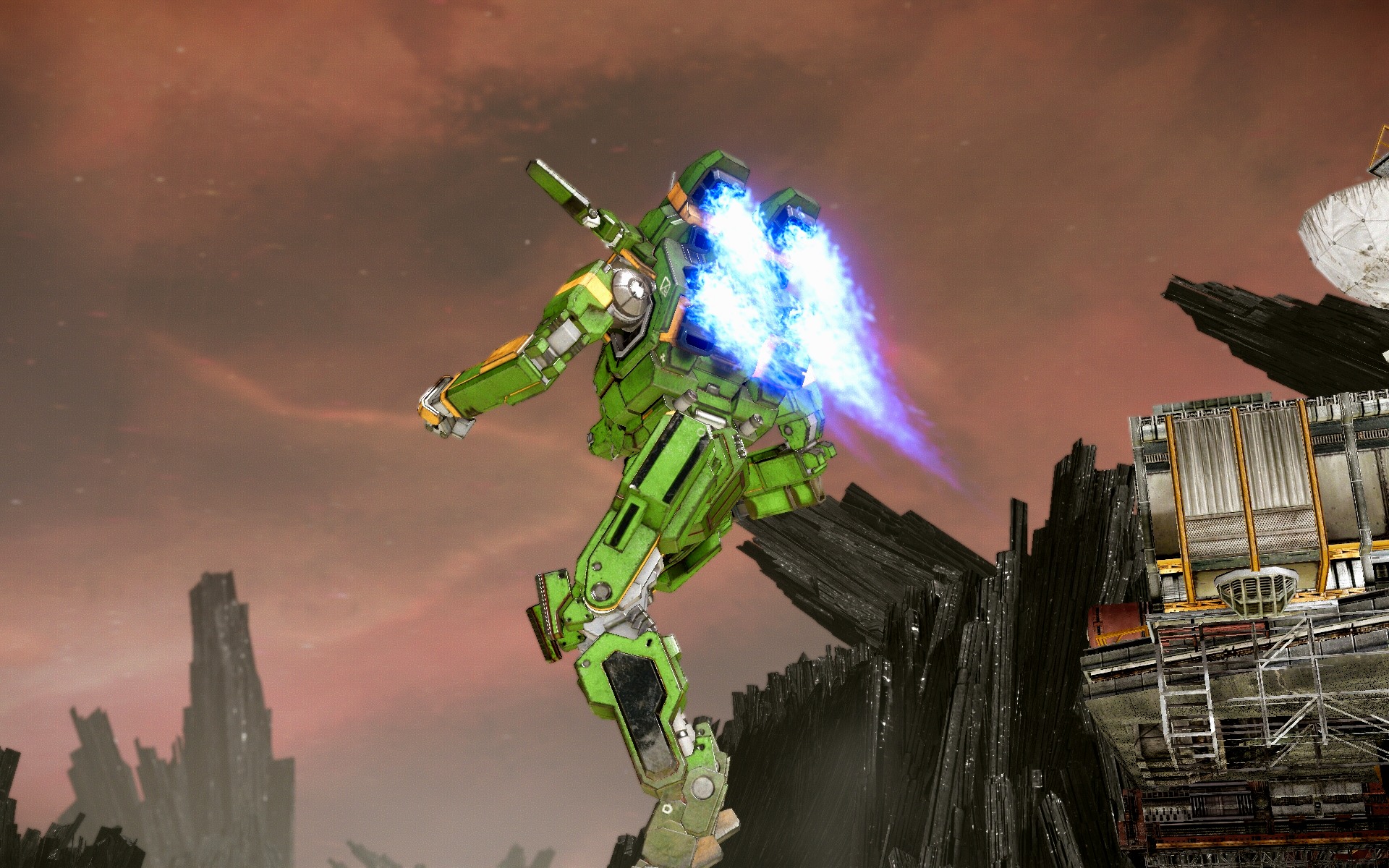
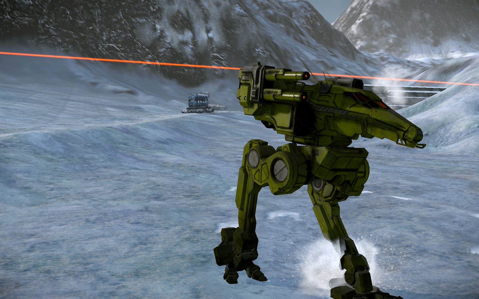
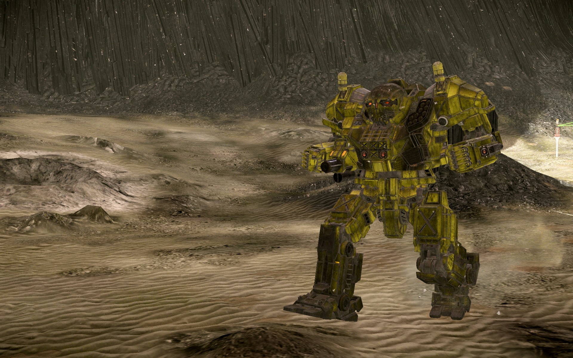
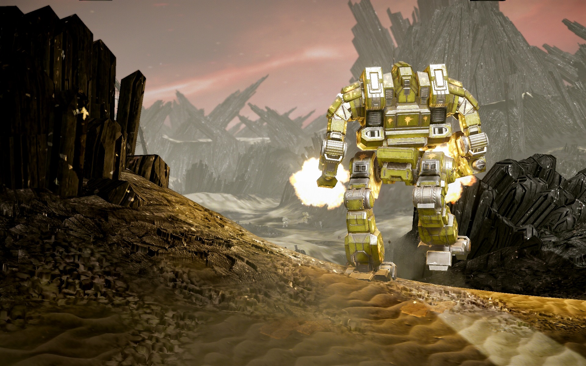
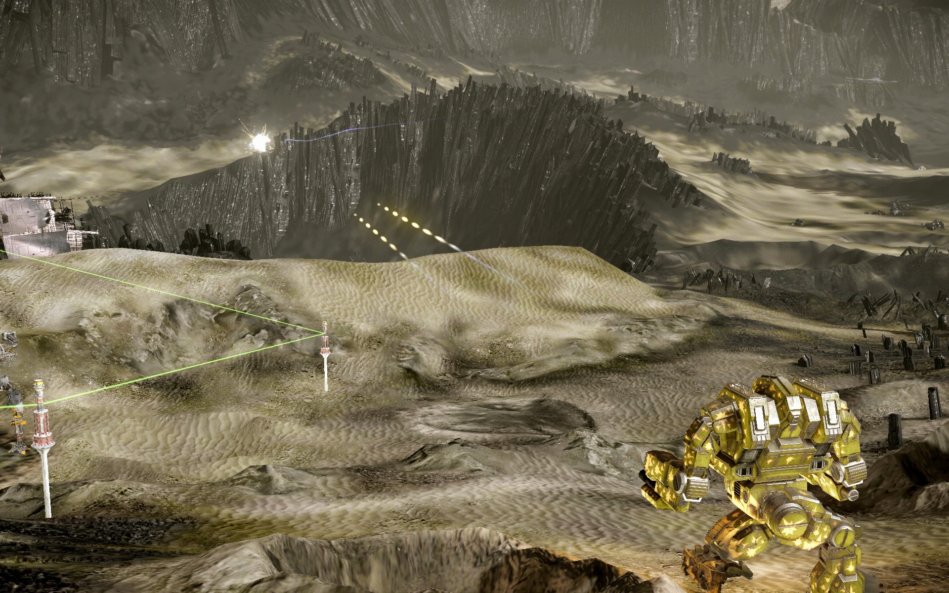
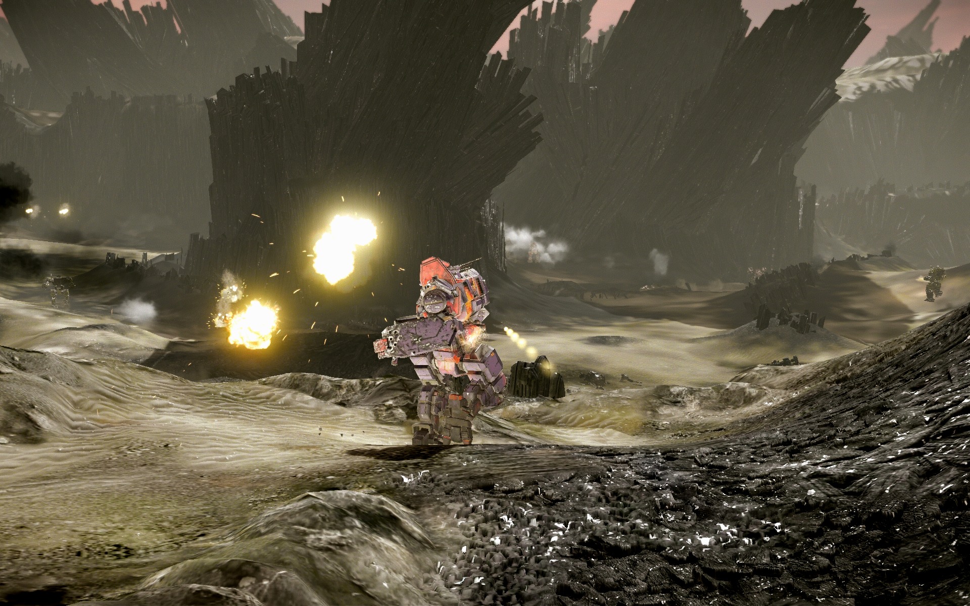
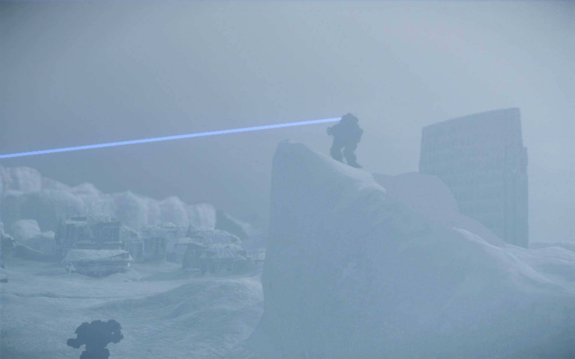
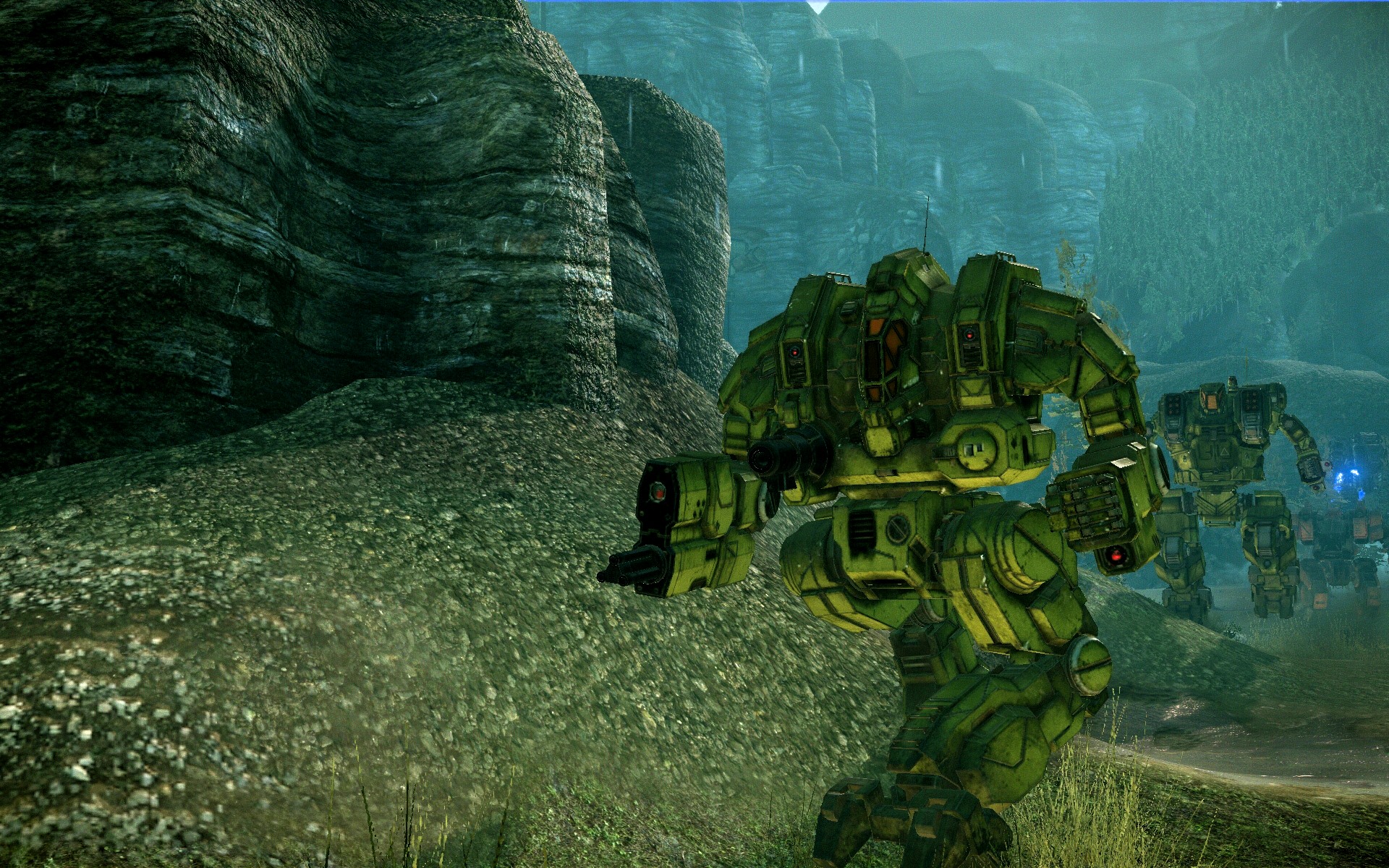
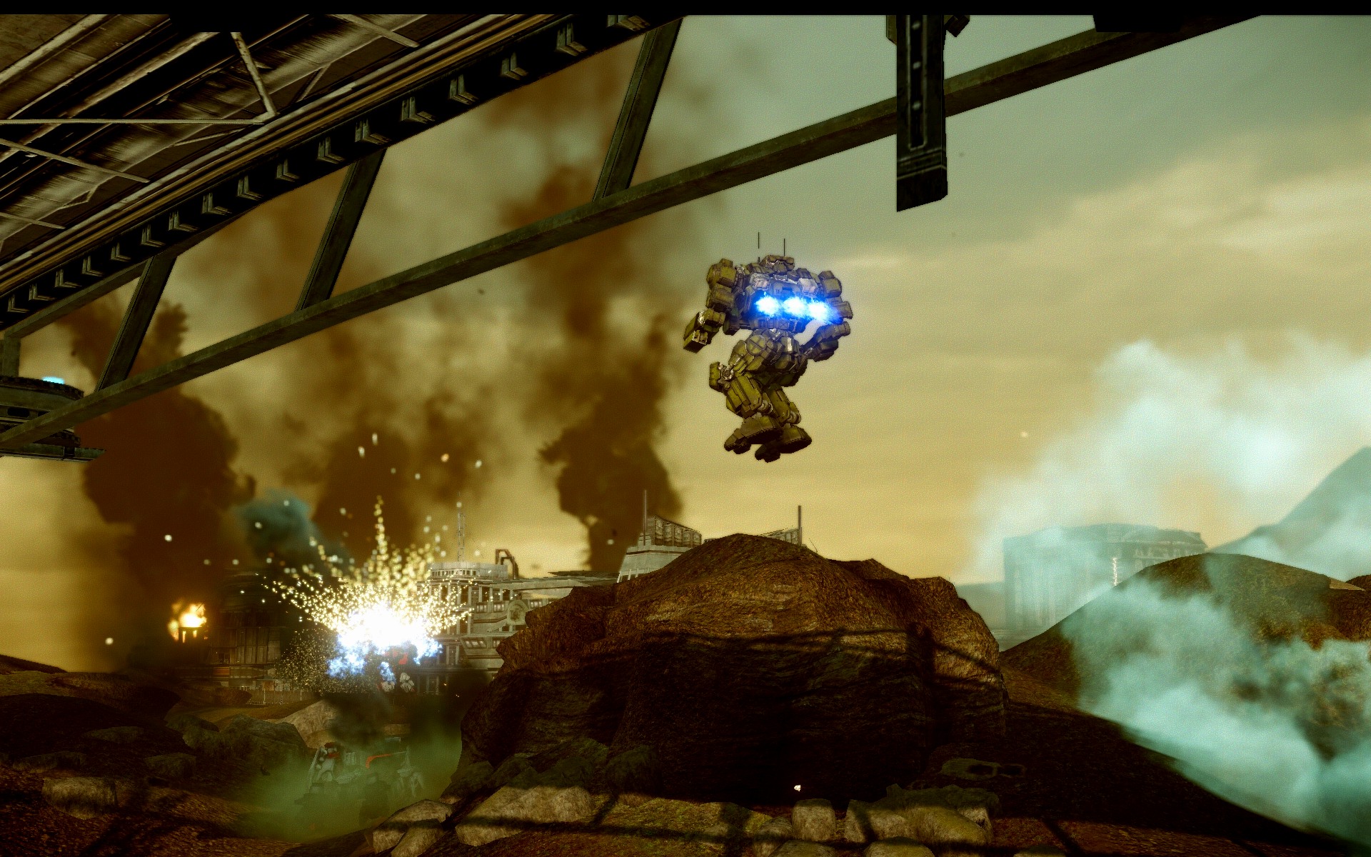
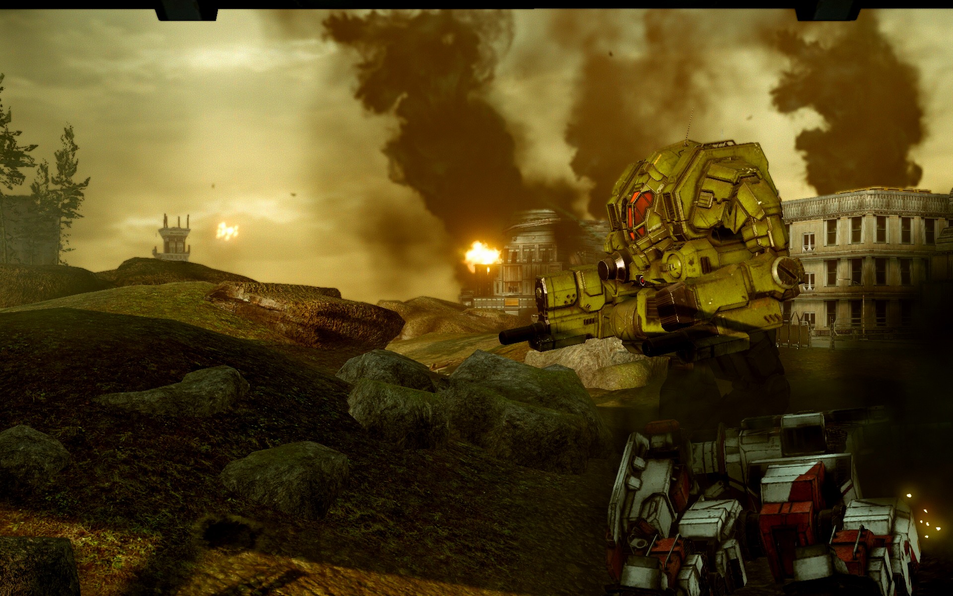
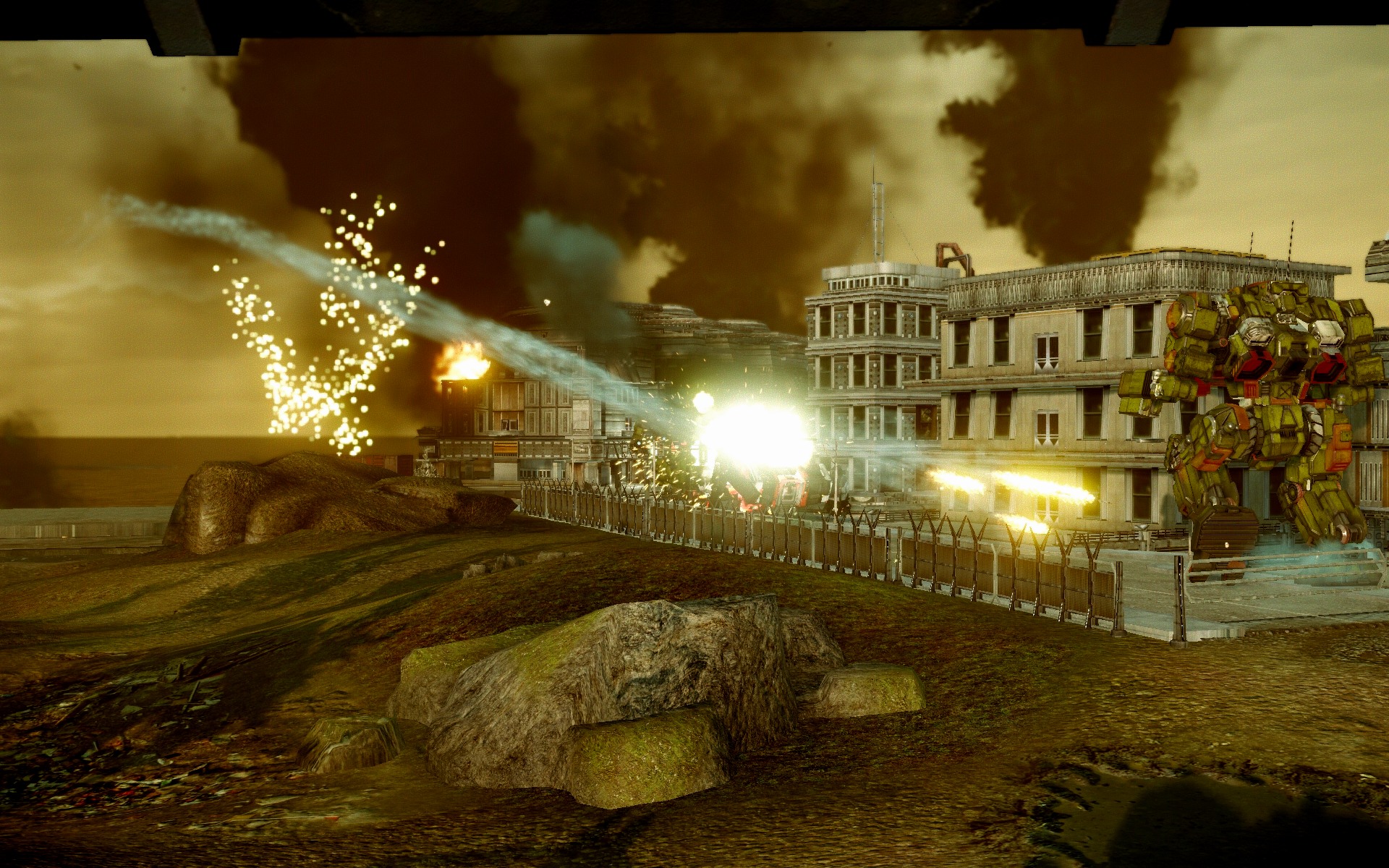
Every one of these pictures seems to be worth a thousand words.
I also like this picture.
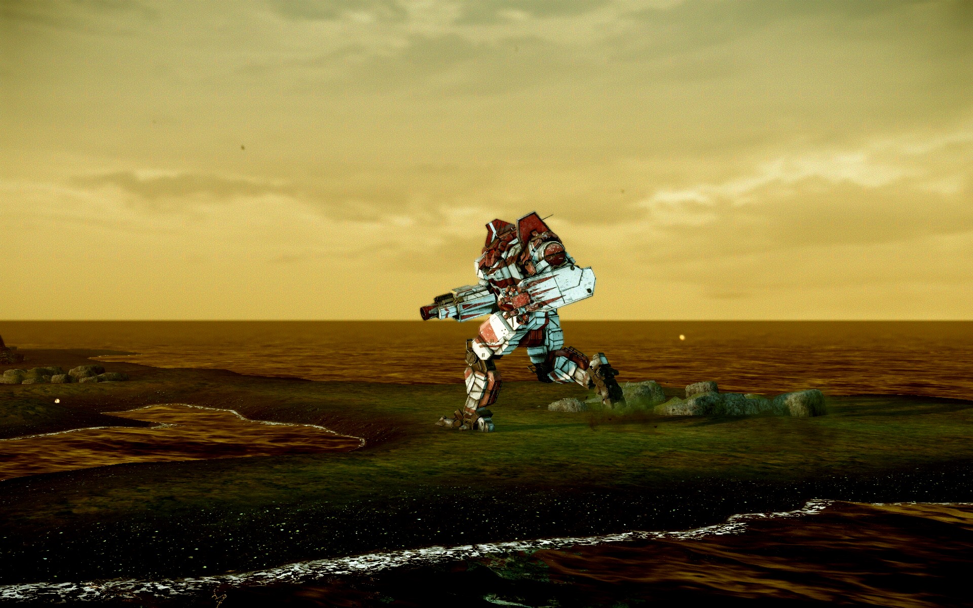
Very scenic view and highly contrasts with the theme of the YLW's default paint. The rising sun, with a glimpse of the background dusk, probably to indicate well, the rising sun or the new dawn.
I don't know how else to describe it, but each of these pictures... have life and meaning and some sense of feeling to it.
I'm pretty speechless. Please keep making more screenshots. Every one of them is worth a thousand words with a story to go with it.
Struggles in a fight for victory.
Edited by ZeProme, 04 May 2013 - 07:02 PM.
#96
Posted 04 May 2013 - 07:34 PM
#97
Posted 04 May 2013 - 07:37 PM
 Koniving, on 04 May 2013 - 06:26 PM, said:
"Baked shadows" on maps. Evidently they don't match the real lighting.
-------
On a separate note, I noticed Garth said this:
TheGarth @pgi_thegarth 3 May
@argentbear Very, very cool. The same people made my paint scheme!
So... Lordred, we made his paint scheme? I'm confuzzled.
Didn't you guys win his "Paint My Cicada" contest a while back?
#99
Posted 04 May 2013 - 07:43 PM
Edited by Koniving, 05 May 2013 - 07:58 AM.
#100
Posted 04 May 2013 - 08:26 PM
1 user(s) are reading this topic
0 members, 1 guests, 0 anonymous users


