Jump to content

Foxdie's Marauder Redesign W/color


24 replies to this topic

#1 Foxdie

    Member

  • PipPipPipPipPip
  • Overlord
  • Overlord
  • 109 posts
  • LocationUSA

Posted 10 July 2013 - 07:47 PM

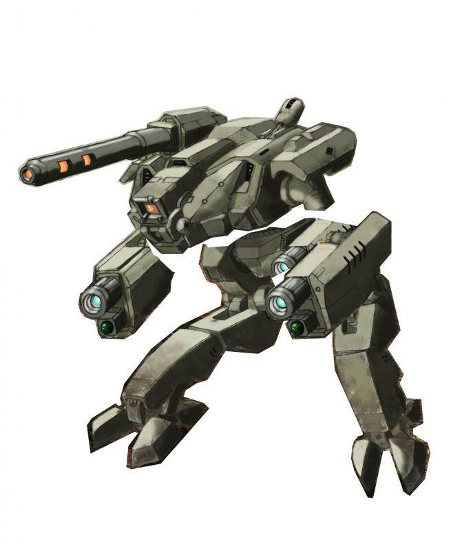
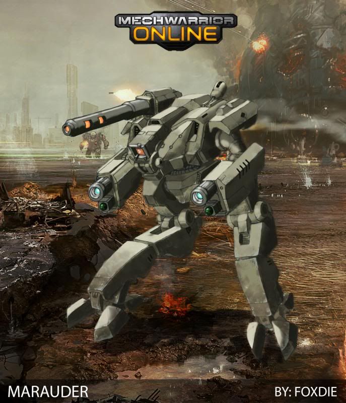
This is the Marauder line art from http://mwomercs.com/...-updated-71013/ actually colored.

I thought about posting it there, but didn't want to force everyone to see the rest of my designs.

This is NOT finished but far enough to put out for people to give opinions on ....so Please do!

I wanted to keep a lot of the visual ideas from the classic but steer far enough away to where people would say "What's that....wait is that a Marauder?" ....and less of the immeidate "Nice Marauder redesign."

Let me know if I accomplished that.

*I realize my coloring skills are sub par and too loose/blurry...but this is a skill i'm still honing in on.

---AS ALWAYS: If you'd like to recolor this and give it a better paint job, please do! I'd love to see them, and by all means post them on this thread, or at least throw me some credit it if it goes else where.
Posted Image

Edited by Foxdie, 10 July 2013 - 07:54 PM.


#2 Tennex

    Member

  • PipPipPipPipPipPipPipPipPipPip
  • The 1 Percent
  • The 1 Percent
  • 6,619 posts

Posted 10 July 2013 - 07:48 PM

cool concept.

haha its got cicada legs!

#3 Foxdie

    Member

  • PipPipPipPipPip
  • Overlord
  • Overlord
  • 109 posts
  • LocationUSA

Posted 10 July 2013 - 07:49 PM

View PostTennex, on 10 July 2013 - 07:48 PM, said:

cool concept.

haha its got cicada legs!

Loved the pose, changed the design to fit the Marauder more....so yeah kinda B) :D

#4 Magik0012

    Member

  • PipPipPipPipPipPip
  • 460 posts
  • LocationAustin, Texas

Posted 11 July 2013 - 06:53 AM

It's got promise.. needs a bit of luvin' tho..

but that is just my $0.02

#5 Max OConnor

    Member

  • PipPipPipPipPipPipPip
  • The Phoenix
  • The Phoenix
  • 731 posts
  • Google+: Link
  • Facebook: Link
  • LocationLebanon, TN

Posted 11 July 2013 - 10:35 AM

Please please please do a color of the Guillotine <_<

#6 CyclonerM

    Tina's Warrior

  • PipPipPipPipPipPipPipPipPipPip
  • FP Veteran - Beta 2
  • FP Veteran - Beta 2
  • 5,685 posts
  • LocationA 2nd Wolf Guards Grenadiers JumpShip

Posted 11 July 2013 - 11:12 AM

Hmm..nice, but it looks like a bit..tiny. Yes, i say "Is that a Marauder?" <_<

#7 Foxdie

    Member

  • PipPipPipPipPip
  • Overlord
  • Overlord
  • 109 posts
  • LocationUSA

Posted 11 July 2013 - 02:44 PM

View PostMagik0012, on 11 July 2013 - 06:53 AM, said:

It's got promise.. needs a bit of luvin' tho..

but that is just my $0.02


What kinda lovin?

View PostCyclonerM, on 11 July 2013 - 11:12 AM, said:

Hmm..nice, but it looks like a bit..tiny. Yes, i say "Is that a Marauder?" ;)


Erm...where is the size reference to make it look small? I can fix it if you can give me that so I can make it bigger.

#8 Bishop Steiner

    ForumWarrior

  • PipPipPipPipPipPipPipPipPipPipPipPipPipPipPip
  • The Hammer
  • The Hammer
  • 47,187 posts
  • Locationclimbing Mt Tryhard, one smoldering Meta-Mech corpse at a time

Posted 11 July 2013 - 02:54 PM

Arms look a tad small, TBH. And the Torso a bit to the legs, though it is in line with the Reseen version for the most part. But the legs on yours are thicker, making the difference more noticeable.

#9 Foster Bondroff

    Member

  • PipPipPipPipPipPip
  • The Bold
  • The Bold
  • 279 posts

Posted 11 July 2013 - 09:58 PM

Don't want to hurt your feelings foxdie, but thats the worst MAD redesign i have seen so far. If it wouldn't be labeled as MAD i would not even have recognized it as such.

#10 Nauht

    Member

  • PipPipPipPipPipPipPipPipPip
  • Ace Of Spades
  • Ace Of Spades
  • 2,141 posts

Posted 11 July 2013 - 11:03 PM

I agree with the others - this looks more like a Cicada and not just with the legs.

The entire torso area needs to be bigger and more portruding and the arms longer and weapon housing bigger.

Good art though, but to me it doesn't say Marauder much.

#11 GrandLocomon

    Member

  • PipPipPipPipPipPip
  • 498 posts
  • LocationWestern Australia

Posted 12 July 2013 - 01:22 AM

It looks a lot like a reseen marauder; I'm not sure what the people saying it looks nothing like a marauder are talking about.

#12 ValdnadHartagga

    Member

  • PipPipPipPipPipPip
  • 422 posts
  • LocationBehind enemy lines

Posted 12 July 2013 - 05:23 AM

Not that it doesn't look like a Marauder, but it looks very small! A 75-ton 'Mech has no qualms about taking up as much space as it needs, and your Marauder looks very compact. Actually, your design reminisces of the Night Stalker from MWDA:
Posted Image

While the coloring is very well done and the art itself fundamentally sound, I think it could do with a bulking up above the legs. It should have the heft of a Cataphract or Mad Cat. I would think that doubling the size of the torso and the arms would make it look fantastic.

#13 Magik0012

    Member

  • PipPipPipPipPipPip
  • 460 posts
  • LocationAustin, Texas

Posted 12 July 2013 - 08:33 AM

View PostFoxdie, on 11 July 2013 - 02:44 PM, said:


What kinda lovin?


Erm...where is the size reference to make it look small? I can fix it if you can give me that so I can make it bigger.


Maybe it's just the angle of the image, but in my humble opinion, the main body (LT/CT/RT) is too small and too.. spherical? it should be (again, IMHO) larger and a bit more egg shaped.

And the legs appear to be way too massive in respect to the torso & arms.

As Bishop mentioned, the arms may need to be a wee bit bigger.

Still better than I could do.

#14 Foxdie

    Member

  • PipPipPipPipPip
  • Overlord
  • Overlord
  • 109 posts
  • LocationUSA

Posted 13 July 2013 - 10:53 PM

View PostFoster Bondroff, on 11 July 2013 - 09:58 PM, said:

Don't want to hurt your feelings foxdie, but thats the worst MAD redesign i have seen so far. If it wouldn't be labeled as MAD i would not even have recognized it as such.


Not at all...opinions are just that!! I'm not one of those MWs who get offended after asking for them. Thanks for weighing in!

#15 Foxdie

    Member

  • PipPipPipPipPip
  • Overlord
  • Overlord
  • 109 posts
  • LocationUSA

Posted 13 July 2013 - 10:58 PM

View PostValdnadHartagga, on 12 July 2013 - 05:23 AM, said:

Not that it doesn't look like a Marauder, but it looks very small! A 75-ton 'Mech has no qualms about taking up as much space as it needs, and your Marauder looks very compact. Actually, your design reminisces of the Night Stalker from MWDA:
Posted Image

While the coloring is very well done and the art itself fundamentally sound, I think it could do with a bulking up above the legs. It should have the heft of a Cataphract or Mad Cat. I would think that doubling the size of the torso and the arms would make it look fantastic.


KK So a lot of people are saying its OVER ALL Small.....wtf are you guys compairing it to in the pic to make it small??? I can understand those whom are point out portions of it...agreed. But the over all? Look at the Atlas art...it is the same size when examining the background. As for the legs ...yes they're longer b/c the classic had longer legs. No I didn't make the arms lower b/c it isn't supposed to be super close to the Marauder b/c then it (as if it ever would be used) wouldn't pass as different enough. This was done on purpose. If it's bigger...would the weapon housing on the arms be bigger!? Larger weapon housings on the arms would make it look Smaller...not bigger. Bigger weapons = smaller mech. Bigger the mech, the smaller the weapons look. JS. The torso isn't cicada tho IMO...but that's just me. It is more toward spherical b/c the Marauder was all curves. I do realize it is not hugely close to the Marauder like other designs....but if it were then it would never pass lawyers (as if it would ever be considered) ...if that makes sense. ...what i'll do tho is i'll do a raw MWO redesign of the Marauder to appease you all and show you what you're looking for, and what I was trying to avoid. Lastly...thank you alllllll soooo much for posting. It really helps to see all the different views. I wouldn't have it any other way.

Edited by Foxdie, 13 July 2013 - 10:58 PM.


#16 Foxdie

    Member

  • PipPipPipPipPip
  • Overlord
  • Overlord
  • 109 posts
  • LocationUSA

Posted 13 July 2013 - 11:26 PM

Are we looking for something more to the tune of

Posted Image

where the entire torso is bigger and longer from back to nose....arms are lower...more gap between legs and torso?

#17 Bishop Steiner

    ForumWarrior

  • PipPipPipPipPipPipPipPipPipPipPipPipPipPipPip
  • The Hammer
  • The Hammer
  • 47,187 posts
  • Locationclimbing Mt Tryhard, one smoldering Meta-Mech corpse at a time

Posted 14 July 2013 - 06:42 AM

View PostFoxdie, on 13 July 2013 - 11:26 PM, said:

Are we looking for something more to the tune of

Posted Image

where the entire torso is bigger and longer from back to nose....arms are lower...more gap between legs and torso?

that would be a good direction, IMO. The MArauder is tricky because it needs to be massive enough to be a heavy mech, but it's insectile and lean, too. I think off it in terms of HR Gigers Alien creature. Large, yet somewhat gaunt, and all the more menacing for it.

#18 Magik0012

    Member

  • PipPipPipPipPipPip
  • 460 posts
  • LocationAustin, Texas

Posted 14 July 2013 - 12:09 PM

View PostFoxdie, on 13 July 2013 - 11:26 PM, said:

Are we looking for something more to the tune of

Posted Image

where the entire torso is bigger and longer from back to nose....arms are lower...more gap between legs and torso?


I think those mods help quite a bit.

#19 NautilusCommand

    Member

  • PipPipPipPipPipPipPip
  • Ace Of Spades
  • Ace Of Spades
  • 695 posts

Posted 15 July 2013 - 03:08 PM

View PostFoxdie, on 13 July 2013 - 11:26 PM, said:

Are we looking for something more to the tune of

Posted Image

where the entire torso is bigger and longer from back to nose....arms are lower...more gap between legs and torso?

Too tell you the truth, I like the more sleek look of your's. Not at a standpoint of it being a MAD but it being a good looking mech.
I like the stubbier length of the torso, it gives it a more compact look. If the armor over the arms were to be widened and there to be increase in length on the front by just a bit, as well as making the arms beefier would (in my mind) look sick as heck
I like the legs, I like them a lot they just need to be proportionate to the rest of the mech.
As I'll say to counter so of what everyone is saying. Go with you think the MAD should look like, if it is a redesign give it a look that you think it fits. It may not be the iconic look, but the fact is if it were more iconic like most designs then it'd never make it into a MW game.
I'll say it again; it may not be the MAD, but it doesn't stop it from look great.

#20 Vanguard319

    Member

  • PipPipPipPipPipPipPipPip
  • Legendary Founder
  • Legendary Founder
  • 1,436 posts
  • LocationTerra

Posted 15 July 2013 - 04:32 PM

As a generic mech, it looks good. However, I can't see it as a Marauder, the cockpit should jut out beyond the arms. This is more like a MAD imo:Posted Image
artwork by Shimmering Sword


6 user(s) are reading this topic

0 members, 6 guests, 0 anonymous users