Jump to content

Marauder Contest - All Entry Voting! - Closed


240 replies to this topic

#181 Autobot9000

    Member

  • PipPipPipPipPipPipPip
  • 572 posts
  • LocationGermany

Posted 16 November 2013 - 07:12 AM

I don't quite like Marcobra's version too much. It's obviously a quality paint job, but the cockpit reminds me of a starcraft 2 reaper (generally like a space marine's / commando's helmet), doesn't really appeal to me as a Battlemech. Otherwise I feel it's nice to vote for how good someone's paint job here is (there are many who did excellent work here), but I feel to do justice to this competition I have to vote for the displayed mech geometry, as PGI is going to need opinion here much more.

As Krigg's work is seemingly not in this competition the next best I am voting for is Karyudo.

Edited by Autobot9000, 16 November 2013 - 07:14 AM.


#182 Evil Ed

    Member

  • PipPipPipPipPipPipPip
  • Ace Of Spades
  • 527 posts
  • LocationStavanger, Norway

Posted 16 November 2013 - 07:14 AM

I liked them all because this is such a great community... :(

#183 Manei Domini Krigg

    Member

  • PipPipPipPipPipPipPipPipPip
  • Overlord
  • Overlord
  • 2,005 posts
  • Locationred team

Posted 16 November 2013 - 12:29 PM

Little pencil/pen art. I feel bad - for a long time no practice. Changes from classic: cannon mowed fom the top - to side tirso; cockpit i call "cyclops type" (i hate all variations of open plane-type cockpits). Legs have one more joint (part of the leg below the knee which was too large and heavy). If I will overcome laziness to finish a little later. Posted Image
Posted Image

Edited by Krigg, 16 November 2013 - 12:31 PM.


#184 Aiden IIC

    Member

  • Pip
  • FP Veteran - Beta 1
  • FP Veteran - Beta 1
  • 12 posts

Posted 16 November 2013 - 01:35 PM

Krigg, I fear you're behind the 8 ball a little, since this contest has been going for a few days now. I love the classic look you're going for, while trying to not infringe on a 30 year old copyright. I liked your image, as well as Marcobra and Karyudo and ResidentCrow.

There are two schools at work here: the old school, and the PGI school. Make no mistake guys, this Battletech universe is PGI, not FASA. They've created their own look, as evidenced by the Phoenix mechs that look similar to the Ral Partha stuff, but with a definite distinctive flair. This is evidenced by the choice of bulky, square lines on mechs that used to be curved (Battlemaster cockpit, Locust shoulders, etc). The new Marauder needs to follow the same aesthetic or else risk looking like an alien design stolen from Japan.

In that vein, I've tried to swallow my strong want to see the original and nostalgic mech designs, in favor of what PGI is trying to do today. So I believe a hybrid of Marcobra and Karyudo and ResidentCrow will produce an outstanding mech.

But PGI, please remember the signature of a Marauder are the reverse articulated legs, severely hunched torso with a long carapace, the large PPC lower arm sponsons (not stubby) with thin upper arms, and a LONG turret weapon (which I'm sure will depend on which ballistic weapon is mounted). As long as you don't screw that up, everyone will know what it is, no matter how blocky you make it.

Oh, and no matter what, ALL of the entrants deserve some kind of cockpit swag from PGI for their efforts. It's clear that while the talent is varied, the time and effort involved by each of these applicants to try to produce something unique makes me very proud to be part of this community.

Edited by Aiden II, 16 November 2013 - 01:39 PM.


#185 Peiper

    Member

  • PipPipPipPipPipPipPipPip
  • The Dragoon
  • The Dragoon
  • 1,444 posts
  • Google+: Link
  • LocationA fog where no one notices the contrast of white on white

Posted 16 November 2013 - 01:36 PM

View PostReno Blade, on 15 November 2013 - 10:28 AM, said:
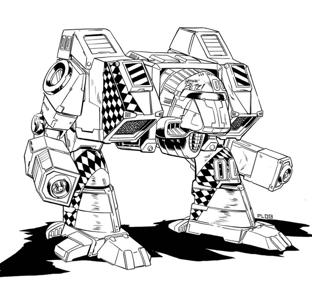
Not that I had any hopes to win, but I didn't expect to get so few votes for my entry (#23).
Is it the low amount of detail, or just the design with the shields that make people not liking it?

I'd like to know what you guys like the least in the design/image, or if there is anything you like at all. Don't be shy ;)


Because when I saw your picture, I didn't see a Marauder, I saw a Linebacker.

http://www.sarna.net/wiki/Linebacker
Posted Image

As I was saying in another post, it's really a challenge to both come up with a Marauder that's not a Marauder, but does the original Marauder justice. For myself, I looked at the submissions and 'liked' the ones that I thought really caught the spirit of the Marauder, enough so that when I looked at it I thought: that's a Marauder! And with the hundreds of mechs and mecha pictures out there, it's really difficult not to end up creating a clone of one, even if you've never seen the mech you're cloning.
And don't take it too hard: as an artist I've had my work critiqued and beauty really is in they eye of the beholder. Think of mechs like women (or men if you prefer). Think of your friend that's married to that hideous person: to your friend, he or she is the most beautiful person on the planet. There's no explaining it. It just IS. ;)

#186 Odanan

    Member

  • PipPipPipPipPipPipPipPipPipPip
  • Ace Of Spades
  • Ace Of Spades
  • 8,205 posts
  • LocationBrazil

Posted 16 November 2013 - 01:46 PM

View Postmaxoconnor, on 15 November 2013 - 06:40 AM, said:

First off, NOT MY WORK, NOT MY WORK!!!!!
I took the best parts from Shortpainter's Marauder and one of Bishop Steiner's Marauder designs and added a few minor parts myself till I had the Marauder of my dreams. I'd really love to see this made someday, either in game or as a figure I can field on the board.
Just wanted to share.
Posted Image

Can I vote in this one?

;)

#187 Cimarb

    Member

  • PipPipPipPipPipPipPipPipPip
  • Caladbolg
  • Caladbolg
  • 3,912 posts
  • Twitter: Link
  • Twitch: Link
  • LocationA hop, skip and jump from Terra

Posted 16 November 2013 - 02:45 PM

View PostShimmering Sword, on 15 November 2013 - 03:03 PM, said:

I'd like to throw in a word of defense for all the fat mechs (yes that includes mine).
Remember that most of these illustrations are delivered without an absolute scale indicator, also remember that (regardless of what may be in some novel somewhere) that the squat marauder isn't that tall of a mech. I sense that a lot of people are seeing these pieces and visualizing them as big as an assault mech, when in reality they're just the normal squat heavy mech they intend to be.

I feel it's a little unfair to disqualify someone's entry in your mind simply because "it looks more like a II or IIC". We aren't designing a Glaug, we aren't designing a IIC either, we're designing something different and something that (preferably) has the MWO style. Bottom line, you're not going to see what you expect all the time, but that doesn't make it wrong.

Other guys might have their own defenses, as for my own design: If you look at my piece and then look at the MWO cataphract concept art, comparing their scales via the legs, the torso on my Marauder doesn't have much more volume than the cataphract does (it's longer, but less tall). Being 5 tons heavier with largely identical arms and legs, you should expect the torso to be bigger.
I wont deny my submission is fatter than I would like, but time was a limiting factor. That doesn't make a slightly spacious 75 tonner suddenly jump up to 100 tons though.

So, I'm not saying "mine is right" here, I'm just saying to cut EVERYONE some slack in this very unique competition. Don't let your idea of II and IICs disqualify entries. Instead, work with your brain a little and imagine those mechs smaller (or bigger in the case of the skinnies) than you initially interpreted.

Kind of what I was getting at is that you have some people voting for the best art, some for the best layout, and others for the best "feeling". I love your work - it is top notch - it even looks like a marauder, just an assault version of it.

View PostKaryudo ds, on 15 November 2013 - 06:15 PM, said:


Yeah I sat on that one for a bit. The arms being forward sort of created a sense of motion in the design to me and were part of the look. Which was why I tried to compromise there and keep them close to the center. It's tricky, but what you get when the original design was intended for something very different.

The forward thrust of the design, with arms ahead of the legs, is one of the most important design elements to me. I know it makes the torsos more vulnerable, but that is what makes the design different - same issue the catapult and jäger-type designs have, actually.

#188 JohnnyWayne

    Member

  • PipPipPipPipPipPipPipPip
  • Ace Of Spades
  • Ace Of Spades
  • 1,629 posts

Posted 16 November 2013 - 03:48 PM

It doesn't necessarily makes it vulnerable. Just see the stalker.

There are a lot of great designs out there, but of the good ones the one I least like is leading -.-... It's not the Mech it self, I HATE those legs.

They make no sense, they look like they can't decide if they should be humanoid or chicken walker legs ARGH!...

Edited by JohnnyWayne, 16 November 2013 - 03:57 PM.


#189 Volt Corsair

    Member

  • PipPipPipPipPipPip
  • The Clan Cat
  • The Clan Cat
  • 203 posts
  • LocationOutpost, Periphery (HPG down)

Posted 16 November 2013 - 04:06 PM

All of these designs are great in their own right, but my votes are on Marcobra and Bishop Steiner.

#190 GalaxyBluestar

    Member

  • PipPipPipPipPipPipPipPipPip
  • 3,748 posts
  • Location...

Posted 16 November 2013 - 04:18 PM

should i start a whine thread on pay to forum?

MUB = 4000 likes for $95 a bargin! ;)

Edited by GalaxyBluestar, 16 November 2013 - 04:19 PM.


#191 MoonUnitBeta

    Member

  • PipPipPipPipPipPipPipPipPip
  • Philanthropist
  • Philanthropist
  • 4,560 posts
  • LocationCanada ᕙ(⇀‸↼‶)ᕗ

Posted 16 November 2013 - 06:03 PM

View PostGalaxyBluestar, on 16 November 2013 - 04:18 PM, said:

should i start a whine thread on pay to forum?

MUB = 4000 likes for $95 a bargin! ;)

Haha, actually, I just thought of that the day after I made this thread and went "uhh... hmm.. i wonder if anyone will notice.." Haha. it was definitely not something I thought of while i thought about how to do the contest. But if anyone is wondering, it's personally just a stat that doesn't mean much. It just makes it even more of a pointless stat to me now that it's not an accurate representation to the content I post.
I probably could have done a multiple selection poll, but I feel this is easier for the people voting instead of remembering numbers or names and navigating the thread. I dunno. There's a bunch of ways to do it, likes don't matter to me so i regret nothing lol. Although, I've been sitting here thinking how I might have been able to give those likes to the artists instead. But coordinating them to all post at the exact same time, or avoiding voters to require to "find" the submissions (in the event that the artist do not post at the same time, and their entries get lost within the thread, potentially affecting how the votes are spread out) and base the likes on that would be disastrous and some might say how it's unfair. Also this way I have control too over the final submissions that they do not change and everything remains "static" (for the lack of a better word.)
But yeah.. *shrug* something I'll think about later IF I do another contest. There seems to be some interest in the Warhammer, but this contest was mainly a spur of the moment thing after reading what Bryan Ekman said. So we'll see. I learned a lot from this contest. The biggest one is how much work it is to properly maintain something like this. Questions, submissions, moderation, remembering your own rules, enforcing those rules, keeping everything straight so that it runs smoothly, there is a lot more to it that i thought there was haha. I may do another contest when I have more time.

I made a post about making badges/trophies/ribbons for the contestants. I got a few sketches out but I don't have enough time to make them the way I want them to look. So I'll likely do those for any future contests.

Re-reading this.... I see how much I ramble now.

Edited by MoonUnitBeta, 16 November 2013 - 06:13 PM.


#192 GalaxyBluestar

    Member

  • PipPipPipPipPipPipPipPipPip
  • 3,748 posts
  • Location...

Posted 16 November 2013 - 07:32 PM

you deserve every bit. helping to make marauders happen, 4000 likes is nowhere near enough!

lookforward to rifleman and warhammer comps! come on bryan speculate about these mechs too! ;)

#193 Bishop Steiner

    ForumWarrior

  • PipPipPipPipPipPipPipPipPipPipPipPipPipPipPip
  • The Hammer
  • The Hammer
  • 47,187 posts
  • Locationclimbing Mt Tryhard, one smoldering Meta-Mech corpse at a time

Posted 16 November 2013 - 08:32 PM

View PostKrigg, on 16 November 2013 - 12:29 PM, said:

Little pencil/pen art. I feel bad - for a long time no practice. Changes from classic: cannon mowed fom the top - to side tirso; cockpit i call "cyclops type" (i hate all variations of open plane-type cockpits). Legs have one more joint (part of the leg below the knee which was too large and heavy). If I will overcome laziness to finish a little later. Posted Image
Posted Image

please do!!! Lovely take on the MAD! And I too prefer the added lower leg joint for the same reason! That beast looks like it could have some SERIOUS awesome factor!

#194 Bishop Steiner

    ForumWarrior

  • PipPipPipPipPipPipPipPipPipPipPipPipPipPipPip
  • The Hammer
  • The Hammer
  • 47,187 posts
  • Locationclimbing Mt Tryhard, one smoldering Meta-Mech corpse at a time

Posted 16 November 2013 - 08:35 PM

View PostGalaxyBluestar, on 16 November 2013 - 07:32 PM, said:

you deserve every bit. helping to make marauders happen, 4000 likes is nowhere near enough!

lookforward to rifleman and warhammer comps! come on bryan speculate about these mechs too! ;)

oh yes. Whammy and Rifleman are must dos.... ditto archers and one of the toughest...the Phoenix Hawk!

#195 MoonUnitBeta

    Member

  • PipPipPipPipPipPipPipPipPip
  • Philanthropist
  • Philanthropist
  • 4,560 posts
  • LocationCanada ᕙ(⇀‸↼‶)ᕗ

Posted 16 November 2013 - 09:49 PM

View PostBishop Steiner, on 16 November 2013 - 08:35 PM, said:

oh yes. Whammy and Rifleman are must dos.... ditto archers and one of the toughest...the Phoenix Hawk!

ooo.. i like challenges so maybe i'll do the pheonix hawk ;)

#196 Commissar Aku

    Member

  • PipPipPipPipPip
  • Urban Commando
  • Urban Commando
  • 195 posts

Posted 16 November 2013 - 09:54 PM

Stop taunting me with the one mech I actually want. Give me

#197 Cimarb

    Member

  • PipPipPipPipPipPipPipPipPip
  • Caladbolg
  • Caladbolg
  • 3,912 posts
  • Twitter: Link
  • Twitch: Link
  • LocationA hop, skip and jump from Terra

Posted 16 November 2013 - 10:35 PM

View PostBishop Steiner, on 16 November 2013 - 08:35 PM, said:

oh yes. Whammy and Rifleman are must dos.... ditto archers and one of the toughest...the Phoenix Hawk!

Warhammer, Archer and Phoenix Hawk, yes (in that order, too). Rifleman? We already have it in game, IMO.

#198 Karyudo ds

    Member

  • PipPipPipPipPipPipPipPip
  • Knight Errant
  • Knight Errant
  • 1,706 posts
  • LocationChaos March

Posted 16 November 2013 - 10:43 PM

View PostKrigg, on 16 November 2013 - 12:29 PM, said:

Little pencil/pen art. I feel bad - for a long time no practice. Changes from classic: cannon mowed fom the top - to side tirso; cockpit i call "cyclops type" (i hate all variations of open plane-type cockpits). Legs have one more joint (part of the leg below the knee which was too large and heavy). If I will overcome laziness to finish a little later. Posted Image
Posted Image


I thought about the eye like, or forward hooded window from the old art, wasn't satisfied with what I was coming up with though. Only cockpit that really bugged me was the Phoenix one with it being sooooo open looking. Being a Macross fan this guy feels like a super-Glaug upgrade but I'm liking it.


View PostCimarb, on 16 November 2013 - 02:45 PM, said:

The forward thrust of the design, with arms ahead of the legs, is one of the most important design elements to me. I know it makes the torsos more vulnerable, but that is what makes the design different - same issue the catapult and jäger-type designs have, actually.


It could. Depends how they set it up but regardless, turning away from an opponent wouldn't be a great plan with a longer body. Though if you set it up for long range that might not be a big issue. Works well enough for my cat's to stay WAAAAY back.

View PostBishop Steiner, on 16 November 2013 - 08:35 PM, said:

oh yes. Whammy and Rifleman are must dos.... ditto archers and one of the toughest...the Phoenix Hawk!


Aw geez... I would probably feel more compelled to paint more stuff than I already do.

#199 GalaxyBluestar

    Member

  • PipPipPipPipPipPipPipPipPip
  • 3,748 posts
  • Location...

Posted 16 November 2013 - 11:51 PM

View PostCimarb, on 16 November 2013 - 10:35 PM, said:

Warhammer, Archer and Phoenix Hawk, yes (in that order, too). Rifleman? We already have it in game, IMO.


we have an unfit fat kid trying to be like his buff brother... we need rifleman.

View PostPeiper, on 16 November 2013 - 01:36 PM, said:

And don't take it too hard: as an artist I've had my work critiqued and beauty really is in they eye of the beholder. Think of mechs like women (or men if you prefer). Think of your friend that's married to that hideous person: to your friend, he or she is the most beautiful person on the planet. There's no explaining it. It just IS. ;)


Posted Image


*reads voting results thus far*

OMG at this point it's a tie for 5th!

bishop or dadrick

established in house art vs reseen alternate fanbase

time will tell.

Edited by GalaxyBluestar, 17 November 2013 - 12:04 AM.


#200 MustrumRidcully

    Member

  • PipPipPipPipPipPipPipPipPipPipPip
  • Legendary Founder
  • Legendary Founder
  • 10,644 posts

Posted 17 November 2013 - 01:34 AM

View PostMoonUnitBeta, on 16 November 2013 - 06:03 PM, said:

Haha, actually, I just thought of that the day after I made this thread and went "uhh... hmm.. i wonder if anyone will notice.." Haha. it was definitely not something I thought of while i thought about how to do the contest. But if anyone is wondering, it's personally just a stat that doesn't mean much. It just makes it even more of a pointless stat to me now that it's not an accurate representation to the content I post.
I probably could have done a multiple selection poll, but I feel this is easier for the people voting instead of remembering numbers or names and navigating the thread. I dunno. There's a bunch of ways to do it, likes don't matter to me so i regret nothing lol. Although, I've been sitting here thinking how I might have been able to give those likes to the artists instead. But coordinating them to all post at the exact same time, or avoiding voters to require to "find" the submissions (in the event that the artist do not post at the same time, and their entries get lost within the thread, potentially affecting how the votes are spread out) and base the likes on that would be disastrous and some might say how it's unfair. Also this way I have control too over the final submissions that they do not change and everything remains "static" (for the lack of a better word.)
But yeah.. *shrug* something I'll think about later IF I do another contest. There seems to be some interest in the Warhammer, but this contest was mainly a spur of the moment thing after reading what Bryan Ekman said. So we'll see. I learned a lot from this contest. The biggest one is how much work it is to properly maintain something like this. Questions, submissions, moderation, remembering your own rules, enforcing those rules, keeping everything straight so that it runs smoothly, there is a lot more to it that i thought there was haha. I may do another contest when I have more time.

I made a post about making badges/trophies/ribbons for the contestants. I got a few sketches out but I don't have enough time to make them the way I want them to look. So I'll likely do those for any future contests.

Re-reading this.... I see how much I ramble now.

All I read was "Warhammer contest is next".


5 user(s) are reading this topic

0 members, 5 guests, 0 anonymous users