Jump to content

Best And Worst Looking Mechs In Mwo? (In Game Models, Not Concept Art)

BattleMechs

79 replies to this topic

#1 Bishop Steiner

    ForumWarrior

  • PipPipPipPipPipPipPipPipPipPipPipPipPipPipPip
  • The Hammer
  • The Hammer
  • 47,187 posts
  • Locationclimbing Mt Tryhard, one smoldering Meta-Mech corpse at a time

Posted 27 March 2014 - 08:53 AM

By class, in your Opinions?

Doesn't matter all that much for playing, and can be a silly reason to avoid a mech (though there are 1-2 that the looks did ruin for me) but let's face it, we all want our mechs to look cool, right?

Light:
Posted Image
runner up: Commando
worst: Raven

Medium:
Posted Image
-runner up: Cicada
-worst: Wolverine (actually managed to make the Trebuchet look less boring)

Heavy:
Posted Image
-runner up: Cataphract
-worst: Quickdraw

Assault:
Posted Image
-runner up: Battlemaster
-worst: Banshee

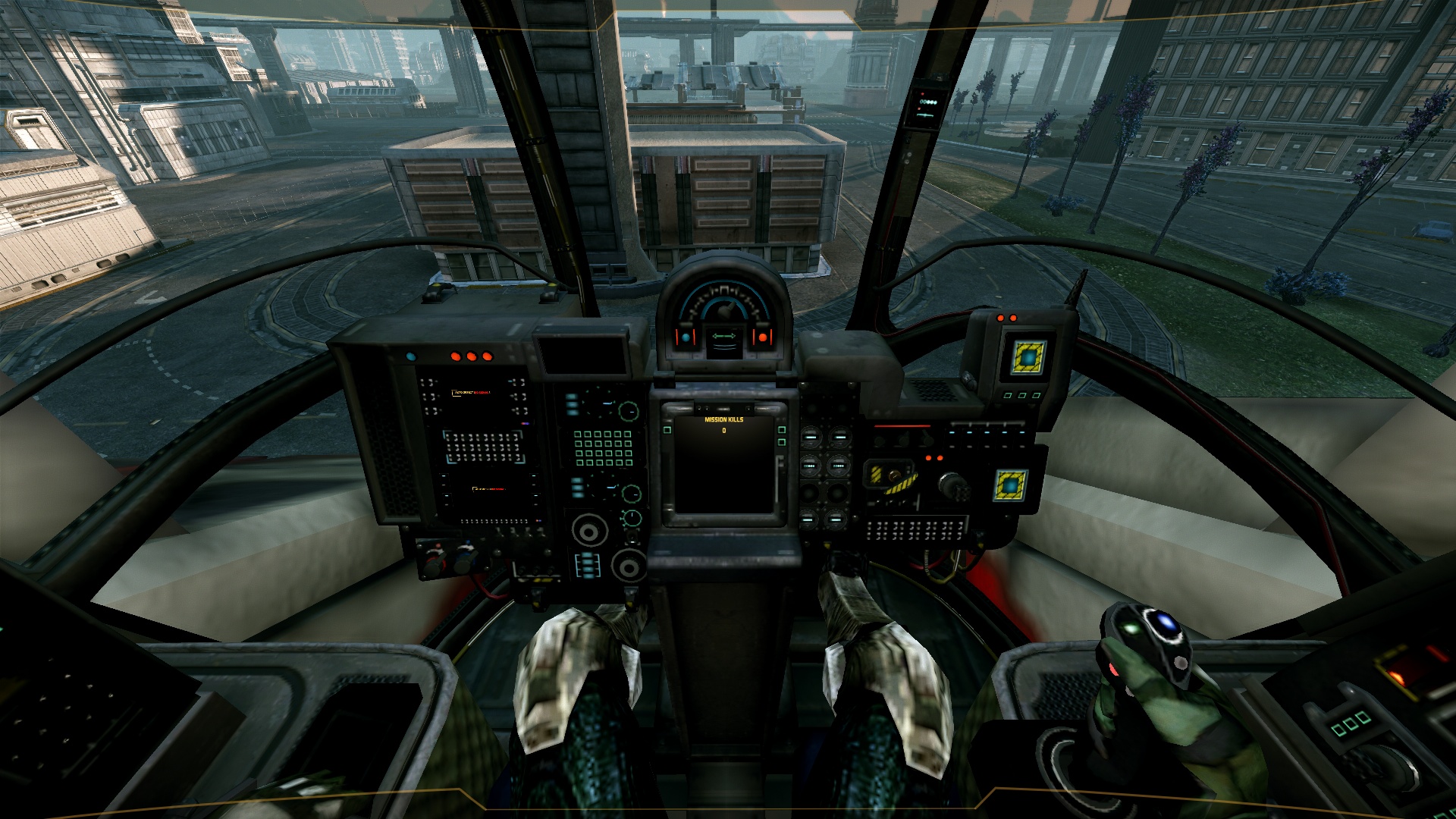
and IMO, the best cockpit view
Posted Image
runner up: Cataphract
worst: Atlas


Just a few thoughts:
I was surprised I ended up going Founders (well, K2 isn't, but the Catapult was) across the board TBH, but one thing I have noticed, is post Closed Beta, detail quality and such seems to be reduced with almost each new mech, they start to look homogenous and boring, to me, despite there being several newer designs I like.

In general, I like non humanoids, chicken walkers or quasi-humanoids like the Cataphract more that actual humanoid mechs. The K2 I liked even better before the art department ruined the arm PPCs by shrinking them. Original PPC barrels left the K2 the best looking mech in the game, IMO. Hunchback was always my runner up, as the original source art is crap, but the way he kept the feel, but so massively improved it, and the little details, just too cool. If the Cicada had been modeled as exhaustively, it probably would have topped the HBK though, as the basic design of the Cicada is just so interesting.

Anyhow, what about you guys?

#2 Sug

    Member

  • PipPipPipPipPipPipPipPipPip
  • The People's Hero
  • The People
  • 4,629 posts
  • LocationChicago

Posted 27 March 2014 - 09:08 AM

View PostBishop Steiner, on 27 March 2014 - 08:53 AM, said:

and IMO, the best cockpit view


Which mech is that?

#3 DONTOR

    Member

  • PipPipPipPipPipPipPipPipPip
  • Ace Of Spades
  • Ace Of Spades
  • 3,806 posts
  • LocationStuck on a piece of Commando in my Ice Ferret

Posted 27 March 2014 - 09:14 AM

Ha this is interesting because I LOVE the looks of alot of the ones you think are sub par.

Wolverine: looks militant and armored I really like it (gasmask is badass to me). The shawk to me is the ugliest mech in game and I wont pilot it. (even though I got 3 from Phoenix) Trebuchet would be my first favorite lookng medium however.

I like the Quickdraw for all the same reasons as the Wolverine boxy militant look, and a huge armored chest.

I also love the banshees looks aside from I agree that it is a little too fat. Battlemaster is my favorite looking assult though.

I do agree with you on lights however, except that the commando is #1 for me because again it looks quite militant.

I think you can see a pattern there lol.

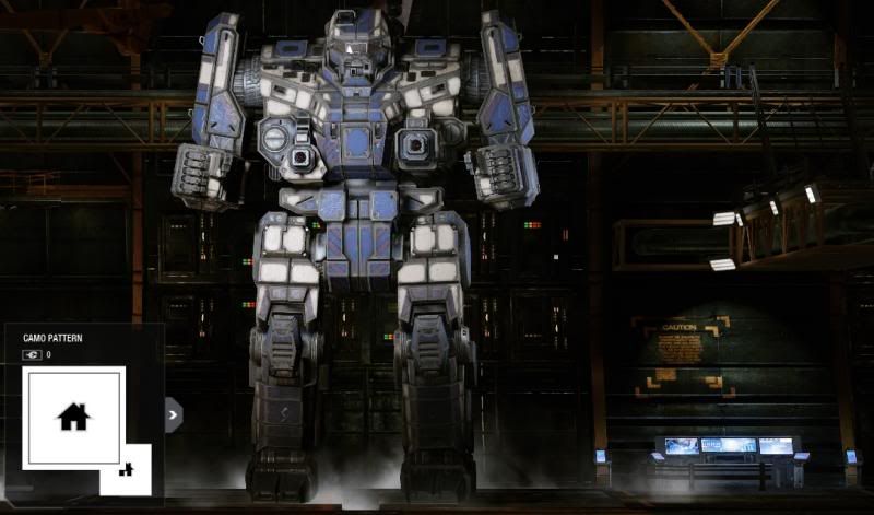
A little evidence to support my claims!
Posted Image
Posted Image
Posted Image
Posted Image

As you can see I really like my "Snow Leopard" Camo. P.S. I cant wait for the commados model updates!

Edited by DONTOR, 27 March 2014 - 10:45 AM.


#4 Artgathan

    Member

  • PipPipPipPipPipPipPipPip
  • Knight Errant
  • Knight Errant
  • 1,764 posts

Posted 27 March 2014 - 09:47 AM

Funny that you ended up with all Founders Bishop!

Personally my choices would be:

Light - Locust (Best), Firestarter (Runner-Up), Commando (If I have to pick a worst, I actually like all the lights)
Medium - Wolverine / Griffin (I'm really too torn on this one to pick a favorite), Centurion (Runner-Up), Shadowhawk (Vomit Factory)
Heavy - Cataphract (Best), Thunderbolt (Runner-Up), Orion (Pretty Ugly)
Assault - Atlas (Best), Highlander (Runner-Up), Stalker (The Goodyear Blimp wants its number).

#5 Bishop Steiner

    ForumWarrior

  • PipPipPipPipPipPipPipPipPipPipPipPipPipPipPip
  • The Hammer
  • The Hammer
  • 47,187 posts
  • Locationclimbing Mt Tryhard, one smoldering Meta-Mech corpse at a time

Posted 27 March 2014 - 09:52 AM

View PostSug, on 27 March 2014 - 09:08 AM, said:


Which mech is that?

Griffin

#6 Eximar

    Member

  • PipPipPipPipPipPipPip
  • 911 posts
  • LocationStill living in 3025

Posted 27 March 2014 - 09:52 AM

Best:
Light - Locust
Medium - Wolverine
Heavy - Cataphract
Assault - Awesome

Worst:
Light - Raven
Medium - Cicada
Heavy - Orion
Assault - Stalker

#7 TercieI

    Member

  • PipPipPipPipPipPipPipPipPipPip
  • Littlest Helper
  • Littlest Helper
  • 8,161 posts
  • LocationThe Far Country

Posted 27 March 2014 - 09:53 AM

I like this thread!

Best/worst:

Light: Locust (it's terrible, but it does look cool)/Firestarter (it's a friggin' koala bear!)
Medium: Cicada (wow, mediums are an ugly lot, I just realized)/Trebuchet (the only medium I don't own and so it will remain because I can't stand looking at it)
Heavy: Cataphract (supposed to be ugly, just looks BOSS)/Quickdraw (are those antennae on your head? No, you're happy to see me? Ick.)
Assault: Atlas (Duh)/Victor (too many paint schemes have "eyes" and it's just awkward looking, always 5 degrees off from awesome, which is worse than being a d*ck on legs, IMO)

#8 Bishop Steiner

    ForumWarrior

  • PipPipPipPipPipPipPipPipPipPipPipPipPipPipPip
  • The Hammer
  • The Hammer
  • 47,187 posts
  • Locationclimbing Mt Tryhard, one smoldering Meta-Mech corpse at a time

Posted 27 March 2014 - 09:59 AM

View PostDONTOR, on 27 March 2014 - 09:14 AM, said:

Ha this is interesting because I LOVE the looks of alot of the ones you think are sub par.

Wolverine: looks militant and armored I really like it (gasmask is badass to me). The shawk to me is the ugliest mech in game and I wont pilot it. (even though I got 3 from Phoenix) Trebuchet would be my first favorite lookng medium however.

I like the Quickdraw for all the same reasons as the Wolverine boxy militant look, and a huge armored chest.

I also love the banshees looks aside from I agree that it is a little too fat. Battlemaster is my favorite looking assult though.

I do agree with you on lights however, except that the commando is #1 for me because again it looks quite militant.

I think you can see a pattern there lol.

Yeah, to me the Wolverine is boxy and featureless. Then the head seems to stand too tall. Remove the missile rack it has a pinhead look. And like the Trebbie, its massive looking from the front, but flat from the side. It just looks like the mutant lovechild of a Thunderbolt and a Trebbie, to me.

And in some case, like the Quickdraw, I don't have it, at least not all of them. my old 5K with chest lasers and PPC in the arms looked pretty decent, in fact, it reminds me a lot of my Dervish redesign. But I like it less than the rest. Orion surprised me how much I liked it, since I felt Alex's art design was a little too pillsbury dough boy (which he repeated with the Wolverine and Banshee, IMO).

Mind you, the list of mechs I actually "hate" is pretty small. Banshee, Trebuchet, Wolverine are about it for that list. The Shadowhawk is ccertainly boring and dull to look at, but it is an instance that it plays so well, I can't stop using it, though I am glad my Griffin is awesome too, since that is my new go-to Mech. The others either didn't wow me, or were just less interesting than the other choices.


Actually, I should probably amend my "worst" choice in heavy. I HATE the stupid bird beak on the Founders Catapult.

Edited by Bishop Steiner, 27 March 2014 - 10:01 AM.


#9 BLOOD WOLF

    Member

  • PipPipPipPipPipPipPipPipPipPip
  • The Jaws
  • The Jaws
  • 6,368 posts
  • Locationnowhere

Posted 27 March 2014 - 09:59 AM

The problem is your comparing this with what? the novels? the oder MW games?

In anycase. the models look alright, im a bit biased as i dont like IS mechs so im waiting for the clan mechs.

The Atlas looks way better than the one in MWLL, i dont know what they were thinking. Theres loads of differnt looks of the mechs, so its really in the eyes of the beholder which mechs look best to them

Edited by BLOOD WOLF, 27 March 2014 - 10:01 AM.


#10 Mazzyplz

    Member

  • PipPipPipPipPipPipPipPipPip
  • Ace Of Spades
  • 3,292 posts

Posted 27 March 2014 - 10:02 AM

awesome is the best looking.

then catapult with the uac5 on the side torso

cataphract

banshee

cicada

and commando.


worst:

the worst one is the griffin, imo. the cockpit makes it look like a toy, not really armored enough for combat.
reminds me of the yellow suit ripley uses in aliens, that's how clunky it looks to me.

also the jenner is ugly

and the orion's cockpit again, looks off. the whole orion looks like it's made from lego

#11 Bishop Steiner

    ForumWarrior

  • PipPipPipPipPipPipPipPipPipPipPipPipPipPipPip
  • The Hammer
  • The Hammer
  • 47,187 posts
  • Locationclimbing Mt Tryhard, one smoldering Meta-Mech corpse at a time

Posted 27 March 2014 - 10:06 AM

View PostTerciel1976, on 27 March 2014 - 09:53 AM, said:

I like this thread!

Best/worst:

Light: Locust (it's terrible, but it does look cool)/Firestarter (it's a friggin' koala bear!)
Medium: Cicada (wow, mediums are an ugly lot, I just realized)/Trebuchet (the only medium I don't own and so it will remain because I can't stand looking at it)
Heavy: Cataphract (supposed to be ugly, just looks BOSS)/Quickdraw (are those antennae on your head? No, you're happy to see me? Ick.)
Assault: Atlas (Duh)/Victor (too many paint schemes have "eyes" and it's just awkward looking, always 5 degrees off from awesome, which is worse than being a d*ck on legs, IMO)

watchu talkin' about, Willis?
Posted Image

And yeah, the "eyes" on the VTR annoy the crap out of me. If there were like you say, just a few tweaks, it would be awesome. Kinda how I feel about the ShadowHawk, TBH. Put a little more flair, and a non crap looking head? Might be cool.

View PostBLOOD WOLF, on 27 March 2014 - 09:59 AM, said:

The problem is your comparing this with what? the novels? the oder MW games?

In anycase. the models look alright, im a bit biased as i dont like IS mechs so im waiting for the clan mechs.

The Atlas looks way better than the one in MWLL, i dont know what they were thinking. Theres loads of differnt looks of the mechs, so its really in the eyes of the beholder which mechs look best to them

I'm comparing this to anything. It's my opinion (and yours, and everyones) of what they do or do not like. Nothing more.

#12 Bishop Steiner

    ForumWarrior

  • PipPipPipPipPipPipPipPipPipPipPipPipPipPipPip
  • The Hammer
  • The Hammer
  • 47,187 posts
  • Locationclimbing Mt Tryhard, one smoldering Meta-Mech corpse at a time

Posted 27 March 2014 - 10:10 AM

View PostMazzyplz, on 27 March 2014 - 10:02 AM, said:


the worst one is the griffin, imo. the cockpit makes it look like a toy, not really armored enough for combat.
reminds me of the yellow suit ripley uses in aliens, that's how clunky it looks to me.

also the jenner is ugly

and the orion's cockpit again, looks off. the whole orion looks like it's made from lego

lolz, totally disagree with your worsts, but that is why looks are subjective. I do like the 8Q Awesome a lot, just hate most of the other versions with the big box launchers.

And Jenner is ugly, which is part of what makes it cool to me at the same time. It's ugly, but so well designed despite. Too many later mechs, like the Banshee, are ugly, and look like they were copy pasted by a Jr High School student.

#13 Mazzyplz

    Member

  • PipPipPipPipPipPipPipPipPip
  • Ace Of Spades
  • 3,292 posts

Posted 27 March 2014 - 10:24 AM

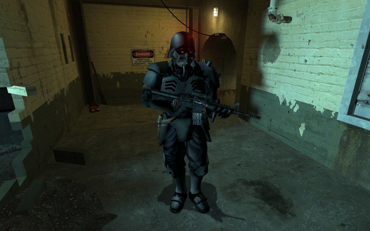
whaa how is the banshee ugly? i find it pretty freakin cool, looks like a soldier in full riot gear, with a motorcycle helmet:

Posted Image

Posted Image


i will say though, la malinche is AWFUL... it's the worst looking hero mech by far, something about that paint job is really unfortunate - makes it looks even more square and tacky as the stock variants

Edited by Mazzyplz, 27 March 2014 - 10:30 AM.


#14 Equalizer

    Member

  • PipPipPipPipPip
  • Elite Founder
  • Elite Founder
  • 138 posts

Posted 27 March 2014 - 10:26 AM

View PostBishop Steiner, on 27 March 2014 - 08:53 AM, said:


Just a few thoughts:
I was surprised I ended up going Founders (well, K2 isn't, but the Catapult was) across the board TBH, but one thing I have noticed, is post Closed Beta, detail quality and such seems to be reduced with almost each new mech, they start to look homogenous and boring, to me, despite there being several newer designs I like.


My thoughts exactly - most of the newer mechs look pretty crappy, compared to the initially released ones. Now looking at the list below, it actually tends to reflect that, lol:

Lights: I find the Commando, Spider and Locust the best looking ones, would include the Raven too but its back looks just too silly. Unlike other classes, however, I pretty much like all lights.

Mediums: I like the Cicada, Hunchback, Trebuchet and Kintaro, but the Shadowhawk is hands-down the ugliest mech so far (even uglier than Stalkers).

Heavies: Catapult (although all variants look considerably worse that what they used to), Jagermech, Cataphract are my favourites here, but I also kinda like the Thunderbolt. I really wish they did the Orion a bit differently though, it just... doesn't look right.

Assaults: Best looking ones - Atlas, Awesome and Highlander, worst - Stalker (2nd worst in the game IMO) and Battlemaster.

#15 Sable

    Member

  • PipPipPipPipPipPipPip
  • The Predator
  • The Predator
  • 924 posts

Posted 27 March 2014 - 10:26 AM

Best looking

Light - Raven (it just looks sleek and slim, fits its role as a stealthy scout really well)
Medium - Dragon (I like how its shoulders are far back like its strutting it's stuff)
Heavy - Jagermech (specifically the Firebrand, not sure if its arms are a little builkier or what but it looks beastly)
Assault - Atlas (at least for now, doesn't matter what other 100 tonners come out, a skull face is always intimidating)

#16 Bishop Steiner

    ForumWarrior

  • PipPipPipPipPipPipPipPipPipPipPipPipPipPipPip
  • The Hammer
  • The Hammer
  • 47,187 posts
  • Locationclimbing Mt Tryhard, one smoldering Meta-Mech corpse at a time

Posted 27 March 2014 - 10:28 AM

View PostMazzyplz, on 27 March 2014 - 10:24 AM, said:

whaa how is the banshee ugly? i find it pretty freakin cool, looks like a soldier in full riot gear, with a motorcycle helmet:

Posted Image

Posted Image
Posted Image


i will say though, la malinche is AWFUL... it's the worst looking hero mech by far, something about that paint job is really unfortunate - makes it looks even more square and tacky as the stock variants

firstly, it's way too fat. Banshee is supposed to be tall and lanky. Secondly, no iconic grinning skull in sunglasses. It looks like fat generic mech to me. And yeah, LM makes it even worse, not aided by the stupid cigar laser.

And it's a mech. I don't want my mech to look like Power Armor so much. Atlas is of course, arguably in that category, but the detail level is way better, and unlike the banshee it is sloppy job made by lazy programmers trying to keep polygons to a minimum.

Edited by Bishop Steiner, 27 March 2014 - 10:30 AM.


#17 Bishop Steiner

    ForumWarrior

  • PipPipPipPipPipPipPipPipPipPipPipPipPipPipPip
  • The Hammer
  • The Hammer
  • 47,187 posts
  • Locationclimbing Mt Tryhard, one smoldering Meta-Mech corpse at a time

Posted 27 March 2014 - 10:32 AM

View PostSable, on 27 March 2014 - 10:26 AM, said:

Best looking

Light - Raven (it just looks sleek and slim, fits its role as a stealthy scout really well)
Medium - Dragon (I like how its shoulders are far back like its strutting it's stuff)
Heavy - Jagermech (specifically the Firebrand, not sure if its arms are a little builkier or what but it looks beastly)
Assault - Atlas (at least for now, doesn't matter what other 100 tonners come out, a skull face is always intimidating)

Dragon is actually a heavy, but I like your list (though my fave Jager, the JM6-A sure does lose it's arms alot with how wide those missiles make it, lol.

#18 Mazzyplz

    Member

  • PipPipPipPipPipPipPipPipPip
  • Ace Of Spades
  • 3,292 posts

Posted 27 March 2014 - 10:31 AM

View PostBishop Steiner, on 27 March 2014 - 10:28 AM, said:

firstly, it's way too fat. Banshee is supposed to be tall and lanky. Secondly, no iconic grinning skull in sunglasses. It looks like fat generic mech to me. And yeah, LM makes it even worse, not aided by the stupid cigar laser.

And it's a mech. I don't want my mech to look like Power Armor so much. Atlas is of course, arguably in that category, but the detail level is way better, and unlike the banshee it is sloppy job made by lazy programmers trying to keep polygons to a minimum.


true i guess that's true, we'd have to see the poly count on those

i'll try and get the models into a 3d editor and count them sometime soon :rolleyes:

#19 Thorqemada

    Member

  • PipPipPipPipPipPipPipPipPipPip
  • 6,385 posts

Posted 27 March 2014 - 10:32 AM

Best:
Light - Raven
Medium - Centurion
Heavy - Catapult
Assault - Awesome

Worst:
Light - Firestarter
Medium - Trebuchet
Heavy - Quickdraw
Assault - Viktor

#20 Bishop Steiner

    ForumWarrior

  • PipPipPipPipPipPipPipPipPipPipPipPipPipPipPip
  • The Hammer
  • The Hammer
  • 47,187 posts
  • Locationclimbing Mt Tryhard, one smoldering Meta-Mech corpse at a time

Posted 27 March 2014 - 10:35 AM

View PostMazzyplz, on 27 March 2014 - 10:31 AM, said:


true i guess that's true, we'd have to see the poly count on those

i'll try and get the models into a 3d editor and count them sometime soon :rolleyes:

recycled art assets I kind of get, but it makes for dull, repetitive builds.


1 user(s) are reading this topic

0 members, 1 guests, 0 anonymous users