Jump to content

Updated! Timber Wolf Screen Shots Revealed


950 replies to this topic

#341 Zack Esseth

    Member

  • PipPipPipPipPipPip
  • The Predator
  • The Predator
  • 248 posts
  • LocationRith Essa

Posted 10 April 2014 - 08:24 PM

Even if the pods are smaller than the ears of the Catapult, I hope they disappear if I remove the LRMS.

#342 Jin Ma

    Member

  • PipPipPipPipPipPipPipPip
  • 1,323 posts

Posted 10 April 2014 - 08:25 PM

Now they just need to update the post with the proper screenshot.

#343 Navid A1

    Member

  • PipPipPipPipPipPipPipPipPip
  • CS 2022 Gold Champ
  • CS 2022 Gold Champ
  • 4,938 posts
  • LocationVancouver, BC

Posted 10 April 2014 - 08:26 PM

View PostTichorius Davion, on 10 April 2014 - 07:39 PM, said:

View PostRhapsody Repine, on 10 April 2014 - 07:37 PM, said:

My only concern with the Legs, is that they seem to be almost 2x as long as the entire top section of the Mech in those early screenshots. I can understand a 'weighty' apperance... but when you have a mech, who's legs are fully 1/3 more lengthy than the upper 1/2 of the mech... it just looks wrong.


Posted Image

There's a thread in Upcoming Features.

The Timber Wolf is hardly larger than a Dragon.

The legs are not as big as you think they look.


You Fell for that?... that timberwolf is running (clever trick by PGI when they see the feedback).
the legs in that animation snapshot is what it should be in idle stance too....
the idle stance looks like this: (also from the newly posted pics)

Posted Image

#344 Xoxim SC

    Member

  • PipPipPipPipPipPip
  • The Universe
  • The Universe
  • 454 posts

Posted 10 April 2014 - 08:30 PM

The legs do need some serious work. They look awful. The cockpit could use some work too, looks almost as if you just slapped some low texture models on it and called it a day.

#345 DocBach

    Member

  • PipPipPipPipPipPipPipPipPip
  • Legendary Founder
  • Legendary Founder
  • 4,828 posts
  • LocationSouthern Oregon

Posted 10 April 2014 - 08:32 PM

View PostCimarb, on 10 April 2014 - 06:03 PM, said:


Huh?... Phelan sent a message before he was captured. That was the first warning the IS got.


He did a data dump of his battle recorder over wideband comms, he didn't write a briefing. He got blown up, knocked out and woke up a bondsman.

#346 DEN_Ninja

    Member

  • PipPipPipPipPipPipPipPip
  • The Blade
  • The Blade
  • 1,097 posts
  • LocationCrossing, Draconis March

Posted 10 April 2014 - 08:35 PM

View PostNavid A1, on 10 April 2014 - 08:26 PM, said:


You Fell for that?... that timberwolf is running (clever trick by PGI when they see the feedback).
the legs in that animation snapshot is what it should be in idle stance too....
the idle stance looks like this: (also from the newly posted pics)

Posted Image


If that is idle why is the foot pad in the air?

#347 verybad

    Member

  • PipPipPipPipPipPipPipPipPip
  • 4,229 posts

Posted 10 April 2014 - 08:37 PM

They could fix a lot of the look simply by making the pelvis a bit thinner and moving the upper leg inward.

#348 toncrell

    Member

  • PipPip
  • Nova Captain
  • Nova Captain
  • 43 posts

Posted 10 April 2014 - 08:40 PM

ok the mady looks cool the legs maybe just the angle of the picture,anyway we cant see ourselves from the front to begin with so not a deal breaker. the desing team has always deliverd on the looks of the mechs. The look of the mechs has never been a problem, delivering on the game itself has benn and still is So until we have a game to play these nice looking mechs with, my wallet is still closed until you honor your word.

#349 BLACKFIRE

    Member

  • PipPipPip
  • The Defiant
  • The Defiant
  • 88 posts
  • LocationSan Antonio

Posted 10 April 2014 - 08:42 PM

FIX THE KNEES!!! THEY ARE SIDE LOCKED NOT DIRECT! ALSO WHERES THE TOES! If you insist on recycling your mech parts at least use the Catapults FEET! and fix the Knees! Even your alpha strike picture had the right KNEES! I dont care about your angles and your BS LOOK at the Knees TOTALLY WRONG that's iconic for the Maddog and the Timberwolf.

View PostDirePhoenix, on 10 April 2014 - 07:13 PM, said:

Wrong. That is now the old outdated style.

This is the new updated style:
Posted Image

published last October.

Or the pre-published version for cleaner lines:
Posted Image


#350 GalaxyBluestar

    Member

  • PipPipPipPipPipPipPipPipPip
  • 3,748 posts
  • Location...

Posted 10 April 2014 - 08:46 PM

ONE MORE SECRET SCREEN SHOT!

Spoiler


:) kinda thinking the cockpit area is short andstubby in comparasent to the legs, the legs are very stocky and the arms look stubby and stocky too but other than that it's okay i guess...

Edited by GalaxyBluestar, 10 April 2014 - 08:48 PM.


#351 verybad

    Member

  • PipPipPipPipPipPipPipPipPip
  • 4,229 posts

Posted 10 April 2014 - 08:47 PM

Think a lot of people are learning the lessen to not buy before you try after this.Hopefully some of the other clan mechs look better.

From the non-biased (ie straight on rather than looking up at it) it looks mediocre. It's not as bad as the earlier screens were, but it still ain't gonna win any beauty contests.

#352 Ghost0r

    Member

  • PipPip
  • Elite Founder
  • Elite Founder
  • 33 posts

Posted 10 April 2014 - 08:48 PM

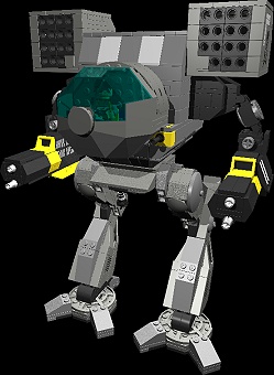
This is a Mad Cat.

Posted Image

#353 Tannhauser Gate

    Member

  • PipPipPipPipPipPipPipPip
  • The Blood-Eye
  • The Blood-Eye
  • 1,302 posts
  • LocationAttack ship off the Shoulder of Orion

Posted 10 April 2014 - 08:53 PM

Yeah looking at it closer I have to agree that the knees need to be side mounted and not straight on like a stalker. Its going to impossible to please everyone with such an iconic mech thats has different looks in so many different games. But you gotta at least get the basics right. The kneew look off. The hips too wide. I think it looks badas over all though. just a few changes needed

#354 Ngamok

    Member

  • PipPipPipPipPipPipPipPipPipPip
  • Elite Founder
  • Elite Founder
  • 5,033 posts
  • Twitter: Link
  • Twitch: Link
  • LocationLafayette, IN

Posted 10 April 2014 - 08:57 PM

Really wish he posted the gold paint version so all you guys raging would rage even more that they are trying to sell you the $500 one by only showing it or whatever reason you'd come up with. Me, I like the boxy R2D2 coming out the side cockpit version with the more rounded legs. Yes, the initial screen shot looked like it had really big legs. But it's nothing to rage quit / foam at the mouth over.

#355 Duncan Jr Fischer

    Member

  • PipPipPipPipPipPip
  • Legendary Founder
  • Legendary Founder
  • 493 posts
  • LocationKyiv

Posted 10 April 2014 - 08:57 PM

I'm disappointed from the aesthetic point of view, I must say. They gave him the fattest and most un-elegant legs possible. And those ugly missile racks, those fatty arms.. Looks disgusting. Nothing remains here of grace and superiority of the original design..
And the main question is - why in the world you would try to draw Mona Lisa when there is already a perfect one?

View PostGhost0r, on 10 April 2014 - 08:48 PM, said:

This is a Mad Cat.

Posted Image


Yes, YES! YES!!!!

EDIT
And just one more question. Gamedev-wise, is it normal in PGI to miss the concept art THAT badly when modelling? The concept wasn't as awesome as a picture above, but it did bear much more resemblance to the original design, than this pile of cubes..
Not only I'm happy that I haven't spent anything on clans, but also I start to feel that I wouldn't want even to play at all when this ugliness arrives on the battlefields. Until today I was looking forward to see Clans and fight them.. Guess, I'll quit instead.

Edited by Duncan Jr Fischer, 10 April 2014 - 09:18 PM.


#356 Magic Murder Bag

    Member

  • PipPipPipPipPip
  • Bad Company
  • Bad Company
  • 149 posts
  • LocationSomewhere between Naraka and Shinkoku

Posted 10 April 2014 - 09:10 PM

View PostNgamok, on 10 April 2014 - 08:57 PM, said:

Really wish he posted the gold paint version so all you guys raging would rage even more that they are trying to sell you the $500 one by only showing it or whatever reason you'd come up with. Me, I like the boxy R2D2 coming out the side cockpit version with the more rounded legs. Yes, the initial screen shot looked like it had really big legs. But it's nothing to rage quit / foam at the mouth over.


View PostLakeDaemon, on 10 April 2014 - 08:53 PM, said:

Yeah looking at it closer I have to agree that the knees need to be side mounted and not straight on like a stalker. Its going to impossible to please everyone with such an iconic mech thats has different looks in so many different games. But you gotta at least get the basics right. The kneew look off. The hips too wide. I think it looks badas over all though. just a few changes needed


They say that nostalgia is as much of a curse as it is a gift...yeah I made that up

If one were to look at the redesign on a more "practical and militaristic" note the stockier legs and arms would allow it greater stability and armor (seriously the original TRO's arms and upper legs were fairly flimsy looking IMO). Of course some minor scaling back can be used around the legs here and there. Overall, its a nice redesign of an iconic mech IMO, but as you said, it's damn near impossible to please everyone....and that can get relatively sad.

#357 Gernot von Kurzmann

    Member

  • PipPip
  • 49 posts

Posted 10 April 2014 - 09:10 PM

LOL - an for that you will pay so much money... that never looks like an orginal Timberwolf of an advanced Technology Clan. This looks like a Timberwolf ->
https://www.google.a...F%3B1600%3B1200

This Mech looks like a poor inner sp. variant of an Mad Cat :)

Edited by Gernot von Kurzmann, 10 April 2014 - 09:10 PM.


#358 verybad

    Member

  • PipPipPipPipPipPipPipPipPip
  • 4,229 posts

Posted 10 April 2014 - 09:11 PM

View PostGalaxyBluestar, on 10 April 2014 - 08:46 PM, said:

ONE MORE SECRET SCREEN SHOT!

Spoiler


:) kinda thinking the cockpit area is short andstubby in comparasent to the legs, the legs are very stocky and the arms look stubby and stocky too but other than that it's okay i guess...

That's the best one yet!

#359 verybad

    Member

  • PipPipPipPipPipPipPipPipPip
  • 4,229 posts

Posted 10 April 2014 - 09:17 PM

Mechwarrior 4 Madcat.

Just update it, add some more polys and detail, and you've got something better.
Posted Image

Edited by verybad, 10 April 2014 - 09:17 PM.


#360 Antagonist

    Member

  • PipPipPipPipPipPip
  • 256 posts
  • LocationGermany

Posted 10 April 2014 - 09:19 PM

Well, now we know how they're going to account for Clan mobility: Make the legs large and easy to hit. Same goes for the arms, TBH.

The torso sections look too small for the rest of the mech, IMHO...or the arms and legs too large to be mounted on that torso.


8 user(s) are reading this topic

0 members, 8 guests, 0 anonymous users