Updated! Timber Wolf Screen Shots Revealed
#361
Posted 10 April 2014 - 09:26 PM
It's actually even worse than the uninspired garbage they designed for MW4. I would rather they used the model straight out of MechAssault and just upscaled it.
I know PGI is trying to make the 'Mechs in this game look all modern and such, and some of the 'Mech designs looks pretty good in their updated forms, but this really needs a revision. Badly.
I am not trying to be dramatic or hyperbolic. It's barely recognizable as a Timber Wolf. It looks like it's some third-party knock-off.
#362
Posted 10 April 2014 - 09:45 PM
 Tichorius Davion, on 10 April 2014 - 08:35 PM, said:
 Navid A1, on 10 April 2014 - 08:26 PM, said:
You Fell for that?... that timberwolf is running (clever trick by PGI when they see the feedback).
the legs in that animation snapshot is what it should be in idle stance too....
the idle stance looks like this: (also from the newly posted pics)

If that is idle why is the foot pad in the air?
Starting it's walking pace movement?...
that made it even worse... you just proved that it looks bad, not only in idle stance... but in walking pace to0...
Edited by Navid A1, 10 April 2014 - 09:46 PM.
#363
Posted 10 April 2014 - 09:54 PM
 Navid A1, on 10 April 2014 - 09:45 PM, said:
Starting it's walking pace movement?...
that made it even worse... you just proved that it looks bad, not only in idle stance... but in walking pace to0...
^^
This...
Damn it, it was one of the easiest one to do!
And your ****** up!
#364
Posted 10 April 2014 - 10:00 PM
It's supposed to also look nimble. Make the legs less beefy while keeping the length.
#365
Posted 10 April 2014 - 10:19 PM
In Vlog #2 David said:
David:
“And people have been asking for the previews of the hard points and load outs of clan ‘mechs, and that information should be coming very soon, if not out already by the time this video gets out to you guys.”
Paul:
“We’ll hold that to him."
That was posted back on Feb 11 and it is now April 10th, two months later, and all you have that is new is an in game screen shot of one mech. Not only that but it is THE clan mech. At first I was like the others here, thinking the legs were too long, bulky, and square. Thankfully you posted on twitter (it should have been an edit to this post, I should not have to go to someone's personal twitter to see updates) a couple more screen shots that made it look not as bad as I thought but something was still off. Then others hit it on the head, it is the straight shot of the legs, they are not side locked/offset at the knee, as they should be. This changes the look, that is why the legs seem so bulky and out of place. The "toes" seem too short too but that is not as big as the legs themselves. This is the one clan mech you do not want to screw up on and you have. As an investor, I am not happy with the product being shown. Fix it, please. The social rewards are still sitting at the 10% from before this announcement, so no one has been enticed by your screen shot to buy in, that alone should tell you something.
Anywho, onto the other part of my post, we have only been given the prime variants hardpoints of the clan mechs so far. When are we getting the others? You did not even give us the other variants of the Timber Wolf with this post. I am sure some people are holding off on buying till they see this information and they are losing out on monthly rewards. You still have not held David to what he said either and it has been two months since he said this info would be out. We still do not have it.
Also, there is very little information on the Gold Khan mechs. Just that they are a gold skin and get a 30% c-bill bonus. Are they going to be a 4th mech of that type? So the prime and Khan would each have a 30% c-bill bonus then the 2 variants for a total of 4 mechs? Or is the prime going to be given a gold skin and you have 2 variants for 3 total mechs of that type? In the 4 mech case, would the Khan be its own variant or a duplicate of one of the others(ex/2 primes, one gold and one not or the 3 variants then a fourth unique gold variant)? or would the skin be moveable to any of that type of mech it was purchased for and the skin gives them the 30% bonus?
Then there is all the other items you have yet to define in the FAQ, such as warhorns and the unique moduels. There is only two months until this goes live, so you know what they are by now but are not telling us. If you do not know by now... you guys are in trouble with a fast approaching dead line. We have had nothing on the clans for two months and the best you have for us is one screen shot done three times over and two others from a twitter post, not even on the main game page. You guys are slipping on the communication again, you guys were doing good for a while, do not go back to the old ways. I want to support you, but you are making it very difficult.
Edited by Saber Avalon, 10 April 2014 - 10:21 PM.
#366
Posted 10 April 2014 - 10:50 PM
This has fat arms and fat legs. It's an unfit Madcat with middle-age spread.
Poor job, PGI.
3/10 must try harder.
#367
Posted 10 April 2014 - 10:51 PM
#368
Posted 10 April 2014 - 10:56 PM
The design is obviously a Timber Wolf, but considering that every single other model in the game at the moment have never looked as good as they do in MWO... I just expected more..? I like it. It is evidently just not the gorgeous piece of clan metal that was expected, though.
#369
Posted 10 April 2014 - 10:59 PM

#370
Posted 10 April 2014 - 11:00 PM
Side-offset knee joints are missing.
It's recognizably a Timberwolf, but... it's also subtly wrong.
Edited by Sable Phoenix, 10 April 2014 - 11:13 PM.
#372
Posted 10 April 2014 - 11:24 PM


There will be a lot of dissapointed people when clan weaponary is "balanced", and all clanmechs prove to be exactly same crap as mechs we have now.
#373
Posted 10 April 2014 - 11:25 PM
 Drathorin, on 10 April 2014 - 06:42 PM, said:
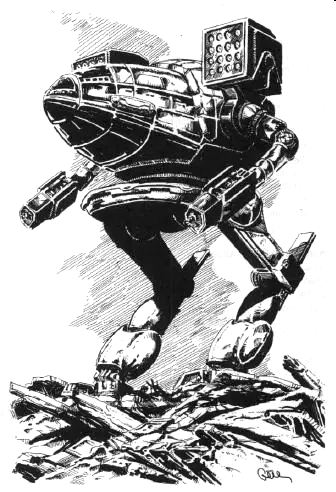
I present to you some official lineart.


Have your precious official mech >

 BLACKFIRE, on 10 April 2014 - 06:56 PM, said:


Did someone say cardboard boxes?

#374
Posted 10 April 2014 - 11:25 PM
Somehow the legs and the Torso doesn't fit good.
Sorry about the complains but I'am a Clan player eversince and I want my Clanmechs to look as perfect as possible
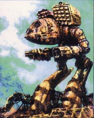
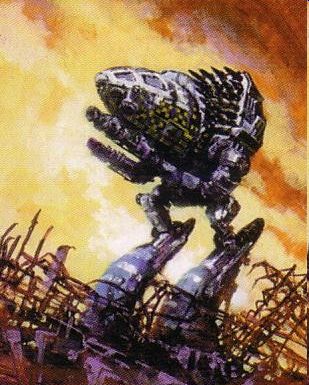
The legs a little less bulky and the Tors a little bit stretched and widend and I think it will look like the concept Art-
#375
Posted 10 April 2014 - 11:27 PM
#376
Posted 10 April 2014 - 11:30 PM
Seems PGI is really just bouncing from one bad design decision to another.
#377
Posted 10 April 2014 - 11:30 PM
Somehow the legs and the Torso doesn't fit good.
Sorry about the complains but I'am a Clan player eversince and I want my Clanmechs to look as perfect as possible
The legs a little less bulky and the Tors a little bit stretched and widend and I think it will look like the concept Art-
sorry for the double post but IE didn't worked properly.
Edited by Hornviech, 10 April 2014 - 11:43 PM.
#378
Posted 10 April 2014 - 11:47 PM
So, wich clan mech i next? I guess we get them spoonfed 1 / week now?
Edited by John McFianna, 10 April 2014 - 11:48 PM.
#379
Posted 10 April 2014 - 11:51 PM
#380
Posted 10 April 2014 - 11:53 PM
This thing will be a glass cannon, even more if the rear of launchers are rear sections.
1 user(s) are reading this topic
0 members, 1 guests, 0 anonymous users
 This topic is locked


