Edited by Jaroth Corbett, 06 June 2014 - 04:42 AM.

Clan Logos: How It Should Be
Started by Odanan, Jun 04 2014 03:38 AM
133 replies to this topic
#61
-

-

- The Vicious

- 2,308 posts
Member
- LocationSmoke Jaguar OZ
Posted 06 June 2014 - 04:41 AM
But they can put them on the Clan mechs in the Clan Collection ad? Really? So I guess we can have a glimpse of the Warhammer then? A copyright issue is a copyright issue there is no halfway ****.
#62
-
-
- 1,505 posts
Member

Posted 06 June 2014 - 05:20 AM
Honestly I don't know whether I like the original logos because of their visuals or because I am simply used to them after all those years. The new ones aren't exactly bad either. I just can't make my mind. I suppose what matters most is that now people know I am from CGB.
#63

Posted 06 June 2014 - 05:24 AM
My problem is threefold:
1. They were not given the same sort of art pass the IS logos had
2. As a result of 1, they do not have artistic consistency with the rest of the logos in game
3. They are so cluttered they are basically unrecognizable blobs in game
Simplification, not ostentatiousness, is the key to resolving all three of these issues.
#64

Posted 06 June 2014 - 05:55 AM
 KelesK, on 06 June 2014 - 04:36 AM, said:
They have mentioned legal issues were the reason they can't outright use the originals.
Has anyone provided a link to where they mentioned legal issues with the logos? I don't remember reading it myself.
Pariah Devalis, on 06 June 2014 - 05:24 AM, said:
My problem is threefold:
1. They were not given the same sort of art pass the IS logos had
2. As a result of 1, they do not have artistic consistency with the rest of the logos in game
3. They are so cluttered they are basically unrecognizable blobs in game
Simplification, not ostentatiousness, is the key to resolving all three of these issues.
1. They were not given the same sort of art pass the IS logos had
2. As a result of 1, they do not have artistic consistency with the rest of the logos in game
3. They are so cluttered they are basically unrecognizable blobs in game
Simplification, not ostentatiousness, is the key to resolving all three of these issues.
I am looking forward to the mild refresh versions, as I really like the IS ones, but I honestly think having two versions (militarized and parade) would be the best option. Have the militarized version be simplified for clarity on the battlefield and the parade version full of detail and color.
Mordin Ashe, on 06 June 2014 - 05:20 AM, said:
I suppose what matters most is that now people know I am from CGB.
That right there is THE most important thing, IMO.
#65

Posted 06 June 2014 - 07:40 AM
Pariah Devalis, on 06 June 2014 - 05:24 AM, said:
My problem is threefold:
1. They were not given the same sort of art pass the IS logos had
2. As a result of 1, they do not have artistic consistency with the rest of the logos in game
3. They are so cluttered they are basically unrecognizable blobs in game
Simplification, not ostentatiousness, is the key to resolving all three of these issues.
1. They were not given the same sort of art pass the IS logos had
2. As a result of 1, they do not have artistic consistency with the rest of the logos in game
3. They are so cluttered they are basically unrecognizable blobs in game
Simplification, not ostentatiousness, is the key to resolving all three of these issues.
@Cimarb it was mentioned in one of their blue/cyan/whatever posts. I'm not going hunting for it.
#66
Posted 06 June 2014 - 08:23 AM
KelesK, on 06 June 2014 - 07:40 AM, said:
@Cimarb it was mentioned in one of their blue/cyan/whatever posts. I'm not going hunting for it.
Well I have looked and, granted the search tool here is horrible, can't find it. If someone knows, please post it, since a lot of this argument is based off of that unconfirmed assumption.
#67
-

-
- The Sickle

- 2,161 posts
Member
Posted 06 June 2014 - 10:27 AM
Mordin Ashe, on 06 June 2014 - 05:20 AM, said:
I suppose what matters most is that now people know I am from CGB.
Well, lucky you, because apparently I belong to Clan Flesh Hound

#68
-

-
- The Universe

- 455 posts
Member
Posted 06 June 2014 - 10:58 AM
The Jaguar is still goofy as all hell looking....


#71
-
-
- Elite Founder

- 1,115 posts
Member
- LocationIn my parent's basement
Posted 06 June 2014 - 04:06 PM
Cimarb, on 06 June 2014 - 05:55 AM, said:
Has anyone provided a link to where they mentioned legal issues with the logos? I don't remember reading it myself.
The original post by Russ discussing the feedback mentions that is ambiguous about who owns the rights to the original logos, hence the need to tweak them. Specifically the fourth paragraph.
Edited by VanillaG, 06 June 2014 - 04:07 PM.
#72
Posted 06 June 2014 - 04:32 PM
VanillaG, on 06 June 2014 - 04:06 PM, said:
The original post by Russ discussing the feedback mentions that is ambiguous about who owns the rights to the original logos, hence the need to tweak them. Specifically the fourth paragraph.
Ah, gotcha, thanks! Here it is for lazy people (like me):
Russ Bullock, on 04 June 2014 - 12:05 PM, said:
No, they won't simply be the exact old logos either since there is enough ambiguity on rights ownership of artwork to prevent such from being feasible.
I totally read that differently the first time...
#73
-
-
- Ace Of Spades
- 8,219 posts
Member
- LocationBrazil
Posted 06 June 2014 - 04:48 PM
If this ambiguity on rights is the same of the IS logos, they can do the same subtle treatment in the Clan logos.
#74
Posted 06 June 2014 - 05:52 PM
Odanan, on 06 June 2014 - 04:48 PM, said:
If this ambiguity on rights is the same of the IS logos, they can do the same subtle treatment in the Clan logos.
I'm pretty sure that's the goal. We just have to wait three or so days to get them double checked. Not sure why the Art Director couldn't take 5 minutes to check them remotely, but it is what it is.
#75
-
-
- The Widow Maker

- 1,031 posts
Member
Posted 06 June 2014 - 06:01 PM
Odanan, on 04 June 2014 - 03:38 AM, said:
I'm not a graphic artist and I don't want to offend the PGI artist's work, but this is how the Clan logos should be:

And a bonus: (for players of other Clans)

PS: I just made a montage of the traditional Clan logos with some basic Photoshop. I didn't draw and don't own these sources.
EDIT: Like the traditional logos best?Vote in the pool. This pool was locked by a mod.
And a bonus: (for players of other Clans)
PS: I just made a montage of the traditional Clan logos with some basic Photoshop. I didn't draw and don't own these sources.
EDIT: Like the traditional logos best?
This is how it should have been right off the bat and no one would have complained.

#76
Posted 06 June 2014 - 06:30 PM
ShadowWolf Kell, on 06 June 2014 - 06:01 PM, said:
This is how it should have been right off the bat and no one would have complained.
I actually prefer the new Ghost Bear logo over the old one, but it needs a "high contrast" version for use in game.
#77
-

-
- Sergeant
- 68 posts
Member
Posted 06 June 2014 - 07:12 PM
Odanan, on 04 June 2014 - 03:38 AM, said:
I'm not a graphic artist and I don't want to offend the PGI artist's work, but this is how the Clan logos should be:
And a bonus: (for players of other Clans)
PS: I just made a montage of the traditional Clan logos with some basic Photoshop. I didn't draw and don't own these sources.
EDIT: Like the traditional logos best?Vote in the pool. This pool was locked by a mod.
And a bonus: (for players of other Clans)
PS: I just made a montage of the traditional Clan logos with some basic Photoshop. I didn't draw and don't own these sources.
EDIT: Like the traditional logos best?
The problem with the old emblems OP is that they look like they're from a Junior League Hockey game. They're blocky, 2-dimensional, poorly drawn, and lack any intimidation.
They needed a revamp.badly.
#78
-

-
- Gunsho-ni

- 672 posts
Member
- Location米国のネバダ州のリノで住んでいます。
Posted 06 June 2014 - 07:16 PM
I think the old Clan Ghost Bear logo, looks goofy. The new one just needs to show the eyes and ears of the Bear so people know what it is. Also a high Contrast simplified version would make it look better along with the Clan Wolf Logo.
Actually, the Clan Wolf logo looks Awesome, the problem is with the original Design. It`s Red-Orange On top of Orangish-red. My Artistic License, says that`s bad for design, so that`s not necessarily PGI`s Fault.
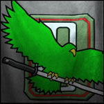
Clan Jade Falcon`s Logo looks alright but it too needs a high Contrast version, it`s too small in the Avatar Block in Game.
Clan Wolf needs the most help, It`s not recognizable. I would say change the Color of the bar in the back either to Orange and keep the Wolf Red Orange and make the Stars solid Yellow.
Clan Smoke Jaguar`s logo looks pretty dang sweet actually. But, I don`t know how it looks in game. The Old Smoke Jaguar logo is Bleh.
For Clan Jade Falcon, make the wings a bit thicker and sharper, Long exaggerated Feathers tend to make the Bird look like a Tiny Lovebird instead of Massive Hawk.
The real issue is Design
The older logos looked good in previous games because they were not shrunk down so much due to the size of lances.
The more complex your Design is and the more you Shrink, the Less and Less Recognizable it becomes. It just turns into a blob.
It`s why a lot of the Inner Sphere Logos work because they rarely are more than 2 or three colors.
Clan logos have Tons of Color and complex Shape so they just dissolve into Mush once you shrink them down.
Actually, the Clan Wolf logo looks Awesome, the problem is with the original Design. It`s Red-Orange On top of Orangish-red. My Artistic License, says that`s bad for design, so that`s not necessarily PGI`s Fault.
Clan Jade Falcon`s Logo looks alright but it too needs a high Contrast version, it`s too small in the Avatar Block in Game.
Clan Wolf needs the most help, It`s not recognizable. I would say change the Color of the bar in the back either to Orange and keep the Wolf Red Orange and make the Stars solid Yellow.
Clan Smoke Jaguar`s logo looks pretty dang sweet actually. But, I don`t know how it looks in game. The Old Smoke Jaguar logo is Bleh.
For Clan Jade Falcon, make the wings a bit thicker and sharper, Long exaggerated Feathers tend to make the Bird look like a Tiny Lovebird instead of Massive Hawk.
The real issue is Design
The older logos looked good in previous games because they were not shrunk down so much due to the size of lances.
The more complex your Design is and the more you Shrink, the Less and Less Recognizable it becomes. It just turns into a blob.
It`s why a lot of the Inner Sphere Logos work because they rarely are more than 2 or three colors.
Clan logos have Tons of Color and complex Shape so they just dissolve into Mush once you shrink them down.
Edited by Timuroslav, 06 June 2014 - 07:42 PM.
#79
-
-
- The Vicious
- 2,308 posts
Member
- LocationSmoke Jaguar OZ
Posted 06 June 2014 - 07:42 PM
Graystone1, on 06 June 2014 - 07:12 PM, said:
The problem with the old emblems OP is that they look like they're from a Junior League Hockey game. They're blocky, 2-dimensional, poorly drawn, and lack any intimidation.
They needed a revamp.badly.
I & a LOT of other people think not. They look a LOT better than the nonsense presented to us on Tuesday.
#80
Posted 06 June 2014 - 10:23 PM
Jaroth Corbett, on 06 June 2014 - 07:42 PM, said:
I & a LOT of other people think not. They look a LOT better than the nonsense presented to us on Tuesday.
That right there is the dilemma, though. On almost every topic, you have people that like it and others that don't. Some people really like the new logos, while others really don't like them. Some people love the front-loaded autocannons, others do not. Some people think ECM is balanced, while others do not. Do you see my point?


1 user(s) are reading this topic
0 members, 1 guests, 0 anonymous users


