


Clan Logos: How It Should Be
Started by Odanan, Jun 04 2014 03:38 AM
133 replies to this topic
#82
-

-

- The Vicious

- 2,308 posts
Member
- LocationSmoke Jaguar OZ
Posted 07 June 2014 - 01:10 AM
 Cimarb, on 06 June 2014 - 10:23 PM, said:
That right there is the dilemma, though. On almost every topic, you have people that like it and others that don't. Some people really like the new logos, while others really don't like them. Some people love the front-loaded autocannons, others do not. Some people think ECM is balanced, while others do not. Do you see my point?
http://mwomercs.com/...go-re-redesign/
Actually with the number of people who do NOT like the logos & the number of people who want them to be as close to the originals as possible based on the poll shown here, no I do not see your point.
#83
-
-
- Ace Of Spades

- 8,219 posts
Member
- LocationBrazil
Posted 07 June 2014 - 01:24 AM
Jaroth Corbett, on 07 June 2014 - 01:10 AM, said:
http://mwomercs.com/...go-re-redesign/
Actually with the number of people who do NOT like the logos & the number of people who want them to be as close to the originals as possible based on the poll shown here, no I do not see your point.
OK, I'm sure if some very talent artist pushes himself he CAN DO better logos for the Clans.
The thing is: (most of) we old players don't want new logos - we want the old ones, those we get used and learned to love. I'm sorry to say that, but Battletech is a much important part of our lives than of those new kids that started playing right now.
By presenting two options, PGI divided the player base. They should have made the "mild redesign" in the first place* and there would be no discussion.
*exactly like they did with the IS ones.
#84
Posted 07 June 2014 - 03:42 PM
Jaroth Corbett, on 07 June 2014 - 01:10 AM, said:
http://mwomercs.com/...go-re-redesign/
Actually with the number of people who do NOT like the logos & the number of people who want them to be as close to the originals as possible based on the poll shown here, no I do not see your point.
Actually with the number of people who do NOT like the logos & the number of people who want them to be as close to the originals as possible based on the poll shown here, no I do not see your point.
Biased poll is biased, even without intentional bias.
The subject of the poll is calling for a re-redesign, which biases anyone that bothers to click on that title. Even with it being biased that direction, the "it is ok" and "yes" are 164 votes, compared to the "no", which is 208. That is pretty close to a 40/60 vote, which is by no means a landslide.
I am indifferent, really. I am fine with the new ones in general, and actually prefer the new CGB logo more than any other ones.
Personally, I really think there should be a "fancy" version for parade use (in cockpit items and forums) as well as a "simplified" version for military use (in game icon and mech decal). Choosing Clan Ghost Bear should be the only thing needed, with the appropriate version showing as needed.
#85
Posted 07 June 2014 - 05:02 PM
Wolf could use a bit of toning down.
Jade Falcon needs to look a little more Falcon and less pigeon.
Smoke Jaguar needs to be more Smokey.
Ghost Bear needs the face pulled down in the it's record breaking beard and the paws enlarged... And you know, white and not blue.
Jade Falcon needs to look a little more Falcon and less pigeon.
Smoke Jaguar needs to be more Smokey.
Ghost Bear needs the face pulled down in the it's record breaking beard and the paws enlarged... And you know, white and not blue.
#86
-

-
- The 1 Percent

- 831 posts
Member
Posted 07 June 2014 - 05:52 PM
They pushed concept art to sell clan packs featuring classic logos. Give classic logos. Simple. Or atleast something closer to the classics.
Edited by CHH Badkarma, 07 June 2014 - 05:53 PM.
#87
Posted 07 June 2014 - 07:01 PM
CoffiNail, on 07 June 2014 - 05:02 PM, said:
Wolf could use a bit of toning down.
Jade Falcon needs to look a little more Falcon and less pigeon.
Smoke Jaguar needs to be more Smokey.
Ghost Bear needs the face pulled down in the it's record breaking beard and the paws enlarged... And you know, white and not blue.
Jade Falcon needs to look a little more Falcon and less pigeon.
Smoke Jaguar needs to be more Smokey.
Ghost Bear needs the face pulled down in the it's record breaking beard and the paws enlarged... And you know, white and not blue.
Agreed.
Indifferent.
Agreed.
Agree about the face - it should be less wolf-howl and more bear-growl. Indifferent about the paws, but I like the white-blue fade. Look at your own signature, where white and blue are the Ghost Bear colors, just like in the original logo - I think the fade looks good for parade colors, but needs to have more contrast for the military colors:
Original Logo
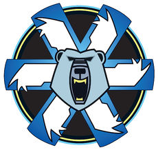
MWO heavy redesign

My suggested "parade" version - plenty of fades and colors
My suggested "militarized" version - simplified and high-contrast colors
Edited by Cimarb, 07 June 2014 - 07:04 PM.
#88
-
-
- Mercenary
- 2,037 posts
Member
- LocationSt. Louis, Niles, Kerensky Cluster
Posted 08 June 2014 - 01:06 PM
So, after several months of staying the hell away from MWO, I decided to check back and see if things had improved. Sadly, they have not.
The first thing I noticed, before I even got a chance to do any reading, was how stupid and juvenile the Clan logos look. They were fine before; there was no need to change them. Add the ripply flag effect to the originals, and call it a day.
Leave it to PGI to 'fix' something that is not broken. I have yet to see what abomination they plan to use for Clan Hell's Horses, but I would keep my Marik tags before using something as stupid as the new Clan logos...especially since the IS flags actually look like the originals.
#89
-

-
- Gunsho-ni

- 672 posts
Member
- Location米国のネバダ州のリノで住んでいます。

Posted 08 June 2014 - 04:08 PM
Aethon, on 08 June 2014 - 01:06 PM, said:
So, after several months of staying the hell away from MWO, I decided to check back and see if things had improved. Sadly, they have not.
The first thing I noticed, before I even got a chance to do any reading, was how stupid and juvenile the Clan logos look. They were fine before; there was no need to change them. Add the ripply flag effect to the originals, and call it a day.
Leave it to PGI to 'fix' something that is not broken. I have yet to see what abomination they plan to use for Clan Hell's Horses, but I would keep my Marik tags before using something as stupid as the new Clan logos...especially since the IS flags actually look like the originals.
The first thing I noticed, before I even got a chance to do any reading, was how stupid and juvenile the Clan logos look. They were fine before; there was no need to change them. Add the ripply flag effect to the originals, and call it a day.
Leave it to PGI to 'fix' something that is not broken. I have yet to see what abomination they plan to use for Clan Hell's Horses, but I would keep my Marik tags before using something as stupid as the new Clan logos...especially since the IS flags actually look like the originals.
Stop being Senile, They were fine FOR LARGE avatars.
I guarantee You take a Complex Shape with more than 5 colors and shrink it down to in game Size It WILL ALWAYS TURN INTO MUSH.
Don`t believe me?
Try it in Microsoft Paint. Scale a complex design all the way down to in game size. It will turn into Crap and be unrecognizable without simplification.
The Clan Wolf Logo will STILL BE crap because its Orange RED ontop of ORANGE.
Fine I`ll say it straight the old Clan Ghost Bear Logo looks dumb, compared to House Liao`s Logo. It NEEDS a Revamp.
Saying it`s nostalgiac is kind of a joke, because almost anything can become nostalgiac over time. Even bad memories.
Attacking young Fans, is also Idiotic because Young Fans keep the Series alive.
But, Hey I guess your Right Battletech doesn`t need to be Change, it can forever Remain the same, and over time It will become a Book no one reads, because it didn`t evolve. And those kids that supply the money for your dream of a Battletech game will go away. And Battletech will whither and die all because Old People hate young people. No wonder why America has population problems.
Edited by Timuroslav, 08 June 2014 - 04:13 PM.
#90
-
-
- Ace Of Spades
- 8,219 posts
Member
- LocationBrazil
Posted 08 June 2014 - 04:22 PM
Timuroslav, on 08 June 2014 - 04:08 PM, said:
And those kids that supply the money for your dream of a Battletech game will go away. And Battletech will whither and die all because Old People hate young people.
Kids with money? I thought they used to spend it all at the mall.
And if you don't like Battletech, go play something else. Just don't try to transform the game I love into a Hawken.
#91
-
-
- Gunsho-ni
- 672 posts
Member
- Location米国のネバダ州のリノで住んでいます。
Posted 08 June 2014 - 04:24 PM
See I got the impression that you didn`t give a **** about the game considering how much you give ***** about it. Like a bunch of whiny High School Girls. If nothing changes, Nothing Improves. Get over it.
Edited by Timuroslav, 08 June 2014 - 04:25 PM.
#92
-
-
- IS Exemplar

- 41 posts
Member
- LocationMagdebursch

Posted 08 June 2014 - 04:41 PM
Is it too late, to say, that i don't like the Steiner Fist?
I would like a more intimidate one, like this sex toy.

But i think that is like some people, that are complaining about a cute icebear or a fat bird...
...*trolling away*
I would like a more intimidate one, like this sex toy.
But i think that is like some people, that are complaining about a cute icebear or a fat bird...
...*trolling away*
Edited by Nippon, 08 June 2014 - 04:50 PM.
#93
Posted 08 June 2014 - 04:45 PM
The game needs to evolve. I agree with Timuro on that at least, though not his tone.
I don't want this game to turn into Hawken either, but that has nothing to do with this debate. We are talking about logos, not gameplay.
I'm looking forward to the mild refresh versions, just so I can have a choice. I am fine with the new logos, but I like having a vote in things and feel like I contributed. Depending on what they look like, I may vote for the mild OR heavy - totally depends on how they look, like all art.
Whichever winds up winning, I will be fine with it, since it's just a logo. If I don't like their version, I'll go ahead and make my own version for my signature.
#94
-

-
- FP Veteran - Beta 2

- 5,685 posts
Tina's Warrior
- LocationA 2nd Wolf Guards Grenadiers JumpShip
Posted 09 June 2014 - 12:28 AM
Yes, Timuroslav, they will always look crap in-game.. And this is just another reason to have a mild-worked simpler logo, quiaff? 
New young players may not even notice the change. The Clans have their identity and the old, militaristic logos (especially their modern redesigns that are actually VERY close to the originals, much improving them) express it very well. Better, for sure, than cartoony angry wolves and sneezy bears, quiaff? Unless we are talking about 10 y.o. kids who watch this kind of cartoons..
New young players may not even notice the change. The Clans have their identity and the old, militaristic logos (especially their modern redesigns that are actually VERY close to the originals, much improving them) express it very well. Better, for sure, than cartoony angry wolves and sneezy bears, quiaff? Unless we are talking about 10 y.o. kids who watch this kind of cartoons..
#95
-
-
- The Warden

- 3,741 posts
Member
- LocationLook at my Arctic Wolf. Closer... Closer...
Posted 09 June 2014 - 01:10 AM
The only one i think that actually needs redone is the ghost bear one the bear head is too small
#96
-

-
- Ace Of Spades

- 518 posts
Member
- LocationRussia
Posted 09 June 2014 - 03:28 AM
Dedicated to Jade Falcon 

#97
Posted 09 June 2014 - 08:18 AM
KursedVixen, on 09 June 2014 - 01:10 AM, said:
The only one i think that actually needs redone is the ghost bear one the bear head is too small
The head needs tilted down, I agree, but I actually like the CGB logo over any of the other remakes. Clan Wolf is probably my least favorite, but the main issue is the lack of contrast between foreground and background (all red-orange), which is an issue with the original as well.
#98
-
-
- FP Veteran - Beta 1

- 2,726 posts
Member
- LocationUSA
Posted 09 June 2014 - 08:34 AM
The old FASA clan and inner sphere logos were fine for 1995 2D graphics and I think PGI did a wonderful job recreating and redesigning the new logos and keeping the originality of the old logos intact. But I would like to see PGI allow custom nose art and custom decals.


#99
-
-
- 124 posts
Member
Posted 09 June 2014 - 08:40 AM
I wouldnt hold my breath for custom stuff unless it was a submitted design contest. There are legal ramifications and it would keep PGI from controlling what went on the mechs (which is probably part of their license agreement). Just look at some of the stupidness that comes from CoD where you can design logos.
I hope to keep the newer ones. I'm a fan of the Jade Falcon and the old symbol is drab. Yes I realize it is a military symbol, but it is also their totem, it is part of how they represent themselves and what they wish the world to see when they see them. A fat bird that doesnt even have the feathering style of a bird of prey is just bad. Might have rolled ok for the 90s, but it needed a refresh.
I hope to keep the newer ones. I'm a fan of the Jade Falcon and the old symbol is drab. Yes I realize it is a military symbol, but it is also their totem, it is part of how they represent themselves and what they wish the world to see when they see them. A fat bird that doesnt even have the feathering style of a bird of prey is just bad. Might have rolled ok for the 90s, but it needed a refresh.
#100
-

-
- 174 posts
Member
Posted 09 June 2014 - 08:48 AM
I am actually quite pleased with the new Clan banners. I think they are more aggressive and fearsome, befitting the general attitude of the invading Clans.


4 user(s) are reading this topic
0 members, 4 guests, 0 anonymous users


