Inner Sphere Resistance Badges
#41
Posted 25 March 2015 - 05:11 AM
#42
Posted 25 March 2015 - 05:17 AM
#43
Posted 25 March 2015 - 05:18 AM
I don't like this Paint stuff. I want a flaming skull. *stomping on ground*
Edited by Draal Kaan, 25 March 2015 - 05:19 AM.
#46
Posted 27 March 2015 - 07:33 AM
#47
Posted 27 March 2015 - 03:30 PM
#48
Posted 27 March 2015 - 04:14 PM
 Tina Benoit, on 20 March 2015 - 01:13 PM, said:
Basically the reason they were changed is due to the badges being so small in-game (16x16).
The skulls being the same color and similar shape were barely recognizable from one another in that size.
So therefore the change was made to better differentiate them!
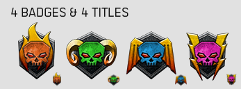
How about something like this?

I've included the in game icon size, which is 16x16. These are quite easy to differentiate, as they are coloured to match each pack as it appears both on the order page and the "new" badges.
Edited by Tarogato, 28 March 2015 - 02:27 AM.
#49
Posted 27 March 2015 - 07:17 PM
They will never be warhorns.
#51
Posted 29 March 2015 - 06:25 AM
 Tina Benoit, on 20 March 2015 - 01:13 PM, said:
Basically the reason they were changed is due to the badges being so small in-game (16x16).
The skulls being the same color and similar shape were barely recognizable from one another in that size.
So therefore the change was made to better differentiate them!
Understandable, but can I have the original badge in the Forums, at least?
 Tarogato, on 27 March 2015 - 04:14 PM, said:
How about something like this?

I've included the in game icon size, which is 16x16. These are quite easy to differentiate, as they are coloured to match each pack as it appears both on the order page and the "new" badges.
This, this, this and this!!!!
 strikebrch, on 20 March 2015 - 03:00 PM, said:
The fight is not over yet, Bro!
Edited by Odanan, 29 March 2015 - 06:22 AM.
#52
Posted 29 March 2015 - 07:14 AM
 Kjudoon, on 25 March 2015 - 04:56 AM, said:
That one made my day. Thanks mate.
PS: I don't really mind what the badges look like, I just loved that comment.
Edited by SethAbercromby, 29 March 2015 - 07:16 AM.
#54
Posted 29 March 2015 - 11:16 PM
#56
Posted 01 April 2015 - 03:11 AM
So there should be better ways how to get the best of both worlds as some artists in this thread allready pointed out by adding colors to the skulls.
Or maybe only show the skull, a flash, a wing and a flame in the respective in game badges and give the original badges to the forum signatures?
#57
Posted 01 April 2015 - 03:23 AM
 Tina Benoit, on 20 March 2015 - 01:13 PM, said:
Basically the reason they were changed is due to the badges being so small in-game (16x16).
The skulls being the same color and similar shape were barely recognizable from one another in that size.
So therefore the change was made to better differentiate them!
Hello Tina,
as pointed out by many players I think the MWO art department could do better than this. If they are stressed out by actual work packages it is fully understandable that they focus on the present work. But PGI should reconsider giving those badges at least a review as soon as the appropriate department gets some free time on its hands.
In fact there are a lot of places where parts of the art department (Alexis Art is Awesome!) leave a lot of potential (bad camo&color-options, forced on decals, etc.) unused and gets players frustrated as they form the face of MWO but sometimes show little heartblood or understanding of the universe they are creating. You can look up the players base reaction when some artist just wanted to change the Clan Insignias! I mean it is the same as trying to change something fix as national insignias, or to speak in gundam terms, change the Neo Zion insignias for a tulip or something...
I do not want to sound mean and I apologize if my words are received in an offending matter. I do not know how much/few time they got to redo the badges. I just want to express that they hold a precious universe in their hands, a lot of players grew up with for decades. So it is not an easy task but study on Battletech lore and real life combat vehicle camouflage, insignia & inscriptions should help to get an idea.
Edited by Ryoken, 01 April 2015 - 07:20 AM.
#58
Posted 01 April 2015 - 09:59 AM
Overall, these badges suck.
#59
Posted 01 April 2015 - 12:25 PM
 Tina Benoit, on 20 March 2015 - 01:13 PM, said:
Basically the reason they were changed is due to the badges being so small in-game (16x16).
The skulls being the same color and similar shape were barely recognizable from one another in that size.
So therefore the change was made to better differentiate them!
Why not keep the skull geometry and color them differently?
#60
Posted 04 April 2015 - 10:03 AM
 Myke Pantera, on 24 March 2015 - 02:31 AM, said:
I never did, really. Though now I'll switch between metal and industrial. I'll listen to a lot of Front Line Assembly these days, but can always make room for some Overkill or Savatage.
 Burktross, on 01 April 2015 - 12:25 PM, said:
I actually favor the originals. If we swapped out colors I'd prefer it to be the secondary color (e.g. orange flame, black horns, white or light blue wings, yellow lightning).
Frankly, though, I just don't care that much about the distinction. In-game badges tell me two things:
1) If that player has been here a long time.
2) If that player supports the game or not.
To be clear, I'm relatively apathetic about the results of these categorizations, but this is the majority of the passing recognition I give any in-game badges when I'm looking over the scoreboard. I don't care enough to differentiate further. People pay within their means and I'm not going to think differently of them for having purchased an Uller collection instead of a Masakari collection.
I wouldn't care about the badges at all, but as said previously, they're pretty f****** metal. I'd use a skull over a flag in a second; even if that means no longer displaying my veteran status.
1 user(s) are reading this topic
0 members, 1 guests, 0 anonymous users


