Jump to content

1 Day Left Countdown To Black Knight Release Sept 22Nd


202 replies to this topic

#61 White Bear 84

    Member

  • PipPipPipPipPipPipPipPipPip
  • Ace Of Spades
  • Ace Of Spades
  • 3,857 posts

Posted 16 September 2015 - 05:31 PM

View PostTina Benoit, on 16 September 2015 - 09:43 AM, said:

Instragram!


Tina were you super excited to share this preview with us :P

My OCD couldn't resist

#62 Sigilum Sanctum

    Member

  • PipPipPipPipPipPipPipPip
  • The Hammer
  • The Hammer
  • 1,673 posts
  • Twitter: Link
  • LocationSouth Carolina

Posted 16 September 2015 - 05:34 PM

View PostK19, on 16 September 2015 - 03:00 PM, said:

Badge need more 3D? bad

Seriously men. :angry: Mech that radius and this, the same thing .... .... this is not what you sold you. The design is not equal to or that you shows up. With you and always the same problem, if not you do not draw the mechs so ok. I'm getting tired ... and difficult to rely on your work so ever to deceive the guys. I was able to $$$$$$ men. :angry:


What language is this?! Other than the lower weapons on the arms and the tacky paint job, what the hell is everyone complaining about?!

#63 Frost Lord

    Member

  • PipPipPipPipPipPip
  • Mercenary
  • Mercenary
  • 419 posts

Posted 16 September 2015 - 07:41 PM

View PostGeminiWolf, on 16 September 2015 - 12:18 PM, said:

Ummm where is the Cannon arm? I baught this specifically because the Illustration has a Cannon for an arm on the left side....#SCREWEDAGAINFORPREORDERINGPACKAGES #NEVERAGAIN :wacko: <_<

easy fix put the ppc in second so its on the side.

#64 Gas Guzzler

    Member

  • PipPipPipPipPipPipPipPipPipPipPip
  • Big Daddy
  • Big Daddy
  • 14,257 posts
  • LocationCalifornia Central Coast

Posted 16 September 2015 - 07:45 PM

View PostFrost Lord, on 16 September 2015 - 07:41 PM, said:

easy fix put the ppc in second so its on the side.


People keep missing the point. As per the concept art, the PPC should be on the side of the arm, and the medium laser is on top of the PPC, so both weapons are on the side. There should be no weapon slung under the arm, according to the concept art.

Posted Image

#65 SilentSooYun

    Member

  • PipPipPipPipPipPip
  • Knight Errant
  • Knight Errant
  • 426 posts
  • LocationTikonov

Posted 16 September 2015 - 07:49 PM

With that paint, it's more of a clown-down :P

Seriously, looking sharp. With all the Marauder excitment going around, I'd almost forgotten the Black Knight was due out.
And how cool would it be if the Hero version had a Centurion-style shield arm?

#66 Frost Lord

    Member

  • PipPipPipPipPipPip
  • Mercenary
  • Mercenary
  • 419 posts

Posted 16 September 2015 - 08:02 PM

View PostGas Guzzler, on 16 September 2015 - 07:45 PM, said:


People keep missing the point. As per the concept art, the PPC should be on the side of the arm, and the medium laser is on top of the PPC, so both weapons are on the side. There should be no weapon slung under the arm, according to the concept art.

Posted Image

well actually the point is this is a concept illustration and concepts and final products rarely Aline 100% its just meant to be used as a guide.

also its not the concept artists responsibility to make the mech balanced its his job to make it look awesome and guide the modelers ascetically.
if you don't like the end product don't buy it till you know what it is.

personally I cant think of anything in any game of any format including even out side computer games like table top or card games that I haven't appreciated the artwork more then the main product its self, perhaps that's just the artist in me.

#67 Lexx

    Member

  • PipPipPipPipPipPipPip
  • The Clamps
  • The Clamps
  • 740 posts
  • LocationSlung below a mech's arm shooting nothing but dirt

Posted 16 September 2015 - 08:14 PM

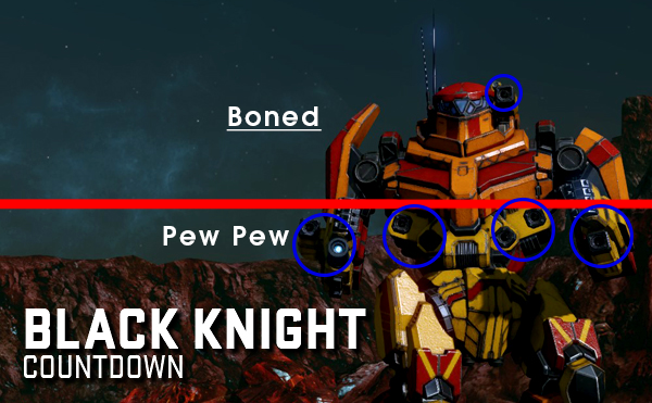
Having the arm weapons on top of the arms, or to the side (as it was advertised), or moving them to below the arms might not seem like a big deal, but it is. If you are "hill humping", it's the difference between only exposing the top half of your mech, vs. showing the enemy your knees. It means you have to spend 1/2 a second longer exposed to enemy fire to use all your weapons. That half a second could cost you half your mech, or even cause you to be destroyed.

How high the weapons are mounted makes a HUGE difference in MWO. Showing them to us in one position, and moving them to an undesirable location is basically bait and switch. Unique geometry or not, it's the only image we had when we bought the pack.

PGI has a tendency to move mechs weapons to the bottom or sides of the arm when the original TRO artwork clearly shows that weapon being mounted on the top of the arms. That small amount of extra exposure to the enemy can be the difference bestween a mech being used often and considered good, and a mech being considered trash because it's too easily destroyed.

#68 Gas Guzzler

    Member

  • PipPipPipPipPipPipPipPipPipPipPip
  • Big Daddy
  • Big Daddy
  • 14,257 posts
  • LocationCalifornia Central Coast

Posted 16 September 2015 - 08:24 PM

View PostFrost Lord, on 16 September 2015 - 08:02 PM, said:

well actually the point is this is a concept illustration and concepts and final products rarely Aline 100% its just meant to be used as a guide.

also its not the concept artists responsibility to make the mech balanced its his job to make it look awesome and guide the modelers ascetically.
if you don't like the end product don't buy it till you know what it is.

personally I cant think of anything in any game of any format including even out side computer games like table top or card games that I haven't appreciated the artwork more then the main product its self, perhaps that's just the artist in me.


Too be honest, I can't remember a time where weapons have been shown in one position in the concept art, and then were in a different location on the model.

#69 Sigilum Sanctum

    Member

  • PipPipPipPipPipPipPipPip
  • The Hammer
  • The Hammer
  • 1,673 posts
  • Twitter: Link
  • LocationSouth Carolina

Posted 16 September 2015 - 08:31 PM

View PostGas Guzzler, on 16 September 2015 - 08:24 PM, said:


Too be honest, I can't remember a time where weapons have been shown in one position in the concept art, and then were in a different location on the model.


I wonder if it has anything to do with the mechs Rigging and the "lego mech" system. I tweeted Russ asking, but because its so late, I doubt he'll get to it tomorrow.

#70 InRev

    Member

  • PipPipPipPipPipPipPipPip
  • Survivor
  • Survivor
  • 1,236 posts
  • LocationConnecticut, USA

Posted 16 September 2015 - 08:36 PM

View PostLordLosh, on 16 September 2015 - 04:22 PM, said:

in any cause glad i don't have kids


The rest of us are glad too . . .

#71 Speedy Plysitkos

    Member

  • PipPipPipPipPipPipPipPipPip
  • The 1 Percent
  • The 1 Percent
  • 3,460 posts
  • LocationMech Junkyard

Posted 16 September 2015 - 11:47 PM

feedings for my maulers...

#72 Captain Artemis

    Member

  • PipPipPip
  • The Formidable
  • The Formidable
  • 67 posts

Posted 17 September 2015 - 12:02 AM

View PostFrost Lord, on 16 September 2015 - 08:02 PM, said:

well actually the point is this is a concept illustration and concepts and final products rarely Aline 100% its just meant to be used as a guide.

also its not the concept artists responsibility to make the mech balanced its his job to make it look awesome and guide the modelers ascetically.
if you don't like the end product don't buy it till you know what it is.

personally I cant think of anything in any game of any format including even out side computer games like table top or card games that I haven't appreciated the artwork more then the main product its self, perhaps that's just the artist in me.


Lower mounted weapon will behave good in urban warfare, where you can expose only one of your sides. The point is, that we don't fight always in the River City nor the Crimson Strait.

I would rather like the placement of the right arm PPC, like the Griffin or the Battlemaster have. Even more, because this mech does not have JJ, and most of hardpoints are placed pretty low.

#73 bad arcade kitty

    Member

  • PipPipPipPipPipPipPipPipPipPip
  • Bridesmaid
  • 5,100 posts

Posted 17 September 2015 - 12:05 AM

View PostKatchem Killem, on 16 September 2015 - 10:38 AM, said:

I hope this mech is good.


too low energy hardpoints comparing to cockpit, too large head and no jj to be good

imo grasshopper will be better unless knight gets some outrageous quirks

#74 Speedy Plysitkos

    Member

  • PipPipPipPipPipPipPipPipPip
  • The 1 Percent
  • The 1 Percent
  • 3,460 posts
  • LocationMech Junkyard

Posted 17 September 2015 - 01:25 AM

Why is the picture look like a clownini ?

Posted Image

Posted Image

Edited by Titannium, 17 September 2015 - 01:27 AM.


#75 K19

    Member

  • PipPipPipPipPipPip
  • Mercenary Rank 3
  • Mercenary Rank 3
  • 355 posts
  • LocationPortugal

Posted 17 September 2015 - 01:28 AM

View PostSigilum Sanctum, on 16 September 2015 - 05:34 PM, said:

What language is this?! Other than the lower weapons on the arms and the tacky paint job, what the hell is everyone complaining about?!


Pt- for friends.

ok. Tu não entendes o que está escrito! Eu também não, entendo como se faz tanta borrada neste jogo. Simples o desenho que foi apresentado e muito diferente do que vai para o jogo. A questão para PGI e seguinte.. se não conseguem reproduzir no jogo o mesmo mech que foi desenhado deixem de enganar o jogadores.

OK.I do not understand what is written! I do not, I understand how to do so blurred in this game. Simple design that was presented and very different from going to the game. The question for PGI and following .. if you can not play the game the same mech that was designed cease to fool the players.

#76 Widowmaker1981

    Member

  • PipPipPipPipPipPipPipPipPipPip
  • The Widow Maker
  • The Widow Maker
  • 5,031 posts
  • LocationAt the other end of the pretty lights.

Posted 17 September 2015 - 01:48 AM

Looks amazing, and may well have very good hitboxes. That hardpoint placement though.. this mech will need very good quirks (20-25%) to be competitive at all. I hope it gets enough love, because its pretty and id like to see it used.

Impressed with the Mauler, so R2 is off to a good start.. lets see if that carries on.

#77 SIN Deacon

    Member

  • PipPipPipPipPipPip
  • The Slayer
  • The Slayer
  • 351 posts

Posted 17 September 2015 - 04:02 AM

Wow the concept art almost had me wanting to buy a BK, glad i didnt! Looks like a 75 ton wolfhound (including the low slung arms).

Edited by SIN Deacon, 17 September 2015 - 04:03 AM.


#78 Desintegrator

    Member

  • PipPipPipPipPipPipPipPip
  • Shredder
  • Shredder
  • 1,225 posts
  • LocationGermany

Posted 17 September 2015 - 04:38 AM

Nice Mech !

Let's see and wait how it performs on the Battlefield !

#79 Grayson Sortek

    Member

  • PipPipPipPipPipPip
  • FP Veteran - Beta 1
  • FP Veteran - Beta 1
  • 371 posts

Posted 17 September 2015 - 05:19 AM

Well.. I got the Mauler pack... That was stupid. I like my Mauler, and I have fun with it, but I hope they don't royally F the other ones in the pack like the BK.

Seriously, I'm just looking at the in-game model and thinking to myself: Gee I knew the torso weapon mounts would be a little low so I'll save them for brawling, but what happened to the arm mounts?

Seriously... This thing is going to get absolutely destroyed, I think the kids these days call it "rekt":

Posted Image

Edited by Grayson Sortek, 17 September 2015 - 05:21 AM.


#80 Speedy Plysitkos

    Member

  • PipPipPipPipPipPipPipPipPip
  • The 1 Percent
  • The 1 Percent
  • 3,460 posts
  • LocationMech Junkyard

Posted 17 September 2015 - 05:43 AM

Im glad, I bought Mauler only - a la carte.


5 user(s) are reading this topic

0 members, 5 guests, 0 anonymous users