 Hayden, on 10 December 2011 - 04:20 AM, said:
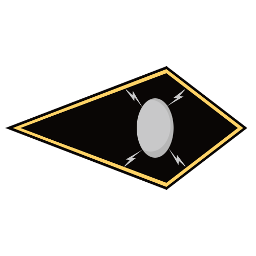
Alright, I'll try to explain my thought process on these. I'll admit most of the insignia that I make are based off designs dating from the 1980s. My reasoning for this is that I feel a lot of the modern insignia have much less of a military feel, or that they look more like one would expect nose art to look. Consider the Regulan Hussars, which went from a lightning bolt on a field of blue with a yellow frame to some kind of Death-floating-on-a-cloud image.
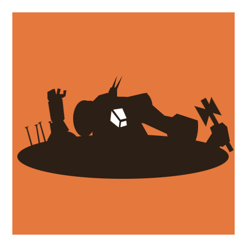
This is the new one off the Sarna wiki:

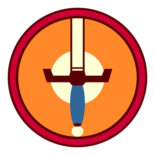
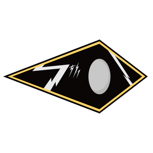
And this is mine, based off the old version:

Now, I feel that the modern one looks like nose art, than say, a roundel. And that's really what I'm trying to go for with these: something that feels more akin to a roundel on an aircraft. However, some of the newer images are so convoluted that it's hard to derive something simple from that and still remain canonical (which is a big concern). But with many of the older insignia they are simple and seem closer in their design to what I have in mind to make.
I have a much easier time envisioning a technician or mechwarrior wearing the old Regulan Hussars insignia as a patch than the new one. It's just a matter of one kind of design feeling professional and military, and another going for a "cool" factor that I just don't feel.
[EDIT: This is also why I try to keep away from gradients and try to use clean lines: I've never seen a roundel with gradients.]
i think when they were originally made in the 80s they are more akin to the old European war flags, simple with blocks of colour so its easier for other armies to recognize than complicated images and simple colourful blocks standout more
When remaking insignia's you could try and figure out what all the components of the image mean and go from there, because it'll still be canon because your taking the meaning of it and re-creating it, like how the devs are redesigning the mechs the initial idea is still there but modernized and taken one step forward


