
Jump to content

Countdown To Release: Black Lanner


81 replies to this topic

#1 InnerSphereNews

    Member

  • Developer
  • Developer
  • 2,856 posts

Posted 15 February 2018 - 01:59 PM


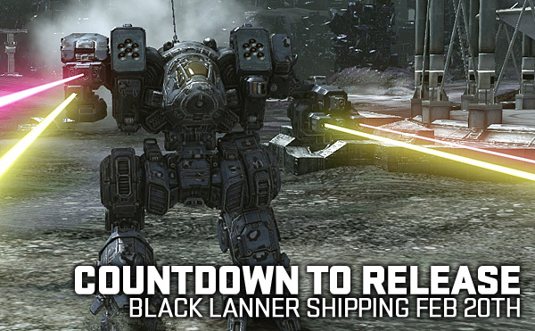
Countdown to Release: Black Lanner
Shipping Feb 20th


BLACK LANNER: Preview Stream

YouTube Archive


Watch the Preview Stream Today on NGNG TV!
Join Daeron and Phil as they check out the Black Lanner!
Starting at 12 PST - 3 PM EST
Don't worry if you can't attend the Livestream
an archive will be uploaded to youtube afterward!


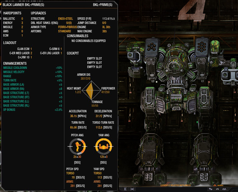
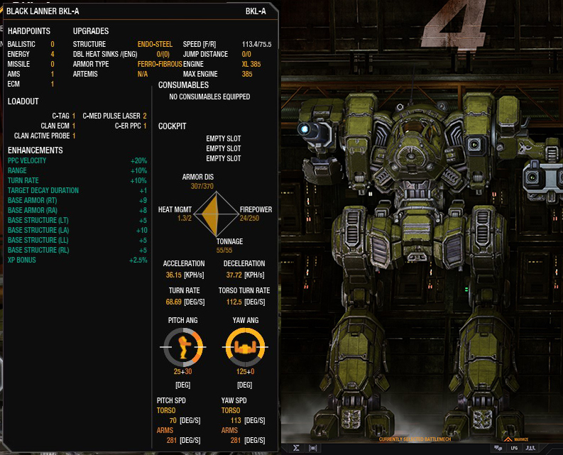
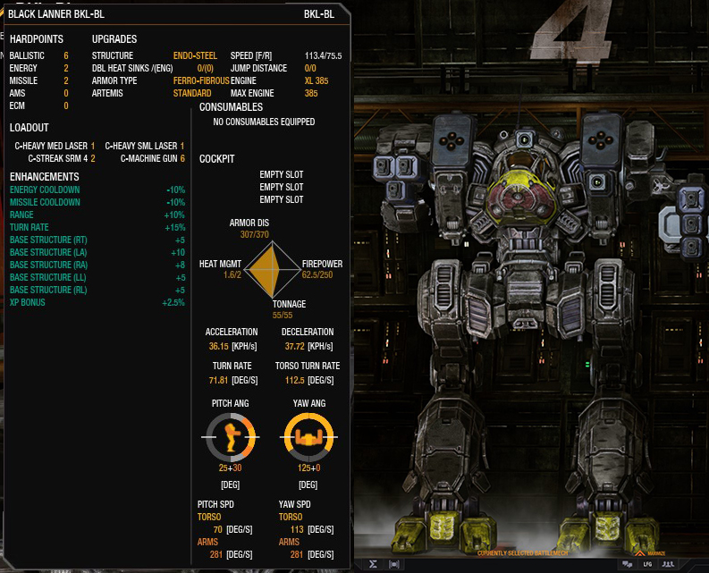
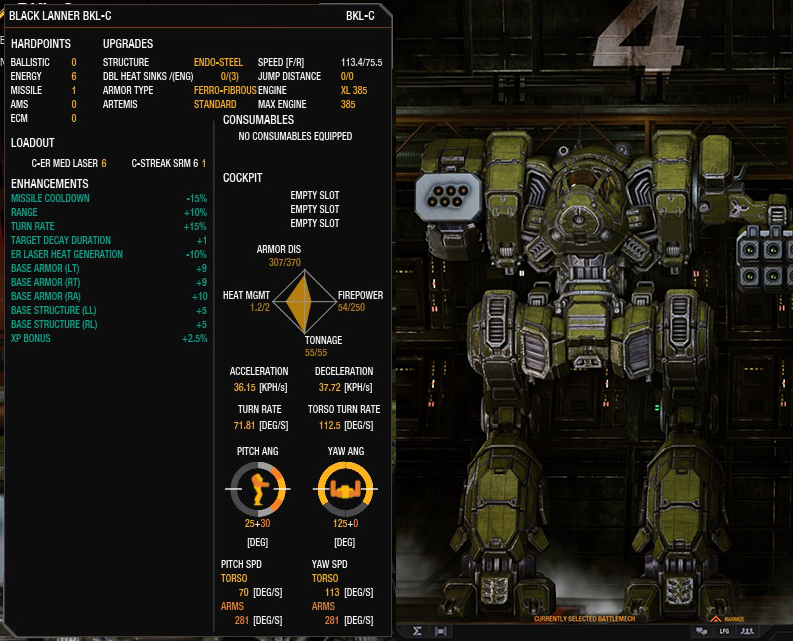
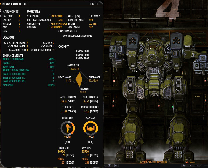
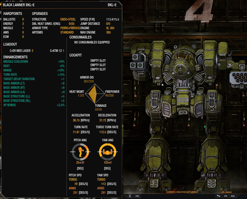
BLACK LANNER: Quirks

Black Lanner Prime and (s)


Black Lanner A


Black Lanner BL


Black Lanner C


Black Lanner D


Black Lanner E


BLACK LANNER: Scale Comparison

Black Lanner vs Bushwacker


Black Lanner vs Griffin


Black Lanner (55 Tons) vs Huntsman (50 Tons)


Black Lanner vs Stormcrow


BLACK LANNER: Titles and Badges

STANDARD TITLE:
The Lanner

BADGE:


COLLECTORS TITLE:
The Raptor

COLLECTORS BADGE:


*Collectors edition comes with both titles and badges


BLACK LANNER: Desktops


#2 l42yb0y

    Member

  • PipPip
  • The Pest
  • The Pest
  • 20 posts
  • LocationDark Side of the Moon

Posted 15 February 2018 - 02:13 PM

Black Lanner... hm... dunno if i want it

#3 Alvar Von Kenesthor

    Member

  • PipPipPip
  • The Lanner
  • The Lanner
  • 93 posts
  • LocationSpain

Posted 15 February 2018 - 02:14 PM

After seeing the design I knew it was already impossible, but hope is the last thing one losses.

The Black Lanner C actually uses a Nova (Blackhawk) arm taking advantage of the omnimech technology to switch whole members. I suppose that was asking for too much...

Other than that, I just can't wait to take her for a ride :P

#4 Gas Guzzler

    Member

  • PipPipPipPipPipPipPipPipPipPipPip
  • Big Daddy
  • Big Daddy
  • 14,257 posts
  • LocationCalifornia Central Coast

Posted 15 February 2018 - 02:15 PM

6E Arm looks nice and not as oversized as I thought. Now lets see the quirks.

#5 Nema Nabojiv

    Member

  • PipPipPipPipPipPipPipPip
  • 1,783 posts
  • LocationUA

Posted 15 February 2018 - 02:20 PM

Looks thicker than on arts. I thus name them Fat Lanners.

Edited by Nema Nabojiv, 15 February 2018 - 02:21 PM.


#6 suffocater

    Member

  • PipPipPipPipPipPipPip
  • Urban Commando
  • Urban Commando
  • 570 posts

Posted 15 February 2018 - 02:23 PM

I will enjoy shooting this juicy chickenlegs. Posted Image

Edited by suffocater, 15 February 2018 - 02:23 PM.


#7 MechaBattler

    Member

  • PipPipPipPipPipPipPipPipPipPip
  • Survivor
  • Survivor
  • 5,122 posts

Posted 15 February 2018 - 02:37 PM

It looks nice. Bit wider than I was expecting. But visually it seems relatively sleek. It makes me want the Argus for the IS.

#8 DarkFhoenix

    Member

  • PipPipPipPipPipPip
  • The Terror
  • The Terror
  • 401 posts

Posted 15 February 2018 - 02:46 PM

I already bought something this month so black lan package will have to wait till March .

#9 Deadead

    Member

  • PipPipPip
  • The 1 Percent
  • The 1 Percent
  • 66 posts

Posted 15 February 2018 - 03:18 PM

hmm. I hate to say it, because that thing actually still looks pretty good..... but i'm actually dissapointed.

Let me try to explain.

I'm a jade falcon loyalist and I've been wanting this mech since before the clans came out. My biggest dissapointment when my brother roped me into MWO was that the Clans were not a playable faction yet, mostly because of this one machine in particular.

The concept art had a taller sleeker look to it. I understand being short and squat with high mounts is actually a good thing in MWO. lower head for better cover, and fatter legs/torso mean a smaller mech because of volumetric scaling.

I understand on the minis and the illustrations this thing used to be a short squat fat ugly machine.

I understand for most players this is going to be the better way to go.

But have you SEEN the CCG illustrations? I LOVE those things. Concept art looked much closer. And as a fan, I'd much rather drive that even with the disadvantages that come from having it that way.

From a gameplay standpoint this design looks like an MAJOR improvement. it'd be much much better then the version that i was hoping for. higher, tighter mounts in general.
More volume and less spindly bits so the whole mech can be a little smaller when scaled by volume.
The first 6 point laser arm that doesn't seem like an ape hanger that can't hit anything due to being obstructed by terrain( card art has the arm down below hip level... the squat versions i've seen look just as bad, utterly impractical in MWO.)


From an asthetics standpoint...
I dislike how large and high the shoulders are. They look better a moderate amount smaller and a little lower. The big cannon arm (higher one) should be higher. the toothy(?) plates above and below the cannon sit higher then the side torso in my favorite art(prime,A) so this looks wierd to me.
The lower arm (hanging one) seems a little higher up then i imagined. i knew it'd have to be improved because while practically speaking i dont want a useless arm on something with that few hardpoints, but it just don't LOOK right. Also, it is either AT (concept art) or ABOVE the side torso as well.

Mind you i'm not complaining.

I understand the changes,

I think the changes are for the most part great ideas, gameplay AND visually speaking.

And i think the artist did an amazing job of combining the features of two DRASTICALLY different interperetations of mechs (seriously. I would never have guessed that squat thing with the dome cockpit was a black lanner without sarna) while also adding a lot of unique design and his own style into it and making it all work. That mech looks awesome. I know exactly what my desktop background is going to be for the next coming months.

I just... for reasons I can't understand even though i've put thought into words here, still FEEL very dissapointed.

And does anyone else feel the same confliction here?

I think it looks wonderful. I think it's been tweaked in all the right ways to make it as viable as possible in MWO. I think he's done a wonderful job of turning a squat turkey-looking machine and a beanpole with spindly legs into one mech that is recognisably descended from both, and ALSO very uniquely it's own thing. I've always loved MWO's art style and thought it looked great, but this is amazing.


... and I HATE it.


I can't make heads or tails out of my reaction.


Am i just turning into one of those salty old dudes who think everything is wrong no matter what?

#10 Deadead

    Member

  • PipPipPip
  • The 1 Percent
  • The 1 Percent
  • 66 posts

Posted 15 February 2018 - 03:22 PM

P.S. Still gonna buy every last one.

#11 Odanan

    Member

  • PipPipPipPipPipPipPipPipPipPip
  • Ace Of Spades
  • Ace Of Spades
  • 8,206 posts
  • LocationBrazil

Posted 15 February 2018 - 03:42 PM

What a beautiful mech!
I hope it turns out as good as his heavier overengined rival, the Linebacker.

#12 Pak Hammond

    Member

  • PipPipPip
  • The Raider
  • The Raider
  • 63 posts
  • LocationTrying to run on a connection that has to cross oceans

Posted 15 February 2018 - 04:20 PM

Going to wait for the walk/run animation before making final judgement.
Not concerned about quirks as l can build around that later.

#13 LT. HARDCASE

    Member

  • PipPipPipPipPipPipPipPipPip
  • The Spear
  • The Spear
  • 2,706 posts
  • LocationDark Space

Posted 15 February 2018 - 06:00 PM

Patiently awaiting the scale comparisons. Looks like another medium with a far larger profile than the Catapult.

#14 -Ramrod-

    Member

  • PipPipPipPipPipPipPip
  • The Solitary
  • The Solitary
  • 697 posts
  • LocationSome place

Posted 15 February 2018 - 06:19 PM

Can we get the quirks please? Since probably a good chunk of the sales of this mech will depend on it? You typically gives us the quirks for mechs on Thursdays anyways.

#15 BrunoSSace

    Member

  • PipPipPipPipPipPipPipPip
  • The Guide
  • The Guide
  • 1,032 posts
  • Twitch: Link
  • LocationAustralia

Posted 15 February 2018 - 06:52 PM

Looks like its going to be very easy to shoot at.

#16 GamerPro4000

    Member

  • PipPipPipPipPipPip
  • 348 posts
  • LocationSian

Posted 15 February 2018 - 07:04 PM

I love how the mech looks, but it should be profiled more as a heavy clan mech by its bulky design. This is suppose to be in the same tonnage as the 55 ton stormcrow and I just can see this mech as a medium mech. Maybe if you guys post a few pictures of size comparisons with other mechs, so we can really see this mech's size.

Edited by GamerPro4000, 15 February 2018 - 07:06 PM.


#17 MrKvola

    Member

  • PipPipPipPipPipPip
  • The Scythe
  • The Scythe
  • 329 posts

Posted 15 February 2018 - 07:31 PM

View PostGamerPro4000, on 15 February 2018 - 07:04 PM, said:

I love how the mech looks, but it should be profiled more as a heavy clan mech by its bulky design. This is suppose to be in the same tonnage as the 55 ton stormcrow and I just can see this mech as a medium mech. Maybe if you guys post a few pictures of size comparisons with other mechs, so we can really see this mech's size.

Size comparison coming up later during the countdown.

#18 nathen west

    Rookie

  • 5 posts

Posted 15 February 2018 - 09:46 PM

It certainly gained some weight since the concept art was taken.

I preferred the more lean and sleek design, now it looks much more in line with the Supernova and Nova which I personally don't like. Was really looking forward to a smaller not bulky looking clan Mech. Small dissapointment.

Still looking forward to give it a spin on release. Can't wait to see how the cockpit will look like.

#19 Trennbull

    Member

  • PipPipPip
  • The Machete
  • The Machete
  • 51 posts

Posted 15 February 2018 - 10:11 PM

I desperately hope for a open cockpit with a clear side view and not these claustrophobic recent designs.

-> PGI please also take into consideration that more and more players use ultra wide monitors these days!


#20 AngrySpartan

    Member

  • PipPipPipPipPipPip
  • Bad Company
  • Bad Company
  • 349 posts

Posted 16 February 2018 - 12:14 AM

Linabacker Mk II (or Mk 0,5?). Even the same "lose the torso to first aimed SRM volley" mojo applies here I am afraid, but it's better to wait for the scale comparison though.

Looking forward to play this after C-Bill release anyway.


2 user(s) are reading this topic

0 members, 2 guests, 0 anonymous users