Jump to content

The Champion Art Looks Terrible

BattleMechs Camo Spec News

69 replies to this topic

#1 NimoStar

    Member

  • PipPipPipPipPipPip
  • Knight Errant
  • 216 posts

Posted 11 July 2018 - 06:04 PM

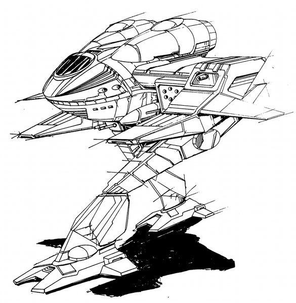
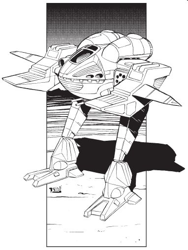
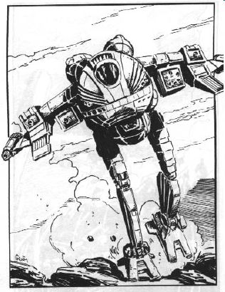
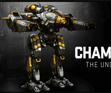
Seriously, WTH are those arms?

Posted Image

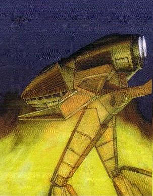
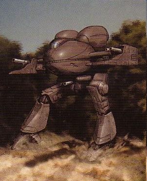
Shape makes me think of, even has the same thingy for hanging in the middle:
Posted Image


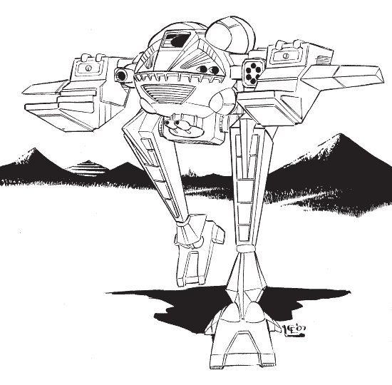
Original was much more dynamic
Posted Image

#2 Mole

    Member

  • PipPipPipPipPipPipPipPipPip
  • Ace Of Spades
  • Ace Of Spades
  • 3,314 posts
  • LocationAt work, cutting up brains for a living.

Posted 11 July 2018 - 06:28 PM

What's wrong with it? It looks like a Champion to me.

#3 Nightbird

    Member

  • PipPipPipPipPipPipPipPipPipPip
  • The God of Death
  • The God of Death
  • 7,518 posts

Posted 11 July 2018 - 06:31 PM

I like it to be honest. The arms are a weak point but the rest looks great.

#4 Y E O N N E

    Member

  • PipPipPipPipPipPipPipPipPipPipPipPip
  • The Nimble
  • The Nimble
  • 16,810 posts

Posted 11 July 2018 - 06:34 PM

It will be salvageable as long as they squat it a little bit instead of having it stand straight lock-legged like that.

#5 Bishop Steiner

    ForumWarrior

  • PipPipPipPipPipPipPipPipPipPipPipPipPipPipPip
  • The Hammer
  • The Hammer
  • 47,187 posts
  • Locationclimbing Mt Tryhard, one smoldering Meta-Mech corpse at a time

Posted 11 July 2018 - 07:01 PM

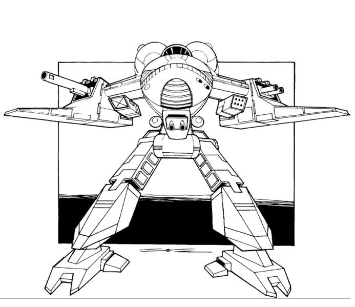
um... you hate the new art but think the original "Porker Blimp" was somehow dynamic? In general I acknowledge art to be subjective, but I objectively have to object about one's sobriety or need for lasik in this case.

Guess what? ALL Champion art to date has been terrible. This is an improvement.

also.....
Posted Image
Posted Image
Posted Image
Posted Image
Posted Image
Posted Image

Boo hoo. The arms are still wonky. Yet in line with canon art, and in all other regards it's better than ANY previously published version. Methinks thou dost protest too much. But hey, if you think it's so terrible, why not show us how it's done and draw a better one? It's a shame MWO is saddled with such a scrub artist like Alex.

#6 Cloves

    Member

  • PipPipPipPipPipPipPip
  • Bad Company
  • Bad Company
  • 561 posts

Posted 11 July 2018 - 07:15 PM

I can only imagine the outrage if it actually had had arms that poked out as far as the original art did, while keeping those cannons close to the body. We don't have LAMs, no need for a wingfoil body shape. For a laugh, compare the alpha strike minis to MWO prints. Alex has done wonders for the whole IP visually.

#7 NimoStar

    Member

  • PipPipPipPipPipPip
  • Knight Errant
  • 216 posts

Posted 11 July 2018 - 07:15 PM

I showed how i liked the art that I showed better. I don't need to show my own art. I prefer the opriginal design, period.

As you can see on several you posted (biasedly putting the worst first), the Champion is modeled after an aiscraft. In fact in cannon there is a comvertible Champion that can be used as one: http://www.sarna.net/wiki/Champion_LAM

The current arms look anything but wing-like, they look like a clother hanger with pincers.
Plus arms in the original don't cover the torso at a profile, IE they are actually lower than the cockpit.

You can also look at the legs. Old legs are at an angle and avian-like. New legs are just straight.

In short dynamic vs stiff style.

Edited by NimoStar, 11 July 2018 - 07:17 PM.


#8 Xeno Phalcon

    Member

  • PipPipPipPipPipPipPipPipPip
  • Bad Company
  • 2,461 posts
  • LocationEvening Ladies

Posted 11 July 2018 - 07:25 PM

cant really improve the champion without turning it into....not a champion. But I will find much humor when we see Champion (C) available. Like a Abot and Costello skit.

#9 ChapeL

    Member

  • PipPipPipPipPipPipPipPip
  • Elite Founder
  • Elite Founder
  • 1,363 posts

Posted 11 July 2018 - 07:39 PM

I think it looks great. Greatly improved over the original and yet still keeps a twinge of awkward that made the original's "charm".

#10 JediPanther

    Member

  • PipPipPipPipPipPipPipPipPip
  • Legendary Founder
  • Legendary Founder
  • 4,087 posts
  • LocationLost in my C1

Posted 11 July 2018 - 07:48 PM

Except for the legs I like the air ship of some kind look. Was hoping it would be the first lam in game but the wall of specs said nothing about a toggle-able lam function al la masc so I didn't order it. Still waiting for the stinger lam proper and wasp proper. took flea five years so five years for stinger lam I guess. Agree with others that alex has done wonders for redesigns of the older art.

#11 Armored Yokai

    Member

  • PipPipPipPipPipPipPipPip
  • IS Exemplar
  • IS Exemplar
  • 1,950 posts
  • LocationHouston,TX

Posted 11 July 2018 - 07:50 PM

OMG A CLASSIC!
PGI needs to add 10 jumpjets to a champion variant though.

#12 NimoStar

    Member

  • PipPipPipPipPipPip
  • Knight Errant
  • 216 posts

Posted 11 July 2018 - 07:51 PM

Im not the only one who thought this. Each of these comments if from a different player:

Quote

Posted Image


Quote

Posted Image


Quote

Posted Image


Quote

Posted Image


Quote

Posted Image

Edited by NimoStar, 11 July 2018 - 07:52 PM.


#13 Nightbird

    Member

  • PipPipPipPipPipPipPipPipPipPip
  • The God of Death
  • The God of Death
  • 7,518 posts

Posted 11 July 2018 - 08:08 PM

The only improvement I would make is move the wings up so that the ST gun box looks like it's hanging from the wing. The arms will need to be moved up so that the weapon box is slightly above the cockpit. This would follow lore better.

Posted Image

Actually scratch that, some wings are lower, my mistake

#14 Nightbird

    Member

  • PipPipPipPipPipPipPipPipPipPip
  • The God of Death
  • The God of Death
  • 7,518 posts

Posted 11 July 2018 - 08:28 PM

Ah, the wings can slant down so the arms are the same height, but the ST pods will look like they are hung underneath the wings. But whatever, I'm happy with it as is.

Edited by Nightbird, 11 July 2018 - 08:35 PM.


#15 Ruccus

    Member

  • PipPipPipPipPipPipPipPip
  • The Bloodlust
  • The Bloodlust
  • 1,136 posts
  • LocationAbbotsford, BC

Posted 11 July 2018 - 09:05 PM

I like the looks of it though I hope they make it crouch a bit instead of standing straight-legged, like the Blackjack years ago before they straightened up the stance of that mech.

Looks good though; I'm at least putting in for the base pack, and I'll have to do some theory-crafting on the Invictus.

#16 kuma8877

    Member

  • PipPipPipPipPipPipPip
  • The Tip of the Spear
  • The Tip of the Spear
  • 691 posts
  • LocationCO

Posted 11 July 2018 - 09:20 PM

The more I look at it, the more I like Alex's redesign, though I am hoping the stance is a tad more crouched and less stiff looking.

#17 jjm1

    Member

  • PipPipPipPipPipPipPipPip
  • Hell Fork
  • Hell Fork
  • 1,384 posts

Posted 11 July 2018 - 09:35 PM

View PostNimoStar, on 11 July 2018 - 06:04 PM, said:

Original was much more dynamic


Dynamic because its drawn in motion?

Also, if you can project that walk cycle into a loop and try to imagine just how comical it would be.

#18 Felbombling

    Member

  • PipPipPipPipPipPipPipPipPip
  • 2,979 posts
  • LocationVancouver, BC

Posted 11 July 2018 - 09:44 PM

Alex made chicken salad out of chicken sh!t. I don't actually see WHY the Champion is being added before other, more popular Mechs, but the update looks pretty damn good by my estimation.

#19 razenWing

    Member

  • PipPipPipPipPipPipPipPip
  • The Fearless
  • The Fearless
  • 1,694 posts

Posted 11 July 2018 - 10:24 PM

That's why despite my fond memory of the Champion from MW3 (one of the first tough mech you face against in early game), I knew no matter what, there's kinda no way to make it look nice.

I knew Alex would be the last person to have a good chance of saving it. And the final art... I mean, I guess that's about as good as it will go. I was hoping for some sort of radical re-interpretation, but... final design, nothing amazing, just a solid serviceable design. Not bad, but not great either.

Truly, the original design is a cylinder with 2 vertical pseudo "wings" and 2 pair of humanoid legs. It's basically the worst combination of shapes you can think of. You all have transformer toys right? Think of a half transformed Starscream with the top of an airplane with a random pair of legs on the bottom. It's absolutely hideous.

Another example is the Garchomp from Pokemon. It's dead on for one of the ugliest designed conceived outside of garbage pokemon like muk. The wings are put on in a manner that's like someone comically can't put their arms down. The legs just don't flow with the rest of the body.

It's a horrible combination. Macross designs only semi-made it work because of the chicken-leg style to at least give some sort of angles on the legs. (Basically. think another plane inspired design in the EBJ, which produce a much sharper curves at the legs with the arms at an angle to give more of a relaxed look)

If anything was going to make the champion look extraordinary, it will have to be an anti-canon complete reinterpretation. Sort of remaking it as an Innersphere EBJ. (And I understand the inspiration of having an airplane cockpit, but with a pair of legs, you can't do a complete derivative or it just looks odd, so Alex actually did a great job there with the back exhaust vent and those chin pods to break it up... could it be more dramatic? IMO, yes.)

But yea, basically... good design, but not extraordinary. 85/100

Edit: one last critique

There is absolutely no reason for the arms to feature a huge square gun pods. Those were supposed to be engines for LAMS models. So to serve purely as a gun pods, it would be better if they are MUCH lighter. Like no other mech has a laser gun pod this rectangular and bulky. The vertical wings will work if the gun pods is reworked to be lighter, so that the weight of the mech is focused toward the cylinder, instead of a wacky fat vertical line connecting from one arm to the other.

Edited by razenWing, 11 July 2018 - 10:29 PM.

#20 WrathOfDeadguy

    Member

  • PipPipPipPipPipPipPipPip
  • The Pest
  • The Pest
  • 1,951 posts

Posted 11 July 2018 - 10:24 PM

I kinda want one just because it's such an ugly duck... but I don't really have a use for it since it doesn't do anything new, and I'm not committed enough to the design to put RealBucks™ on it. I'll wait for the cbill release.

The Argus, on the other hand- if and when it ever arrives- will be an automatic Ultimate purchase, because I just f'n love the design.


5 user(s) are reading this topic

0 members, 5 guests, 0 anonymous users