
#781
Posted 01 February 2012 - 04:57 PM
#782
Posted 01 February 2012 - 04:59 PM
What comes first? The multiple sketches or the colored art for the mechs?
page1 post #18
#783
Posted 01 February 2012 - 06:02 PM
 Hartsblade, on 01 February 2012 - 04:59 PM, said:
LMAO! Now I got it. Can't believe I missed that. So funny!
#784
Posted 01 February 2012 - 06:10 PM
 Hartsblade, on 01 February 2012 - 04:53 PM, said:
Hartsblade, ya beat me to it! Nice stuff! The idea of putting the 25th MM insignia on top is dead on, leaving ample room for the Inouye Man to shine on that shield. Dark one is better.
Punk has talent. I am sure he can catch on quickly if he uses Hayden's templates from page 16 (I assume he didn't use them).
#785
Posted 01 February 2012 - 06:19 PM
#786
Posted 01 February 2012 - 06:31 PM
#787
Posted 01 February 2012 - 06:32 PM
New month, new opportunity to reflect upon the recent past... Put things into perspective.
First, I am going to say this: I never thought I'd be doing so much of that repaint art! Could never have guessed. Aside from our Hula and Urbie lovin' buds at PG and so many talented people on this thread, two people more specifically inspired me: one is easy to guess. It's Hayden. Hayden, sir, your production and rigor are an example to us all. Sharing the templates and insignia work is mighty generous as well. I am sure I speak on behalf of many to say that you are an inspiring force. Hats off! Also, my buddy Thunderbird, who has been working for years on countless miniatures from Games Workshop and others, doing wonders at small scale (crafty fella'), has inspired me with his tenacity and hard, relentless work.
Figured in early Jan I'd make a couple of poster art posts this month... and I ended up doing repaints and not counting them. Looking back here are what I think should be on top 3 among my little art pieces for the month (with the links for those who may have not seen the earlier ones):
- View on coast battle from Vulture cockpit interior (#537)
- Delivered cold poster with the UrbanMech (#614)
- Yen Lo Wang in the Coliseum scene (#720)
Thanks for reading.
#788
Posted 01 February 2012 - 10:50 PM
You really need to add the AH sites addy to your sig. Be a bit easier to find, eh?
#789
Posted 02 February 2012 - 12:30 AM
 Ironhawk, on 01 February 2012 - 06:10 PM, said:
Hartsblade, ya beat me to it! Nice stuff! The idea of putting the 25th MM insignia on top is dead on, leaving ample room for the Inouye Man to shine on that shield. Dark one is better.
Punk has talent. I am sure he can catch on quickly if he uses Hayden's templates from page 16 (I assume he didn't use them).
Talent? Maybe. I'm no good with layers tho, and I don't have a prog that does them as well as PS. I'd actually like to see what I did with all the red replaced with Purple, so, actually a closer version to what is the cannon 25th MM paint scheme, leaving the black and white areas from my inital design, plus my Inouye Man, Lance + motto + W.
 Hartsblade, on 01 February 2012 - 06:31 PM, said:
They both look killer, but ya the darker one looks more mencing. If I can look that mencing on the battlefield, maybe my CO will look past my shoty piloting.
#790
Posted 02 February 2012 - 09:11 AM
#791
Posted 02 February 2012 - 09:24 AM
BTW GREAT work !!! It looks like you have the original model or blank artwork to start from..
I can't even think of getting close to this..
#792
Posted 02 February 2012 - 09:43 AM
#793
Posted 02 February 2012 - 09:46 AM
 Garth Erlam, on 02 February 2012 - 09:43 AM, said:
No, not mine, but what came to mind
#794
Posted 02 February 2012 - 10:13 AM
 Chuckie, on 02 February 2012 - 09:24 AM, said:
BTW GREAT work !!! It looks like you have the original model or blank artwork to start from..
I can't even think of getting close to this..
I can't speak for the other artists, but before I start mine I actually "clean" them as best as I can. Remove any decals or strong non-gray-scale coloring. I've been releasing templates for people to work off, you can find them on this thread if you want to use them.
 Garth Erlam, on 02 February 2012 - 09:43 AM, said:
...I'm gonna do it. I'm gonna go one above doing it. Give me a couple days.
ED: Still posting to page 37 until I fill it.
Edited by Hayden, 02 February 2012 - 10:15 AM.
#795
Posted 02 February 2012 - 10:41 AM
I think the work done by Hayden and Ironwork has been spectacular. As a result I decided tonight that I would give this a go.
I have never really used photoshop or anything like this before and used Esentials as that was what opened Haydens wonderful templates.
I have done a Jenner in the colours of the Taurian Concordat 1st Taurian Pride I picked up the 24 symbol which was quite hard to see and I don't link the end product of that. Please let me have your feedback
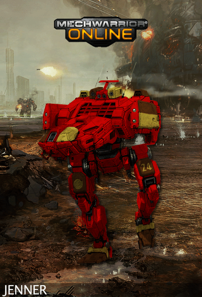
Here is a Hunchback in Concordat Commandos paint scheme, didn't like the red at first but I think it sets it off nice now
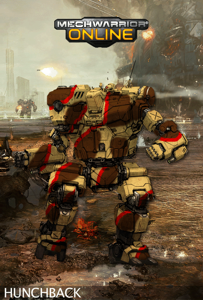
I have tried to work in insignias on this one, however, I think I might need some tips.
Here is a go at an Atlas from the 5th Oriente Hussars
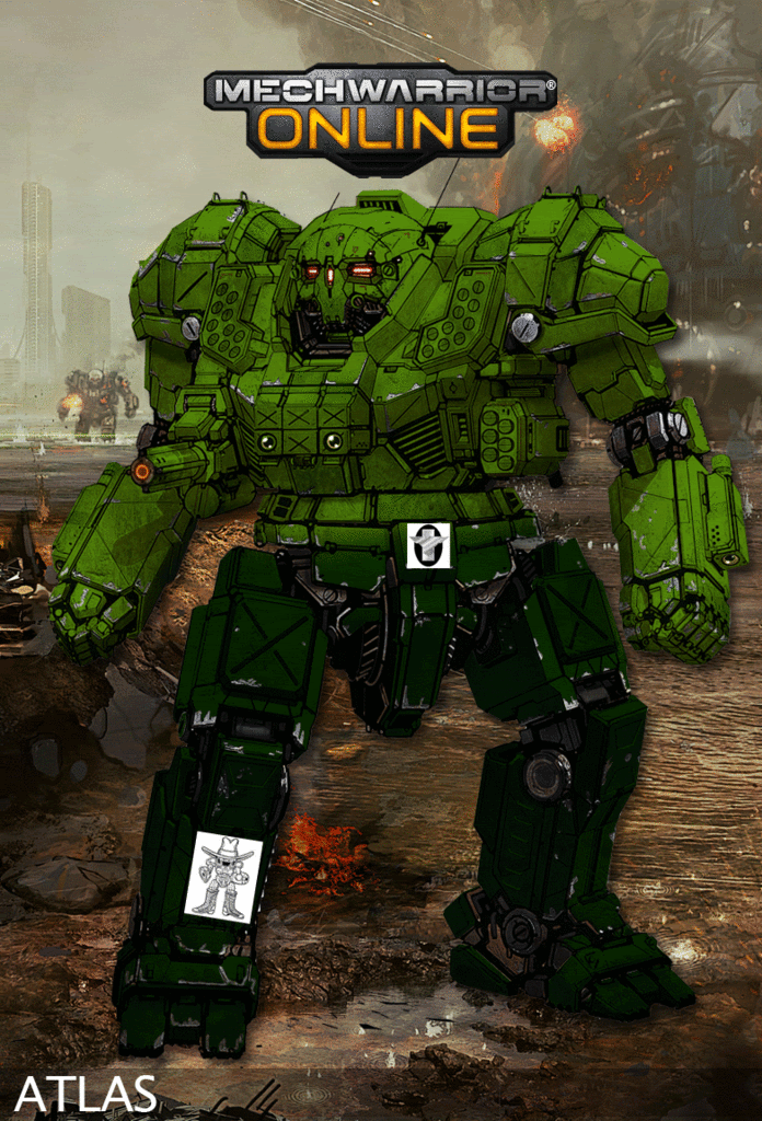
The next is a Fire Mandrill Hunchback iic, went middle ground with a bit darker orange and a grey rather than back as I felt the black obsurced too much, had problems with the insignia so gave up, might attempt it again when I have more patiance
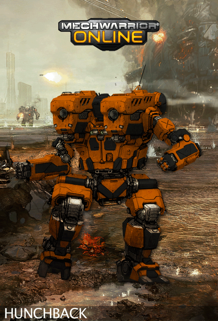
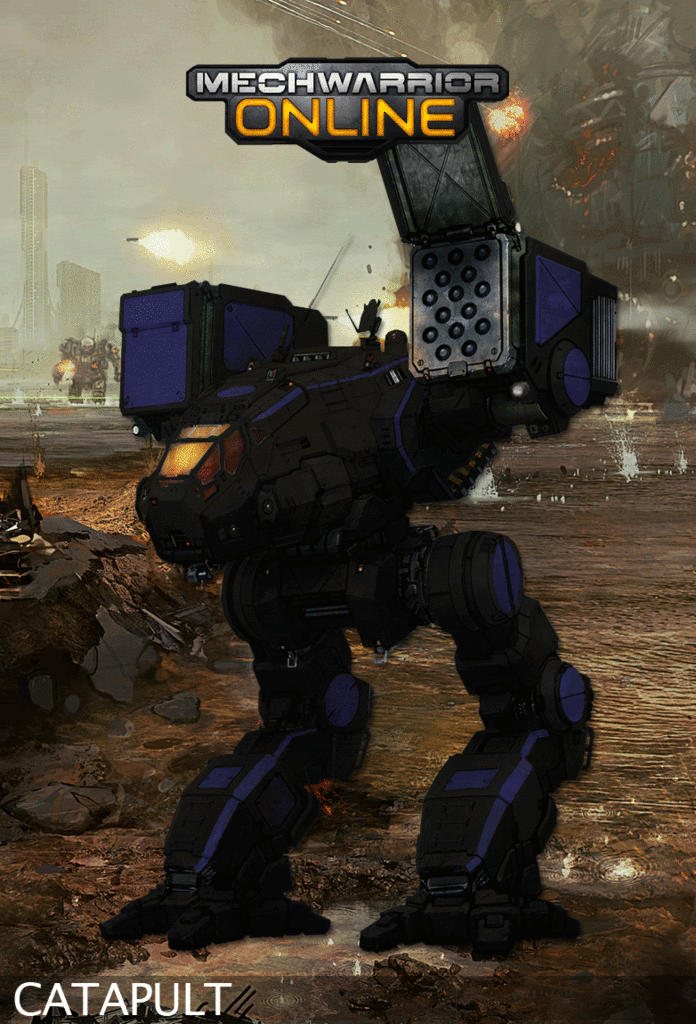
Decided to surf Camospecs and found out about the Black Lions Co-operative (the oldest co-op on Solaris) and thought the Catapult would look cool painted along those lines. I debated about making the nose purpule but decided against it.
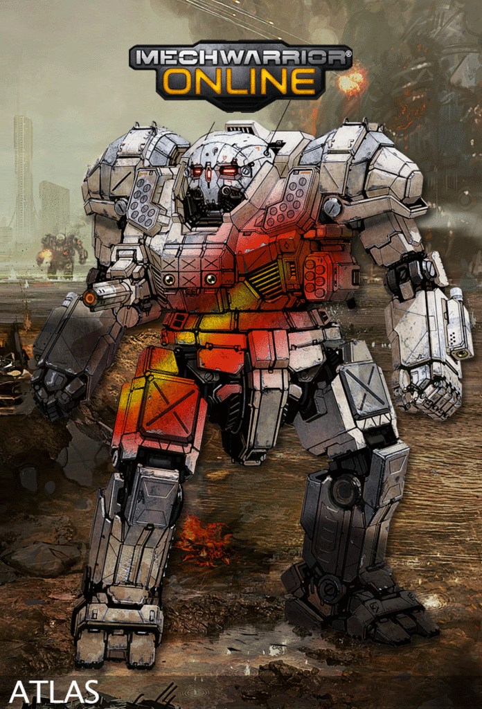
Found the brilliantly painted 3rd Drakons on camospecs and did an attempt at an atlas.
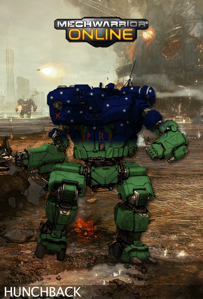
As much as I think the atlas' above are poor, I am really liking the 2nd Freemen (FRR) Hunchback below which I have done, the Rune on the AC means 'gift' and the two on the centre torso mean 'joy' and 'ride'
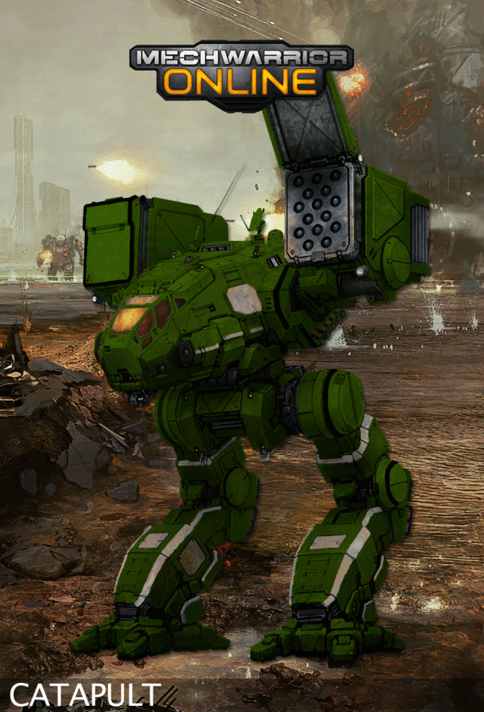
Hiritsu Catapult - The specs said green with silver and then black trim, I could not get the look of the minitures so I went with silver trim with black to a lesser extent
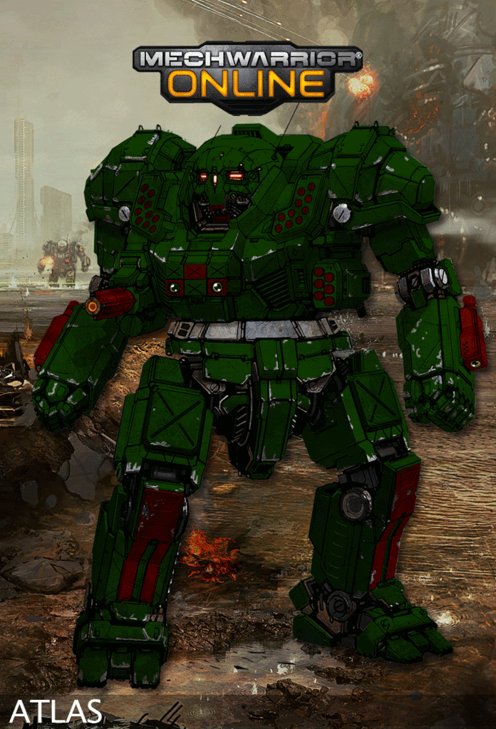
Harloc Raiders Atlas next, the silver band around the middle signifies that they used to be mercs. I went and highlighted the legs and the weapons ports. It has also eaten a few lesser mechs and has coolant around his mouth.
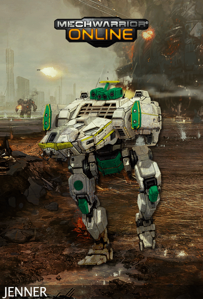
House Imarra Jenner next up using the hex color for ivory and jade green, with gold accents.
Edited by Darrin Thomason, 03 February 2012 - 10:17 AM.
#796
Posted 02 February 2012 - 11:56 AM
#797
Posted 02 February 2012 - 12:02 PM
#798
Posted 02 February 2012 - 12:57 PM
 Darrin Thomason, on 02 February 2012 - 10:41 AM, said:
I think the work done by Hayden and Ironwork has been spectacular. As a result I decided tonight that I would give this a go.
I have never really used photoshop or anything like this before and used Esentials as that was what opened Haydens wonderful templates.
Awesome first try Darrin. Much better then my first attempt :-) Hope to see more!
#799
Posted 02 February 2012 - 01:13 PM
 Garth Erlam, on 02 February 2012 - 09:43 AM, said:
Hmmm... Sounds like Atlas Hunting. I am in.
#800
Posted 02 February 2012 - 02:44 PM
I put together a paint scheme for the merc corp I and some friends are putting together, the Royal Scots Dragoon Guards, using FD's planar view Catapult. My skills are still novice, and working with these 2D views is easier. I think it turned out better than my previous effort, let me know what you think.

5 user(s) are reading this topic
0 members, 5 guests, 0 anonymous users


