Jump to content

Repainted Concept Art

Art

7732 replies to this topic

#841 Darrin Thomason

    Member

  • PipPipPip
  • 98 posts
  • LocationBuckingham, UK

Posted 04 February 2012 - 11:03 PM

View PostHayden, on 04 February 2012 - 07:22 PM, said:

St. Ives Protest Artwork. The next 10 images are going to be about St. Ives units. Many of these will be conjectural paint schemes. This will also be my first attempt at depicting similar 'mechs in the same unit (normally I try not to do more than one 'mech type per unit).


I agree with you I think SIC should be a faction, was a bit disappointed when I found on Camospecs that SIC wasn't a seperate faction and was under the CC


View PostHayden, on 04 February 2012 - 07:22 PM, said:

Aliesha's Mounted Fusiliers Catapult. This is meant to be a generic woodland-like scheme. Conjectural. Another obscure unit with a dearth of information.
Posted Image


Cool paint scheme.
How do you get the flame effect on?
Also a question which I have had for a long time is how do you get your lines so crisp?


View PostHayden, on 04 February 2012 - 07:22 PM, said:


ED: PS, my tablet suddenly works. So... maybe I can do some more exciting stuff?


:) I can't wait

Edited by Darrin Thomason, 04 February 2012 - 11:03 PM.


#842 Darrin Thomason

    Member

  • PipPipPip
  • 98 posts
  • LocationBuckingham, UK

Posted 04 February 2012 - 11:06 PM

View PostHayden, on 04 February 2012 - 10:29 PM, said:

Ok, here's my Phase 1 of the "Flying Debrisian Style Urbanmech and Atlas Critical Destruction match up." Since this is in the style of flying debris, I wanted to start at what seemed to be the very beginning. A selection of concept pieces. So, I want the readers here to help me to decide which of these to "flesh out" into the next step (which is gonna be line art, followed by a final colored rendition of it giving the final blow to an Atlas). Anyway, let me know what's good :)

Posted Image

Thanks for looking!


Can I be awkward and say that to look like FD's style that it should be the legs and laser off the top right and the torso and AC off the top left?
Realy good work :(

#843 Hayden

    Member

  • PipPipPipPipPipPipPipPip
  • Little Helper
  • Little Helper
  • 1,997 posts

Posted 04 February 2012 - 11:13 PM

View PostDarrin Thomason, on 04 February 2012 - 11:06 PM, said:

Can I be awkward and say that to look like FD's style that it should be the legs and laser off the top right and the torso and AC off the top left?
Realy good work :)


Thank you and yes, you can! That's exactly the kind of feeback I want/need.

View PostDarrin Thomason, on 04 February 2012 - 11:03 PM, said:

I agree with you I think SIC should be a faction, was a bit disappointed when I found on Camospecs that SIC wasn't a seperate faction and was under the CC


Yeah, cammo specs has a couple problems, my biggest beef is that they're limited to post 3050 units, and utterly neglect anything destroyed in earlier periods.

View PostDarrin Thomason, on 04 February 2012 - 11:03 PM, said:

Cool paint scheme.
How do you get the flame effect on?
Also a question which I have had for a long time is how do you get your lines so crisp?


Thanks. For the flame effect and many others I use a combination of marquee, polygon lasso and regular lasso tools. It just depends on what I need done.

View PostDarrin Thomason, on 04 February 2012 - 11:03 PM, said:

:lol: I can't wait


Neither can I :(

#844 Hartsblade

    Member

  • PipPipPipPipPipPipPip
  • Big Brother
  • 772 posts

Posted 04 February 2012 - 11:42 PM

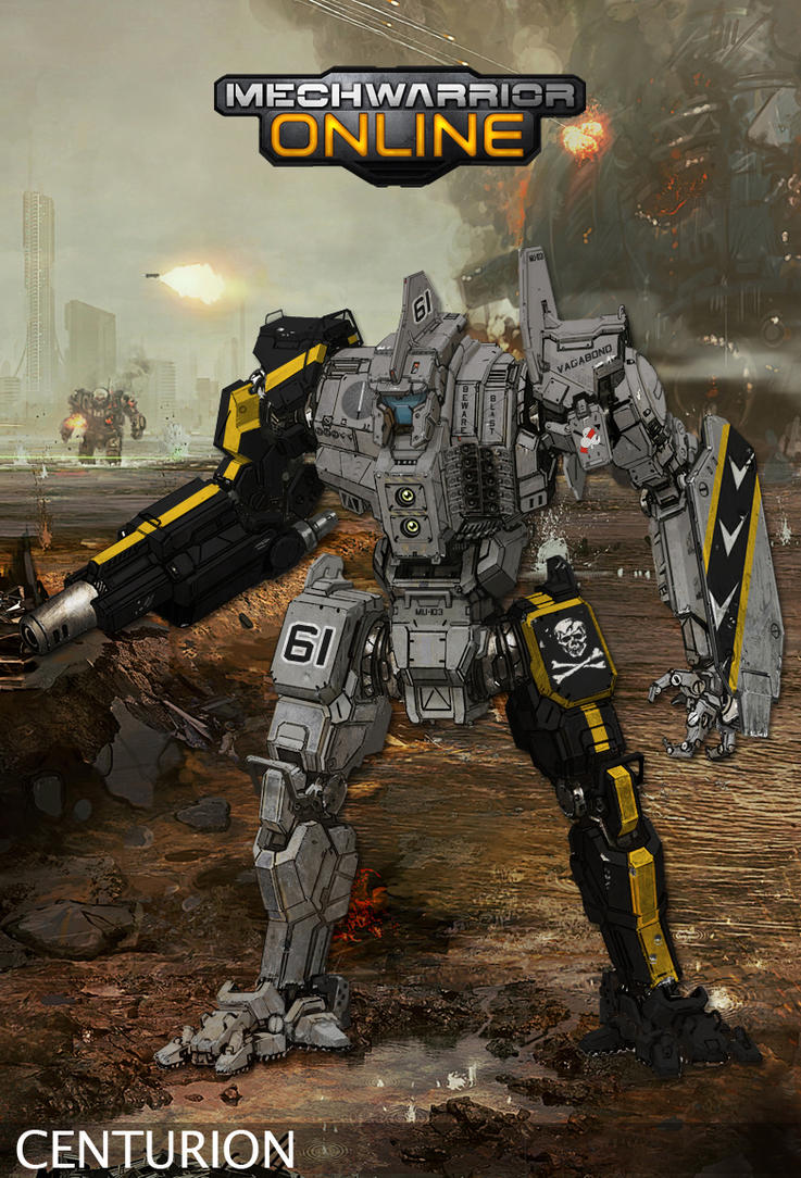
Okay this is a WIP for a 12th VR Centurion. CamoSpecs states that the 12th VR uses a standard camo theme, but I figured I spice it up with a tiger stripe twist. Note that it still needs some extra details and personalized logos.

Posted Image
EDIT: added updated look

Edited by Hartsblade, 05 February 2012 - 11:21 AM.


#845 AlfalphaCat

    Member

  • PipPipPip
  • 85 posts

Posted 05 February 2012 - 12:07 AM

Nice Harts, now we just need to twist Hayden's arm to do a remake of the awful Gamma Regiments logo. :)

Deadly Dancers FTMFW!!

Edited by AlfalphaCat, 05 February 2012 - 12:08 AM.


#846 IxxxI

    Member

  • PipPipPipPipPipPip
  • 360 posts

Posted 05 February 2012 - 12:41 AM

I shy to say, that I liked the Urbanmech's new look :) Nice redo. Just one comment on Solaris picture, it seems to me, that proportions are not correct. Either Urbi should be higher or Atlas smaller, I think that it's better to rescale Atlas.

#847 Darrin Thomason

    Member

  • PipPipPip
  • 98 posts
  • LocationBuckingham, UK

Posted 05 February 2012 - 05:07 AM

View PostSesambrot, on 04 February 2012 - 03:59 PM, said:

Words fail to describe how awesome this topic is! :)

However, I have a challange for anyone willing to take it.
Someone in here capable of turning one of these mechs into a "Bloody GIR"?
Posted Image
or at least use it as a baseline for a paintjob...
If I'm lucky there are some Invader Zim fans among you :(


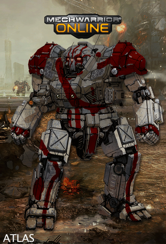
I will try and alter the silver Hunchback into bloody GIR, I love Invader Zim, nearly as much as cupcakes.

Hunchback wasn't looking looking good so I changed to the Atlas, I tried to keep the same blood patten. The main reason I did the atlas was so that the shoulders, eys and wrists could all be done in the Blood Red as well. I would wait and see though incase any of the better repainters have taken up the possibility of doing it.
Posted Image

Edited by Darrin Thomason, 05 February 2012 - 07:27 AM.


#848 TheUncle

    Member

  • PipPipPip
  • Big Brother
  • 96 posts

Posted 05 February 2012 - 05:11 AM

View PostJack Gallows, on 04 February 2012 - 11:21 AM, said:


Posted Image


This is really really great work. It looks evil like a vagabond or a pirate, but at the same time it has grace and style.
This criminal look is really the best color scheme I've seen so far in this thread.


View PostIronhawk, on 04 February 2012 - 04:12 PM, said:


EDIT: Colored model with changed legs as per Sesambrot's constructive comments.
Posted Image


You sir are great. The mech looks compact, well proportioned and versatile.

#849 Gilberto La Volpe

    Member

  • PipPip
  • 23 posts

Posted 05 February 2012 - 05:59 AM

Hi guys, thank you so much for the beautiful pictures. keep it up!

#850 Hartsblade

    Member

  • PipPipPipPipPipPipPip
  • Big Brother
  • 772 posts

Posted 05 February 2012 - 06:32 AM

View PostAlfalphaCat, on 05 February 2012 - 12:07 AM, said:

Nice Harts, now we just need to twist Hayden's arm to do a remake of the awful Gamma Regiments logo. :(

Deadly Dancers FTMFW!!


The regiment logos have been on my mind too so I can use them in the repaints, just haven't had a chance to sit down and do them. Maybe next week :)

Edited by Hartsblade, 05 February 2012 - 06:35 AM.


#851 Threat Doc

    Member

  • PipPipPipPipPipPipPipPipPip
  • The Bowman
  • The Bowman
  • 3,715 posts
  • LocationO'Shaughnnessy MMW Base, Devon Continent, Rochester, FedCom

Posted 05 February 2012 - 07:30 AM

Holy smokes, this thread is running completely nuts... I love it. Since I checked in at 11 last night, about a dozen or so posts have been added, and 3 even while I was reading. Lovely work, and I absolutely love how that UrbanMech has come out... it rocks on toast.

#852 tyrone dunkirk

    Member

  • PipPipPipPipPipPipPip
  • 672 posts
  • LocationOutreach

Posted 05 February 2012 - 09:44 AM

View PostIronhawk, on 04 February 2012 - 09:09 PM, said:


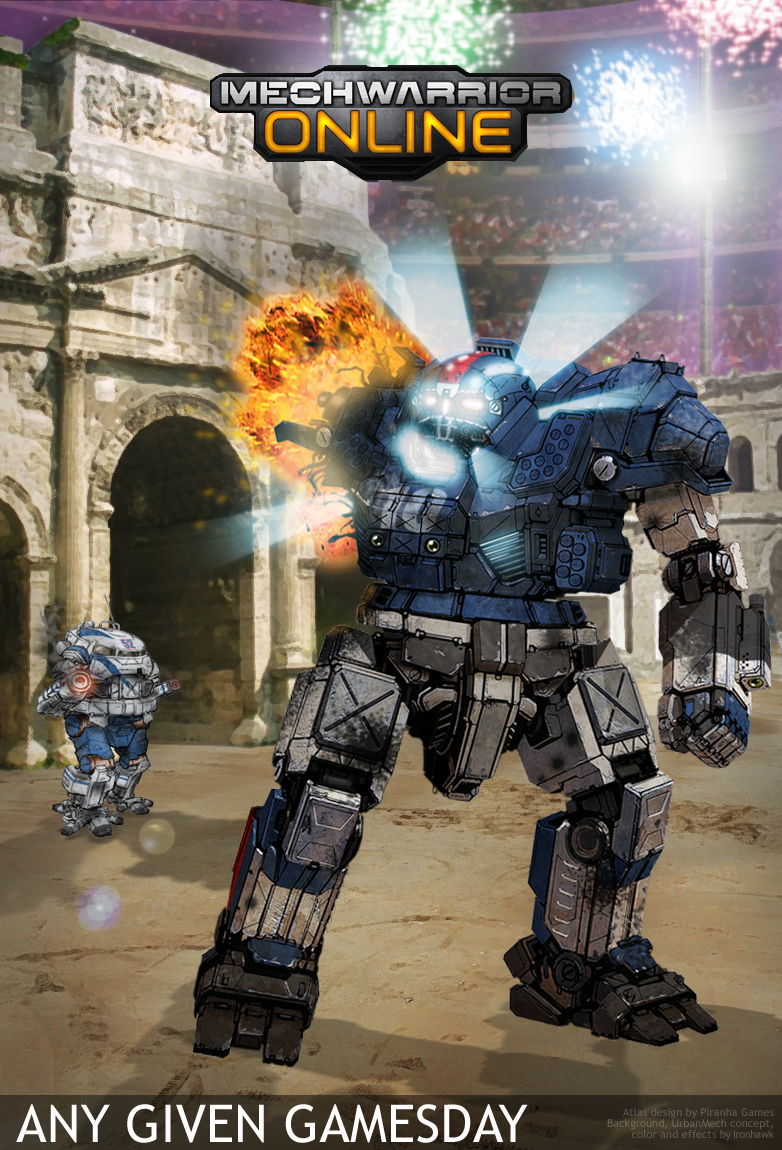
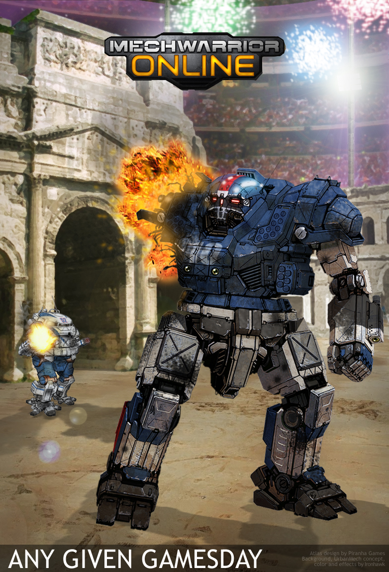
OK Garth, here goes. Response with a Superbowl special in Solaris VII. I tried to capture FD's style not only in the Urbie but also in the fact that poor Atlas has got his arm ripped off... Versus your CCG card reference, the action here would take place a second or two later I guess... But I wanted to see the initiation of the core's chain reaction.

To all football fans, enjoy the game!

Posted Image

EDIT: Adding what would be the view of the hit just a second earlier (AC detonates, no core reaction).

Posted Image

My God.... words cannot express how amazing this is! The Urbie looks like a legitimate badass and the scene itself is beautiful!!!!

#853 Sesambrot

    Member

  • PipPipPipPipPipPipPip
  • Bridesmaid
  • 862 posts
  • LocationGermany

Posted 05 February 2012 - 10:11 AM

View PostDarrin Thomason, on 05 February 2012 - 05:07 AM, said:

Posted Image


Uh, I like!
I also thought that the Hunchback might work well for it. I like the paintscheme you came up with in general, might be a little hard to aply it to the other chassis tho.
There are a few things I can think of, on how to improve it though;
You see in the original image I posted, the red used for the blood is quite a bit darker than for GIR's red parts. About the "blood", what bothers me a little is that the bloodflows on the head are so small and narrow, while they are rather thick all over the rest of the mech. The next is probably going to be tricky, the "blood" doesn't really look like it flows. If you look at the original, the blood is forming drops and the flows are wide in some places, yet narrow in others. Also, using two different colors for the blood itself, makes it seem to have some depth, which is probably not going to work for a battlemech.
The arms in the original may be clean, but it looks kinda like something is missing there on the atlas.
Also something that's going to be hard to account for is that the torso is actually twisted a little, in fact there should probably a little offset in the paintscheme.

I know this is a lot, sry! But actually I think using that exact same pattern for a mech is not really going to work due to the totally different proportions. Keeping it as a basic idea tho, how about making the actual mech more look like, it just tore another mech apart with it's Hands, and is now covered with it's "blood" (hydralic/cooling liquid/oil), GIR in that picture looks like he just did something similar, and that's pretty much the look I was having in mind...

View PostIronhawk, on 04 February 2012 - 04:12 PM, said:

EDIT: Colored model with changed legs as per Sesambrot's constructive comments.
Posted Image

Awesome dude, that looks pretty much perfect now!
If was nitpicky I would say that it doesn't look like it can twist it's torso now, but I'm not, and it's just me anyways! :) Plus it looks freakin' awesome nontheless!

Edited by Sesambrot, 05 February 2012 - 10:14 AM.


#854 Ironhawk

    Member

  • PipPipPipPipPipPipPipPip
  • Ace Of Spades
  • Ace Of Spades
  • 1,333 posts
  • LocationMontreal

Posted 05 February 2012 - 10:24 AM

View Posttyrone dunkirk, on 05 February 2012 - 09:44 AM, said:

My God.... words cannot express how amazing this is! The Urbie looks like a legitimate badass and the scene itself is beautiful!!!!


Wow! Thanks. Lots of hours into it.

#855 Ironhawk

    Member

  • PipPipPipPipPipPipPipPip
  • Ace Of Spades
  • Ace Of Spades
  • 1,333 posts
  • LocationMontreal

Posted 05 February 2012 - 10:32 AM

View PostSesambrot, on 05 February 2012 - 10:11 AM, said:


If was nitpicky I would say that it doesn't look like it can twist it's torso now, but I'm not, and it's just me anyways! :) Plus it looks freakin' awesome nontheless!


Torso twist is easy to fix. However for the legs, I'd like to explore, when I find time, a variant that still retains FD's great style but is closer to the original UrbanMech design. I think the new Jenner may be a better base for that. Anywho, more legwork for me... (so to speak).

#856 Ironhawk

    Member

  • PipPipPipPipPipPipPipPip
  • Ace Of Spades
  • Ace Of Spades
  • 1,333 posts
  • LocationMontreal

Posted 05 February 2012 - 10:50 AM

View PostHayden, on 04 February 2012 - 10:29 PM, said:

Ok, here's my Phase 1 of the "Flying Debrisian Style Urbanmech and Atlas Critical Destruction match up." Since this is in the style of flying debris, I wanted to start at what seemed to be the very beginning. A selection of concept pieces. So, I want the readers here to help me to decide which of these to "flesh out" into the next step (which is gonna be line art, followed by a final colored rendition of it giving the final blow to an Atlas). Anyway, let me know what's good :)

Posted Image

Thanks for looking!


Great exploration work. Successfully went near and far the original (not as easy as it looks) and into FD's style. Top left is my favorite, although all have some interesting items. Best legs are definitely in top left (perfect balance between FD and the original look). Like the AC of top middle (probably the smoking gun... You know me and the FX!) Laser is best at top right I think. Torso is quite interesting on top left but will be a challenge to match to FD as I do not think he's done large curved shapes yet for MW:O. But he'll have to if he wants to tackle those Liao 'Mechs.

Anyway looking good, Colonel. Can't wait to see it evolve.

#857 Hayden

    Member

  • PipPipPipPipPipPipPipPip
  • Little Helper
  • Little Helper
  • 1,997 posts

Posted 05 February 2012 - 10:53 AM

View PostIronhawk, on 05 February 2012 - 10:50 AM, said:

Great exploration work. Successfully went near and far the original (not as easy as it looks) and into FD's style. Top left is my favorite, although all have some interesting items. Best legs are definitely in top left (perfect balance between FD and the original look). Like the AC of top middle (probably the smoking gun... You know me and the FX!) Laser is best at top right I think. Torso is quite interesting on top left but will be a challenge to match to FD as I do not think he's done large curved shapes yet for MW:O. But he'll have to if he wants to tackle those Liao 'Mechs.

Anyway looking good, Colonel. Can't wait to see it evolve.


Awesome feedback, thanks. I'm trying to get a couple more opinions before I move forward.

#858 Ironhawk

    Member

  • PipPipPipPipPipPipPipPip
  • Ace Of Spades
  • Ace Of Spades
  • 1,333 posts
  • LocationMontreal

Posted 05 February 2012 - 11:06 AM

View PostHayden, on 05 February 2012 - 10:53 AM, said:


Awesome feedback, thanks. I'm trying to get a couple more opinions before I move forward.


You're welcome. Just another quick thing to reflect upon. It seems that PGI is bent toward providing arm actuators on even those Mech designs which only had attached weapons (such as the Dragon). Makes sense to have two articulations for wider arcs both vertically and horizontally. Anyway it's obviously your choice but this dilemma was part of my exploration process so I tought it'd be good to share.

#859 Joseph Calvert

    Member

  • PipPipPipPipPip
  • Knight Errant
  • 153 posts
  • LocationQC, Arizona

Posted 05 February 2012 - 11:12 AM

I agree with Ironhawk on the legs and body, got to go top left. The AC is a toss up between top and bottom right, and I like the laser top right.

#860 Darrin Thomason

    Member

  • PipPipPip
  • 98 posts
  • LocationBuckingham, UK

Posted 05 February 2012 - 11:37 AM

View PostSesambrot, on 05 February 2012 - 10:11 AM, said:


Uh, I like!
I also thought that the Hunchback might work well for it. I like the paintscheme you came up with in general, might be a little hard to aply it to the other chassis tho.
There are a few things I can think of, on how to improve it though;
You see in the original image I posted, the red used for the blood is quite a bit darker than for GIR's red parts. About the "blood", what bothers me a little is that the bloodflows on the head are so small and narrow, while they are rather thick all over the rest of the mech. The next is probably going to be tricky, the "blood" doesn't really look like it flows. If you look at the original, the blood is forming drops and the flows are wide in some places, yet narrow in others. Also, using two different colors for the blood itself, makes it seem to have some depth, which is probably not going to work for a battlemech.
The arms in the original may be clean, but it looks kinda like something is missing there on the atlas.
Also something that's going to be hard to account for is that the torso is actually twisted a little, in fact there should probably a little offset in the paintscheme.

I know this is a lot, sry! But actually I think using that exact same pattern for a mech is not really going to work due to the totally different proportions. Keeping it as a basic idea tho, how about making the actual mech more look like, it just tore another mech apart with it's Hands, and is now covered with it's "blood" (hydralic/cooling liquid/oil), GIR in that picture looks like he just did something similar, and that's pretty much the look I was having in mind...


Yeah, those sort of mirriored my own thoughts on it. GIR's head is vastly larger then his body and every mech has a much smaller head than its body. The lack of two tone of the blood and the narrowing of the flows is down to the fact I have not really developed the skills to make them look right at the moment. I think one of the other guys might be able to do a better job.
I will gladly try to do one where it looks blood splatted, however, I don't have the skills to make it look real. Sorry.


9 user(s) are reading this topic

0 members, 9 guests, 0 anonymous users


  • Google