#941
Posted 09 February 2012 - 11:04 PM
its been really cool watching the evolution of each artist from page one through to page 48
thank you for eating 3 hrs of my afternoon
cheers
#942
Posted 09 February 2012 - 11:35 PM
 Mautty the Bobcat, on 09 February 2012 - 09:38 PM, said:
Can you please try this below and see if it works. It is how I am working, however, I wondered if it worked for anyone else.
 Darrin Thomason, on 07 February 2012 - 12:44 PM, said:
Step one - go to the toolbox, there is a drop down menu where it says paintbrush click then click add tab, click layers.
This should give you a layers tab within the tool box - Click on it.
Step two - Then click "Color Here" layer in the layer toolbox - this makes the picture totally beige. In the work window (don't know what the real name is) there is a menu bar at the top, click Layer, go to stack, click Layer to bottom
Step three - Click the layer "white mutli" in the layer toolbox and then you should be able to colour in this layer (careful of the edges though, it doesn't stop you from going over the edge as it does in photoshop)
I hope this helps (and works) I am just about to try and go in detail. Will post the result.
EDIT: If you want to add an insignia you need to do so in the White multi layer otherwise it won't blend in.
#943
Posted 09 February 2012 - 11:36 PM
 Ironhawk, on 09 February 2012 - 06:55 PM, said:
Beefier is better as far as Urbie legs go! Done. And poor Urbie lost the arms race in this concept. So he's picking up on weaker than himself. Enjoy!
EDIT: Note the toes are adjustable so they can line up to the 'slipper' in Urban mode or spread out if terrain demands it.

Best design EVER, I really like the legs on this, I think you have come up with an inspired middleground for the feet. Also loving the metal bars over the knees
Edited by Darrin Thomason, 09 February 2012 - 11:41 PM.
#944
Posted 09 February 2012 - 11:37 PM
 Mautty the Bobcat, on 09 February 2012 - 02:51 PM, said:
Anyways, CC on it...I really can only find one single thing to poke at, the emblem on the close missile pod seems to 'stand out'. My only suggestions would be to make it ever so slightly transparent and see if it blends better, attempt to skew it to the left, or even both. I would recommend testing a skew to angle it with the missile pod first, that seems to be the most prevalent thing to me as I just looked at it again and it looks sort of flat compared to the missile pod's angle.
Also, if you wanted to spice up the Catapult any way, stripes, designs, etc. I would say go for it. I'm interested in what sort of things you could come up with to really turn it into a custom paint scheme. Just if you want to of course, I love it as is already. xD
I will give it a go tonight and come up with a bit more customised scheme for the 2nd. Any suggestions?
#945
Posted 10 February 2012 - 12:08 AM
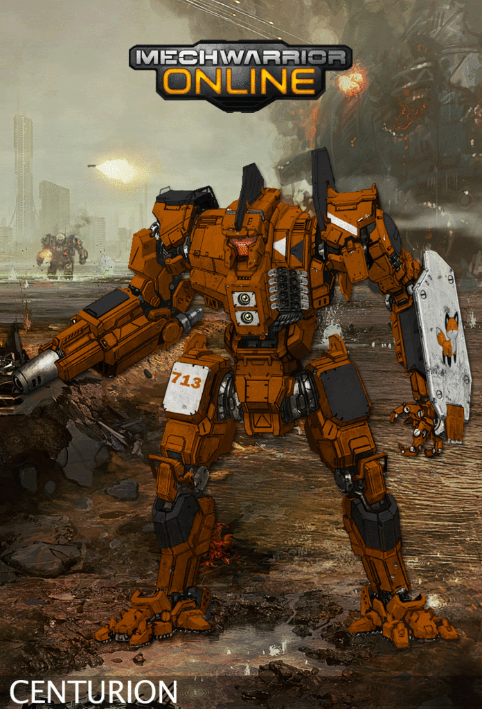
I want it to be mainly orange, with black and white secondary colors (you know, like a fox). If you look back at page 40-something, there's a great Fire Mandrill Hunchback IIC that looks like what I'm looking for.
As far as any markings, just put the number '713' somewhere (preferably in a non-military looking font, but I'm open for whatever looks better), and a logo of a cute fox anywhere on it, like this:

I'll love you forever.
Edited by Oswin Aurelius, 10 February 2012 - 12:09 AM.
#946
Posted 10 February 2012 - 03:58 AM
 Darrin Thomason, on 09 February 2012 - 11:35 PM, said:
Can you please try this below and see if it works. It is how I am working, however, I wondered if it worked for anyone else.
I did try this, it was the first thing I tried and then I attempted to mess around and try getting it to work by myself.
When I followed the steps,it didn't actually recolor the mech, it only tinted it. So if I used blue, it would stay white, but turn a grey/blue hue and look sort of airbrushed into the picture. I don't know why it didn't work for me, too tired to attempt to try getting it to work right now.
#947
Posted 10 February 2012 - 06:04 AM
#949
Posted 10 February 2012 - 06:36 AM
 Ironhawk, on 09 February 2012 - 06:55 PM, said:
Beefier is better as far as Urbie legs go! Done. And poor Urbie lost the arms race in this concept. So he's picking up on weaker than himself. Enjoy!
EDIT: Note the toes are adjustable so they can line up to the 'slipper' in Urban mode or spread out if terrain demands it.

Maybe it's me but the torso/cockpit of this reminds me of a chopped Mini Cooper... Kind'a has a "Steam Punk" feel... not a bad thing mind you.
#950
Posted 10 February 2012 - 06:42 AM
#951
Posted 10 February 2012 - 06:47 AM
#952
Posted 10 February 2012 - 06:49 AM
#953
Posted 10 February 2012 - 07:10 AM
#954
Posted 10 February 2012 - 07:19 AM
#955
Posted 10 February 2012 - 09:22 AM
Edited by ManDaisy, 10 February 2012 - 09:23 AM.
#956
Posted 10 February 2012 - 09:38 AM
 Dihm, on 10 February 2012 - 06:04 AM, said:
Sorry I didn't realise. It is just difficult trying to do a few conversations which have occured while you were asleep, while not wanting to confuse everyone by doing 6-8 multiquotes in one post.
 Mautty the Bobcat, on 10 February 2012 - 03:58 AM, said:
When I followed the steps,it didn't actually recolor the mech, it only tinted it. So if I used blue, it would stay white, but turn a grey/blue hue and look sort of airbrushed into the picture. I don't know why it didn't work for me, too tired to attempt to try getting it to work right now.
This happened to me the first time
 corsair, on 09 February 2012 - 07:31 PM, said:
I Would love to see a Black Thorns Mercenary Unit Camo Scheme.
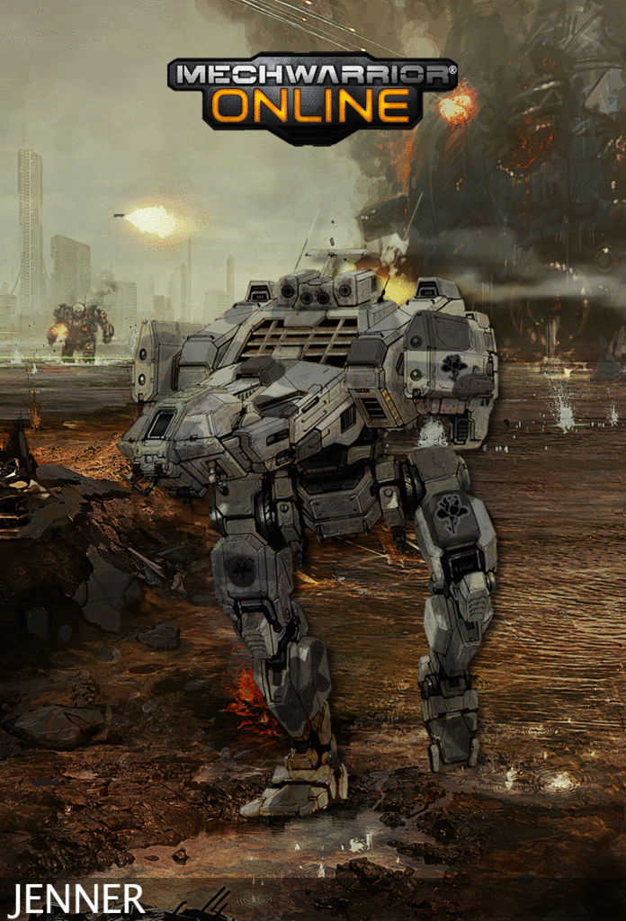
From my brief look at the internet I can't find a camo scheme for them. They appear to be all grey, so I have done this mech which is a replacement for the recon lance and is done in a grey camo. I hope you like it.

 Conjure, on 09 February 2012 - 03:28 PM, said:
VVVVVV
http://www.camospecs...ure.asp?ID=1913
I hope you like this attempt, I am not the best at doing camos, I am only just starting to try out a bit more. I put the unit insignia on the leg. I did debate about putting in on the arm-shield however, I thought it detracted too much from the camo scheme

 Oswin Aurelius, on 10 February 2012 - 12:08 AM, said:
I want it to be mainly orange, with black and white secondary colors (you know, like a fox). If you look back at page 40-something, there's a great Fire Mandrill Hunchback IIC that looks like what I'm looking for.
As far as any markings, just put the number '713' somewhere (preferably in a non-military looking font, but I'm open for whatever looks better), and a logo of a cute fox anywhere on it, like this:
I'll love you forever.
Thanks for the nice words on the Hunchback
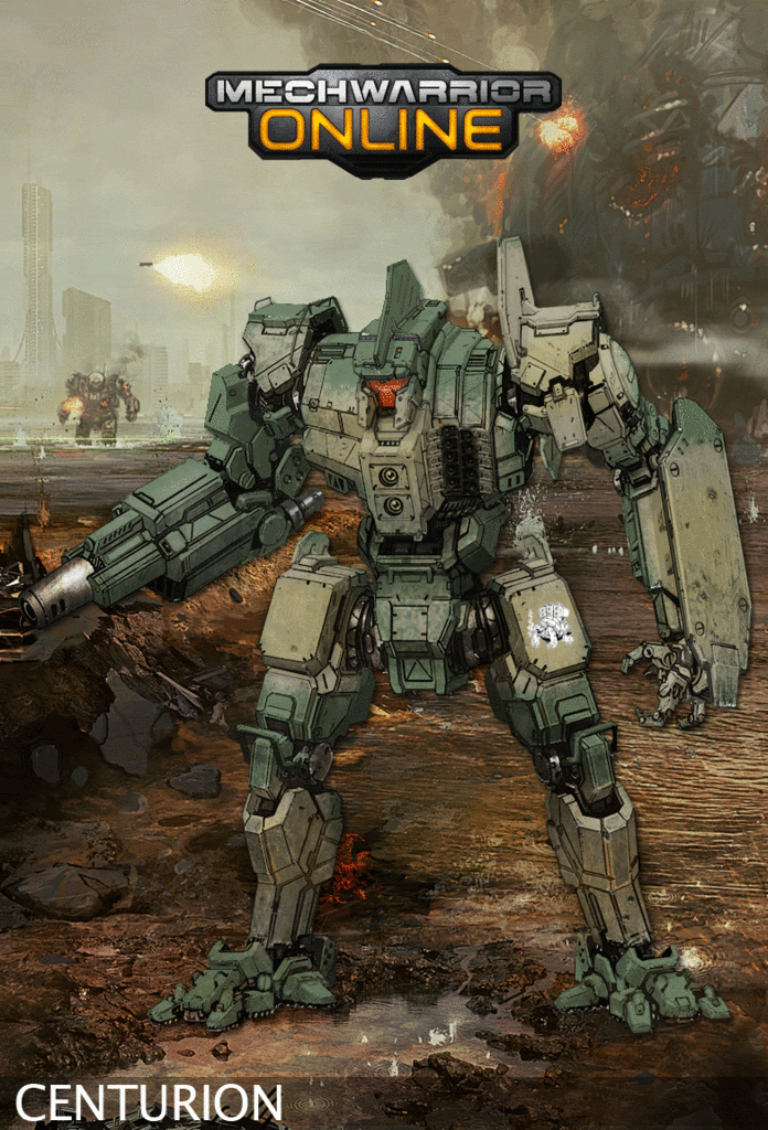
I have done this version of the centurion, I hope you like it

Edited by Darrin Thomason, 10 February 2012 - 12:04 PM.
#957
Posted 10 February 2012 - 01:20 PM

#958
Posted 10 February 2012 - 01:34 PM
#960
Posted 10 February 2012 - 03:34 PM
The legs look perfect now, but I gotta say I think it looked better with the arms, but maybe that's just me not caring about the original design lol it just feels to me as if the weapons are in the wrong place now...
srsly tho I dunno why I have to be so nitpicky, it's still awesome!
Edited by Sesambrot, 10 February 2012 - 03:36 PM.
6 user(s) are reading this topic
0 members, 6 guests, 0 anonymous users


