#5381
Posted 27 April 2014 - 03:12 PM
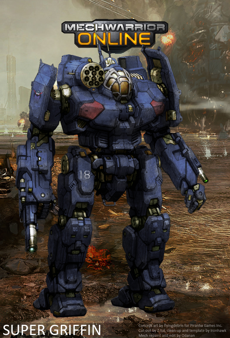
Only problem: there's only one for now. Both Sargeants agreed they would take turns on it. They'd even lend it to Bateleur for some Lance practice from time to time... Heck I decided to help them on the repaint job! I just love these guys!
We decided to name this battleline monster: the Cannibal!
#5382
Posted 27 April 2014 - 04:24 PM
Bishop Steiner, on 26 April 2014 - 09:04 AM, said:
Yes, removing the insignias has been my base stumbling block thus far. I am doing it, but it is slow, tedious and inexact.
Photoshop's *content aware fill* feature is probably the fastest and easiest method.
A clip of it in action:
What method are people currently using?
...
I really like your re-paints, Ironhawk. Very nice!
Edited by I Zeratul I, 27 April 2014 - 04:25 PM.
#5383
Posted 27 April 2014 - 05:18 PM
I Zeratul I, on 27 April 2014 - 04:24 PM, said:
Photoshop's *content aware fill* feature is probably the fastest and easiest method.
A clip of it in action:
What method are people currently using?
...
I really like your re-paints, Ironhawk. Very nice!
I'm a poor boy in Mexico, so I am using gimp, and largely repainting areas, best I can pixel by pixel.
#5386
Posted 27 April 2014 - 05:38 PM
Bishop Steiner, on 27 April 2014 - 05:21 PM, said:
I just scan my PC a few times after torrenting, with over lap of different programs it seems to take care of anything "extra" but I do see where you are coming from.
#5387
Posted 27 April 2014 - 09:43 PM
Ironhawk, on 27 April 2014 - 03:12 PM, said:
Only problem: there's only one for now. Both Sargeants agreed they would take turns on it. They'd even lend it to Bateleur for some Lance practice from time to time... Heck I decided to help them on the repaint job! I just love these guys!
We decided to name this battleline monster: the Cannibal!
The dead gray eyes just make it more terrifying.
#5388
Posted 03 May 2014 - 10:40 AM
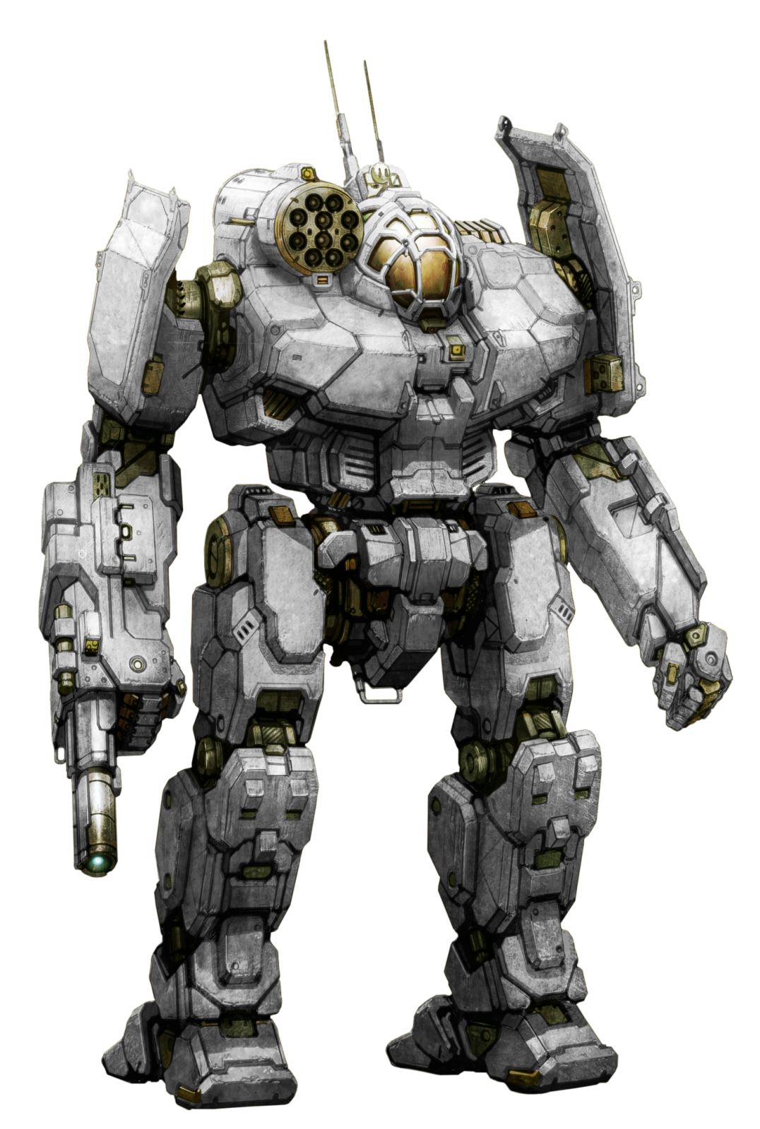
Template available here. Thanks to Zeratul for an excellent cutout job.
Oh and this time around, I included a layer that gives away one of my trade secrets: a Highlight layer. It increases the 3D effect by providing more lighting vs shade contrast, hence giving more depth to Alex's beautiful design, especially with darker colors. You can play with layer transparency to increase or decrease the effect.
Enjoy and have fun.
Cheers!
IH
EDIT: File update containing minor improvements and correcting the mask layer opacity (back at 100%).
Edited by Ironhawk, 04 May 2014 - 06:01 AM.
#5389
Posted 03 May 2014 - 10:53 AM
#5390
Posted 03 May 2014 - 07:34 PM
Ironhawk, on 03 May 2014 - 10:40 AM, said:
Template available here. Thanks to Zeratul for an excellent cutout job.
Oh and this time around, I included a layer that gives away one of my trade secrets: a Highlight layer. It increases the 3D effect by providing more lighting vs shade contrast, hence giving more depth to Alex's beautiful design, especially with darker colors. You can play with layer transparency to increase or decrease the effect.
Enjoy and have fun.
Cheers!
IH
I love you, man. ....Griffin....... = WUB.......
#5392
Posted 03 May 2014 - 07:56 PM
NautilusCommand, on 03 May 2014 - 07:41 PM, said:
Well, I'm a medium guy. And they are the most agile mech in the game. Great FoV in their cockpit. Only downside is no ballistic, so a little warm. But I absolutely love mine, though they took me a little bit to figure out my builds. But my 1N and 3M are my faves.
Helps that I loved them in TT, too.
#5393
Posted 04 May 2014 - 02:43 AM
Ironhawk, on 03 May 2014 - 10:40 AM, said:
Template available here. Thanks to Zeratul for an excellent cutout job.
Oh and this time around, I included a layer that gives away one of my trade secrets: a Highlight layer. It increases the 3D effect by providing more lighting vs shade contrast, hence giving more depth to Alex's beautiful design, especially with darker colors. You can play with layer transparency to increase or decrease the effect.
Enjoy and have fun.
Cheers!
IH
And I was thinking this Sunday would be boring...
#5394
Posted 04 May 2014 - 04:35 AM
Edit: updated version.
Edited by Odanan, 04 May 2014 - 02:43 PM.
#5395
#5396
Posted 04 May 2014 - 10:54 AM
Ironhawk, on 04 May 2014 - 06:02 AM, said:
I have updated the file in my previous post to correct a few glitches.
IH
Well, here goes nothing...... only what., my 3rd attempt at a repaint? I don't have the skills to modify it enough to make it my "Hero" version, but so instead I attempted to make it into my "In-Game" personal mech, and ride of choice, Bishop's GRF-1N
but being new at this, any input and advice on how to improve it, would be very welcome. Next I think I'll work on my "Crimson Dynamo" GRF-3M
#5397
Posted 04 May 2014 - 02:08 PM
#5399
Posted 04 May 2014 - 02:38 PM
#5400
Posted 04 May 2014 - 02:43 PM
Bishop Steiner, on 04 May 2014 - 02:38 PM, said:
You are already doing some advanced stuff.
I just recommend trying to make the image sharper and tune the colors.
Edit: there is also a light outline in the mech, which should the the contrary (dark).
Edited by Odanan, 04 May 2014 - 02:47 PM.
23 user(s) are reading this topic
0 members, 23 guests, 0 anonymous users