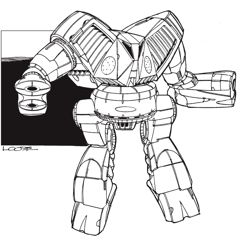
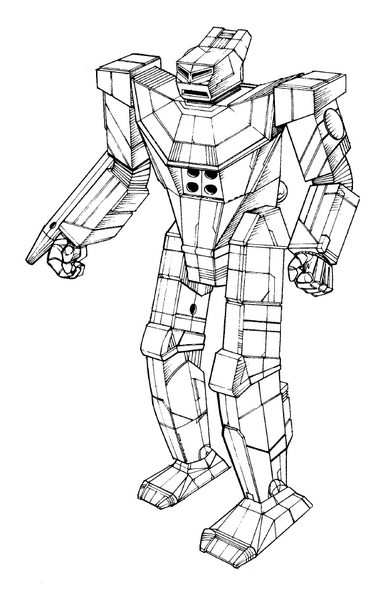
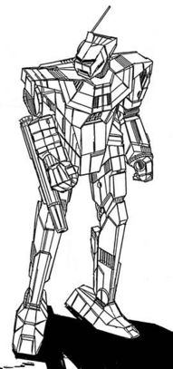
PNT-9K Panther fan concept
#41
Posted 08 February 2012 - 09:37 PM
If the SRM4 was put back in the center torso it would do good things for it, as would reducing the width of the torso.
It's good looking on it's own, but it's taken most of what made a panther feel like a panther, and stripped it out.
If I could suggest bringing back the half-octagon shaped armor plates around the upper torso that looked sort of like an ancient Egyptian collar of sorts you'd see them wearing in old images. Working with that concept will help to maintain the Panther's 'feel', especially since this game is moving away from the existence of 'mech-necks.
#42
Posted 08 February 2012 - 09:47 PM
 SMDMadCow, on 08 February 2012 - 09:13 PM, said:
good catch - im a hugely perspectively challenged. I guess it doesn't help where most artists chickenscratch the whole silhouette before chiseling in the detail. I made the upper torso before even conceptualizing the arms and legs. Good catch!
 ice trey, on 08 February 2012 - 09:37 PM, said:
If the SRM4 was put back in the center torso it would do good things for it, as would reducing the width of the torso.
It's good looking on it's own, but it's taken most of what made a panther feel like a panther, and stripped it out.
If I could suggest bringing back the half-octagon shaped armor plates around the upper torso that looked sort of like an ancient Egyptian collar of sorts you'd see them wearing in old images. Working with that concept will help to maintain the Panther's 'feel', especially since this game is moving away from the existence of 'mech-necks.
Good point about the panther's collar and the pharoah-collar motif. I never thought of it like that..
BACK TO THE DRAWING BOARD!
#43
Posted 09 February 2012 - 01:32 AM
#44
Posted 09 February 2012 - 02:35 AM
#45
Posted 09 February 2012 - 04:06 PM

#46
Posted 09 February 2012 - 07:00 PM

Edited by ethnic minority, 09 February 2012 - 10:23 PM.
#47
Posted 09 February 2012 - 08:45 PM
#48
Posted 09 February 2012 - 08:45 PM
The panther looks have a few key features you should try to maintain: cat like head, and a slim tallish body. It should almost look like a walking panther (just don't go too furry...or people will make fun of you) The raised head looks a lot better, but it kinda looks like a sad frog...make it look more like a angry cat face with sharper "teeth". If you really want to set it apart a bit from the original, give it digitigrade legs like the nova cat or thanatos. It'll give it that werewolf look to it, which would fit the 'walking panther' theme.
Edited by =Outlaw=, 09 February 2012 - 08:51 PM.
#49
Posted 10 February 2012 - 02:48 AM
#50
Posted 10 February 2012 - 06:51 AM
Good job!
#51
Posted 10 February 2012 - 07:00 AM
As previously mentioned, the head/face does look like a sad frog (thanks Outlaw, I could not put my finder on what it looked like at first..) and I'm in support of the reverse-joint legs as Outlaw also inferred, it does go a long way to conveying an animalistic tone...
Excellent work!
Edited by DaZur, 10 February 2012 - 07:02 AM.
#52
Posted 10 February 2012 - 07:08 AM
I'd still like to see the SRMs moved into the center torso too, tbh.
#53
Posted 10 February 2012 - 08:08 AM
#54
Posted 10 February 2012 - 08:22 AM
Oh...and give it antennas.
#55
Posted 10 February 2012 - 09:17 AM
#56
Posted 10 February 2012 - 09:37 AM
 Chuckie, on 08 February 2012 - 04:55 PM, said:
Figured it might be easier if a head to head camparison was done..


So with that said..
I can see the camparison really well.. and like FD you sunk the head into the torso (Which BTW I am good with).
Seems the only major deviatons you incorporated other than sinking the head into the chest was the "waist" so it could really "do the twist" (Wich again I am really good with.. ) and relocation of the SRM4 (which I think could have been where it was.. so don't understand that change.. but its minor)
On a scale of 1-100 I give it a 92 really really good.. Do think it needs its "Face".. specifically the mouth.
This one I think garners a 95, only things I would change was the SRM4 location to the chest and a mean look as opposed to the sad one) in the "face" of the mech. Think you need to open the mouth / vent port, whatever it maybe)
Then you get a 102 (2 points for extra credit)
Maybe this explains it.. (Forgive my free hand skills)

Edited by Chuckie, 10 February 2012 - 11:32 AM.
#57
Posted 10 February 2012 - 10:41 AM

#58
Posted 10 February 2012 - 10:59 AM
Excellent work. This is Mechwarrior! Well done.
*102 points*
#59
Posted 10 February 2012 - 11:13 AM
 The_Birdeater, on 08 February 2012 - 07:34 AM, said:
Dude, this is a 35 ton LightMech, not a Clan Timberwolf... I can see original armaments and it's ok.
DUDE! it's not about what you like its about what I like!
So with that said ( kicks Birdeater off the construction plat form ) Cram more weapons into that dam thing and call me when your done!
Hence why I want the ability to make my own Custom Mech rather than your old and tired load outs or "Purist" cannon babble ( petewwe, spits on floor )
#60
Posted 10 February 2012 - 11:14 AM
7 user(s) are reading this topic
0 members, 7 guests, 0 anonymous users


