Jump to content

New Art Style? Thoughts?


58 replies to this topic

#1 tyrone dunkirk

    Member

  • PipPipPipPipPipPipPip
  • 672 posts
  • LocationOutreach

Posted 02 November 2011 - 02:41 PM

If there was one thing that immediately stood out to me on those days of watching the decoded fragments, it was the new direction that PGI was taking the art style. The 3 released mechs look darker, grittier, and more realistic( that is, they actually look like MACHINES) than alot of the newer artwork seen in some of the newer Technical Readouts. What I'm wondering is how well will this translate into the game, if indeed this is the final chosen art style for the game. Also, what does this mean for the rest of the game? How do you think this will translate into the rest of the game?
Thoughts?

#2 metro

    Member

  • PipPipPipPipPipPipPipPipPip
  • 2,491 posts
  • Facebook: Link
  • LocationSians Celestial City- http://capellanconfederation.com/

Posted 02 November 2011 - 02:45 PM

It appears more realistic and less cartoonish to me.

I actually like it.

#3 Xhaleon

    Member

  • PipPipPipPipPipPipPip
  • The Money Maker
  • The Money Maker
  • 542 posts

Posted 02 November 2011 - 02:50 PM

Flyingdebris is good as always, but I don't like how hunched over his Atlas is. I much prefer the most recent furry-killing version. That had a much more classic and less try-hard-realism look.

#4 taxman

    Member

  • PipPipPip
  • 61 posts
  • LocationWirral Cheshire England

Posted 02 November 2011 - 02:52 PM

I guess its a bit like 'Marmite' you will either Love it or Hate it.

Personaly I Love It.!!

#5 CycKath

    Member

  • PipPipPipPipPipPipPipPipPip
  • Legendary Founder
  • Legendary Founder
  • 2,580 posts
  • Google+: Link
  • LocationSE QLD, Australia

Posted 02 November 2011 - 02:53 PM

A single unified art-style, as a opposed to multiple artists which is the newer TRO's greatest sin IMO, is the nicest thing to me personally.

#6 tyrone dunkirk

    Member

  • PipPipPipPipPipPipPip
  • 672 posts
  • LocationOutreach

Posted 02 November 2011 - 02:56 PM

haha the furry killing Atlas is cool!

#7 Liam

    Member

  • PipPipPipPipPipPip
  • 220 posts
  • LocationStuttgart

Posted 02 November 2011 - 03:03 PM

I like all 3 arts. But what I don't see is modularity. It is like the same stuff as in MW3, MW4 > Tro mech design, no matter what weapons they use. Maybe I am wrong, but let see it realistic, no one has a enough grey cells or time to implement some nice slot based weapons that you can actually see on your mech appearance.

#8 infinite xaer0

    Member

  • PipPipPipPipPipPip
  • 417 posts

Posted 02 November 2011 - 03:12 PM

i really like the art style, but, it's starting to look like all the mechs were literally designed by the same person (i'm sure they were at least drawn by the same person..). It would be a nice touch if they put a little more diversity in the designs, like some mechs have more angular shaped armor, while other mechs have smother, sloped armor sections, b/c there's no way that ALL the mechs in the IS should look like they were created by the same designer and pushed out of the same factory..

#9 Xhaleon

    Member

  • PipPipPipPipPipPipPip
  • The Money Maker
  • The Money Maker
  • 542 posts

Posted 02 November 2011 - 03:17 PM

View Postinfinite xÆr0, on 02 November 2011 - 03:12 PM, said:

i really like the art style, but, it's starting to look like all the mechs were literally designed by the same person (i'm sure they were at least drawn by the same person..). It would be a nice touch if they put a little more diversity in the designs, like some mechs have more angular shaped armor, while other mechs have smother, sloped armor sections, b/c there's no way that ALL the mechs in the IS should look like they were created by the same designer and pushed out of the same factory..


...now that I think about it, it sort of does look that way.

Goddommot, flyingdebris, silly mechs must ALWAYS be silly! Stalker should always be a Stalker!

#10 tyrone dunkirk

    Member

  • PipPipPipPipPipPipPip
  • 672 posts
  • LocationOutreach

Posted 02 November 2011 - 03:18 PM

View Postinfinite xÆr0, on 02 November 2011 - 03:12 PM, said:

i really like the art style, but, it's starting to look like all the mechs were literally designed by the same person (i'm sure they were at least drawn by the same person..). It would be a nice touch if they put a little more diversity in the designs, like some mechs have more angular shaped armor, while other mechs have smother, sloped armor sections, b/c there's no way that ALL the mechs in the IS should look like they were created by the same designer and pushed out of the same factory..


That makes sense, but what I DON'T want to see is the crazy @$$, ugly, circle shaped pieces like the Hoplite, Sentinel, and Shogun. Circular machinery looks downright cartoony, and wouldn't make sense due to being able to deflect projectiles as well as sloped angular armor designs

I forgot to include the Stalker. AKA "The P#n!s in a Box" of Battletech

Edited by tyrone dunkirk, 02 November 2011 - 03:22 PM.


#11 Sesambrot

    Member

  • PipPipPipPipPipPipPip
  • Bridesmaid
  • 862 posts
  • LocationGermany

Posted 02 November 2011 - 03:22 PM

This is actually a very subjective topic.
I can understand people growing attached to the TRO with time, but I personally really like the new designes way better. (Yeah, even the Atlas!)

Let me explain by looking at those three designs individually:

Hunchback
Well actually there isn't all that much difference between the TRO and the new concept art, unless you really want to be nitpicking.
Over all it just looks like a more detailed, "meaner" version of the TRO, but actually looks way better at the same time!

Jenner
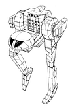
Let's face it, the TRO was just plain ugly! Actually I dare say one of the ugliest I've ever seen, and the reason for attaching the legs to the torso doesn't really get into my head, as it is completely impractical considering the way those mechs move. Now, the new design, on top of being more functional due to the legs being separated from the torso, it just looks way better! You couldn't deny that by any means!

Atlas
Undenyably this mech has gotten the heaviest redesign. But I already mentioned elsewhere that, I think it now looks much more like a big bully, which fits the image of this mech way better than the overgrown human with a skullhead. The new design simply looks more fearsome than the old one, it is actually something I would want to run away from on the battlefield, the reaction to the old one is more like:
"So it has a skull as head....... *shrugs* ...now what?"

And to the point of them being possibly created by that one particular concept artist :) is probably a fact, but we've only seen three so far, and I'd bet there are going to be a few different styles. After all this is "just" concept art, awesome one indeed, but the actual models are probably going to look a little different, and the artists working on those will give them their own personal touch anyways...

Edited by sesambrot, 02 November 2011 - 03:48 PM.


#12 infinite xaer0

    Member

  • PipPipPipPipPipPip
  • 417 posts

Posted 02 November 2011 - 03:25 PM

View Posttyrone dunkirk, on 02 November 2011 - 03:18 PM, said:


That makes sense, but what I DON'T want to see is the crazy @$$, ugly, circle shaped pieces like the Hoplite, Sentinel, and Shogun. Circular machinery looks downright cartoony, and wouldn't make sense due to being able to deflect projectiles as well as sloped angular armor designs


sooooooo many mechs have TERRIBLE btech art. I'd say that probably half, if not more of all the mechs in battletech need to be redesigned, especially all the mechs that have enormous amounts of forward facing cockpit glass.

#13 tyrone dunkirk

    Member

  • PipPipPipPipPipPipPip
  • 672 posts
  • LocationOutreach

Posted 02 November 2011 - 03:29 PM

"So it has a skull as head....... *shrugs* ...now what?"

My thoughts exactly! It looked big, but not BAD!
The new one looks like one man MF'er and the redesigned head doesn't look as... I dare say... goofy.
Come at me, TRO Atlas fans

#14 Stormcrow900

    Rookie

  • Legendary Founder
  • Legendary Founder
  • 1 posts
  • LocationChester, VA

Posted 02 November 2011 - 03:33 PM

Hehehe goofy face Jenner, hehehe....

Posted Image

#15 sigma

    Member

  • Pip
  • 11 posts

Posted 02 November 2011 - 03:34 PM

Alex Iglesias is the best thing to happen to Battletech art in the last decade.

That being said I prefer his FH2 Atlas and his V2 Hunchback to these. All this stuff rocks though.

#16 tyrone dunkirk

    Member

  • PipPipPipPipPipPipPip
  • 672 posts
  • LocationOutreach

Posted 02 November 2011 - 04:12 PM

Alex Iglesias artwork is friggin fantastic, and one of the things I love about some of the newer TRO's, but there are also A LOT of ugly new mechs out there.
Also, there was always something I liked about the TRO Jenner, idk. It wasn't ugly to me... just quiky ha. It did, however, have a decent load out compared to alot of the light mech's in 3025

#17 Marauder3D

    Member

  • PipPipPipPipPipPipPip
  • The Patron Saint
  • The Patron Saint
  • 744 posts
  • LocationHuntress

Posted 02 November 2011 - 04:15 PM

I am curious to see the full body of work. I like where they went with the Atlas. Especially slapping the rearward firing mediums on the front torso.

#18 CobraFive

    Member

  • PipPipPipPipPipPipPipPip
  • Elite Founder
  • Elite Founder
  • 1,174 posts
  • LocationAZ, USA

Posted 02 November 2011 - 04:19 PM

BTech and mechwarrior have a problem with ugly mechs and bad art.

Te three so far are a step in the right direction... not really feeling the Jenner yet, but maybe once I see it in action it'll grow on me. And the Hunchback's arms kinda throw me off... but I think they fit perfectly with the design. Just kinda thrown on there as an afterthought, its all about that AC/20.

The Atlas I have no criticism of. This is what the Atlas should've looked like from the beginning. :)

I especially like how "military" all the designs feel. One of the things I like about battletech/mechwarrior is that despite 3200 years in the future, it has such a gritty, "modern" feel to it.

#19 Tyra

    Member

  • PipPipPipPipPipPip
  • Knight Errant
  • Knight Errant
  • 242 posts
  • LocationSin City

Posted 02 November 2011 - 04:19 PM

I love it.

#20 Captain Fabulous

    Member

  • PipPipPipPipPipPipPip
  • Philanthropist
  • Philanthropist
  • 685 posts

Posted 02 November 2011 - 04:57 PM

I dunno, I kind of liked the torso-leg Jenner more. The Hunchback is perfect though.


7 user(s) are reading this topic

0 members, 7 guests, 0 anonymous users