Jump to content

Battlemech - Kintaro


402 replies to this topic

#241 Ngamok

    Member

  • PipPipPipPipPipPipPipPipPipPip
  • Elite Founder
  • Elite Founder
  • 5,033 posts
  • Twitter: Link
  • Twitch: Link
  • LocationLafayette, IN

Posted 02 August 2013 - 06:27 AM

View PostWildcat2013, on 02 August 2013 - 03:40 AM, said:

Looks definetly better than the TRO art. But I'll skip this one...initially, at least.


If I can make this a fast 4 missile SRM striker with a couple of Energy weapons as backup, I might try it. By fast I mean at least 100 KPH or more with speed tweak. Also going to depend on how it takes damage so that way I can determine if I want to try XL or not. I'll wait till I see it on the battlefield and see how it takes damage.

#242 Belorion

    Member

  • PipPipPipPipPipPipPipPipPipPip
  • Legendary Founder
  • Legendary Founder
  • 5,469 posts
  • LocationEast Coast

Posted 02 August 2013 - 06:36 AM

I am totally trying this one out.

#243 Burning Chrome

    Member

  • PipPipPipPipPipPip
  • Ace Of Spades
  • 248 posts

Posted 02 August 2013 - 06:38 AM

View PostViper69, on 02 August 2013 - 06:19 AM, said:


I would but its been said over again, besides I wont be adding anything to the thread by derailing it with negativity. SO I will bow out and respect everyone's decision to purchase it and that is all.


Fair enough.

We may share the same concerns as it is.

I will probably replace my QKDs with KTOs as the QKD is horribly oversized and suffers in-game for that reason alone, which is truly a shame as I'm really like the way the QKD looks in-game and it can be a fun ride.

If the KTO is as big at the QKD...

#244 SteelPaladin

    Member

  • PipPipPipPipPipPipPip
  • Knight Errant
  • Knight Errant
  • 715 posts

Posted 02 August 2013 - 06:47 AM

View PostStraygo, on 02 August 2013 - 12:47 AM, said:

@SteelPaladin, theres the wolfhound 35 ton light, uses mostly lasers, utilizes ecm and moves fairly fast (for tabletop), theres also the panther, which with the current meta would work great since it uses a damned ppc. speed wont be an issue since the TT version doesnt go very fast. its a heavy armor light mech that snipes. theres the hermes, with TONS of varients, and a personal fav, the valkyrie, honestly, i dont think its very high on the list of priorities to fix the issues with lights, and thats fine. Im still gonna play my heart out solo;ing atlai in my death knell.


The Panther and Wolfhound don't have the required number of distinct 3050 variants for MWO. In particular, all three of the WLF are functionally the same from an MWO standpoint. The WLF-1B is just what will happen to the WLF-1 anyway (since no rear weapons in MWO) and the WLF-1A is only removing a laser.

The Hermes moves too fast. Its base speed is above the current speed cap.

The Valkyrie is a Macross Unseen, which are still apparently radioactive. If PGI isn't going to jump under that bus w/all the clamoring for the Marauder and Warhammer, they sure as hell aren't going to do it over a Valkyrie.

#245 Xeno Phalcon

    Member

  • PipPipPipPipPipPipPipPipPip
  • Bad Company
  • 2,461 posts
  • LocationEvening Ladies

Posted 02 August 2013 - 07:32 AM

View PostSteelPaladin, on 02 August 2013 - 06:47 AM, said:

The Valkyrie is a Macross Unseen, which are still apparently radioactive. If PGI isn't going to jump under that bus w/all the clamoring for the Marauder and Warhammer, they sure as hell aren't going to do it over a Valkyrie.


Yeah hell the warhammer was in the original trailer for MWO and it up and poofed despite a couple of the devs claiming their was no issue with Harmony Gold, talk about an effective gag order.

#246 Koniving

    Welcoming Committee

  • PipPipPipPipPipPipPipPipPipPipPipPipPip
  • The Guide
  • The Guide
  • 23,384 posts

Posted 02 August 2013 - 07:48 AM

View PostJohnny Two Legs, on 01 August 2013 - 09:47 PM, said:


The Yeoman would like to contest this :rolleyes:
Posted Image

j2l


That thing has.. LRM-25s? I want LRM-25s!

Oh on Kintaro's swagger -- give me time and I'll make a short animation on it.

Guard Scorpion boot-up sequence (two cameras)

Dyne, limping. Pay attention to the necklace.

Hammer Blaster test animations. First one, I was bored (do the wave!). Second one, a reaction to a modded Deus Ex-style flashbang. Deus Ex is where these models were going to go before I realized how daunting early Unreal Engines were about animations.


Some past ones from 2003 to 2006 done on a windows 95 PC with 16 megabytes of ram, pentium 1 processor. :P Re-recorded on my new one after finding a way to connect IDE hard drives to it.

Edited by Koniving, 02 August 2013 - 08:01 AM.


#247 IAN WAGNER

    Member

  • PipPip
  • Knight Errant
  • 21 posts
  • LocationChaos March

Posted 02 August 2013 - 08:04 AM

While unknown variables still exist, the Kintaro looks like a natural for being an SRM infighter, while hopefully presenting a smaller target than the Quickdraw. Should the tonnage limits on drops and the vague 'agility buff' for Mediums go through, it will become even more popular.

Thankfully, the MWO incarnation is far more aesthetic than its original TRO appearance.

#248 Inflatable Fish

    Member

  • PipPipPipPipPipPipPip
  • Rage
  • Rage
  • 563 posts

Posted 02 August 2013 - 08:09 AM

I reckon I'll stick to a Shadow Hawk as my 55-ton mech. I mean, this one's all nice and stuff, but it's like a 4SP on beef.

buuuuuut if/when the Wolverine comes out... ho boy. (one may argue that one, in turn, is a CN-9A on beef, but them looks!)

#249 Cache

    Member

  • PipPipPipPipPipPipPip
  • Legendary Founder
  • Legendary Founder
  • 746 posts

Posted 02 August 2013 - 08:12 AM

View PostSteelPaladin, on 01 August 2013 - 05:25 PM, said:

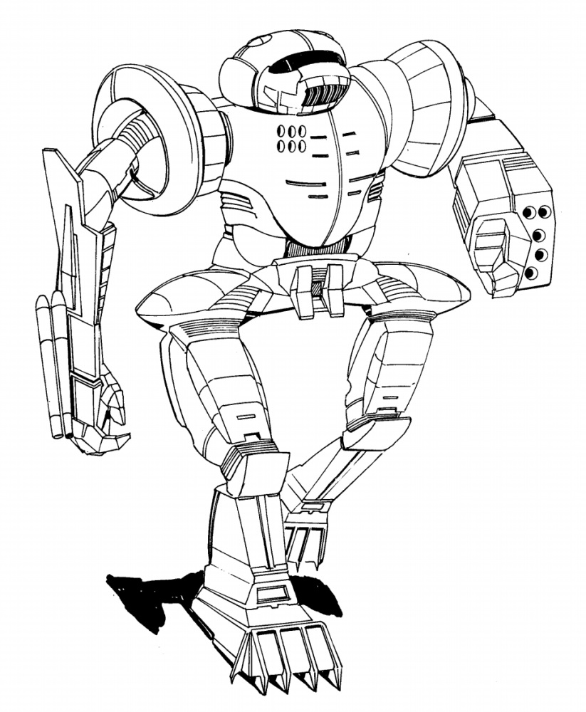
A significant portion of Battletech art is just bad. The mechs look silly and have very little of a "military" aspect about them. They're walking tanks, not blinged-out BMWs. Suspension of disbelief only goes so far (and Battletech burns A LOT of it on other aspects). Alex is doing a pretty good job of making the mechs look like they could actually belong on a battlefield instead of at a cosplay convention.


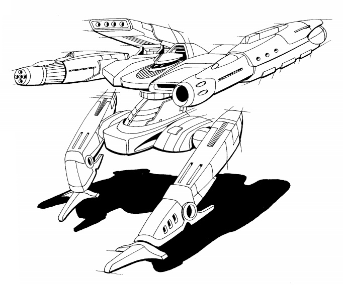
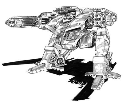
When the original artwork is bad, you take this:

Posted Image

...and turn it into this:

Posted Image

...where it is instantly recognizable because a vast majority of the original details are present, thus preserving the uniqueness of the design. You don't turn it into a boring cookie-cutter design just to make it look more military.

Edited by Cache, 02 August 2013 - 08:13 AM.


#250 Trip Hammer

    Member

  • PipPipPipPipPip
  • 135 posts

Posted 02 August 2013 - 08:31 AM

First I'd like to say that I'm glad to see a 55 toner and that I'm REALLY glad that they did not hold too closely to the original artwork as it was much to cartoonish. Good Job!

View PostSaber Avalon, on 01 August 2013 - 09:52 PM, said:

Seriously? Another surprise mech? When you have lights falling behind and already passed over the Orion, which pissed a lot of us off, myself included. Plus you were teasing the Wolverine on the news, so you have two 55T mechs lurking.

If anything the light pilots deserve a mech this month and if you can't do that then Orion, after the stunt you pulled before. Jesus Christ PGI, I'm normally very patient but this is getting rediculous.


As to the Light Pilots "deserving" a new mech; It seems you've forgotten that there is a problem with hit detection on light mechs at the moment, which is probably the reason that they have skipped over the lights again.

As for the Orion, I realize that PGI was planning on releasing it and then changed their minds. This is not a "Stunt". They made a decision that you and others didn't like. Design decisions like this get made all the time (and not just in the gaming world). Acting as if they have broken a contract with you is just silly and sad. Try to remember that this is a game and get over it.

Edited by The Faceless, 02 August 2013 - 08:34 AM.


#251 Glitchbit

    Member

  • Pip
  • Overlord
  • Overlord
  • 14 posts
  • LocationTsukude, Vega, Altair, Draconis Combine

Posted 02 August 2013 - 08:51 AM

View PostOcilfa, on 01 August 2013 - 12:20 PM, said:

Ugh, not enough swagger in the mwo version...Posted Image

View PostRoland, on 01 August 2013 - 12:49 PM, said:

Someone post the animated gif of the kintaro strutting.

Posted Image

Edited by Glitchbit, 02 August 2013 - 09:00 AM.


#252 Sparkymarkyp

    Member

  • PipPipPipPipPip
  • Elite Founder
  • Elite Founder
  • 187 posts

Posted 02 August 2013 - 09:11 AM


#253 SteelPaladin

    Member

  • PipPipPipPipPipPipPip
  • Knight Errant
  • Knight Errant
  • 715 posts

Posted 02 August 2013 - 09:27 AM

View PostCache, on 02 August 2013 - 08:12 AM, said:


When the original artwork is bad, you take this:

Posted Image

...and turn it into this:

Posted Image

...where it is instantly recognizable because a vast majority of the original details are present, thus preserving the uniqueness of the design. You don't turn it into a boring cookie-cutter design just to make it look more military.


And how would they do that within the graphical style and polygon budget of this game? Curvy sections are out. They've got the Kintaro's arm "rings," the "helmet visor," the wiry arms and even the dangly bits. The only details I can see missing from the original are the "face grill" and the hip "skirt." Those are pretty serious omissions, but I imagine something had to go to keep the framerates from tanking.

#254 Sisel

    Member

  • PipPip
  • 21 posts

Posted 02 August 2013 - 09:34 AM

WAAAAAAAAT? No Flea or any light mechs? I'm disappointed.

#255 Agent 0 Fortune

    Member

  • PipPipPipPipPipPipPipPipPip
  • Bad Company
  • Bad Company
  • 3,403 posts

Posted 02 August 2013 - 09:38 AM

I'm not sure how this mech is going differentiate itself from the Trebuchet or Quickdraw.
Mounting fewer missile tubes and less energy hardpoints, the kintaro doesn't seem to bring anything to the party.

#256 Kibble

    Member

  • PipPipPipPipPipPipPip
  • Elite Founder
  • Elite Founder
  • 539 posts
  • LocationOakland, CA

Posted 02 August 2013 - 09:52 AM

I LOVE the art work. Always have. However the in game models have been less desirable and the quality has been going down hill. Since the Kintaro was data mined I again have doubts of an awesome looking mech. So far I think this mech will look like the treb in it's boxyness.

#257 Benden

    Member

  • PipPipPipPipPip
  • Elite Founder
  • Elite Founder
  • 133 posts
  • LocationFrance

Posted 02 August 2013 - 09:57 AM

Thanks PGI for a new mech but ... K in taro ? duh ? never heard about this one ever before.
Orion, dervish, Urban mech... ring me a bell though...
Also, mech artist is usually damn good but even if the original arts are strongly years 60's inspired, the new art is soo generic.
I first tought Kintaro was under some copyrights and artist had to make it completley unrecognizable. Too bad, it could have been a mech with some "personnality".
Now let's just hope it can be interesting to play or kill, if not to watch.

Edited by Benden, 02 August 2013 - 03:11 PM.


#258 AdamBaines

    Member

  • PipPipPipPipPipPipPipPip
  • Elite Founder
  • Elite Founder
  • 1,384 posts

Posted 02 August 2013 - 10:05 AM

I like the Kintaro. An unexpected choice for sure but I like it. I especially like the fact that they are just not taking all of the same mechs that have been used in the previous incarnation of MW.

I like many of you would like the see the hip "skirts" in place, even if they were much smaler and the "helmetvisor", but over all as usual FD come through with great work..

#259 Kyone Akashi

    Member

  • PipPipPipPipPipPipPipPip
  • The Blade
  • The Blade
  • 1,656 posts
  • LocationAlshain Military District

Posted 02 August 2013 - 10:16 AM

A nicely written story to go along with the announcement. Kudos to the author, and thanks for featuring the DCMS for once. :rolleyes:

#260 Cache

    Member

  • PipPipPipPipPipPipPip
  • Legendary Founder
  • Legendary Founder
  • 746 posts

Posted 02 August 2013 - 10:38 AM

View PostSteelPaladin, on 02 August 2013 - 09:27 AM, said:

And how would they do that within the graphical style and polygon budget of this game? Curvy sections are out. They've got the Kintaro's arm "rings," the "helmet visor," the wiry arms and even the dangly bits. The only details I can see missing from the original are the "face grill" and the hip "skirt." Those are pretty serious omissions, but I imagine something had to go to keep the framerates from tanking.

Curves have nothing to do with the problem. Most of the changes can be done with the textures. A few are actual model changes.

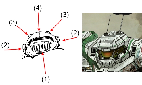
Let's start with the head. We were given a Spartan helmet or Doom space marine--period. Want to keep the original flavor without rounding it, add this:
(1) Face grill. The two put on either side of the head don't cut it, and we know they're possible to do, yet we get the minimal homage that is there.
(2) "Ears". Did the face grill and these get merged into those bits on either side of the head? Why?
(3) "Horns". There is one knot on the head now, and it's in the center. Why not two in the same location as the original, then put the antenna on them?
(4) Armor seam. There should be one seam going down the center of the head. This is not a problem to add.

Spoiler


Arms: The wiry upper arms are not there. A large armor panel was added to the upper arms to beef them up. The rings are the only part vaguely recognizable. I'm going to assume the renders showing the RA lasers stacked rather than side-to-side are an error that will be fixed. Lowers are good otherwise.

Torso: I can see the homage to the CT curves (blue line). The torso is squished a bit, along with the head.
(1) Lines to either side of the laser are there. Good.
(2) Laser... looks raised a little but that's more the upper part of the torso being squished down. Good.
(3) Vent is there, mostly. Good.
(4) Integrated 'rib' vents are gone and tacked on as a 'scoops'. Not good. Go back to them as an internal part of the side torso, and narrow the sides a little.

Spoiler


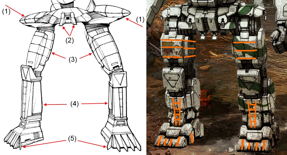
Legs:
(1) Hip skirts are there, just minimized to the extreme. I would assume to allow arm movement, but the arms don't bend down that low. Make them larger.
(2) The 'dangly bits' shouldn't be dangly. I'm assuming they are now tie-downs for transport. In the original they are wedge shaped pieces pointing forward. No curves involved, no limb clearance issues.
(3) Upper leg armor panels are completely different. You don't need curves to mimic the horizontal lines of the original.
(4) Knees are good but lower leg armor panels are completely different. Again, you don't need curves to mimic the original.
(5) The claws on the toes don't have to stand out. The 'toenails' we were given could run to the top of the toe, and be added to the inner and outer foot.

Spoiler

Edited by Cache, 02 August 2013 - 10:46 AM.


3 user(s) are reading this topic

0 members, 3 guests, 0 anonymous users