
Suggestion for the weapon grouping: Is it possible to list where the weapons are equipped (other than arms/torso/head) for easily sorting left from right without having to launch the game or training ground. There is no easy way now to tell which arm or torso a weapon is located.

Ui Feedback
Started by Elder Thorn, Feb 04 2014 12:28 PM
1175 replies to this topic
#182
-

-

- 33 posts
Member
Posted 04 February 2014 - 06:47 PM
Just a quality of life fix but...Being able to "ready" for group launching at any point in the menus would be great... i would think you could ready up and launch reguardless of your location in the menus as long as you havent done anything in need of saving, i often want to browse around and derp around while waiting for a buddy to rearrange his mech, but it unreadies me. Also, currently why the crap do i have to back out of all of my menus to Ready. when im not even in a menu where changes can be made?
#183
-

-
- Legendary Founder

- 1,576 posts
Member
Posted 04 February 2014 - 06:48 PM
The pop out window that lists a lot of key info (but everything that it should list) is plenty large enough to obscure the Mech, but could easily be much much larger.
You're already blocking the view of the Mech, go all the way and make the darn window big enough that you can use a larger font! I'm 44 years old. I bought a big a$$ monitor so I wouldn't have to squint to read stuff. Why the hell is your text so small?
You're already blocking the view of the Mech, go all the way and make the darn window big enough that you can use a larger font! I'm 44 years old. I bought a big a$$ monitor so I wouldn't have to squint to read stuff. Why the hell is your text so small?

#184
-
-
- Knight Errant

- 596 posts
Member
Posted 04 February 2014 - 06:50 PM
 stjobe, on 04 February 2014 - 01:56 PM, said:
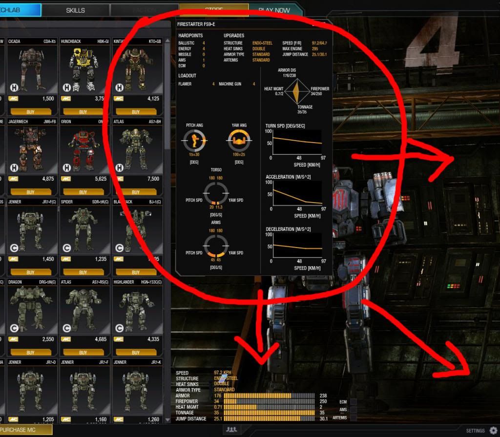
Can't find what engine it has, what modules, what loadout, you can basically see the name and nothing else until you go into "Configure" - and then it's just for that one 'mech.
I noticed that if you hover over the mech before you click "Configure", a box pops up on the right with some of that information, not all of it, but at least what weapons, speed, and a few other things. It's tricky though, you can't actually click the mech, just hover over it without moving the cursor for a second, and it will come up. (Intuitive, right?)
It would have been great if they just showed the old mech loadout summary in that box, instead of the little useless but cool-looking diamond graphs they stuck in there. Oh well, I guess that might happen in UI 2.1.
Edited by LastPaladin, 04 February 2014 - 06:51 PM.
#185

Posted 04 February 2014 - 06:51 PM
FactorlanP, on 04 February 2014 - 06:26 PM, said:

In the Skills, it places a "Master" banner across the only Mech that isn't actually Mastered.
This is counter-intuitive, in my opinion.
+1
#186
-
-
- The Blazing

- 93 posts
Member
- LocationEastern U.S.
Posted 04 February 2014 - 06:51 PM
Well PGI, I believe a big "We told you so" is in order. I'm usually not one for sarcasm or the like, but you had us publicly test the new UI and we told you what was wrong. And yet, nothing was changed and you released it anyways.
What exactly was the point of a public test?
So the rage you are reading from everybody about UI 2 could have been avoided, or at least severely reduced, had you addressed the issues that the player base cited from public testing.
Look, I understand that you wanted to honor the deadline, that missing the deadline would have garnered you rage as well. But I think you really shot yourselves in the feet this time with UI 2. And you may have ruined your last chance with many players because of it, and any new players may well be discouraged to play as well due to the new UI. Yes, UI was a bottleneck for future features, but until this is fixed, no new features should even be considered anyways.
Get the Mountain Dew, Red Bull, coffee, No-Doze and anything else to help you stay awake and get these issues fixed a.s.a.p.!
#187
-

- Elite Founder
- 1 posts
Rookie
Posted 04 February 2014 - 06:53 PM
I have opened and closed mechwarrior over ten times and have only gotten one game it. Keep getting the connecting bug when i login. Plus the only match i played the triggers are messed up. No matter how I set the triggers they all alpha strike.
So far all i see is a patch that looks pretty, but increases loading time and overall sucks.
So far all i see is a patch that looks pretty, but increases loading time and overall sucks.
#188
-
-
- Ace Of Spades

- 1,445 posts
Member

Posted 04 February 2014 - 06:58 PM
Likes:
- Improved sensitivity slider. Makes it much more easy to aim. Will change the game play and make a lot of people better I think.
- graphics seem faster and less glitchy
- Confirmation for purchases at the end.
- The user-user messaging interface is somewhat better.
- Slider bars need values next to them to show what the selected sensitvity/setting is.
- Builder not intuitive. Too many menus and not enough information displayed. Old mech builder was better.
- Too many clicks needed to do things in general
- Fonts and borders look ugly and poorly polished.
Edited by JigglyMoobs, 04 February 2014 - 07:00 PM.
#189
-

-
- 530 posts
Member

Posted 04 February 2014 - 06:58 PM
Most competent UI designers contemplate average distance to most-likely-used next button and aim to reduce it.
...it seems as if you guys decided to win the record for most times you have to go top-left to bottom-right in order to play a 6min game.
I am concerned for the longevity of the game at this point. Terrible outcome.
--billyM
...it seems as if you guys decided to win the record for most times you have to go top-left to bottom-right in order to play a 6min game.
I am concerned for the longevity of the game at this point. Terrible outcome.
--billyM
Edited by BillyM, 04 February 2014 - 06:58 PM.
#190
-

- 6 posts
Rookie

Posted 04 February 2014 - 06:59 PM
I wanted to reiterate a couple of big points that may have been missed -
FPS is now 20 - 30 lower.
Artemis "upgrade" now requires you to repurchase all your launchers and ammo. So different load-outs are no longer available unless you spend the $millions in c-bills again.
FPS is now 20 - 30 lower.
Artemis "upgrade" now requires you to repurchase all your launchers and ammo. So different load-outs are no longer available unless you spend the $millions in c-bills again.
#191
-
-
- Legendary Founder
- 1,576 posts
Member
Posted 04 February 2014 - 07:01 PM
The CHECKOUT button has got to GO! It's fine in the STORE...
But why do I have to "CHECKOUT" to change colors that I ALREADY OWN?
Doesn't make any sense at all.
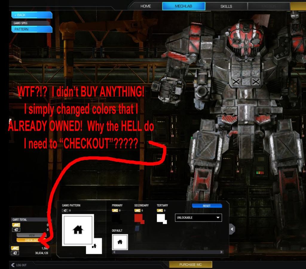
But why do I have to "CHECKOUT" to change colors that I ALREADY OWN?
Doesn't make any sense at all.

#192
-
- Shredder
- 5 posts
Rookie
Posted 04 February 2014 - 07:05 PM
Was the original UI broken? It did need some work but it was great compared to 2.0.
What I was expecting from 2.0 was something that was the same yet diffrent, All I was hoping for was the ability to organize mech bays, To see my mech with its camo spec in the mech bay, Maybe improved tool tips, How much ammo is equip to my mech... the same yet diffrent, just improve what was there.
With the frist look of 2.0 and looking around i can say I don't like it and just may stop playing till its reverts back to what it was.
#193
-
- Shredder
- 5 posts
Rookie
Posted 04 February 2014 - 07:10 PM
Meta 2013, on 04 February 2014 - 05:31 PM, said:
Wow ... ok all of us that have been playing for months and months etc.. are all but lost in this new user interface .... Can you imagine what the noobs are going through ... sure we'll muddle through it because we have the basics in our heads and the numbers for the most part, but the poor Noobs .... they will download it ... get in this UI .... Look for a Help button, see non ...spend another 4-6 minutes playing around in it ... Then uninstall and go Back to something mindless. Hmmm Well that could be good for keeping trolls out, will need to have at last an AS degree in computer science to configure your mech.
Since I cannot invite anyone for some reason, or actually verify they are really signed in the game. I am going to go play MechWarrior 4 Mercs. I found my old disks that run perfect in win7 64.
I know someone spent a lot of time on this. Just not someone good at designing user interfaces. I appreciate all the hard work that was put into this, just feel much of it was wasted. Now we all better realize that because of that last statement, we really are stuck with this.
FREE to PLAY
You get what you pay for. So don't complain. Deal with it or uninstall, and just be thankful for the few months this game as actually fun to play and we got to enjoy it.
Meta
Well then Im left with no choice but to uninstall.
#194
-
-
- 328 posts
Member
- LocationSydney, Australia
Posted 04 February 2014 - 07:10 PM
WaKK0, on 04 February 2014 - 06:04 PM, said:
· You can turn your mech around in the bay and see how it looks
Actually you could do that in the previous UI but only in the cammo config section as i recall.
I only know this because i used the feature with a view to modeling some of the mechs as per my passion for doing so
http://mwomercs.com/...-fochts-bt-art/
#196
-
-
- Shredder
- 11 posts
Member
- LocationToronto, Ontario, Canada
Posted 04 February 2014 - 07:17 PM
Nice job folks, but it looks like there's still some work to be done. I Love the look of the new UI. The 'mechs look great in the mech lab. I also like being able to rename my mechs whenever I feel like it. The layout and presentation of the menus and buttons will surely take some getting used to.
My biggest immediate criticism though, has got to be about the text size and font. Please give us an option to increase the size to make things easier to read. Larger text would go a long way towards making the new UI more comfortable to look at, and making some things easier to find.
It would also be cool if we could mouse over an owned 'mech in our inventory and see a pop-up showing the entire load out including modules and engine size.
All in all, a step in the right direction for sure. I'm sure that with a couple more steps on the part of the devs, and with a little experience using the new UI on the part of the players, it will all be good. Just not quite there yet.
#197
-
-
- 52 posts
Member
Posted 04 February 2014 - 07:19 PM
Kalane, on 04 February 2014 - 07:05 PM, said:
Was the original UI broken? It did need some work but it was great compared to 2.0.
What I was expecting from 2.0 was something that was the same yet diffrent, All I was hoping for was the ability to organize mech bays, To see my mech with its camo spec in the mech bay, Maybe improved tool tips, How much ammo is equip to my mech... the same yet diffrent, just improve what was there.
With the frist look of 2.0 and looking around i can say I don't like it and just may stop playing till its reverts back to what it was.
What I was expecting from 2.0 was something that was the same yet diffrent, All I was hoping for was the ability to organize mech bays, To see my mech with its camo spec in the mech bay, Maybe improved tool tips, How much ammo is equip to my mech... the same yet diffrent, just improve what was there.
With the frist look of 2.0 and looking around i can say I don't like it and just may stop playing till its reverts back to what it was.
Well, you see.. The original UI was bad and everyone knew it. The biggest problems were the clunky social windows and less than optimal mech lab. That's why most people used 3rd party stuff for creating mechs and communicating in game. So it was quite clear changes had to be made. So when they had to make a new UI, they kinda figured out what sucked about the old one and made it even worse. It kinda makes sense. I'm personally just glad that I had a healthy bowel movement this morning, as otherwise these guys might be inclined to improve the experience by stuffing a razor blade covered baseball bat up my derriere...
Ok, I know PGI isn't going to fix this since "if we already spent 8 months of planning or three hours of actual work getting it done, it means is done guldangit." But please PGI, give us an import from smurfy button and I'll quit whining about this UI.
#198
-
-

- 2,980 posts
Member
- LocationVancouver, BC

Posted 04 February 2014 - 07:19 PM
I just went back into the new UI for another spin and came away thinking that PGI missed multiple golden opportunities here.
- Trying to buy a Mech and no info on it in the store screen, other than the Mech image and price. Hey... how heavy is it? How many hard points does it have? What kind of engine? Weapons? Equipment? Guess I'll have to go to the website and figure it all out.
-No filter in the store to sort Mechs near as I can tell, either.
-Triple confirmation that I indeed want to leave the game? Are you super duper sure you want to leave, or did you just mis-click the last four buttons?
-In the MechLab there is literally a full open space that could have a complete rundown of weapons, equipment, AMMO... the whole nine yards.
The more I look at it, the more I am convinced that nobody at PGI has ever designed a Mech in their lives... not on a sheet of paper and certainly not in a MechWarrior game. A few hours ago I was wishing PGI luck with the changes they need to make, but the more I read today, the more I realize they ignored about 89% of the UI feedback already. Good grief, even the Drawing Board program from a decade or more ago is more intuitive and user friendly than this effort.
#199
-

- 8 posts
Rookie
- LocationCalifornia
Posted 04 February 2014 - 07:22 PM
I have 63 mechs. Now where did I put my one and only hill climb module? (Founded like an hour later...)
Before UI 2.0
A friend asked "What do you have on your old mech?" (Can reply on whats the loadout is in a second.)
After UI 2.0
A friend asked "What do you have on your old mech?" Reply "Please don't ask cause I don't want to look through all this crap just to tell you. But if you really insist then I'll get back to you in an hour."
Two words for UI 2.0...
IT'S CRAP!
#200
-
-
- Knight Errant
- 596 posts
Member
Posted 04 February 2014 - 07:28 PM
FactorlanP, on 04 February 2014 - 07:01 PM, said:
The CHECKOUT button has got to GO!


3 user(s) are reading this topic
0 members, 3 guests, 0 anonymous users


