Jump to content

To Pgi: Mockups By The Community Properly Address Major Enforcer Issues


107 replies to this topic

#21 Bishop Steiner

    ForumWarrior

  • PipPipPipPipPipPipPipPipPipPipPipPipPipPipPip
  • The Hammer
  • The Hammer
  • 47,187 posts
  • Locationclimbing Mt Tryhard, one smoldering Meta-Mech corpse at a time

Posted 09 February 2015 - 11:25 AM

View PostMauttyKoray, on 09 February 2015 - 11:21 AM, said:

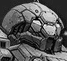
Dredging my topic on the Enforcer head back up because I think the Porsche vs Beetle thing is a little inflated of a topic/title and making the issue seem more out of proportion about the mech than just the head.

As far as I've read the head is LITERALLY the only major issue we, as a player base have with the Enforcer. Some other minor adjustments would be nice (a slightly beefier ballistics arm for instance) but I think we can agree that those are minor things we can ignore.

The Point: Fix The Head

View PostBishop Steiner, on 09 February 2015 - 11:14 AM, said:

Posted Image
Posted Image

almost all the same elements, yet due to proportioning differences, very different final product. (though if you stretch the Beetle out, you largely end up with... A Porsche)
Posted Image
Now since the conversation is specifically revolving around the head, it's really not that big a "stretch".

But, attention grabbing headlines grab..well, attention better than dry accounting titles.


don't seem so over the top to me

#22 Malleus011

    Member

  • PipPipPipPipPipPipPipPip
  • Overlord
  • Overlord
  • 1,854 posts

Posted 09 February 2015 - 11:26 AM

Have any of the Twitterati annoyed Russ about this?

I'd suggest we have a general consensus that would like the Enforcer head tweaked, and possibly the RA improved (granted, we only have two screenshots of the RA, from the opposite side).

#23 Axeface

    Member

  • PipPipPipPipPipPipPip
  • Shredder
  • Shredder
  • 655 posts

Posted 09 February 2015 - 11:28 AM

Dropping this here so pgi can't miss it!

Posted Image

#24 Brody319

    Member

  • PipPipPipPipPipPipPipPipPipPip
  • The Ominous
  • The Ominous
  • 6,273 posts

Posted 09 February 2015 - 11:32 AM

I think it should look similar to this
Posted Image

#25 MauttyKoray

    Member

  • PipPipPipPipPipPipPipPipPip
  • 2,831 posts

Posted 09 February 2015 - 11:33 AM

View PostAxeface, on 09 February 2015 - 11:28 AM, said:

Dropping this here so pgi can't miss it!

Posted Image

That edit... PGI MAKE IT SO. Oh my god it looks perfectly acceptable.

Edited by MauttyKoray, 10 February 2015 - 01:09 PM.


#26 Bishop Steiner

    ForumWarrior

  • PipPipPipPipPipPipPipPipPipPipPipPipPipPipPip
  • The Hammer
  • The Hammer
  • 47,187 posts
  • Locationclimbing Mt Tryhard, one smoldering Meta-Mech corpse at a time

Posted 09 February 2015 - 11:41 AM

View PostAxeface, on 09 February 2015 - 11:28 AM, said:

Dropping this here so pgi can't miss it!

Posted Image

love the arm mods.

View PostBrody319, on 09 February 2015 - 11:32 AM, said:

I think it should look similar to this
Posted Image

if that was how the concept art had looked, I might agree.

#27 Lily from animove

    Member

  • PipPipPipPipPipPipPipPipPipPipPip
  • The Devoted
  • The Devoted
  • 13,891 posts
  • LocationOn a dropship to Terra

Posted 09 February 2015 - 12:00 PM

View PostBishop Steiner, on 07 February 2015 - 09:38 PM, said:

Posted Image

which would you be more inclined to drop IRL money on?


the left one with the non compensating weapon, because this is going to kill your arm faster.

#28 Bishop Steiner

    ForumWarrior

  • PipPipPipPipPipPipPipPipPipPipPipPipPipPipPip
  • The Hammer
  • The Hammer
  • 47,187 posts
  • Locationclimbing Mt Tryhard, one smoldering Meta-Mech corpse at a time

Posted 09 February 2015 - 12:01 PM

View PostLily from animove, on 09 February 2015 - 12:00 PM, said:


the left one with the non compensating weapon, because this is going to kill your arm faster.

Learn to twist?

#29 Deathlike

    Member

  • PipPipPipPipPipPipPipPipPipPipPipPipPipPip
  • Littlest Helper
  • Littlest Helper
  • 29,240 posts
  • Location#NOToTaterBalance #BadBalanceOverlordIsBad

Posted 09 February 2015 - 01:57 PM

If only a Catapult one for the VCR ears would have gotten the same treatment...

#30 MauttyKoray

    Member

  • PipPipPipPipPipPipPipPipPip
  • 2,831 posts

Posted 10 February 2015 - 12:02 PM

Yea, I'm really wishing the head would get changed. Its seriously the only issue that will make me not get this mech. I can handle the other differences, but the head is the stopping point.

However

Quote

From: http://mwomercs.com/...ost__p__4181633

View PostMoonUnitBeta, on 09 February 2015 - 10:18 PM, said:

yeah that too! I made this up quick. Didn't bother going into the head much. Someone covered that already with a good edit.Posted Image

Edit: updated.
Edit: changed what I said, it sounded weird, like i was claiming your thoughts lol.

Its obvious that 2 different 3D modelers worked on the Panther and Enforcer respectively, the Panther is very well done and tailors closely to the concept art, meanwhile the Enforcer looks sloppy and as if it had shortcuts taken to reduce its poly count not to make it more streamlined but to make the job easier/quicker.

Overall I can deal with the rest of the mech if the head/face gets corrected, something not pointed out here is that the front of the head/face ends up much further down the chest area than the concept (look at where the front plate of the hexagon ends on the Concept compared to the model).

Quote

#1. Agreed

#2. Agreed (changing #3 could negate this change, as the ST isn't much wider than the Concept and between that and the change in #1 could alleviate this issue visually while keep the STs as are and reducing the work

#3. Agreed, from the center of the hexagon the shape needs to not change, but it need to be 'shortened' slightly moving each side inward as a whole, ultimately reducing the length of the top and bottom of the hexagon while not changing the angle of the hexagon itself. This only needs ever so slight of a reduction, not too much.

#4a/b. Top needs to be slanted slightly inward more, bottom needs to be moved back just a little to be inline with the flat face of the hexagon (if it isn't already).

#5. I'm not quite sure which piece you're talking about. However I'd like to point out here the pelvic area is much blockier in the model than the art and also hangs lower in the concept, an illusionary part that is causing visual 'strangeness' with the legs.

#6. Agreed, assuming the bottom is toward the inside of the mech and the top is toward the outside (facing us), the bottom piece tapers into the top face, while in the concept the piece had a 90 degree edge between the top and bottom.

#7. I'm assuming you mean the piece under #6, it could have to be changed to match the new angle of #6, and yes there was a bit more mech there in the concept than in the model.

#8. Upper legs need to be a bit deeper (front to back) than they are now and slants exaggerated from the current model, which would fit the concept.

#9/#10. The overall thickness needs to be reduced slightly, while providing a 70/30% (roughly) plit between the back and front division of the sections. Both pieces at the top have a slant, while only the front section has a slant on the side into the flat faces of the back piece.

#11. Possibly needs to be thinner, but I also don't see the slant of the side on the front piece of the shin guard. Shin guard is also actually TOO TALL, and the whole lower leg armor housing on that 'shin guard' piece in the front need to be thinned, downscaled slighty, and shortened to accomodate the upper stems from #9/10/11.

#12. No, this is a visual illusion due to the overly elongated kneepads, If you look the thighs are actually proportionally correct...possibly even too long, they may need to be shortened a tad after the lower leg armor housing in the front is corrected.

#13. The top flat face is actually so small it could possibly be removed for simplicity, leaving only the top angled face and the side flat face which would emulate the concept closely enough. Also, that entire piece is angled farther backward toward the bottom in the concept.

#14. Not half, maybe 60-70% as wide.

#15. Again, along with the #9-12, that entire armor housing in the front there is too large and needs to be reduced. Its too 'meaty' compared to the concept.

#16. Hopefully just a graphical issue...I hope. On the side toes, the shape is wrong. It should be flat bottom, with a 90 degree dace on its side, and then a top that slants up into that 'ring' housing, which is far too inflated/floating looking. The ring needs to not be so far angled outward on the outside and a bit thinner (75-80% of current thickness I'd say). Also notice that the inside side toe has a heavier flant (ring included) than the outside toe which is a bit flatter.

#17. The top of that piece needs to be angle more steeply toward the mech's leg, which will help with that Armor Housing in the front too. That piece (along with the rest of the lower leg its seeming) also needs to be made a bit thinner.

#18. Toe height looks like it may be okay, however, the bottom should again be flat, no double angle faces between the bottom and top flat faces. The front of the toe should be flat between the bottom and top, maybe a 'slight' angle tapering up to the top, but only slight.

#19. This is actually not so, as the foot depth actually looks about right from toe to heel. (See #18 for the 'side' issue) The sides, along with the rest of the leg armor housing, actually need to be thinner, closer to that little anchor connecting the 'shoe pad' to the leg assembly on the side there. The Toe overall needs to be about the length/width (in relation to the leg assembly as seen on the concept art) about where to top flat edge is. (overall thinner due to the reduced size of the leg thinning as a whole)

#20. With the other changes, the arms should actually be about the right width, no need to change it unless its still disproportionate after.

#21. This should be included with the thinning of the torso as a whole, top to bottom (shoulder to pelvis in other words).

#22. (same as #25) Warped due to the angle/geometry of the lower legs themselves being off.

#23. (See #5 below.) Adding: The top slanted area also has that inner section depressed and a higher ridge at the outside.

#24. Stabilizing fin...meant for the JJs? I feel that this could be skipped as it doesn't really provide any real aesthetic (it wasn't very noticeable in the concept) and would increase the leg hitboxes.

#25. (same as #22) Warped due to the angle/geometry of the lower legs themselves being off.


Some things I'm seeing that I may or may not have mentioned above, but are not part of the numbered problems. Numbers do not tie in to the above picture or numbered comments on that picture which I have stated prior, they're just to keep this an organized list too.

Quote

#1. The center torso overall is much deeper in the concept (front to back) which is seen when look at the distance between the front of the hexagon and the upper arm actuator (connection between ST and Arm). The angles are also much steeper, which would be corrected by making the torso thinner. The CT are, with the hexagon seems to be the major culprit as the sides are roughly even on the concept but the top/bottom of the hexagon are longer than the other 4 sides in the model.

#2. This actually rlates to #2 on the image, The ST piece highlighted by number by #2 is actually both too wide and too tall (I rescind my earlier statement that it wasn't) and reducing their height would make the angle for the piece above it more like the concept, and thinning it would provide the room for the head after the overall torso thinning.

#3. The right arm need to be a little bit shorter, and I believe cutting out about the amount of that flat piece between the laser and angled face (right in the middle of the front of the arm) would be just right.

#4. The pelvic area need to be more rounded like the concept and not so flat. It also hangs lower providing more space to correct the shape/angle of that small side piece on the pelvis. The leg actuators also look a big bigger in the concept (not by much, but noticeable) but that could be illusionary due to the incorrect shape of the piece on the side of the pelvis.

#5. With the increase of the upper leg (thigh) depth, the knee joint should be more forward, while the ankle will adjust angle to compensate slightly. This will also help adjust the angle of those boxes (JJs I'm assuming) on the sides of the lower legs. However, the adjustment of the lower leg armor housing in the front may help adjust the angle of the legs as a whole and not require the lower leg to be angle at all, just the rear JJ husing and the piece indicated by #22/25 to be adjusted.

#6. The third section (the one right before the barrel) on the ballistic arm should be slightly longer and the whole ballistic arm looks like it should be slightly taller, and a bit thicker. (Looks like a 4/3 ratio for width vs height.)

#7. The angle of the piece between the hexagon and head is steeper in the concept, reducing the height between the top of the hexagon and the top of the torso (keeping proportions correct) should both correct the angle and give the effect of sinking the head into the shoulder without having to move the arms. #2 from the image would need the side of the top piece on the STs thinned (less material between the arms and top).

Edited by MauttyKoray, 10 February 2015 - 12:05 PM.


#31 DONTOR

    Member

  • PipPipPipPipPipPipPipPipPip
  • Ace Of Spades
  • Ace Of Spades
  • 3,806 posts
  • LocationStuck on a piece of Commando in my Ice Ferret

Posted 10 February 2015 - 12:43 PM

View PostBishop Steiner, on 07 February 2015 - 09:38 PM, said:

Posted Image

which would you be more inclined to drop IRL money on?

Ohhh snap those are boss changes! I would actually buy that!

#32 Bishop Steiner

    ForumWarrior

  • PipPipPipPipPipPipPipPipPipPipPipPipPipPipPip
  • The Hammer
  • The Hammer
  • 47,187 posts
  • Locationclimbing Mt Tryhard, one smoldering Meta-Mech corpse at a time

Posted 10 February 2015 - 12:56 PM

View PostDONTOR, on 10 February 2015 - 12:43 PM, said:

Ohhh snap those are boss changes! I would actually buy that!

Axeface did the RA even better.

#33 Trashhead

    Member

  • PipPipPipPipPipPip
  • Bad Company
  • 261 posts

Posted 10 February 2015 - 01:40 PM

View PostAxeface, on 09 February 2015 - 11:28 AM, said:

Dropping this here so pgi can't miss it!

Posted Image

As i said in another thread:
Well done.

Head looks WAY better.
Ballistics-Arm also looks way better.

So, PGI will defiantly do NOT fix this. ;)

Edited by Trashhead, 10 February 2015 - 01:41 PM.


#34 MauttyKoray

    Member

  • PipPipPipPipPipPipPipPipPip
  • 2,831 posts

Posted 10 February 2015 - 01:46 PM

Tarogato said:

Updated head/cockpit mockup
Posted Image
Mockup Credits to: Axeface
Posted Image

-------------------------------------------------------------
Personal head critique
Posted Image
Ignoring small details, as those always have to be simplified for the final product and are understandable:

#1. Front, center window is too large/has too sharp a slant.
#2. Center/bottom side windows are more triangular than rectangular.
#3. Side window shapes (mostly the center and bottom ones, top ones are pretty close) are off.
#4. Curved 'helmet' design on the side was changed into a straight rectangular cut out. (Which changes the overall look of the design significantly)
#5. The side piece between the mouth/ear along the front/bottom sides are too large/thick, both height on the sides, and width in the front. (This along with create a much different looking head than the concept)
#6. Overall, the head is much taller. (Combination of #5 and the misshapen windows could both contribute to this.)
#7. Mouth is too tall (bottom of head to bottom of center window)
#8. The front of the face (forehead to mouth) is much more flat than hexagonal.
#9. Windows are much more flush with the rest of the head instead of slightly recessed, including the piece between the ceeks. (Is that also a window in between the 2 'cheek' pieces? Its the same material/coloring if you look...)
#10. Armor plate above center window changed from a Hexagon shape to more of a Shell shape. (More than likely due to a combination of #1, #5, #7 and #8.)

--------------------------------------------------------------------------------------------------------------------------

Since people have made this an issue, while Axeface's concept shows the general corrections on the major and second major issues with the Enforcer (main being the head), the concept does indeed have the head rotated backward a little more which would have to be taken care of by the modelers. Axeface has done a great job with simple image editing and here a comparison image of the concept/model to show that he's very close, it just needs some positioning adjustment and minor details (such as the cockpit window being depressed a bit).
Posted Image

View PostTarogato, on 11 February 2015 - 12:10 AM, said:

For all those that don't see the difference, I hope this helps.
On first glance, I could immediately tell that the model didn't match the concept art because the face just had a completely different personality - it wasn't the same character, not the same mech. I couldn't actually tell why, so that's why I drew up the following to compare:

Posted Image

Posted Image

Posted Image

Posted Image

Edited by MauttyKoray, 11 February 2015 - 06:26 PM.


#35 CMDR Sunset Shimmer

    Member

  • PipPipPipPipPipPipPipPipPipPip
  • Legendary Founder
  • Legendary Founder
  • 5,341 posts
  • Twitch: Link
  • LocationNetherlands

Posted 10 February 2015 - 02:01 PM

View PostMauttyKoray, on 10 February 2015 - 01:46 PM, said:

Posted Image


So...you want it to look more mandolorian?

#36 Ratpoison

    Member

  • PipPipPipPipPipPipPip
  • Bad Company
  • Bad Company
  • 851 posts

Posted 10 February 2015 - 02:01 PM

I don't like that edit, you fixed the "brow" some but you made the cockpit even LESS hexagonal than the concept art was, which is what was cool about it in the first place. The "brow" in the concept art peeks over the "eyes" of the cockpit a little bit, making it look almost like a helmet, whereas it's flush with the cockpit in the finished product, and the hexagonal shape of the cockpit was altered to a less even polygonal shape that doesn't look as good.

The cannon is an LB10-X so I expect it to be a little stubby.

#37 Ratpoison

    Member

  • PipPipPipPipPipPipPip
  • Bad Company
  • Bad Company
  • 851 posts

Posted 10 February 2015 - 02:04 PM

Spamming the board with these topics is not helping.

#38 627

    Member

  • PipPipPipPipPipPipPipPipPip
  • Wrath
  • Wrath
  • 4,571 posts

Posted 10 February 2015 - 02:26 PM

sorry guys, but what am I missing?

I see those pics and it looks exactly like theconcept art? What IS wrong with the head, what detail?

Or do you alljust want it meaner looking like axeface's edit? Not that I dislike that. Looks like stormtrooper helmet for me, though.

#39 MauttyKoray

    Member

  • PipPipPipPipPipPipPipPipPip
  • 2,831 posts

Posted 10 February 2015 - 02:28 PM

View PosttortuousGoddess, on 10 February 2015 - 02:04 PM, said:

Spamming the board with these topics is not helping.

On the contrary, this topic pulls to the spotlight an asset which otherwise is buried in the other threads.

View PostFlash Frame, on 10 February 2015 - 02:01 PM, said:

So...you want it to look more mandolorian?

It doesn't perfectly fix the issue, but it addresses the 2 major problems affecting the Enforcer chassis and would make the most impact in correcting them, as seen in the mockup there is a noticeable difference, it doesn't mean it has to end up exactly as the image but image editing is limited in morphing an image.

#40 MauttyKoray

    Member

  • PipPipPipPipPipPipPipPipPip
  • 2,831 posts

Posted 10 February 2015 - 02:51 PM

View Post627, on 10 February 2015 - 02:26 PM, said:

sorry guys, but what am I missing?

I see those pics and it looks exactly like theconcept art? What IS wrong with the head, what detail?

Or do you alljust want it meaner looking like axeface's edit? Not that I dislike that. Looks like stormtrooper helmet for me, though.

Posted Image
Ignoring small details, as those always have to be simplified for the final product and are understandable:

#1. Front, center window is too large/has too sharp a slant.
#2. Center/bottom side windows are more triangular than rectangular.
#3. Side window shapes (mostly the center and bottom ones, top ones are pretty close) are off.
#4. Curved 'helmet' design on the side was changed into a straight rectangular cut out. (Which changes the overall look of the design significantly)
#5. The side piece between the mouth/ear along the front/bottom sides are too large/thick, both height on the sides, and width in the front. (This along with create a much different looking head than the concept)
#6. Overall, the head is much taller. (Combination of #5 and the misshapen windows could both contribute to this.)
#7. Mouth is too tall (bottom of head to bottom of center window)
#8. The front of the face (forehead to mouth) is much more flat than hexagonal.
#9. Windows are much more flush with the rest of the head instead of slightly recessed, including the piece between the ceeks. (Is that also a window in between the 2 'cheek' pieces? Its the same material/coloring if you look...)
#10. Armor plate above center window changed from a Hexagon shape to more of a Shell shape. (More than likely due to a combination of #1, #5, #7 and #8.)

Shall I go on? As I don't have access to full 3D models of the ingame and don't have multiple angles of view of the concept, this is the best comparison I can do.

Edited by MauttyKoray, 10 February 2015 - 02:56 PM.


7 user(s) are reading this topic

0 members, 7 guests, 0 anonymous users