
Jump to content

Countdown To The Wolfhound Release Oct 20Th - 1 Days Left


210 replies to this topic

#21 Muqtada al-Swayze

    Member

  • Pip
  • Ace Of Spades
  • 15 posts

Posted 14 October 2015 - 01:17 PM

not digging the 3d rendering, proportion wise
made some edits

Posted Image

#22 AngrySpartan

    Member

  • PipPipPipPipPipPip
  • Bad Company
  • Bad Company
  • 349 posts

Posted 14 October 2015 - 01:24 PM

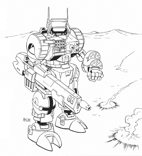
Really? This blocky thing is my beloved wolfhound?

A brick instead of of nice looking curves on the head of the concept, bulky chest and tiny waist instead of balanced proportions and those massive shoulders at 90 degrees to the torso on top of that. Someone was sooo lazy making this model.

Wish to see more in-game footage, but it looks like a good contender for #1 ugliest MWO light so far(

#23 Luscious Dan

    Member

  • PipPipPipPipPipPipPipPip
  • The Privateer
  • The Privateer
  • 1,146 posts
  • Twitter: Link
  • LocationEdmonton, AB

Posted 14 October 2015 - 01:27 PM

I think it would be better to rotate the arms slightly away from the body, and the shoulder pads down instead of up. Would double the effect. There's just too many 90 degree angles on this thing.

#24 lol lol lol lol lol lol lol lol

    Member

  • PipPipPipPipPipPipPip
  • FP Veteran - Beta 1
  • FP Veteran - Beta 1
  • 918 posts

Posted 14 October 2015 - 01:28 PM

View PostSuperiorRobutts, on 14 October 2015 - 01:17 PM, said:

not digging the 3d rendering, proportion wise
made some edits

Posted Image


So glad I didn't prepurchase.

Just imagine how bad IIC's and Reseens are gonna be.

#25 WarHippy

    Member

  • PipPipPipPipPipPipPipPipPip
  • Ace Of Spades
  • Ace Of Spades
  • 3,836 posts

Posted 14 October 2015 - 01:29 PM

View PostSuperiorRobutts, on 14 October 2015 - 01:17 PM, said:

not digging the 3d rendering, proportion wise
made some edits

Posted Image

It isn't terrible, but it isn't very good either. Kind of a let down after the concept art and now seeing how blocky and unrefined the in game model is.

#26 Appuagab

    Member

  • PipPipPipPipPipPip
  • Shredder
  • Shredder
  • 319 posts

Posted 14 October 2015 - 01:47 PM

Oh god, everything above legs is so ugly.

#27 Juodas Varnas

    Member

  • PipPipPipPipPipPipPipPipPipPip
  • Ace Of Spades
  • Ace Of Spades
  • 7,534 posts
  • LocationGrand Duchy of Lithuania

Posted 14 October 2015 - 01:50 PM

I don't know guys, i think it just might be the same problem like with the Shadowcat.
It's just that the screencap's angle is kind of bad

It seems pretty decent in the instagram turnaround post thing:
https://instagram.com/p/81EN8HDPkc/

#28 Twilight Fenrir

    Member

  • PipPipPipPipPipPipPipPip
  • The God
  • The God
  • 1,441 posts

Posted 14 October 2015 - 02:03 PM

View PostJuodas Varnas, on 14 October 2015 - 01:50 PM, said:

I don't know guys, i think it just might be the same problem like with the Shadowcat.
It's just that the screencap's angle is kind of bad

It seems pretty decent in the instagram turnaround post thing:
https://instagram.com/p/81EN8HDPkc/

It looks like a pretty solid little mech. It is a little blocky, I suppose, but the concept art was too. The head on the ® art is MUCH different from what we got, though. It looks fine in the Instagram video there. I think they did a good job making it have a unique silhouette so it can be identified at a glance, even among all the other humanoid lights.

Remember how big of a stink there was over the Arctic Cheetah's shoulder pads when the art first hit? I don't think it was ever mentioned again when they actually got into the game.

#29 Corbon Zackery

    Member

  • PipPipPipPipPipPipPipPip
  • Elite Founder
  • Elite Founder
  • 1,363 posts

Posted 14 October 2015 - 02:12 PM

I demand a proper chest plate with snub laser guns sticking out.


Posted Image

#30 Scout Derek

    Member

  • PipPipPipPipPipPipPipPipPipPip
  • The Infernal
  • The Infernal
  • 8,016 posts
  • Google+: Link
  • Twitch: Link
  • LocationSomewhere where you'll probably never go to

Posted 14 October 2015 - 02:20 PM

View PostsaKhan Ds00 Kerensky, on 14 October 2015 - 01:28 PM, said:


So glad I didn't prepurchase.

Just imagine how bad IIC's and Reseens are gonna be.

I don't like how the highlander IIC looks from this:

Posted Image

To this :

Posted Image

#31 Juodas Varnas

    Member

  • PipPipPipPipPipPipPipPipPipPip
  • Ace Of Spades
  • Ace Of Spades
  • 7,534 posts
  • LocationGrand Duchy of Lithuania

Posted 14 October 2015 - 02:22 PM

View PostScout Derek, on 14 October 2015 - 02:20 PM, said:


Posted Image

It seems Alex went for a more... TRO-look for the IICs.
Posted Image

#32 Scout Derek

    Member

  • PipPipPipPipPipPipPipPipPipPip
  • The Infernal
  • The Infernal
  • 8,016 posts
  • Google+: Link
  • Twitch: Link
  • LocationSomewhere where you'll probably never go to

Posted 14 October 2015 - 02:24 PM

View PostJuodas Varnas, on 14 October 2015 - 02:22 PM, said:
It seems Alex went for a more... TRO-look for the IICs.
Posted Image

And I'd like to say, with no disrespect because his concepts are always good, that out of the entire bunch of Orgins IIC mechs, that the Highlander IIC is the ugliest of them all.

At least, from what I see right now...

#33 C E Dwyer

    Member

  • PipPipPipPipPipPipPipPipPipPip
  • Legendary Founder
  • Legendary Founder
  • 9,274 posts
  • LocationHiding in the periphery, from Bounty Hunters

Posted 14 October 2015 - 02:30 PM

Well we now know, that the 3d modellers can make a Stinger head, when they get around to making the Mech

#34 NocturnalBeast

    Member

  • PipPipPipPipPipPipPipPipPip
  • Shredder
  • Shredder
  • 3,685 posts
  • LocationDusting off my Mechs.

Posted 14 October 2015 - 02:31 PM

Another nice Federated Suns mech!

#35 Speedy Plysitkos

    Member

  • PipPipPipPipPipPipPipPipPip
  • The 1 Percent
  • The 1 Percent
  • 3,460 posts
  • LocationMech Junkyard

Posted 14 October 2015 - 02:35 PM

ugly mech... come here my crabies.... naaahh

#36 Kiiyor

    Member

  • PipPipPipPipPipPipPipPipPipPip
  • Big Daddy
  • Big Daddy
  • 5,565 posts
  • LocationSCIENCE.

Posted 14 October 2015 - 02:35 PM

It's ugly....


...and I must have it.

#37 Speedy Plysitkos

    Member

  • PipPipPipPipPipPipPipPipPip
  • The 1 Percent
  • The 1 Percent
  • 3,460 posts
  • LocationMech Junkyard

Posted 14 October 2015 - 02:41 PM

View PostScout Derek, on 14 October 2015 - 02:20 PM, said:


I don't like how the highlander IIC looks from this:

Posted Image

To this :

Posted Image


extremely ugly upgrade. original is 200% better. BTW, same for orion. absolutely same.

#38 Mechsniper

    Member

  • PipPipPipPipPipPip
  • The Formidable
  • The Formidable
  • 457 posts
  • LocationUnited States

Posted 14 October 2015 - 02:43 PM

terrible compared to the rendering we were teased with for the pre-order. I will feel a little jipped as the initial art version was awesome.

#39 D Heth

    Member

  • Pip
  • The Butcher
  • The Butcher
  • 19 posts

Posted 14 October 2015 - 02:50 PM

Are the badges & titles supposed to be injected the day of the mechs release, or do they come at a later date. I didn't get a title/tag when I received my Crab.

Edited by D Heth, 14 October 2015 - 02:51 PM.


#40 Zeus X

    Member

  • PipPipPipPipPipPipPipPip
  • Shredder
  • Shredder
  • 1,307 posts
  • LocationLuthien

Posted 14 October 2015 - 02:58 PM

All Chest and Butt.


This mech looks like it's wearing a corset.


2 user(s) are reading this topic

0 members, 2 guests, 0 anonymous users