
Unit Insignia
#401
Posted 30 May 2012 - 09:13 AM
#402
Posted 03 June 2012 - 04:54 AM
 Ironhawk, on 05 May 2012 - 08:09 PM, said:

EDITED: Longer sword and minor touch ups:

Adding a green on black version EDITED as per Adridos's and Hayden's (on DA) comments:

Adding a ceremonial version jpg file:

Hail to Sun-Tsu! Great work!!!
My question now is what can you make out of this (original) patch:

Do you and others see the difference?
And no, i´m not talking of the wrong positioning of the picture...
Everyone of you should know this.
For me this type of modern swordarm is the one i prefer...
Even type of sword looks cooler...
Edited by Stefano McCarron, 03 June 2012 - 04:57 AM.
#403
Posted 03 June 2012 - 01:46 PM
Interesting challenge. I do see the difference. I have taken some liberties however and do hope you will enjoy the result. I have made the 'modern' arm mechanical, have made the blood a bit more graphic and have changed the short sword to an updated design following some research. Feedback is welcome.
EDIT: Rotation applied as per Stefano's feedback

EDIT: Alternate sword

Edited by Ironhawk, 04 June 2012 - 05:51 PM.
#404
Posted 03 June 2012 - 02:06 PM
#405
Posted 03 June 2012 - 05:36 PM
Please turn the whole pic a bit, i know the photo of the patch was the same but it is wrong!
The triangle should have the position it normally has...
And the sword on the patchphoto seems to be more like a katana with the edge cut...
Would be nice too, to see the emblem with green marble look!
#406
Posted 03 June 2012 - 07:16 PM


If someone would like to come up with a different version of this patch, or the original patch, from above in this thread, with these elements -perhaps a much better done Raven 'Mech- I would certainly entertain that. As for the lettering of the patch on the left, the top is Invisible Killer font, which I felt apropo for a recon element, and the bottom is MPBT 3025, normal. A bit more work could have been done on the Armageddon Unlimited at the bottom, but the Outriders Recon at the top really isn't that bad. As for the left patch being too busy... I'm not sure I can agree with that. It's certainly not as busy as many of the real-world military patches I've seen.
Anyway, if anyone has better work and/or a better idea, I would love to see it, please? However, not a completely new concept.
#407
Posted 03 June 2012 - 11:13 PM
 Kay Wolf, on 03 June 2012 - 07:16 PM, said:


If someone would like to come up with a different version of this patch, or the original patch, from above in this thread, with these elements -perhaps a much better done Raven 'Mech- I would certainly entertain that. As for the lettering of the patch on the left, the top is Invisible Killer font, which I felt apropo for a recon element, and the bottom is MPBT 3025, normal. A bit more work could have been done on the Armageddon Unlimited at the bottom, but the Outriders Recon at the top really isn't that bad. As for the left patch being too busy... I'm not sure I can agree with that. It's certainly not as busy as many of the real-world military patches I've seen.
Anyway, if anyone has better work and/or a better idea, I would love to see it, please? However, not a completely new concept.
ED: I can see them now! I think the biggest issue that I would bring up is the sheer number of colors, if you intend to make patches. Something Dhim and I discovered when he had patches made up for his unit is that multiple colors = higher costs. Anyway, back to the patches, I think I prefer the second one as it is less busy and more uniform in color.
Edited by Hayden, 04 June 2012 - 02:03 AM.
#408
Posted 04 June 2012 - 01:37 AM
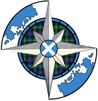
Windbourne Highlanders Merc Corp. Insignia:
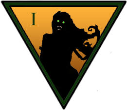
1st Highland Banshees: (1st regiment)
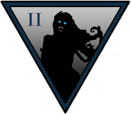
2nd Highland Banshees: (2nd regiment)
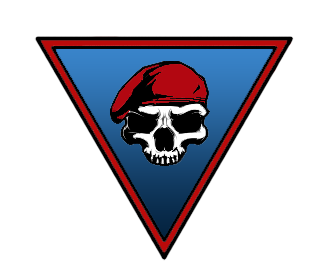
Redcap Raiders: (3rd regiment)
Edited by Bullet Magnet, 04 June 2012 - 01:41 AM.
#409
Posted 04 June 2012 - 01:49 AM
 Bullet Magnet, on 04 June 2012 - 01:37 AM, said:
Windbourne Highlanders Merc Corp. Insignia:

1st Highland Banshees: (1st regiment)

2nd Highland Banshees: (2nd regiment)

Redcap Raiders: (3rd regiment)

Nice stuff! Really well done!
#410
Posted 04 June 2012 - 04:37 AM
 Bullet Magnet, on 04 June 2012 - 01:37 AM, said:
Windbourne Highlanders Merc Corp. Insignia:

1st Highland Banshees: (1st regiment)

2nd Highland Banshees: (2nd regiment)

Redcap Raiders: (3rd regiment)

Wow, really well done!
#411
Posted 04 June 2012 - 05:51 AM
#412
Posted 04 June 2012 - 05:56 AM
 can you do anything with this
Edited by Gunfighter 11, 04 June 2012 - 05:57 AM.
#413
Posted 04 June 2012 - 06:11 AM
 how about this one
 or this one...
#414
Posted 04 June 2012 - 06:59 AM

http://www.sarna.net...Pitcairn_Legion
Edited by MagnusEffect, 04 June 2012 - 07:05 AM.
#415
Posted 04 June 2012 - 08:01 AM
#416
Posted 04 June 2012 - 08:55 AM
 MagnusEffect, on 04 June 2012 - 06:59 AM, said:

http://www.sarna.net...Pitcairn_Legion
Your picture seems to be the symbol of the Outworld Alliance...
combined with the FedSun Sword...
Shouldn´t be difficult to build.
Here a coloured help:


Edited by Stefano McCarron, 04 June 2012 - 09:07 AM.
#417
Posted 06 June 2012 - 09:53 AM
#418
Posted 07 June 2012 - 05:44 PM
EDIT:
Does anyone know how to post an image? 'Cause I can't get it up on here...
Edited by Aidan Ramsdell, 07 June 2012 - 05:45 PM.
#419
Posted 14 June 2012 - 02:13 AM

...to this:

We literally went through three major iterations of design proposal before we settled on this. I feel rather satisfied with the results.
ED: OWA's Pitcairn Legion!

Kincade's Rangers

ED: More to come.
Edited by Hayden, 26 June 2012 - 01:17 PM.
#420
Posted 14 June 2012 - 02:20 AM
I wrote it some where sometimes the choice of a faction could only be caused by a picture - and i wouldn't be surprised when a bunch of new not affiliated players are no rushing to joint the 9th SL* - outstanding work
(*) - me not me hate Snakes
Edited by Karl Streiger, 14 June 2012 - 02:21 AM.
1 user(s) are reading this topic
0 members, 1 guests, 0 anonymous users


