Nice work yet again Hayden.

Unit Insignia
#41
Posted 09 December 2011 - 04:23 AM
Nice work yet again Hayden.
#43
Posted 09 December 2011 - 05:05 AM
there's one thing I've noticed about the Insignia's of BT is that they kinda look like Insignia's of Medieval Europe
#44
Posted 09 December 2011 - 05:20 AM
 Nitsua Asuka, on 09 December 2011 - 05:05 AM, said:
there's one thing I've noticed about the Insignia's of BT is that they kinda look like Insignia's of Medieval Europe
Thanks! The insignia seem to take influences from a lot of different areas, but in some ways I think that's fair to say. I think it's certainly more true of the older logos, which I base the bulk of this work on. Almost all of these units have undergone changes to their logos, "modernization", outright replacement, or in some cases these units no longer exist.
#45
Posted 09 December 2011 - 06:43 AM
~S~
Daniel
#46
Posted 09 December 2011 - 07:14 AM
#47
Posted 09 December 2011 - 07:33 AM
 Metro, on 09 December 2011 - 07:14 AM, said:
He says as I'm pouring over my Objective Raids manual designating targets and calculating nav points within the Capellan rump state so I can make an argument for the inclusion of the St. Ives compact and present a nifty invasion plan in the process. The banners will fly again, oh yes: but they'll be flying under the flag of the St. Ives Compact, and not the Capellan Confederation.
(lulz, unless the dev team gets their way and just merges us. Then I'll get on those flags right away, yessir!)
#48
Posted 09 December 2011 - 07:35 AM
#49
Posted 09 December 2011 - 03:17 PM
#50
Posted 09 December 2011 - 03:37 PM
like a custom one?
I've made the general idea.
#51
Posted 09 December 2011 - 03:55 PM
Here's what it looks like.

Tiny and detailed, perhaps a larger version wouldn't be too much work?
Just a request
*Bows*
-Sir Atticus Aquila
Brotherhood of Randis
#53
Posted 09 December 2011 - 08:29 PM
 Hartsblade, on 09 December 2011 - 07:47 PM, said:
Beautiful
 Pappy, on 09 December 2011 - 03:17 PM, said:
Yeah, my day is just starting and I still have ample free time! I am more than happy to work on this. What I'll do is create a Robinson Rangers insignia, and then do one each for the 1st -3rd Robinson Rangers, shouldn't take too long.
 Nitsua Asuka, on 09 December 2011 - 03:37 PM, said:
like a custom one?
I've made the general idea.
I am happy to do custom works, though I encourage you to keep the following in mind: I work best making relatively simple, 2-D images without a lot of flashy elements. That's just my style: I like to keep things simple. Now, I have done some "flashy" logos in the past, but I'm a much happier man making something that looks like this:

than something like this:

So I am happy to make you a logo, but know that I have a preferred style.
 Atticus Aquila, on 09 December 2011 - 03:55 PM, said:
Here's what it looks like.

Tiny and detailed, perhaps a larger version wouldn't be too much work?
Just a request
*Bows*
-Sir Atticus Aquila
Brotherhood of Randis
I think I can get something worked out here.
Edited by Hayden, 09 December 2011 - 08:41 PM.
#54
Posted 09 December 2011 - 08:44 PM
I would offer up the time honored 2AD flash but I'll be darned if I can figure out how
#55
Posted 10 December 2011 - 03:17 AM
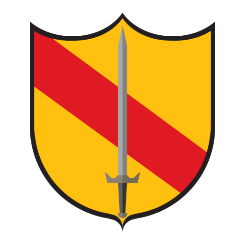
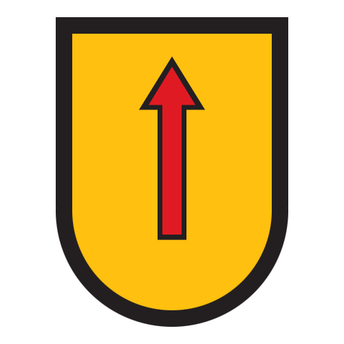
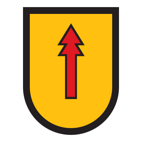
First up, the Robinson Rangers collector's edition! In order, Robinson Rangers, and then 1st - 3rd Robinson Rangers.
All from 2011-12-10
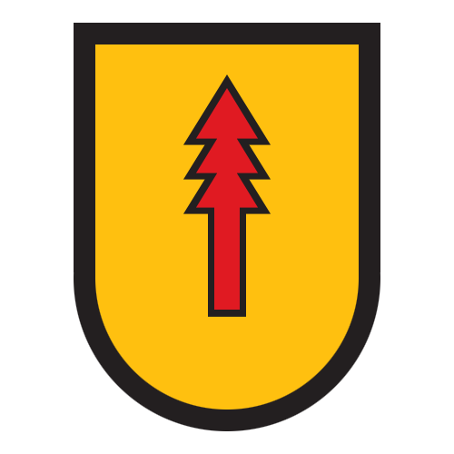
Clan Wolf - 13th Battle Cluster ("The Stalkers") - Per Request. 2011-12-10
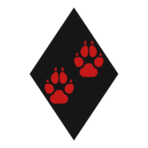
Brotherhood of Randis - Per request, I managed to simplify it without losing the unique feel of it. 2011-12-10

EDIT: Draconis March Militia, 2011-12-10

EDIT: Flying Dragon Insignia Request. EDIT: Give me a white dragon, he says
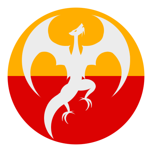
EDIT: Capellan March Militia 2011-12-10
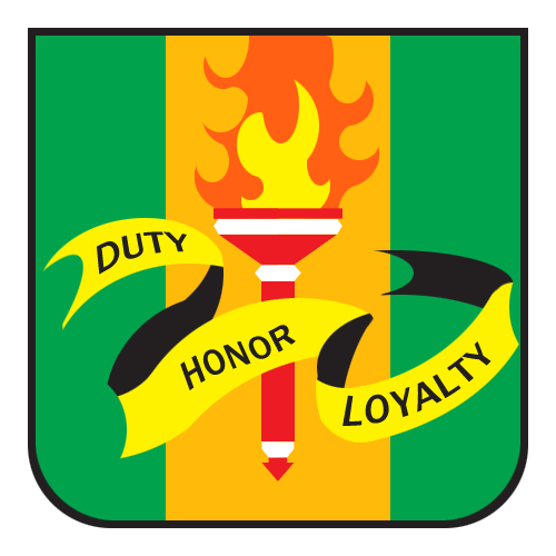
EDIT: Crucis March Militia (New, I posted the "old" version earlier), Just to round out the trifecta.

Thanks!
Edited by Hayden, 10 December 2011 - 09:46 AM.
#56
Posted 10 December 2011 - 03:48 AM
#57
Posted 10 December 2011 - 03:59 AM
The general idea -

Possibly a thicker black mine in the middle, Dragon has to be white roughly the same pose or possibly more rounded like this one
 ( my attempt at trying to make it white but the outline i couldnt do )
I want the dragon to have a black outline, possibly a white or black boarder around the whole design (the circle part) I'm kinda using your
St. Ives circle one with the horse as a reference while writing this by the way
The red HAS to be on bottom because it represents the blood spilled, the yellow colour on top represents the glory/pride/honour/peace from spilling blood (reason why the red is on the bottom) The white dragon is a symbol of my heritage ( Anglo-Saxon ) and its what they took into battle against the Vikings and the Normans. <-- well theres the general ideology behind it
here you go Hayden have fun
#58
Posted 10 December 2011 - 04:20 AM
Edited by Jaroth Winson, 10 December 2011 - 04:20 AM.
#59
Posted 10 December 2011 - 04:20 AM
 GraySho, on 10 December 2011 - 03:48 AM, said:
Alright, I'll try to explain my thought process on these. I'll admit most of the insignia that I make are based off designs dating from the 1980s. My reasoning for this is that I feel a lot of the modern insignia have much less of a military feel, or that they look more like one would expect nose art to look. Consider the Regulan Hussars, which went from a lightning bolt on a field of blue with a yellow frame to some kind of Death-floating-on-a-cloud image.
This is the new one off the Sarna wiki:

And this is mine, based off the old version:

Now, I feel that the modern one looks like nose art, than say, a roundel. And that's really what I'm trying to go for with these: something that feels more akin to a roundel on an aircraft. However, some of the newer images are so convoluted that it's hard to derive something simple from that and still remain canonical (which is a big concern). But with many of the older insignia they are simple and seem closer in their design to what I have in mind to make.
I have a much easier time envisioning a technician or mechwarrior wearing the old Regulan Hussars insignia as a patch than the new one. It's just a matter of one kind of design feeling professional and military, and another going for a "cool" factor that I just don't feel.
[EDIT: This is also why I try to keep away from gradients and try to use clean lines: I've never seen a roundel with gradients.]
Edited by Hayden, 10 December 2011 - 04:26 AM.
#60
Posted 10 December 2011 - 06:47 AM
 Hayden, on 09 December 2011 - 08:29 PM, said:
Thanks! Guess I should have linked the thread though for anyone not logged in...lol
Great workk you have here!! I can see why BenBen made the request
new shiny insignia for us! Page 3 of 4
3 user(s) are reading this topic
0 members, 3 guests, 0 anonymous users
