Jump to content

Countdown To Blood Asp Release May 15Th


146 replies to this topic

#41 BrunoSSace

    Member

  • PipPipPipPipPipPipPipPip
  • The Guide
  • The Guide
  • 1,032 posts
  • Twitch: Link
  • LocationAustralia

Posted 10 May 2018 - 12:14 PM

The shape of this mech, from the video looks like a Cataphract. Shame I'm IS this a good looking mech.

#42 Orion ji

    Member

  • PipPipPipPipPip
  • Shredder
  • Shredder
  • 103 posts

Posted 10 May 2018 - 12:19 PM

That video in OP is a nice proof of the bait & switch Marketing 101 BS. Look at those effing PANCAKE arms and shoulder mounts. Their like massive billboards. Hey at least those decals will look good on them right? Is this a joke or just another reminder not to ever spend money on this farce again?

TLDR: I shoulda just bought a Roughneck-R and called it a day.

#43 Peter2k

    Member

  • PipPipPipPipPipPipPipPipPip
  • Elite Founder
  • Elite Founder
  • 2,032 posts
  • LocationGermany

Posted 10 May 2018 - 12:25 PM

not really sure about those huge billboards
Posted Image
at least a "shoot me" decal would look good on them


btw
whats this supposed to be?
Posted Image
who went with "this looks good"?

so its a low and a high hump?

#44 Grayson Sortek

    Member

  • PipPipPipPipPipPip
  • FP Veteran - Beta 1
  • FP Veteran - Beta 1
  • 371 posts

Posted 10 May 2018 - 12:39 PM

View PostPeter2k, on 10 May 2018 - 12:25 PM, said:

not really sure about those huge billboards
Posted Image
at least a "shoot me" decal would look good on them


btw
whats this supposed to be?
Posted Image
who went with "this looks good"?

so its a low and a high hump?


Right? If they are going to have those massive balloon ST mounts, then why can't you fit more than 1 laser in them? I mean, make it worth the trouble.

Also, did anyone else get the feeling that the person demoing the camo patterns was a little quick to get past the front to front-side profile and spent a little too much time on the back? It kinda felt like they were trying to avoid it or not spend as much time on it. God I hope that means they know, and that they are working on a fix that will come out relatively soon.

#45 Locutos

    Member

  • PipPip
  • The Death Wish
  • The Death Wish
  • 28 posts
  • LocationDE

Posted 10 May 2018 - 12:52 PM

the massive weapon pots on the shoulders should at least be used for the main weaponery, they were designed for weaponry, so they should be used for it.
this XXL design can fit at least 2-3 weapons, there is no other reason they would be that big if not for that.

#46 EthanisAwsome

    Member

  • Pip
  • The God
  • The God
  • 15 posts

Posted 10 May 2018 - 12:58 PM

this is rather unfortunate that the gun shrouds are rather short from concept art we were expecting long gun shrouds that would extend a decent portion in front of the cockpit nose. I would also assume those of us who purchased the full pack with the multi weapon side mounts were hoping to have at the very least have the majority of the ST weapons to be above cockpit not either beside or bellow it. In my opinion since the game seems to be peak and shoot you will only see double gaus since they are the only weapons most appriot for the game style and get the highest mounts and maybe ERPPCS with the rancor. they kinda killed the possibly fun that could be had with the ST weapons after the first one been so low

#47 Hayek Lahiri

    Member

  • PipPipPipPipPip
  • The Fang
  • The Fang
  • 105 posts
  • LocationHoard

Posted 10 May 2018 - 01:29 PM

Man, this concept art to in-game translation did not go well. Can the modelers give this another pass and make the shoulders cannons long and slender? Please?

#48 Jay Leon Hart

    Member

  • PipPipPipPipPipPipPipPipPip
  • The Spear
  • The Spear
  • 4,669 posts

Posted 10 May 2018 - 01:48 PM

View PostPeter2k, on 10 May 2018 - 12:25 PM, said:

whats this supposed to be?
Spoiler

who went with "this looks good"?

so its a low and a high hump?

Really, PGI? Did you learn nothing from the Nightstar ST hardpoint debacle?

Fix this ****, I don't want to cancel another 'mech, especially one I have such fond memories of, but FFS what is this, amateur hour?

#49 Jackal Noble

    Member

  • PipPipPipPipPipPipPipPipPip
  • 4,863 posts
  • LocationTerra

Posted 10 May 2018 - 02:13 PM

View PostJay Leon Hart, on 10 May 2018 - 01:48 PM, said:

Really, PGI? Did you learn nothing from the Nightstar ST hardpoint debacle?

Fix this ****, I don't want to cancel another 'mech, especially one I have such fond memories of, but FFS what is this, amateur hour?


Amen

#50 BrunoSSace

    Member

  • PipPipPipPipPipPipPipPip
  • The Guide
  • The Guide
  • 1,032 posts
  • Twitch: Link
  • LocationAustralia

Posted 10 May 2018 - 02:14 PM

The shape of this mech from the video, looks like a Cataphract. Shame I'm an IS pilot, this is one good looking mech.

#51 FullAlchemy

    Member

  • Pip
  • The Moon
  • The Moon
  • 18 posts

Posted 10 May 2018 - 02:21 PM

PGI, please fix the shoulder mounts. They look terrible. I pre-ordered this mech, and I don't want to cancel. Also don't mess this up like the nightstar fiasco. Thank you!

#52 suffocater

    Member

  • PipPipPipPipPipPipPip
  • Urban Commando
  • Urban Commando
  • 570 posts

Posted 10 May 2018 - 02:35 PM

Huge shoulder weapon pods and we put only one weapon in it and cramp the rest in the lower ST. GG PGI, you failed the design-class again.

#53 Nightbird

    Member

  • PipPipPipPipPipPipPipPipPipPip
  • The God of Death
  • The God of Death
  • 7,518 posts

Posted 10 May 2018 - 04:15 PM

Fix those torso pods, if only one weapon in it then cut the height in half.

#54 Arkhangel

    Member

  • PipPipPipPipPipPipPipPip
  • Mercenary Rank 2
  • Mercenary Rank 2
  • 1,202 posts
  • LocationBritish Columbia

Posted 10 May 2018 - 06:36 PM

View PostFullAlchemy, on 10 May 2018 - 02:21 PM, said:

PGI, please fix the shoulder mounts. They look terrible. I pre-ordered this mech, and I don't want to cancel. Also don't mess this up like the nightstar fiasco. Thank you!

not exactly sure what "Nightstar Fiasco" you mean apart from the arms getting fixed. the weapon mounts on it are just fine. there was just a bunch of idiots who wanted "Fafnirstars" before the Fafnir came out.

Edited by Arkhangel, 12 May 2018 - 07:25 AM.


#55 dimachaerus

    Member

  • PipPipPipPipPip
  • The Flame
  • The Flame
  • 170 posts
  • LocationRichmond KY

Posted 10 May 2018 - 07:21 PM

So... who thought this was a good idea? It bears only a passing resemblance to the concept in it's general shape but its details, like, what the hell? The concept has long thin shoulder barrels, much more svelte legs and hips, and non-popeye sized lower arms.

I'm sorry to whatever artist poured their time into this but, I am disappoint. :(

#56 Kul Tigin

    Member

  • Pip
  • The Howl
  • The Howl
  • 10 posts

Posted 10 May 2018 - 07:22 PM

LOL that shoulder gauss!! xD ..they've simply copy pasted MadCat Mk 2 arms ... xD

Edited by Kul Tigin, 10 May 2018 - 07:29 PM.


#57 ilKhan_OrHan

    Member

  • PipPipPipPipPip
  • Ace Of Spades
  • Ace Of Spades
  • 139 posts

Posted 10 May 2018 - 07:45 PM

On the builds where there are ST weapons below the cockpit, like energy and ballistics, these need to go in the high mounted ST pods ABOVE the existing hardpoints. That is a complete waste of space having only ONE weapon in that massive ST high mounted box.

The Prime variant had one weapon in the ST shoulder mounted boxes but that doesn't mean the other variants would not have been visually represented with multiple weapons in the ST shoulder mounted boxes just because there are few to no drawings of the other variants to confirm the visual design intention. If you look at the old drawing of the Prime variant, it looks like there is another energy hardpoint above the Gauss rifles, signaling the visual intent of the Blood Asp illustrators to have multiple hardpoints ABOVE the cockpit. Moving AT LEAST one other hardpoint into the ST shoulder mounted boxes would be CANON.

Would really appreciate a quick redesign of the ST hardpoint locations as someone that dropped $70 bucks on the pre-order and has whaled off and on since closed beta.

Overall, another excellent looking mech except for that issue.

Edited by ilKhan_OrHan, 10 May 2018 - 08:06 PM.


#58 Cypherdrene

    Member

  • PipPipPip
  • Ace Of Spades
  • Ace Of Spades
  • 96 posts
  • LocationCabo

Posted 10 May 2018 - 07:52 PM

Oh god.... what have you done? PGI, you just ruined one of the best looking mechs in Battletech... what a let down :(

#59 NocturnalBeast

    Member

  • PipPipPipPipPipPipPipPipPip
  • Shredder
  • Shredder
  • 3,685 posts
  • LocationDusting off my Mechs.

Posted 10 May 2018 - 10:02 PM

View PostArkhangel, on 10 May 2018 - 06:36 PM, said:

not exactly sure what "Nightstar Fiasco" you mean apart from the arms getting fixed. the weapon mounts on it are just fine. there was just a bunch of idiots who wanted "Fanfirstars" before the Fafnir came out.


Actually, the problem with the Nightstar is that the arms are so far apart that it makes it too easy to hit friendlies with one of the shots, or hit the corner of the wall, unless you put each arm on a separate weapon group, which makes you have to use too many weapon groups.

#60 Lord Cal

    Rookie

  • Bad Company
  • Bad Company
  • 7 posts
  • LocationMini Soda

Posted 10 May 2018 - 10:21 PM

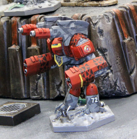
Blood Asp Prime, A and E. Ffficial Iron Wind Metals minis. Blood Asp Prime mini, arms are kinda massive.
Posted Image
Blood Asp A, check the canons in the arms!
Posted Image
Blood Asp E has a ER PPC and Medium Pulse Laser in each side torso(and quad ATM3 in arms).
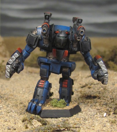
Posted Image

Edited by Lord Cal, 10 May 2018 - 10:31 PM.


2 user(s) are reading this topic

0 members, 2 guests, 0 anonymous users