4
The Champion Art Looks Terrible
Started by NimoStar, Jul 11 2018 06:04 PM
BattleMechs Camo Spec News
69 replies to this topic
#61
Posted 16 July 2018 - 04:05 AM
Champion ALA Mechwarrior 3.
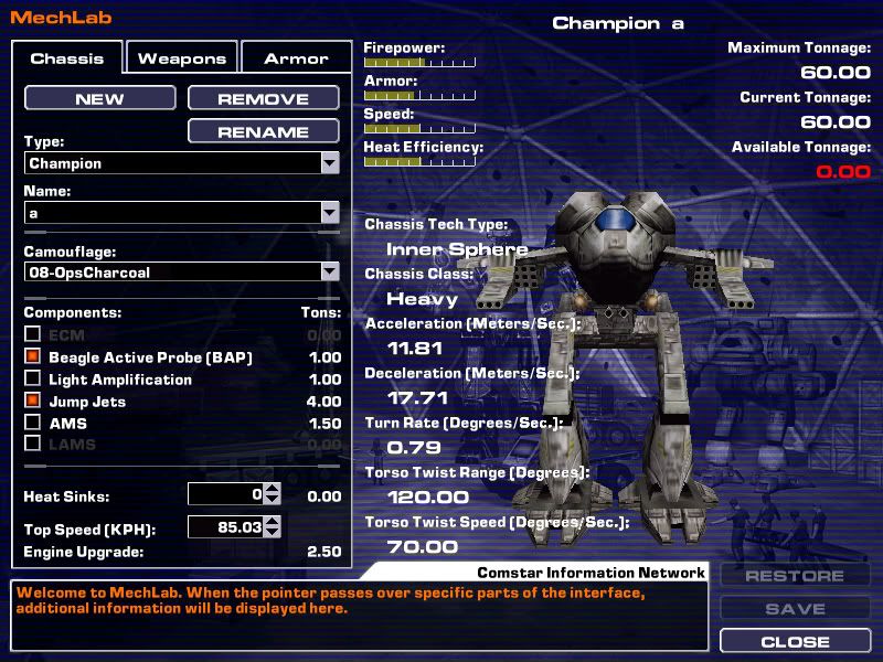
Champion ALA Mechwarrior 4 Mercs Mektek.
Honestly I think I'm okay with the PGI version.
#62
Posted 16 July 2018 - 04:55 AM
I wished they turned it into a chicken walker.
#63
Posted 16 July 2018 - 08:20 AM
Elizander, on 16 July 2018 - 04:55 AM, said:
I wished they turned it into a chicken walker.
Part of me feels that way too, and part of me is glad they made it forward knee-jointed like all the previous artwork.
A reverse knee-joint design (or even the digitgrade leg design like the Crab) would have looked better on the design from a visual standpoint. For some reason, Aircraft Torso mechs just look better with Reverse Knee Joint legs.
On the flip side though, forward facing knees on the Champion are not only correct, but also help differentiate it from most of the other mechs of the same (or similar) design. The only other mech that could be considered similar is the Jenner (if you think of the torso as aircraft-ish). The Jenner also looks a bit awkward because of it, but it also is definitely a Jenner. The Jenner IIC changes things up, but in a small way, it sort of loses a bit of the "Jenner-ness" because of it.
Overall I like that it kept the forward facing knees. I think that it looking pretty good with them helps reinforce my feelings on it. I think the mech looks good, and also retains the features that makes it identifiable as a Champion at a glance (wonky legs and all).
#65
Posted 16 July 2018 - 02:24 PM
I don't thank there was much you could do with the art on this guy, but change those legs with the bellbottom style in the old artwork. Give me a defensive 'staying alive' dance routine to avoid incoming fire, then I am in.
#66
Posted 16 July 2018 - 02:30 PM
Athom83, on 16 July 2018 - 09:08 AM, said:
Look to be pretty decent shields given the length of the things and that most variants don't have anything in the arms.
This guys claims the top half of the arms will the ST. I hope not.
https://mwomercs.com...ost__p__6131480
#67
Posted 16 July 2018 - 02:34 PM
Nightbird, on 16 July 2018 - 02:30 PM, said:
This guys claims the top half of the arms will the ST. I hope not.
https://mwomercs.com...ost__p__6131480
He is quite off. Those would be the "Biceps" of the mech. He's basing it on fan-made reseen art.
#68
Posted 16 July 2018 - 02:57 PM
Athom83, on 16 July 2018 - 02:34 PM, said:
He's basing it on fan-made reseen art.
No, he's using the art of TRO:3025R, p.71 to be precise. That is an official FASA book from 1996.
However this artwork (and its weapon placement) is an outlier, and Alex has not followed it. So I doubt the hitboxes will be determined by that outlier.
I'd say the art of Chris Lewis (TRO:3050U and 3039) was Alex's prime inspiration, especially regarding the weapons' integration.
#69
Posted 16 July 2018 - 03:05 PM
Sader Rykan, on 14 July 2018 - 11:09 AM, said:
It felt super top heavy and unbalanced, so I gave it a 5 minute hatchet job in Photoshop.
Personally I think it looks fine, I'll be picking it up.
Why are people talking about the arms? Look at the hard points, only 2 of them have energy HPs in the arms.
So no, it will not have Nightstar convergence issues, most people will strip the arms and get an extra ton or so.
Also, I like this photoshop version, that looks pretty cool.
#70
Posted 16 July 2018 - 03:09 PM
I do want it to retain its goofy looking humanoid standard knee joints though, just because it make it look goofy.
1 user(s) are reading this topic
0 members, 1 guests, 0 anonymous users