Jump to content

Repainted Concept Art

Art

7732 replies to this topic

#861 Sesambrot

    Member

  • PipPipPipPipPipPipPip
  • Bridesmaid
  • 862 posts
  • LocationGermany

Posted 05 February 2012 - 11:52 AM

View PostDarrin Thomason, on 05 February 2012 - 11:37 AM, said:

Yeah, those sort of mirriored my own thoughts on it. GIR's head is vastly larger then his body and every mech has a much smaller head than its body. The lack of two tone of the blood and the narrowing of the flows is down to the fact I have not really developed the skills to make them look right at the moment. I think one of the other guys might be able to do a better job.
I will gladly try to do one where it looks blood splatted, however, I don't have the skills to make it look real. Sorry.

not talking about realistic tho, can still look like a paintscheme in the end, and you're not going to get better if you don't practice anyways! :D
Maybe I'll have a go at it myself, when it comes to techniques tho I'm a complete noob, so how do you do those paintovers technically?
I assume layers with certain opacity/-settings?

#862 Darrin Thomason

    Member

  • PipPipPip
  • 98 posts
  • LocationBuckingham, UK

Posted 05 February 2012 - 11:52 AM

View PostIronhawk, on 05 February 2012 - 10:50 AM, said:

Best legs are definitely in top left (perfect balance between FD and the original look).


I think that the top left legs look great, however, I don't think that they are close to the orginal feel. I think Hayden's art on the top left is a very good representation of FD's work.I also would love to see any Urbanmech in the game, even with those legs. However, I think that your quote below needs to ring true for the feet as well. [Just to clarify I am not having a go at any one, I think Hayden's drawing is great and think FD's designs have been great, we just haven't seen enough to judge if the feet (and other aspects) will be a constant with little variation]

View PostIronhawk, on 05 February 2012 - 10:50 AM, said:

Torso is quite interesting on top left but will be a challenge to match to FD as I do not think he's done large curved shapes yet for MW:O. But he'll have to if he wants to tackle those Liao 'Mechs.


I agree wholehearlty. I know it might be 6 years time but would love to see FD tackle the Wraith

P.S I hope that when Paul gets into work tomorrow morning he has something nice to pay tribute to the glorious Urbanmech you created

#863 Darrin Thomason

    Member

  • PipPipPip
  • 98 posts
  • LocationBuckingham, UK

Posted 05 February 2012 - 11:54 AM

View PostSesambrot, on 05 February 2012 - 11:52 AM, said:

not talking about realistic tho, can still look like a paintscheme in the end, and you're not going to get better if you don't practice anyways! :D
Maybe I'll have a go at it myself, when it comes to techniques tho I'm a complete noob, so how do you do those paintovers technically?
I assume layers with certain opacity/-settings?


TBH I just use the brush tool on most of them. I haven't really played with opacity settings - the templates Hayden created do most of the grading and shadows automatically. The Silver Hunchback I just used various shades of grey on the different armour panels.

I will have a go but it might have to wait until Tuesday.

#864 Darrin Thomason

    Member

  • PipPipPip
  • 98 posts
  • LocationBuckingham, UK

Posted 05 February 2012 - 12:25 PM

I am still having problems with Photoshop Elements in tring to do gradients, does anyone have any tips for a free program which would be good at doing the repaints?

#865 Hayden

    Member

  • PipPipPipPipPipPipPipPip
  • Little Helper
  • Little Helper
  • 1,997 posts

Posted 05 February 2012 - 12:29 PM

View PostDarrin Thomason, on 05 February 2012 - 12:25 PM, said:

I am still having problems with Photoshop Elements in tring to do gradients, does anyone have any tips for a free program which would be good at doing the repaints?


Gimp is the best free/legal one.

#866 Kale Cytair

    Member

  • PipPipPipPipPip
  • Knight Errant
  • Knight Errant
  • 112 posts
  • LocationAlbuquerque

Posted 05 February 2012 - 12:32 PM

View PostHartsblade, on 04 February 2012 - 11:42 PM, said:

Okay this is a WIP for a 12th VR Centurion. CamoSpecs states that the 12th VR uses a standard camo theme, but I figured I spice it up with a tiger stripe twist. Note that it still needs some extra details and personalized logos.

Posted Image
EDIT: added updated look


It's a USAF Centurion. :/ Not sure how I feel about that.

#867 Sesambrot

    Member

  • PipPipPipPipPipPipPip
  • Bridesmaid
  • 862 posts
  • LocationGermany

Posted 05 February 2012 - 12:35 PM

View PostHayden, on 05 February 2012 - 12:29 PM, said:

Gimp is the best free/legal one.

I personally prefer Paint.net, it's more userfriendly, but probably not quite as "powerfull" as Gimp

#868 Ironhawk

    Member

  • PipPipPipPipPipPipPipPip
  • Ace Of Spades
  • Ace Of Spades
  • 1,333 posts
  • LocationMontreal

Posted 05 February 2012 - 12:58 PM

View PostSesambrot, on 05 February 2012 - 12:35 PM, said:

I personally prefer Paint.net, it's more userfriendly, but probably not quite as "powerfull" as Gimp


Artrage is also a pretty good shareware to consider. Gimp is the best free one.

#869 Hayden

    Member

  • PipPipPipPipPipPipPipPip
  • Little Helper
  • Little Helper
  • 1,997 posts

Posted 05 February 2012 - 01:03 PM

Centurion Template up.

http://mwomercs.com/...dpost__p__57715

#870 Hartsblade

    Member

  • PipPipPipPipPipPipPip
  • Big Brother
  • 772 posts

Posted 05 February 2012 - 01:57 PM

View PostKale Cytair, on 05 February 2012 - 12:32 PM, said:


It's a USAF Centurion. :/ Not sure how I feel about that.


Actually it is not based on the current USAF digital tiger stripe, but more of the Viet Nam Era uniform adopted by US special forces during that conflict. The USAF version is just the newest in a long line of variations on the pattern.

#871 100mile

    Member

  • PipPipPipPipPipPipPipPip
  • Elite Founder
  • Elite Founder
  • 1,235 posts
  • LocationAlegro: Ramora Province fighting Pirates. and the occasional Drac

Posted 05 February 2012 - 02:26 PM

That is excellent work!!!

#872 Jack Gallows

    Member

  • PipPipPipPipPipPipPipPip
  • Legendary Founder
  • Legendary Founder
  • 1,824 posts

Posted 05 February 2012 - 04:00 PM

View PostHayden, on 05 February 2012 - 12:29 PM, said:


Gimp is the best free/legal one.


Gimp is free? I may have to check it out and see if I can't give something back to the thread, to show my appreciation for everyone's amazing and inspiring work, especially all you've done for me Hayden :D

#873 Kale Cytair

    Member

  • PipPipPipPipPip
  • Knight Errant
  • Knight Errant
  • 112 posts
  • LocationAlbuquerque

Posted 05 February 2012 - 05:12 PM

View PostHartsblade, on 05 February 2012 - 01:57 PM, said:


Actually it is not based on the current USAF digital tiger stripe, but more of the Viet Nam Era uniform adopted by US special forces during that conflict. The USAF version is just the newest in a long line of variations on the pattern.


Of this I'm well aware, as I'm in the AF. My statement was a bit more simplistic than I intended; I recognized the Vietnam-era tigerstripe but the "Sponsored by the USAF for Solaris VII!" was the first thing to pop into my head.

#874 Ironhawk

    Member

  • PipPipPipPipPipPipPipPip
  • Ace Of Spades
  • Ace Of Spades
  • 1,333 posts
  • LocationMontreal

Posted 05 February 2012 - 06:27 PM

View PostSesambrot, on 05 February 2012 - 10:11 AM, said:

Awesome dude, that looks pretty much perfect now!
If was nitpicky I would say that it doesn't look like it can twist it's torso now, but I'm not, and it's just me anyways! :D Plus it looks freakin' awesome nontheless!


New edit on my Urbie concept post features addition of a rough concept update with new legs. Room for torso disk under the belt has been added. Link to post: #846

Reader's opinion will be welcome.

#875 Hartsblade

    Member

  • PipPipPipPipPipPipPip
  • Big Brother
  • 772 posts

Posted 05 February 2012 - 08:20 PM

View PostIronhawk, on 05 February 2012 - 06:27 PM, said:


New edit on my Urbie concept post features addition of a rough concept update with new legs. Room for torso disk under the belt has been added. Link to post: #846

Reader's opinion will be welcome.


Love it!

#876 warpig07

    Member

  • PipPipPip
  • Survivor
  • 58 posts

Posted 05 February 2012 - 08:45 PM

View PostHartsblade, on 05 February 2012 - 01:57 PM, said:


Actually it is not based on the current USAF digital tiger stripe, but more of the Viet Nam Era uniform adopted by US special forces during that conflict. The USAF version is just the newest in a long line of variations on the pattern.


good catch, USAF ABU is the ACU colors in a digital tigerstripe.

and yet i still wonder, where the hell does it blend into?

#877 Hayden

    Member

  • PipPipPipPipPipPipPipPip
  • Little Helper
  • Little Helper
  • 1,997 posts

Posted 05 February 2012 - 08:58 PM

View PostIronhawk, on 05 February 2012 - 06:27 PM, said:


New edit on my Urbie concept post features addition of a rough concept update with new legs. Room for torso disk under the belt has been added. Link to post: #846

Reader's opinion will be welcome.


Definite improvement, though the legs feel a little thin. Still, It's a lot more "true" to the original urbie, while maintaining much of the "modernized" feel the dev team is going for.

#878 Bullet Magnet

    Member

  • PipPipPipPipPipPip
  • Elite Founder
  • Elite Founder
  • 212 posts

Posted 06 February 2012 - 01:44 AM

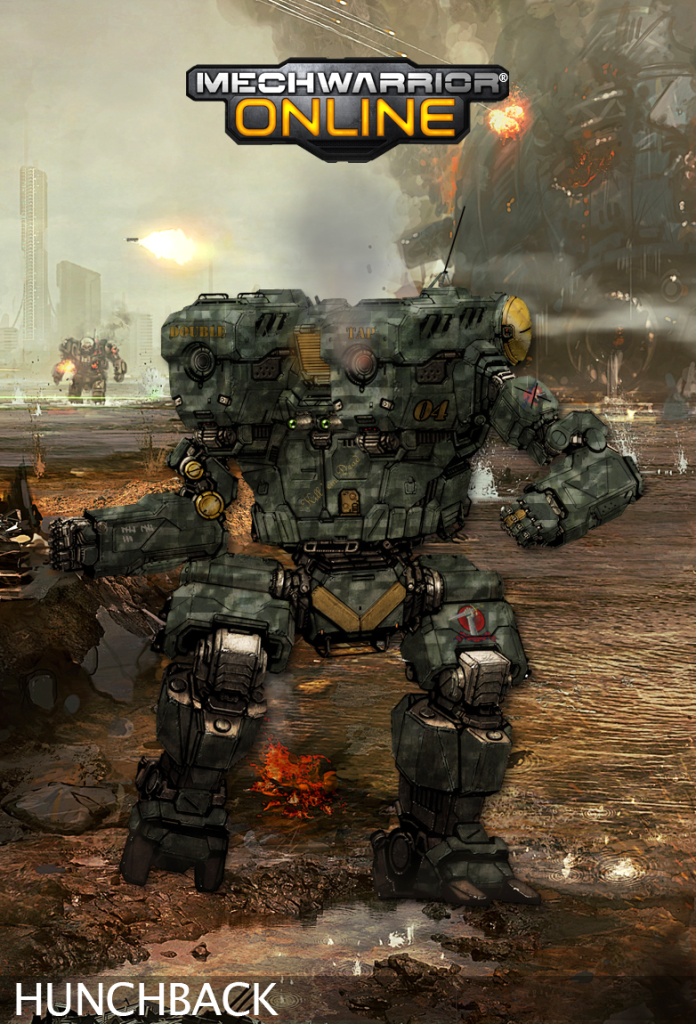
Here's my first ever repaint attempt, It's a Hunchback IIC with a woodland digital camo. I experimented with some metallic gradient effects to try and make the gold accents on the left shoulder and right arm. I also added some smoke effects to the left AC. I added a little something to a certain finger on the left hand as well...

Posted Image

#879 Sesambrot

    Member

  • PipPipPipPipPipPipPip
  • Bridesmaid
  • 862 posts
  • LocationGermany

Posted 06 February 2012 - 03:28 AM

View PostIronhawk, on 05 February 2012 - 06:27 PM, said:


New edit on my Urbie concept post features addition of a rough concept update with new legs. Room for torso disk under the belt has been added. Link to post: #846

Reader's opinion will be welcome.

I gotta agree with Hayden... glad I'm not the only one pointing that out tho lol
They do look more in line with the Urbies design, but also a little too weak.

I'd say it'd be about perfect if you manage to give those legs the same bulk as those of your second attempt had.

#880 Hayden

    Member

  • PipPipPipPipPipPipPipPip
  • Little Helper
  • Little Helper
  • 1,997 posts

Posted 06 February 2012 - 04:14 AM

View PostBullet Magnet, on 06 February 2012 - 01:44 AM, said:

Here's my first ever repaint attempt, It's a Hunchback IIC with a woodland digital camo. I experimented with some metallic gradient effects to try and make the gold accents on the left shoulder and right arm. I also added some smoke effects to the left AC. I added a little something to a certain finger on the left hand as well...

Posted Image


Classy. I really like the mottled effect of the camo.


69 user(s) are reading this topic

0 members, 69 guests, 0 anonymous users